Too much pattern, and other stories

All this sudden heat does slow things down rather deliciously. Makes me crave a chilled glass of rosé in the steamy outdoors, slowly sipping while watching the condensation speckle the wine glass and puddle on the table.

And, while things are busy, work currently has the consistency of molasses. Slow and sticky, but sweet if it ever gets there. How impossible is it to get anything done these days?


I discovered Populus Project through the bastion of cool and contemporary west coast design; Provide. The brainchild of Brian Lin, a Taiwanese-American product designer from Houston who now calls Vancouver home, Populus is the result of Lin pivoting from a career in fashion to create covetable objet for the home.

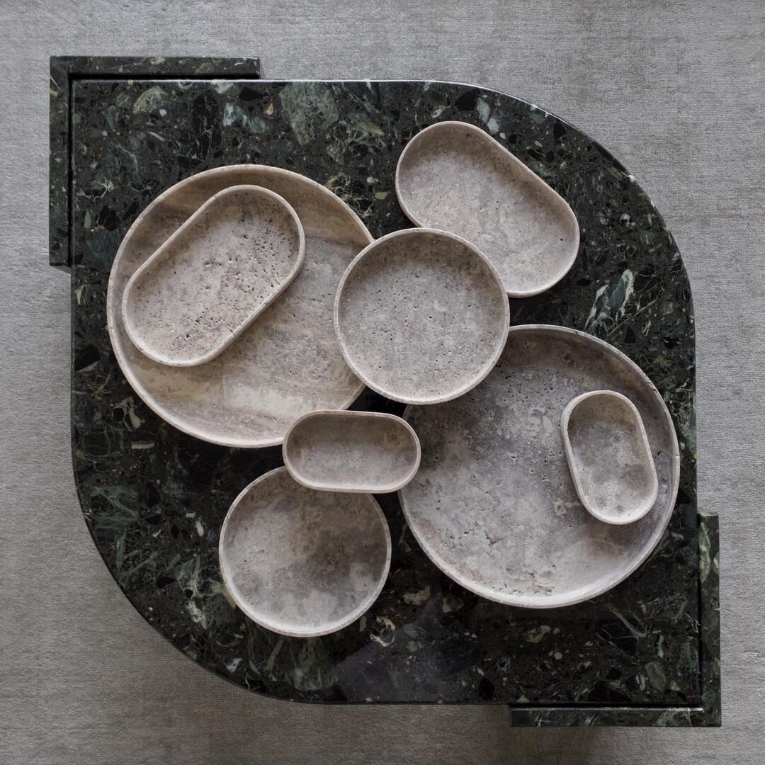
Just say yes to Lin’s stunningly simple yet utterly textural Silver Travertine trays - your keys and loose change will thank you. The trays also come in a heavily veined and totally g-g-g-gorgeous Italian Portoro marble . And I am totes in love with the polished brass Stack Burner designed to hold incense. Light it up and watch the smoky fragrance loop and curl through the pierced top.

Round and oval trays in Silver Travertine. Populus Project

Round and oval trays in Silver Travertine. Populus Project

Stack Burner. Populus Project

Stack Burner. Populus Project


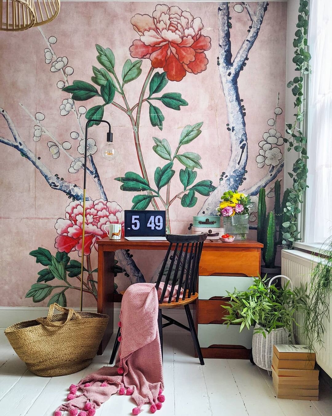
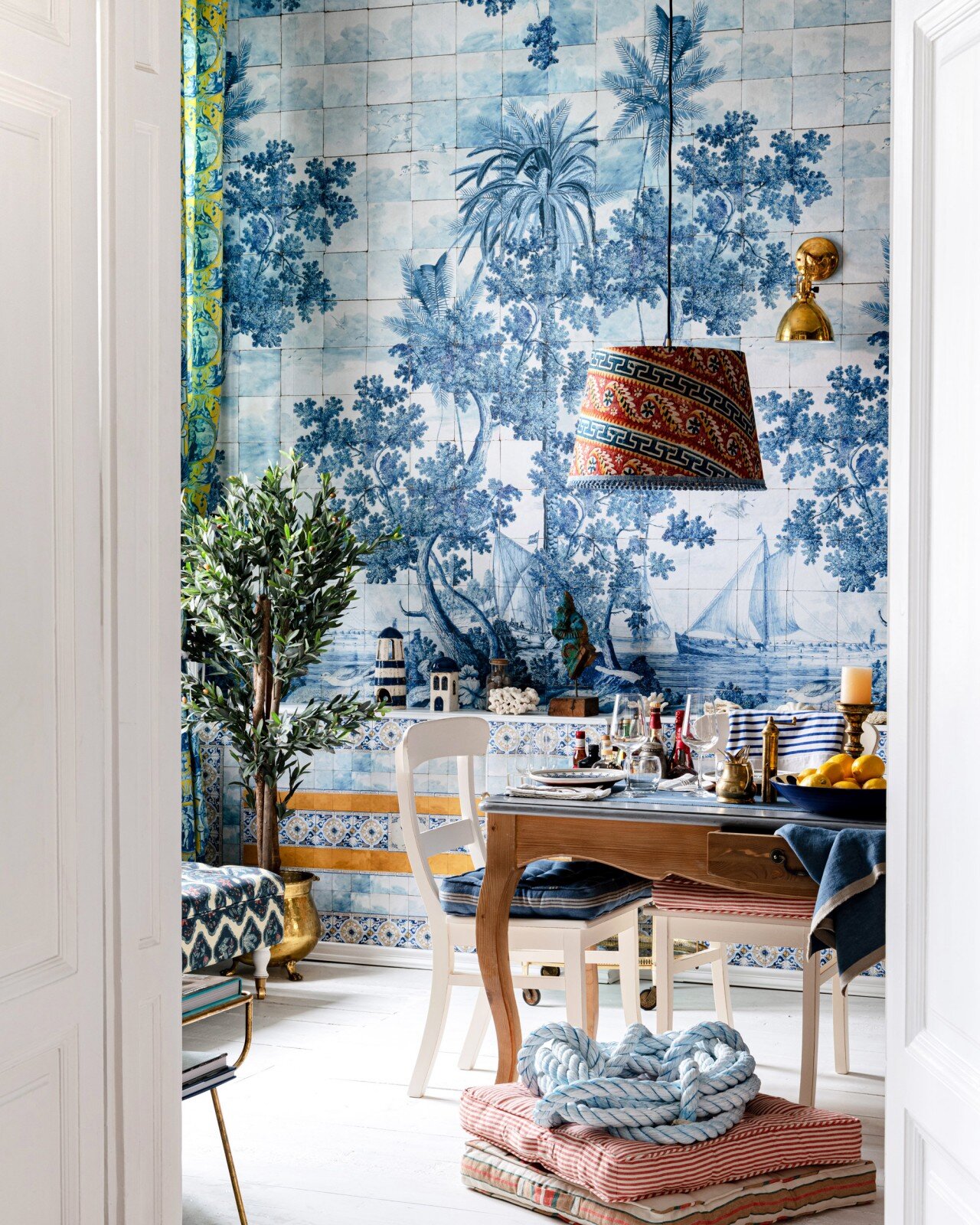
I always wonder about too much pattern. Is that even a thing? Can there ever really be too much pattern in an interior? Listen, before I sound any more like Carrie in SATC, I know this lewk might not be popular with the Japandi-loving crowd, but aren’t these two examples of mural wallpapers just stop-you-in-your-tracks fab???

First up, we’re serving FLORAL in this space by interior stylist Agi, featuring the 'Fragment of wallpaper' mural from the V&A Museum collection at Surface View. The design is taken from a circa 1725-50 wallpaper panel from Eltham Lodge in Kent, scaled up to deliver a definite design moment.

Let’s follow up with this little number from Transylvania-based patterntastic firm Mindthegap, who’s maximalist ethos infuses everything they do. The Azure mural is part of a collection they’ve dubbed Sundance Villa, and includes 201 other patterns, in case the mood takes you.

Surface View ‘Fragment of wallpaper’ mural. Interior design: Agi

Surface View ‘Fragment of wallpaper’ mural. Interior design: Agi

Azure mural. Mindthegap

Azure mural. Mindthegap


Oh, hello high-contrast black and oak. The new Jamie Beckwith collab with Currey & Co is definitely pushing all my buttons, translating Beckwith’s mindbogglingly gorgeous patterned wood surfaces for floors and walls to a 10-piece collection of furniture and furnishings.

Of course!!! You’ll shout, when you realize you can actually match Beckwith’s Gio Ponti inspired Swoop surface in oak with his Swoop Cabinet. (shown below). I’m seeing a wall in the wood pattern fronted by the cabinet, and topped with a barmy vintage lamp like this, you?

Swoop cabinet and Arrow cocktail table. Jamie Beckwith for Currey & Co

Swoop cabinet and Arrow cocktail table. Jamie Beckwith for Currey & Co


More horn-tooting… A while back my talented sister co-founded Plum & Belle, a stylish online resource for sustainable home goods, fashion and apothecary. And, when I chat with her over Facetime on the daily, I’m always pumping her for info on the latest finds they’ve added to the shop.

While there’s always something I want to get my hands on (I’m talking to you, Shibori indigo dyed vintage French linen tote bag), a long time fave are the heirloom kilims by Ishkar. Woven by Afghani weavers in partnership with the Norwegian Refugee Council, they embody the handmade specialness of true craft. Read more of the story behind the blue Band-e Amir design or Anar in burnt umber, each handwoven in wool.

Ishkar Band-e Amir kilim. Plum & Belle

Ishkar Band-e Amir kilim. Plum & Belle

Ishkar Anar kilim. Plum & Belle

Ishkar Anar kilim. Plum & Belle
{giving it} Sukat Makkaralla glassware

{giving it} is all about my take on what makes a good gift. Today I have kitchenware on the brain, since I've been pulling together a look book for a kitchen shoot next week. And that's when I stumbled on Marimekko's latest line of glassware - Sukat Makkaralla. What the what? Yep, the name is kind of a mouthfull, but translate it from Finnish to English and it means "socks with sausage" or - I think this probably conjures up a better visual - "socks rolled down", which is what inspired designer Anu Penttinen to give the colourful glassware its ruched design. Click here to get in touch with Marimekko Vancouver, who'll happily ship just about everywhere. 

Guest blog / Julia Black: Under covers

Julia Black: What happens between the sheets is definitely personal. But, if I may, I’d like to recommend you get to know more about who you are in bed with, at least when it comes to your bedlinens. Shopping for linens can be a complex issue, as there’s a ton to know and a gazillion options out there, like threadccount, the brand, the content, and what part of the world does it come from? On a recent trip to Vancouver I discovered a bedding company called, simply, Bed. At Bed, they pride themselves in making their product themselves, from the sewing right through to the dying, making the most brilliant spectrum of solid, patterned and striped 100% cotton bedlinens, all locally. Luckily, you don't have to be in Vancouver to get in on the Bed action, since they ship just about anywhere, but it is great to get to support a small Canadian company who are making a positive difference in the mass manufactured market we all live in. My absolute fave at Bed was selecting from all the spectacular solid colours they carry - 48 in all - and having fun mixing and matching patterns and stripes. Better still, at the end of the day you get to hop into an overwhelmingly comfortable bed and know exactly who you're zzz-ing with!

To read more posts from Julia click here, and to check out her cool blog click here.

Guest blog / Julia Black: It's in the grain

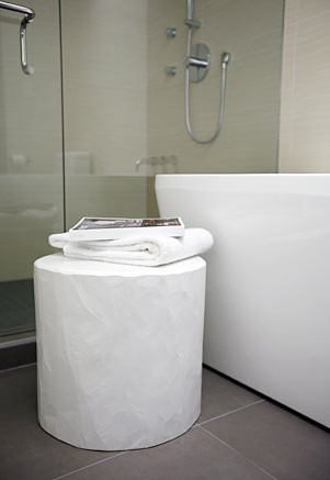
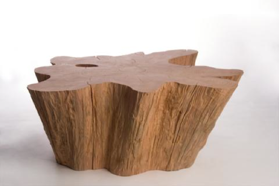
Julia Black: John Ross might as well win a gold medal at the 2010 Vancouver Olympics. Truth be told he might not exactly be an athlete, though he is a supreme representative of the Canadian way. With his overwhelming compassion for nature, his creative brilliance, and his oh-so stylish designs, what more can you ask for? As logger for nearly 15 years in British Columbia, John decided to channel his passion into high-end one-of-a kind pieces crafted from cast-off wood. You might have caught his work in Oprah Magazine and Canadian House & Home, and to actually get your hands on his furniture and lighting you can pop into one of my fave Vancouver shops, The Cross. John currently resides on Vancouver Island, so those of you lucky enough to be on the West coast right now be sure to check him out! Who knows, maybe you’ll come away with an extraordinary, and very Canadian, piece of furniture.

To read more posts from Julia click here, and to check out her cool blog click here.


So you say grey or gray?

Which is it? Unfortunately I tend to flip back and forth, which confuses both spellcheck and any editor I might be working with, lol. Whatever, it's a colour that people seem to have a penchant for these days. We'll be picking a dark smoky tone, either Palais Royal or Chrome from Ralph Lauren Paint, for the walls and ceiling of our basement media room. And I have a bit of a thing for grey/gray glass too - Somewhere in a box in storage sits a bunch of (fingers crossed) well wrapped vintage and new art glass that will be making an appearance shortly in the new place...

In the meantime, here's a swanky set of grey/gray glass vases from BoConcept who, sadly for me at least, have yet to open a store in Toronto; though they do have one for the lucky folks in Vancouver.

Bookmark and Share