{that one great thing} Cobi's ashtray collection

Back when she was Editor of Canadian House & Home Cobi Ladner was one of my many bosses (oh, the life of a freelancer). Now, as I'm sure you've seen, she's just launched her very own witty, colourful and happy line of fabrics, furniture and accessories called cobistyle. As you can imagine she's been a little busy, so I've patiently been pursuing her for a *that one great thing* pick, and here it finally is. And seriously, will you ever look at Cobi the same now that you know she's a little light fingered?

Cobi Ladner: I wonder what it says about a person if their 'one great thing' is a collection of stolen hotel ashtrays? Especially if that person has never smoked! I guess I have to admit here, in front of the entire world, that yes, I did personally steal one of these little beauties myself. It's actually my least favourite of the bunch. It's the one from The Plaza hotel in NYC. I was lucky enough to stay at the Plaza for business  (back in the day when Ivana Trump briefly owned it). The crest is only cheaply printed on, probably in China, but I had to have it as a memento. 

I use these little dishes all around the house -  in the bathroom to hold loose jewellery; at the kitchen sink and bedside for my watch; on my desk for business cards (some days I need to remind myself of who I am); on my husband's dresser to hold change. I look for them whenever I'm in junk stores, the Sally Ann and flea markets. It's a total high to find a lovely little dish that originally sat in a beautiful room in Paris, on a dusty shelf in a thrift store in Southern Ontario. Who's suitcase did it travel in and was it a sentimental impulse to bring it home as a memento of a fabulous holiday?   

Although I love to see kitsch in other people's homes - pillows from Niagara Falls, shot glasses from Florida - I'm not into that myself. No, I love the idea of elegance - Paris - London - New York - Darlin', I love ya, but give me Park Avenue.... and the notion that a hotel would have fine bone china from England printed with their fabulous address. 

My favourite little dish isn't here unfortunately. It was from the Hotel Scribe in Paris and was a little fluted square with a fine orange line around it. I loved it so much I tried using it as a soap dish in our powder room and my clumsy 13-year old broke it. So much for the elegance of Paris in our house.  I guess that's what makes it all the more appealing.

{that one great thing} Michael's Blue Willow dishes

I totally get people who are kind of nuts about collecting, and Michael Penney from House & Home is just one of those kind of nuts. I bet you've seen his stories in the mag, or on the H&H blog, as well as on Design*Sponge. In fact, you'll see his new house featured in H&H's upcoming June issue, where I'm sure you'll catch a glimpse of a wall filled with his that one great thing pick - Blue Willow china.

Michael Penney: My one great thing is my growing collection of Blue Willow china. It started as a love of all things British and cottage-y in style, but I've since decided I like it with almost anything. I love the story behind the pattern (of two young people in love escaping a disapproving father, their souls flying off into the distance represented by two birds) and how the narrative is told on the plates and platters themselves. The clear blue glaze mixed with the time-worn creams and whites is perfection, as are any chips or blemishes that occur over time. This makes the piece look all the better to me!   

I bought a whole lot of dinner plates this past summer at Antiques USA in Kennebunk Maine for very little and have continued collecting everywhere from thrift shops to Cynthia Findlay Antiques (where I got this gorgeous platter). I've since hung the plates on my dining room wall in a symmetrical, geometric pattern radiating out from this central platter. I love the way they look en masse and they really have a big impact that way too. 

I also pick up blue and white ginger jars and vases when I can, and even small bowls and things in Chinatown. I guess I just can't get enough of this English, WASPY staple!

{that one great thing} Meg's chair

I've known Meg Crossley, House & Home mag's senior editor for, well, ages. We've shot a gazillion things together over the years including a memorable out-of-town home shoot where the place actually turned out to be haunted. Fun times? Yep, especially with us both squeezed into a twin bed terrified about having another 'visit'. And so, with that kind of history I just had to ask her to contribute to that one great thing.

Meg Crossley: I love love love this chair my father made sometime in the early 60s. It was for the first little house he shared with my mom when they were newlyweds. As they got more established, their tastes changed and the chair ended up in our toy room -- where my brother and I kept Barbie's and GI Joes, games, the record player, the Meccano set, you get the picture. It became part of our "pretend" house or apartment furniture. Then the lovely thing was moved into the garage not to be seen again for years. My brother resurrected it in the 80s for his university pad (the cushions upholstered in something I would call School Boy stripe, very dark and masculine), then back to the garage. I rescued it just a couple of years ago, when I started to reno and furnish my basement. I needed low furniture because the ceiling was so low in the basement and I wanted to fool the eye into thinking it was higher. This did the trick. After a little lemon oil on the wood and a slipcover in white denim (it is a testament to how well it was made that it was so easy to resurrect), it mixed well with some of my quirky vintage things and my more traditional furnishings -- it is all about the mix after all. We shot my basement for a Makeover issue for House & Home and it landed front and centre, on the cover of that mag. Needless to say, my dad was thrilled.

Finland to Japan to Canada

On the eve of the nice folks at House & Home posting a gallery of both our houses (take a look here) I thought it would be fun to share the latest addition to the interior - snazzy new pillows. We scored the vintage Finnish Fin-Helen fabric in Tokyo - of all places - at Siige in Nakemeguro, well, truth be told, David actually grabbed it and reminded me how we needed new pillows. The pillow 'need' comes from the fact that Spot the whippet likes to chew (and chew, and chew) pillows, and all the ones we had hanging out on the sofa looked like they'd been through the wars. Thankfully Spot is pretty much past this phase, and for the most part uses any and all pillows as a snoozing aid (right this sec he's asleep with his head buried in a pillow I made out of an Orla Kiely tablecloth). Smart dog.

Guest blog / Jenn Hannotte: The royal treatment

Jenn Hannotte: Ahh, the sweet, suffocating smell of plaster dust! We're knee-deep in it over here, tackling the family bathroom. When we bought this house, we thought we could live with it for a while. We thought that we could clean it up, and it would be OK. We thought maybe some new towels would help. We thought WRONG. The 'before' picture provides some visual evidence, but the real issue here was the smell. And the strange textures that stained every surface. I won't elaborate, but suffice it to say we are very happy to have it all GONE! It was demo- day here today, and the folks from Cera Stone (who I also used to renovate the main floor of the last house) knocked it out efficiently as ever.

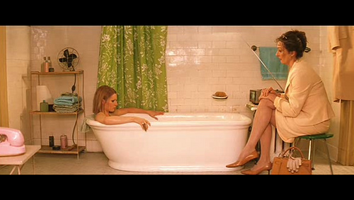
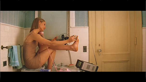
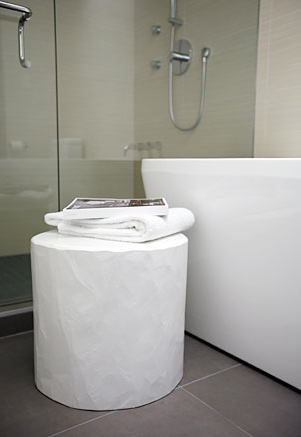
Finding inspiration for the bathroom wasn't a problem. It seemed everything I saw, I loved. Especially anything dark and vintage, with an industrial twist. Like Jenna Lyon's en-suite, or this gorgeous bathroom from House & Home by Connie Braemar. But, I wasn't quite sold on the idea of going to the dark side - something wasn't quite grabbing me. And then, as I do a couple times a year, I was watching The Royal Tenenbaums and there it was, my future bathroom. Nothing dark about it, but oozing original vintage charm with a fresh colour scheme and those great set details found in all of Wes Anderson's films. How close the final product will be to the bathroom Margot Tennenbaum spends  "six hours a day locked up in...watching television and soaking in the tub" remains to be seen, but the hunt is on! [Image 2 via Habitually Chic. Image 3 by Virginia Macdonald]

For more of Jenn's take on style, as well as to see the beginnings of her own reno project, click here.

Principally speaking

Where, oh where, has the week gone? All my best laid plans of it being a quiet week have literally been chucked out the window, and now it's practically the weekend for heaven's sake! Getting back on track, I wanted to show you lot the pics of the principal bedroom and bathroom from the House & Home feature (shot by Angus Fergusson, of course), so without further ado, here we go.

That first pic shows the bedroom under construction, when we'd knocked out the teensy old closets. Now the walls are all papered with grasscloth from Design by Color, the upholstered headboard and bedskirt are in my fave David Hicks designed Hexagon House Chenille from Lee Jofa, and the cream velvet curtains are from inVU Drapery. The ceiling fixture and lamp on the left of the bed are both vintage, while the one on the right (as well as the shades for both lamps) was snapped up at HomeSense. The closet now runs wall-to-wall, and is the Pax system with Vinstra doors from Ikea, and really, we couldn't live without all that built-in shoe storage, lol. The night tables were a sweet $10 each from Value Village, and the dresser was from Frontier, both were refinished to match in that khaki tone by Beresford's. On the dresser is a kooky vintage lamp, enamelled boxes from AT Design, and above there's a lovely West Elm mirror.

The bathroom was tiny, filthy and all pink, so we knocked out the walls and made it 18" wider to make the space that bit more generous. The vanity is KraftMaid kitchen cabinetry, the integral sinks and counter is Corian, and the walls are tiled in a Carrara marble lookalike porcelain tile called Montova, and yep, it's all from Home Depot. The sconces are from CB2, the mirrors are from Walmart (really), and the towels are Ikea. All the plumbing fixture and fittings in the space are from Kohler, and include the swish Oblo wall-mount faucets, the Purist Hatbox toilet (you can just about see it in the reflections) and the ceiling-mount WaterTile shower head. Oh, and I have to give a shout out to Home Depot Installation Services, as well as our contractors Cera Stone, for all their amazing work on the bathroom!

On the (main) level

Yep, the August issue of House & Home is finally out (with our place in it), so I thought it was high time to finally share the heinous 'before' and the lovely 'after' of the main floor of our house! So you can get your bearings, that first pic is me standing pretty much where the coffee table is now, looking back towards where the kitchen ended up, and all before the walls came down to finally open the space up. For more scary before shots click here.

Here are the deets on those glossy after shots, photographed by Angus Fergusson -

In the living room the sofa, chairs, tables and ceiling fixture are all vintage. The ottoman is from Bev Hisey, a couple of the pillows on the sofa are from The Rug Company, the Montigo fireplace is from Odyssey Fireplaces, and the rug is from Sears. Spot looks awfully cute in this next shot, against the brill Manderley wallpaper from Graham & Brown. That's a Besta cabinet from Ikea (crammed with records), topped with a turntable, a Tivoli radio and a vintage lamp. I made the dining table out of scaffolding planks and a vintage table base, and all the chairs were super-cheapy vintage finds refinished by Beresford's and, all the doors and windows in the house are Jeld Wen. The KraftMaid kitchen cabinets, Corian countertop, glass tiles and Quality Craft bamboo flooring are all Home Depot, oh, and the stools are vintage. The fantastic stainless steel slide-in gas range with downdraft (no need for a range hood!), dishwasher and French door fridge are from Jenn Air. In the powder room, the wallpaper was dragged home from BHV in Paris, and the teensy sink is from American Standard. And finally, a major shout out to our contractors, Cera Stone!


Bright and clean

Okay, well I'm happy to drop a little taste of our completely finished house. It's the laundry room, which is in the current issue of Canadian House & Home, and to quote a 1968 cigarette slogan You've come a long way baby. To see how vile it actually looked when we first bought the house click here. Yep, that's ugly, lol. Not to mention all the weird stuff we discovered when we ripped out the old basement kitchen - Part of a garden fence was behind the wall and the ceiling was suspended with sticks from apple boxes and an old chair leg. Seriously.

Here's a quick rundown of what you're looking at: We maxed out on storage and usability with Ikea kitchen cabinets fronted in Abstrakt white hi-gloss doors and a Numerar countertop (just out of view on the left there's a Lagan sink with a slick white Ringskar faucet). Built into the cabinetry on the left are the fantabulous  GE Profile SmartDispense laundry pair, more on them here. That sweet carpet is the Spun hand-knotted runner by Bev Hisey, and the wood floor beneath is actually this TrafficMaster Allure vinyl plank from Home Depot. [Image: Angus Fergusson]

Guest blog / Julia Black: It's in the grain

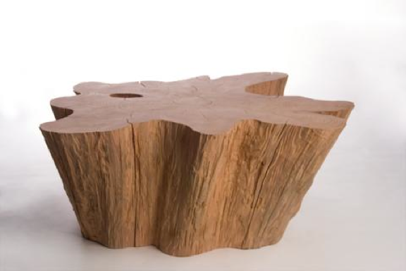
Julia Black: John Ross might as well win a gold medal at the 2010 Vancouver Olympics. Truth be told he might not exactly be an athlete, though he is a supreme representative of the Canadian way. With his overwhelming compassion for nature, his creative brilliance, and his oh-so stylish designs, what more can you ask for? As logger for nearly 15 years in British Columbia, John decided to channel his passion into high-end one-of-a kind pieces crafted from cast-off wood. You might have caught his work in Oprah Magazine and Canadian House & Home, and to actually get your hands on his furniture and lighting you can pop into one of my fave Vancouver shops, The Cross. John currently resides on Vancouver Island, so those of you lucky enough to be on the West coast right now be sure to check him out! Who knows, maybe you’ll come away with an extraordinary, and very Canadian, piece of furniture.

To read more posts from Julia click here, and to check out her cool blog click here.


Dark and disconnected

Our hi-speed internet was down for a couple of days this week, and let me tell you dial-up just wasn't doing it for me. So yep, I was feeling a little disconnected, though no less crazy busy - Over the last couple of days I returned all the last bits of pieces from the IDS (had to drive a truck, blergh), worked on a couple of Trendwatches for House & Home, and shot a webinar for a fun upcoming project with Erica Ehm of YummyMummyClub and author Kathy Buckworth. I am so in need of a bit of rest and relaxation...

On the dark side of things, as in colour, I wanted to share a few snaps of my 700 sq ft IDS space - the Ultimate his and her's bathroom - shot by Stefano Barbera. I was asked "Why black?" a fair bit about my colour choices and well, don't you think we've seen enough white bathrooms? The first two shots show the more feminine side of things (yep, that's one of the vintage dressers I'd scored at the Sally Ann and had re-finished), then there's the black wood panelled men's side, and finally that standout polished steel chest from Kravet in the chillout space that connected the two bathrooms.

5 quick questions: Tommy Smythe

If ever you want to meet someone with airs and graces, who looks down their nose and is the dictionary definition of pretentious, don't go knocking on interior designer Tommy Smythe's door. You definitely know Tommy from his work (and his wit) with Sarah Richardson on HGTV, and also from seeing his fab spaces in Canadian House & Home Magazine (check out the kitchen below, picked by the H&H editors as one of the most memorable rooms published in the mag's history), so I thought it would be fun to put him on the spot to answer 5 quick questions. He graciously agreed, and scooted along all the shots below, snapped by the talented Michael Graydon and featured on the pages of House & Home. Lovely, no?

And, to check out more 5 quick questions interviews with a slew of v. interesting folks, click here.

Arren Wiliams: What's inspiring you right now?

Tommy Smythe: Malachite, amethyst, The High Line, my sister Christie Smythe of Smythe Les Vestes, Yves St. Laurent, D Squared, peacock feathers, King Tut, Grace Coddington, Yoko Ono, London - New York - Palm Beach, Crayola crayons, poppies, Glee, Thom Browne, Miles Redd, flags, blogs.

AW: Is there anything that drives you crazy when you walk into a space?

TS: Fake.  Anything fake, really.  I'm the kind of guy who would (and has) survived on noodles and Gatorade for a month to be able to afford the real thing.  Knock offs are not fair and they're not design.

AW: What's the next thing you have your eyes on for your own house?

TS: I saw an oversized crystal and sterling match striker (I collect them) at a shop I love.  It's over $400, so I walked away, but I've been thinking about it a lot.  I have a crush on it.  I am waiting until I can get up the nerve to walk back in.  Then we will be together.  I'll just have to live on noodles and Gatorade for a few days....

AW: How would you describe your look, and has it changed over the years?

TS: My look has definitely changed over the years!  It's always evolving as I learn and travel and get exposed to more.  I have always liked an eclectic mix of things - the right balance of vintage, or antique and modern things.  I like rooms that have the feeling of timeless elegance and gracious living.  Style and comfort reflected in furniture and art curated with a sense of personal history.  I am really big on nostalgia...real comfort comes from there.

AW: What's next on the horizon?

TS: For the world of design:  I am so glad to have no idea!  What I love so much about this field is the surprise of it all - creative direction is so delightfully unpredictable.  That said, I think we can all expect to see quite a lot of plaid in the near future....

For me:  I am just about to begin shooting a brand new series with Sarah for HGTV Canada.  We're focusing on the building blocks of a room from top to bottom.  It's a '101' sort of a thing with our usual fun approach.  If it's not fun, it's just not worth doing - life is too short!!!


Space invaders

My yesterday started rather early, with making a perfect bed at 5.30am. Perfect, since I'd spent more than an hour ironing sheets, the duvet cover and shams the night before. This, of course, was all in aid of our house shoot. Believe me, there'd be no other way I'd be up at that rather ungodly hour or would ever be caught ironing our linens.

8am hit and photographer Angus Fergusson showed up with a car jam packed with equipment and his two assistants (hi Kim and Jackie), and then Meg Crossley from House & Home arrived and we got to work. Main floor first, catching the kitchen, dining room and living room while the light was with us. Top floor next, working through the master bedroom and office. Then to the basement for the media room and laundry area. Finally, back up to the top floor to catch the master bath. 10 hours later and after lots of can I just move that and love it and crazazy good (thanks Meg for that one) and the shoot was done. Phew. We popped a bottle of Veuve and then headed off to The Tulip for a well earned celebratory dinner (their chocolate cake is crazazy good, lol). 

That snap below shows Angus and his camera crammed into our shower, working on a shot of the bathroom vanity. Unfortunately that's all I can show of the shoot without giving too much away. You'll have to wait patiently to see the results show up on the glossy pages of H&H in 2010, and hopefully - fingers crossed - I'll be able to share all the shots at that point too! 

The final countdown

Nope, not this, ahem, classic track - and guilty pleasure - by those rather bedraggled hair rockers, Europe. Instead it's the final countdown to our place getting shot for a 2010 issue of Canadian House & Home. Tomorrow. Gulp. So today is a last minute bomb around town, getting the last bits and pieces to make sure every nook and cranny is looking lovely. One thing we're in need of is a flatscreen for the media room. Yep, we're upgrading from watching tv on a laptop to something a little larger. I'll be off to Future Shop to check things out, but I think, after a fair bit of research, that we'll be plunking for a 52" Sony Bravia W Series (basically so we can watch Glee in HD, lol).

In the meantime there are interesting things afoot that I wanted to share. Like, for example, what the very cool folks at Established & Sons have been up to with parquet flooring. Yes, you heard me right. Take a boo below at Wall to Wall, designed for Established & Sons by Shay Alkalay and Yael Mer. This inspiring setup (the oak herringbone brick flooring was stained and finished in 15 different colours) has such an interestingly crafty look, almost like a large scale knit or a close-up of a trad Persian rug. I think it's spectacular.

If you'd like to check it out in person, and happen to be in London anytime soon, Wall to Wall is on display as part of the Frieze Art Fair until Nov. 24th. [Photography: Ed Reeve]


Check, check, check it out

This morning is a busy one, calling a v. nice woman in Vienna on the hunt for a missing shot needed for Trendwatch for Canadian House & Home and rustling up contenders for the next Style Scout for the National Post newspaper's Posted Homes section. I was happily interrupted though, by a couple of mags thumping into the mailbox (thanks Postie!). It was the always anticipated arrival of June's House & Home and Bon Appetit.

Good news, since I was asked to hold off on telling you all about the posh and polished re-done House & Home website until the June issue reached subscribers. Okay, now I can let you in on the fact that it's v. cool, and jam-packed with tons of info (way more than before), videos, image galleries and Canadian resources. I do have a fave section though, and that's their brand new editor's blog. Click here to check it out. I'm loving, as usual, Stacey Smither's finds and will be avidly following Meg Crossley's basement reno adventures with The Sicilians (her trusty contractors). Have a poke around the site while you're there, you won't be disappointed, and check out the snaps below of the start of Meg's reno. That last image is Meg's current inspiration, an interior by Kay Douglass. [Image 3: Simon Upton]


Bookmark and Share

Fun with Mikey

I've had a blast over the last couple of weeks, prop styling on a cookbook that will launch in September (shout out to the crazy/cool authors, Julie and Lisa!). The crew on the shoot was just stellar - photography by Michael Alberstat and food styling by Ian Muggridge - and the whole shebang is being put together by Bruce Mau Design. I can't wait until it hits the shelves, and hopefully I'll be able to share a few of the snaps with you when it does.

Michael and I have known each other for years, and have worked together a fair bit too (there's a bunch of shots we did together in my portfolio here), so I wanted to share some of his glorious interior shots with you. He is ace with light and has such an eye for style. Take a boo below and you'll see what I mean. The first is a glossy and modern Ikea kitchen that I designed and we shot for the now sadly defunct Wish Magazine (it was on CityLine too). The second is from Wish as well, and shows Suzanne Dimma's swish kitchen (as you probably know, she's now the big kahuna at House & Home). The third is a lovely dining room shot for House & Home, and the final is a really fab bedroom snapped for Wish. Enjoy, and make sure to check out the rest of Michael's portfolio here.


Bookmark and Share

A healthy obsession

Whenever I ask a photographer to share some of their favourite shots I never know quite what's going to happen, so when I bugged a good friend of mine, photographer Angus Fergusson, to send through his faves he kindly obliged and then revealed that he's 'kitchen obsessed'. Yep, 3 out of the 6 shots he sent through are of very posh kitchen spaces. Funnily enough Angus and his darling wife Beth have a luvverly kitchen of their own; the result of surviving a reno on horrifyingly run-down fixer-upper in Toronto's west end. They bravely managed to see beyond the filth, rotten panelling and oddly placed toilets to create a bright, open and modern space - Fingers crossed we'll see it popping up in a mag sometime soon (it's quite the transformation).

The first two shots are from the sadly defunct Wish Magazine, the next three are from House & Home, and that final snap is of House & Home's Editor-in-Chief Suzanne Dimma, at home with her feet up, from the Globe & Mail. Make sure to take a boo at the rest of Angus's portfolio here and, on a personal note; Angus shot our last house for House & Home (you can see some of the snaps here on Apartment Therapy) so I'd love to give him first dibs on shooting this one, whenever it's ready, lol...


Bookmark and Share

Light and composition

The last time I saw photographer Michael Graydon was just before Christmas, in the grip of a pretty evil snowstorm, when we worked on this feature for Report on Business Magazine. I always enjoy working with him (he has such a calm and thoughtful point of view, and a beautiful way with light and composition) so I thought it would be fun to post some of his work. The five shots below represent just a smidge of what he's done, so make sure to check out more from his portfolio here; in fact, I'm happy to say that some of the work we've done together over the years is there.

The first four shots were seen in Canadian House & Home (that's ceramic artist, Jennifer Graham pictured in #4), and the last - but by no means least - is from Canadian Family.


Bookmark and Share

5 quick questions - Suzanne Dimma

In between takes yesterday, and in the midst of the semi-controlled madness of a Style Dept makeover, I grabbed Suzanne to ask her a few questions. As you might know, she's just been named as the new editor of Canadian House & Home Magazine - So, congrats!

AW: What's your current fave colour palette?

SD: I'm the queen of white, but if I had to pick I'd go with a greeny-aqua-blue mixed with stone and a hit of pumpkin orange.

AW: What's the next piece you want to buy for your place?

SD: I'd like to find a great open style lantern in gold to switch out for the dusty glass apothecary lamp in my front hall, and for the cottage I just saw an outdoor teak table, part of the Veneto line at Design Within Reach, that would be the perfect coffee table.

AW: What's one thing that should be banished from decor?

SD: Anything cranberry red or forest green!

AW: How do you feel about your new gig?

SD:Oh my god, I'm so excited for the challenge! I really see it as the next chapter.

AW: What's next?

SD: Wrapping my show and packing to go on a much needed vacation in the South of France.


In the details


After a frustrating week with the new house and a bumper crop of deadlines to get through (look for Style Scout in Saturday's National Post, Post Homes section) I could do with a bit of relief. Lawdy I need this long weekend like nobody's business.

Today an e-mail popped into my in-box from photographer Angus Fergusson, who'd kindly sent me through a couple of detail shots - one of the dresser in the bedroom, the other of a shelf in the bathroom - from the Canadian House & Home shoot of our old place. If you flick through the mag (Feb '08) you'll see they didn't make the cut, but still, I thought it might be nice for them to see the light of day. That mirror has travelled with me since the age of 12, when I first started collecting Art Deco, and the shelf in the bathroom is an Ikea classic (the Lack) that we customized with a piece of mirror.


Quick pick

I was out and about this afternoon scouting for an upcoming Trendwatch for Canadian House & Home that'll appear in the November issue. As usual, it's a bit like finding a needle in a haystack, but I do enjoy the hunt. While zipping around town I ended up Teatro Verde where this cute-as-a-button watering can caught my eye. The print is Cray, a lovely Arts & Crafts pattern by Williams Morris, and is part of the V&A Museum collection (one of my fave museums to check out whenever I'm in London). Sweet!