Sign that Panton!

So tonight is the big Opening Night fun-fest for the IDS, and one of the funnest (is that a word?) parts of the evening is the unveiling of all of the customized white Panton chairs that will be auctioned off in support of Casey House. You'll see twenty of the modern classic chairs re-interpreted by everyone from Anwar Mekhayech, Matt Davis and Allen Chan of The Design Agency (get a sneak peek at their chair here) to Sarah Richardson and Tommy Smythe. Sarah, Tommy and their intrepid team have been lugging their Panton chair all over the place asking just about everyone in the design community to lend their support and sign it. Take a close look tonight and you'll see the signatures of folks like Miles Redd, Glenn and George of Yabu Pushelberg, Kirk Pickersgill and Stephen Wong of Greta Constantine, plus - as you can see from the caught-in-the-act snaps below - Tommy, Samantha Pynn and Suzanne Dimma. That is one well travelled chair! For more deets on the auction click here.

Oh, and keep your eyes peeled - I'm working on a fun Sarah Richardson giveaway for next week!

Meeting Martha

I was lucky enough to part of a Canadian crew of design media that popped down to check out Home Depot's de-lovely new Martha Stewart Living kitchen collection in NYC, and yep, actually got to meet Martha too! I was trying not to be all goofy and star struck, but as you can see from that kooky grin on my face, that might not have happened. From left to right in the pic is Samantha Pynn, me, Martha, Suzanne Dimma, Deidre Kelly and Karl Lohnes (the delightful Margot Austin was there too, but somehow didn't make it into the photo op). On top of all this - if that wasn't jammy enough - I also got to chat with both Kevin Sharkey and Gael Towey from Martha's team (who just happened to mention that they'll be launching an iPad issue of the mag soon!), as well as Maxwell Gillingham-Ryan and Aaron Able of Apartment Therapy.

The first snap shows how stunning the Martha HQ actually is, all Deco curved windows in a two storey high space with lots of white and polished concrete. Stunning indeed. Next up is a pic of Martha addressing all the folks who attended, standing in front of the very Martha-esque putty toned Seal Harbor cabinetry, with details like the corbels inspired by her own kitchen, followed up with a close-up shot of the plate rack and cabinets. Yum. On the more modern side of things is The Weston, which takes its design cue from Martha's Chief Creative Officer Gael Towey's Manhattan kitchen. All told there are 6 cabinetry styles in a range of painted and wood finishes, 8 exclusive honed marble inspired Corian countertops and a slew of perfect hardware to finish everything off. Expect to see it all in Home Depot stores soon!

Fun with Mikey

I've had a blast over the last couple of weeks, prop styling on a cookbook that will launch in September (shout out to the crazy/cool authors, Julie and Lisa!). The crew on the shoot was just stellar - photography by Michael Alberstat and food styling by Ian Muggridge - and the whole shebang is being put together by Bruce Mau Design. I can't wait until it hits the shelves, and hopefully I'll be able to share a few of the snaps with you when it does.

Michael and I have known each other for years, and have worked together a fair bit too (there's a bunch of shots we did together in my portfolio here), so I wanted to share some of his glorious interior shots with you. He is ace with light and has such an eye for style. Take a boo below and you'll see what I mean. The first is a glossy and modern Ikea kitchen that I designed and we shot for the now sadly defunct Wish Magazine (it was on CityLine too). The second is from Wish as well, and shows Suzanne Dimma's swish kitchen (as you probably know, she's now the big kahuna at House & Home). The third is a lovely dining room shot for House & Home, and the final is a really fab bedroom snapped for Wish. Enjoy, and make sure to check out the rest of Michael's portfolio here.


Bookmark and Share

A healthy obsession

Whenever I ask a photographer to share some of their favourite shots I never know quite what's going to happen, so when I bugged a good friend of mine, photographer Angus Fergusson, to send through his faves he kindly obliged and then revealed that he's 'kitchen obsessed'. Yep, 3 out of the 6 shots he sent through are of very posh kitchen spaces. Funnily enough Angus and his darling wife Beth have a luvverly kitchen of their own; the result of surviving a reno on horrifyingly run-down fixer-upper in Toronto's west end. They bravely managed to see beyond the filth, rotten panelling and oddly placed toilets to create a bright, open and modern space - Fingers crossed we'll see it popping up in a mag sometime soon (it's quite the transformation).

The first two shots are from the sadly defunct Wish Magazine, the next three are from House & Home, and that final snap is of House & Home's Editor-in-Chief Suzanne Dimma, at home with her feet up, from the Globe & Mail. Make sure to take a boo at the rest of Angus's portfolio here and, on a personal note; Angus shot our last house for House & Home (you can see some of the snaps here on Apartment Therapy) so I'd love to give him first dibs on shooting this one, whenever it's ready, lol...


Bookmark and Share

5 quick questions - Suzanne Dimma

In between takes yesterday, and in the midst of the semi-controlled madness of a Style Dept makeover, I grabbed Suzanne to ask her a few questions. As you might know, she's just been named as the new editor of Canadian House & Home Magazine - So, congrats!

AW: What's your current fave colour palette?

SD: I'm the queen of white, but if I had to pick I'd go with a greeny-aqua-blue mixed with stone and a hit of pumpkin orange.

AW: What's the next piece you want to buy for your place?

SD: I'd like to find a great open style lantern in gold to switch out for the dusty glass apothecary lamp in my front hall, and for the cottage I just saw an outdoor teak table, part of the Veneto line at Design Within Reach, that would be the perfect coffee table.

AW: What's one thing that should be banished from decor?

SD: Anything cranberry red or forest green!

AW: How do you feel about your new gig?

SD:Oh my god, I'm so excited for the challenge! I really see it as the next chapter.

AW: What's next?

SD: Wrapping my show and packing to go on a much needed vacation in the South of France.


Are we sitting comfortably?

I was on set today with The Style Dept crew when talk turned to sofas. It's a dilemma for me since I'm always torn when it comes to such a pivotal choice for a room - Should you go for safe or go for style? It's a tough one since you'll be living with your choice for quite a while (a good sofa should last a decade or two). Style normally wins out, which is why at home we have a low-slung vintage teak number upholstered in chocolate brown ultrasuede, but it could be time for a change, especially for the new place...

Could this be it? The velvet is stunning, let alone the romantic lines and all that wonderful tufting. This is the Samuel Johnson from Brit firm Chesterfield 1780 (yes, they've been making sofas that long), and luckily - if you're totally smitten - they'll ship anywhere in the world.

Light reading

Another day shooting on The Style Department, a hot one for sure; with the mercury hitting 30C. The space looked lovely by the time we were all done (such a talented bunch makining it all happen), and it's always a pleasure to work with Suzanne Dimma.

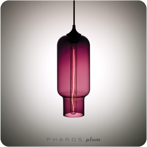
Tonight, before heading out on the town, I wanted to post a great lighting resource - Niche Modern. Their pendants are outstanding, and we'll be in the market for something stunning in the new place. Hmmm... The Plum tint of the Pharos pendant is so on trend.

NicheModern_Pharos-Plum.jpg