Something old and something new

Grace Bonney, the founder of Design*Sponge, has always been a thoughtful voice in the world of design. Now she’s stepping back from her influential Instagram account and allowing important new voices to take centre stage. As Bonney explains, “Starting this week I will be working to turn this from a blog-turned-personal platform into a community page dedicated to the voices and work of designers of color.”

Up first on the Design*Sponge Insta is designer NeKeia McSwain, the president of the Black Interior Designer’s Network and owner of Kimberly + Cameron Interiors, who’ll be sharing her style with the account’s 890,000 followers.

Cheers, Arren


O.M.G. Those chairs!

This snap is of one of designer Benito Escat’s latest finds, a set of vintage Missoni rattan dining chairs. I could decide to stop right here for today, and it would be fine - They’re just that good!!!

Escat and his partner, Pol Castells, are the creative duo behind Spanish interior design firm, Quintana Partners, whose look is defined by layered history and vintage fabulousness. It’s all about the patina, baby!

You can glimpse one of their latest projects, hotel La Bionda on Spain’s Costa Brava coast, in that second snap below. Oh, and the Missoni chairs? If you fancy your own, you might just be able to score a set right now on Chairish

106119375_2536791663204608_7381285977846390258_n.jpg
105943624_362338404750160_5866514491488384556_n (1).jpg

I do love a good kitchen design, especially one as handsome as this in a palette of mixed woods with a few hits of gold and black for good measure. We can thank designer Nikki Klugh for this thoughtfully planned space, but for me I’m completely taken with those herringbone floors.

Which got me thinking as to what else was out there for wood flooring. Parquet, anyone? While the name might strike fear into most, and make you think of golden oak flooring in 80’s condos, there is lots out there that’s worth a look.

While it’s not strictly parquet, the Bloc wood tiles by Studio Job for Bisazza, certainly have a similar vibe and backstory. It’s that feel, for sure, but so much more contemporary. And hexagon - yes, please. Anything hexagon with a trompe-l'œil effect will definitely get a high-five from me.

photo: Brady Architectural Photography

photo: Brady Architectural Photography

studio-job-wood-bisazza-tiles-london-design-festival-2016_dezeen_2364_col_3-852x1517.jpg

We’ll finish off today with a bit of inspo from Ikea, with a look forward to what our Swedish friends will be releasing in their new catalogue in August.

The styling is on point and I’m loving the colour palette, and hey, I’m already a fan of the mid-century inspired Rönninge chair in that great mossy green. Oh, and that storage workhorse, the Ivar shelving system, gets an on-trend update with swish bamboo doors. What’s not to love?

PH170248.jpg
PH170281 1.jpg

Chairs, Shelves, Channels

As I write this, Kate Bush is on the record player, her Lionheart album to be exact. While I collect bits and bobs - more on that later - my husband David collects records. Currently his collection stands at more than 600, housed alphabetically in glossy white Besta cabinets from Ikea.

Music is always so perfect in setting a mood. In fact, I think a touch of Kate Bush would fit perfectly in the Venice Beach home included today.

Cheers, Arren


Call me a heathen, but I don’t usually think of Northern Ireland as a hotbed of modern design. Well, Orior has definitely changed that, especially when AD has proclaimed them ‘The chicest furniture company you’ve never heard of’.

Based in Newry, 40 miles outside of Belfast, the company was founded with a Scandi point of view in the late 70’s by Brian and Rose McGuigan . Now with their son Ciaran as Creative Director that mod tradition continues, with a seriously sizzling collection of upholstery and more.

The Bianca chair is a hot pick. Built for lounging, the seat is a total sensual delight in leather and velvet (just say yes to the Brick colour). Supported by a frame in either oak or walnut, the chair’s wingspan hits wide at 46” - This baby needs room to breathe.

Photo: Bianca in Brick (left) and Flamingo (right)

Photo: Bianca in Brick (left) and Flamingo (right)


Try as I might to curtail my habits, I am an inveterate collector of, well, stuff. Early days was Art Deco objects, that gave way to an obsession with scientific glassware, which waned when I slid into white midcentury vases.

So, there is always something that needs a home, a moment to shine as it were, which is why I’m taken by Amsterdam-based designer Mickey Philips ceramic wall-mounted Shelf. Each is handmade, meaning each is slightly different - ‘wobbly’ explains Philips. But, to my mind at least, that makes them even more perfect.

Currently, I’m veering between that sunny yellow or the murky green to display a favourite Rosenthal vase. What colour would you pick?

Photo: Shelf in yellow

Photo: Shelf in yellow

Photo: Shelf in yellow, mint green and dark green

Photo: Shelf in yellow, mint green and dark green


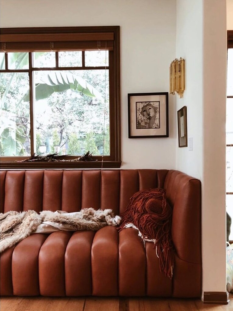
A good designer feels the soul of a space, and that’s what I love about this Venice Beach project by Electric Bowery, where they preserved the charm of a 1927 Spanish Revival, while layering in special moments that makes it feel very now.

That custom channelled leather sofa, designed for the project by Tess Bethune, is the total cat’s pyjamas. And, I love seeing something that feels so contemporary played against the trad wood millwork and funky vintage finds. Boho, but in the best sense of the word. Scope out the rest of the interior here.

Photo: Douglas Friedman

Photo: Douglas Friedman

Photo: Douglas Friedman

Photo: Douglas Friedman

guest blog / Jenn Hannotte: Magic ice and other kitchen stories

Jenn Hannotte: You know how when you're living with something you can convince yourself it's OKAY? Like the old fridge that was approximately 4 feet high and held a carton of eggs, a jug of milk and a loaf of bread if you packed it intelligently? NOT OKAY. And I only realized this after my Whirlpool appliances arrived and we set up the new side-by-side fridge (I put the other guy out on the curb for recycling, I didn't hold that much of a grudge!). It wasn't *just* that the kids squealed with disbelief when I got them ice and water FROM THE FRONT OF THE FRIDGE like a magician (we're simple people), but the fact that it's totally roomy and still counter-depth sold me. And the new dishwasher? Our old one was likened to a garbage bag with a hose attached by the appliance installer - and he wasn't far off. We had to close all the doors to the kitchen and basically vacate the house when that thing was running. My new dishwasher is quiet, yes, but it also has cool features (like Sheer Clean) and is smartly designed - something I can really appreciate after using our completely inefficient old monster. And, then there's the slide-in range that leaves more room for the birch plywood backsplash to do its thing, and which has a quick-heat convection oven to get those frozen pizzas cooked chop-chop! So why white, instead of the more expected stainless? White is fresh and modern and especially in a small kitchen like mine, it helps to unite rather than divide. 

Once the engine of the kitchen was installed, Angus Fergusson and Arren came over to shoot these stunning photos. My perpetual kitchen reno is all done and what's the verdict? For me (the only client who matters!), I absolutely love the ambience of this room, it's less a kitchen in the traditional sense, and more a cozy retreat. *AND* everything works, works well and looks good doing it.

Here are the deets:

Counter Depth Side-By-Side Refigerator, Whirlpool Gold Tall Tub Dishwasher,  Electric Slide-In Range. All Whirlpool.

Vintage industrial bins, Avril Loreti tea towel, Imm Living cruet. All Russet & Empire.

Lighting Design. Matthew Birch for Russet & Empire.

Kitchen Design. Russet & Empire Interiors.

Ikea kitchen cabinets, butcherblock counter, Ringskar faucet, Tral work lamp. West Elm Tripod Table. Breville Barista Express espresso machine. Areaware Numbers LED Clock.

>>> Catch the rest of Jenn's kitchen reno here, and click here to check out Jenn's take on style.

Guest blog / Jenn Hannotte: The perpetual kitchen reno

Jenn Hannotte: Last October, after my youngest pulled what looked like 1930s underwear out from behind the radiator in our kitchen, I called John at Cera Stone. "GUT IT," I said. Really, I didn't *want* to renovate the kitchen, I wanted to live with it and save up for the real-deal. 

But after the underwear, and because earlier in the summer I had removed all the cabinet doors because they were covered in SLIME, and because after the bathroom renovation we had a big ol' hole in the kitchen ceiling thanks to the old toilet losing it's shhhhh all over the place - well, it wasn't a kitchen anymore. And so, like I do, I started to rip things apart myself and discovered the original asbestos-tiles, and while not exactly good for the lungs, they were in really good shape which gave me hope for the pine-plank subfloor. Yes, we were going to gut the kitchen, but, no, we weren't going to spend much putting it back! Once everything was out, I decided to have a wall framed out over the messed up plaster that held the old cabinets in place, and we clad it in beautiful birch plywood. The sink, stove and fridge all stayed in the same place to keep costs down. A couple of base cabinets from Ikea, an inexpensive butcher block countertop, rough-pine shelf from Home Depot ($12!) and bingo, we had a kitchen. 

Okay, it didn't go that smoothly - I have hung different cabinets and shelves, moved the fridge around, painted the floors after resolving not to, and painted half a wall black before deciding (surprise!) white it was! This is a temporary kitchen - if temporary means 5 years or more to you. So, because we'll be living with it for quite some time, we figured that we might consider getting some appliances that work. I know people go on about "function and form" all the time, but sometimes I like to ignore that and spend money in places we shouldn't instead of... .getting appliances that work.

And so, this week a new crop of appliances that will bring harmony to the kitchen are set to arrive. Appliances that marry form AND function. I know, what a concept. Once they're here and installed I promise a full kitchen tour. For now, here are some shots of the before and during - and a sneak-peak of the 'after', shot for the Marion House Book last month! (which, incidentally, already looks different!)

For more of Jenn's take on style click here.

A little bit of B&W

This a.m. - before I headed out to give a talk to design students at Humber College (thx again Jo!) - I discovered the snap below of an Ikea dining table that had been tricked out in a black and white checkerboard. I have to say, I like the look. The hi-contrast combo of b&w seems to be one of those trends that's on the rise again (or did it really ever go away?), so it's kinda fitting that recently I got to play around with the clean and minimally styled Olympus XZ-1 that just happens to come in a lovely white-lacquered body with black detailing. Gorgeous? Yes. And for all you photography wonks out there - It comes fitted with a super-bright built-in 4x Olympus iZUIKO lens, the first ever built-in Zuiko lens on a digital camera. Oh, and just in case white isn't your thing, the XZ-1 is also available in matte black. [Image 1: Ikea/Livet Hemma]


Reidar on my radar

Yesterday I was doing the un-fun part of my job that always happens after a big photo-shoot - Returns. So, after getting that business out of the way at my local Ikea, my consolation prize was to walk the store and see what was new. And I'm happy to say that my chair-a-holic addiction was suitably jonesed by Reidar, one of the latest intro's in the dining department. Designed by Ola Wihlborg, the aluminum chairs come in five colours all together (the white and orange aren't shown below), are stackable, and can handle being both outdoors as well as in. Sweet!

Quick and red and white

Here's a quickie for you since I'm in transit today (more on that later). Okay, the Holidays are a comin', so how about we just try to get through it with a sense of calm and grace, huh? Wobblies and meltdowns will not be tolerated. So, with that in mind, just take a deep breath and remember that decorating in a chic/simple style needs restraint. Take a look at this lovely shot from Ikea - You've got the clean workaday lines of the Sockerart enamel pitcher that's been wound with Snovita sisal twine and then filled with Amaryllis. Glorious and just Christmas-y enough if you ask me. [Image from Livet Hemma, discovered via Tiger Hellström's great Tumblr blog From Scandinavia With Love]


guest blog / Jenn Hannotte: A touch of the RT's

Drumroll! Church bells! Fireworks! It's done! After some finishing touches, I was super lucky to have Naomi Finlay come by to take photographs of the final bathroom reveal, and Arren to help style! I am beyond happy with how it turned out - it's got that Royal Tenenbaum edge, but it's got a lot more of 'me' and a whole lot of this houses' heart in it, too. Here's the complete list of materials and other good stuffs used in the shots and in real life:  

Bancroft toilet, Brockway sink with Cannock faucets - Kohler. Daltile Subway and Octagon and Dot tiles, baseboard, Behr Paint in Ashes - Home Depot. Trim tile - Pollock's. Wild Flower wallpaper - Ferm Living. Fords Mill light fixture - Rejuvination Lighting  (Who, I noticed when I went to grab this link have some AMAZING new product). Towels, bathmat, plate - Anthropologie. Shower curtain - Urban Outfitters. Milk glass vases, vintage fan, MOR soap - Russet and Empire. Vintage pharmacy jars - The Arthur. Molger mirror - Ikea. Kartell Componibilii - Neat.

Click here and here to check out the other posts on the bathroom reno (including the awful before shots), and stay tuned, something else is cooking up at the Hannotte house - pun intended. Wink, wink.

For more of Jenn's take on style click here

Hanging out with Bob

Designed by Hella Jongerius, who you might know from her work for Ikea (I still love her Ikea PS Jonsberg vases), Bob is the latest in outdoor furniture from Spanish firm Kettal. I totally dig the indoor/outdoor feel the collection has, and seriously, how handsome does it look in that architecturally stunning raw wood space - Who knew knotty pine could look so mod? I'm also loving the two-tone metal frames on all three pieces, as well as the two-tone grey upholstery and lovely crafty wound yarn detail that shows up on the armrests of the chair and on handles of the footstool and table (oh, and that cool looking lamp is an outdoor piece too). In Canada, check in with BonaVista LeisureScapes if you fancy kitting out your deck with a set.


No parking allowed

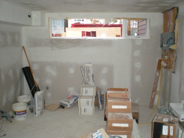
Yes, our media room used to be a drive-down garage, but that all changed back in the '80's sometime (way before we bought the house) when, in a rather hare-brained scheme, the old owners bricked up the garage door and filled in the driveway to create a v. dingy basement apartment. Oh, it was a delightful surprise when we discovered that that there was only one layer of bricks and some rotten chipboard holding back all the in-fill, take a look here, which meant we had to do a major bit of re-construction.

Fast-forward to now and things are all peachy - That's a Gus* Carter sectional sofa, silk velvet pillows and woven cane hassocks from Constantine, and a fab hand-knotted floor cushion from Bev Hisey. The striped velvet curtains have been discontinued at Ikea, but you can still get your hands on the Kvartal curved curtain rail, as well as the wall-mount Besta Burs DVD storage (topped with a few of my fave collectibles). On the other side of the room you'll catch a white leather tufted chair, an end table, and more of the shaggy rayon rug, all from Elte. Then there's more of that great Ikea Besta media storage, working both as a stand for the LCD TV, and mounted on the wall (we had fun tricking it out with Dioder LED lighting strips). The paint colour is Palais Royal by the no-longer-available Ralph Lauren Paint line from Home Depot. And, thanks again to Angus Fergusson for doing such an outstanding job in shooting the house for House & Home!

The last of up top

While the sun is beaming outside, I thought I'd let you know I've just worked on my first Holiday project (for inVU Drapery), and have been finding glitter in all sorts of odd places. Yep, it's Christmas in July in my world! Anyways, I'm still working through posting the rest of the House & Home feature, and thought it was time to flip you the last shots of the top floor.

First up is my home office which, as David would be happy to tell you, is often ignored in favour of the sofa. We had a piece of glass cut to fit the width of the room and set it on top of a pair of Ikea's Vika Lerberg trestle bases. The chair was picked out of a neighbour's garbage, the rug - look closely - is actually a macro view of botulism, from a series of rugs by Bev Hisey called Dirty Dishes, and the vintage lamp is from Zig Zag. And, honestly, it doesn't normally look as tidy as this. Then, in the second bedroom (ignoring the two smiling goofballs), between a pair of great Ikea bookshelves that have sadly been discontinued, you'll find a re-finished vintage sofa that originally looked like this, and a poster from Shelf. Oh, and that's another Bev Hisey rug on the floor, called Mommy Dearest, which has a pattern of wire coathangers woven into it. Then there's a snap of a dresser, which was a crazy-cheap Goodwill find for $15 that was refinished in white at Beresford's. It's topped with paintings by Zebedee Helm, a pair of Foo Dogs dragged home from Macao, and a print by Bold & Noble. And, as always, the talent behind all these great shots is Angus Fergusson.

Principally speaking

Where, oh where, has the week gone? All my best laid plans of it being a quiet week have literally been chucked out the window, and now it's practically the weekend for heaven's sake! Getting back on track, I wanted to show you lot the pics of the principal bedroom and bathroom from the House & Home feature (shot by Angus Fergusson, of course), so without further ado, here we go.

That first pic shows the bedroom under construction, when we'd knocked out the teensy old closets. Now the walls are all papered with grasscloth from Design by Color, the upholstered headboard and bedskirt are in my fave David Hicks designed Hexagon House Chenille from Lee Jofa, and the cream velvet curtains are from inVU Drapery. The ceiling fixture and lamp on the left of the bed are both vintage, while the one on the right (as well as the shades for both lamps) was snapped up at HomeSense. The closet now runs wall-to-wall, and is the Pax system with Vinstra doors from Ikea, and really, we couldn't live without all that built-in shoe storage, lol. The night tables were a sweet $10 each from Value Village, and the dresser was from Frontier, both were refinished to match in that khaki tone by Beresford's. On the dresser is a kooky vintage lamp, enamelled boxes from AT Design, and above there's a lovely West Elm mirror.

The bathroom was tiny, filthy and all pink, so we knocked out the walls and made it 18" wider to make the space that bit more generous. The vanity is KraftMaid kitchen cabinetry, the integral sinks and counter is Corian, and the walls are tiled in a Carrara marble lookalike porcelain tile called Montova, and yep, it's all from Home Depot. The sconces are from CB2, the mirrors are from Walmart (really), and the towels are Ikea. All the plumbing fixture and fittings in the space are from Kohler, and include the swish Oblo wall-mount faucets, the Purist Hatbox toilet (you can just about see it in the reflections) and the ceiling-mount WaterTile shower head. Oh, and I have to give a shout out to Home Depot Installation Services, as well as our contractors Cera Stone, for all their amazing work on the bathroom!

Webisode 2: A bit of an Ikea design mission

Oooh, I feel like there should be a drumroll or something, since here's webisode #2!!! I thought it would be fun to see if Tamara Robbins Griffith and I could take an Ikea sofa - the really rather lovely Karlstad in white tufted leather - and take it in two different and stylish directions. This is the result - Tamara embraced pink and glamour, while I went for a boho well-travelled vibe. What do you think? Major thanks to everyone involved, especially photographer Angus Fergusson, who's studio we invaded (you can see his fab shots below). Btw, that sofa is so new it's actually not quite in stores yet in Canada, but keep an eye out, it'll definitely be there soon...

Julia Black: Manga meets chic

What do you get when you combine the brilliance of a young female cartoonist inspired by Japanese Manga comics (remember Sailor Moon?) with my fave Scandi retailer? You get Ikea's latest textile collection, Charlotta. The line of 5 patterns was designed by Asa Ekstrom, who dreampt of becoming a Mangaka (a Manga cartoonist) from the age of 13, and trained in both Sweden and Japan before releasing her first Manga comic strip. Each of the Charlotta patterns is an imaginative, magical and lively mash-up of Japanese and Swedish styles, mixing Japanese woodcuts, origami and Vikings (one even goes so far as to let Godzilla rampage through some of Scandinavia's most historical buildings). So, whether you fancy new cushions, new drapes, a tea cosy, or you just love a bit of Manga, grab a couple of yards of Charlotta and get sewing.

Spring awakening

Funnily enough my sister posted about Spring 2010 this morning over on the her fashion reporting blog, Blink London, and I'm loving all the vintage chintz and mod florals she's been seeing. So, yep, here's a taste of Spring from me. In fact, to be exact, it's a taste of April, which is when Ikea's outdoor lines hit the floor (and sell out in minutes as usual, lol). The shot shows a sneak peek of a collection called Blanko, and the mix of bright white, cherry red and a lovely turquoise-y blue - the key colours for Ikea's Spring/Summer look - is totally whetting my appetite for warmer weather.

Julia Black: Pop-Up Colour

In light of all the pop-up shops that have been, well, popping up lately, I've felt a lovely buzz around the city like never before. The only problem is that this dampening, dreary winter weather throws a blanket on all the energy we have. I know, when you look outside it appears cold and grey, but the fix is in, and it's colour! Just look to the latest from folks like Jonathan Adler, CB2, Ikea and BoConcept for tons of helpful inspiration, and decide on a New Year's resolution to get more pops of colour in your life. Have a look below at snaps of BoConcept's collection for 2010. Oh, and btw, BoConcept has a store in Vancouver and are about to open a brand new location in Calgary in the next few days.

To read more posts from Julia click here, and to check out her cool blog click here.

Every day is a holiday

Wouldn't that be nice? Yes, we're rushing headlong into that busy time of year. So, rather then letting things look like Christmas has exploded in your house why not take a more pared back approach to the whole shebang? Talking of pared back, you should definitely pop in to Ikea to rifle through their Holiday collection. The line this year is simple, fresh and graphic, like the cool Kallt light fixtures below that - I think - are fab enough to leave up all year round. Thankfully they haven't forgotten the nuttier side of things, just take a gander at these hilariously quirky gift bags printed with what looks like a veritable army of elves. I think they'd be just the ticket filled with chocolate covered almonds and tied up with a scrap of red ribbon. There, I just sorted out all the folks on your impossible-to-buy-for list.

PS I love you

The other day I overheard an interior designer say how much he hated Ikea, slagging it off as cheap and nasty, and I thought to myself how he'd completely missed the point. Their affordable design means that anyone and everyone can have access to cool gear, no matter what stage of life and how deep their pockets might be. I've gotta say, if you're too posh to have Ikea in your house, then you obviously far too posh for me, lol.

The new Ikea PS collection is finally in select stores across the country (hello Boucherville, Etobicoke, Edmonton and Coquitlam) and is definitely on the cool side. The line employed hot designers such as Hella Jongerius, and edgy all-woman Front Design group, to come up with a slew of fab stuff. In researching the stories behind each piece I stumbled across a bunch of Ikea PS videos that I thought would be sweet to share. The first gives an animated overview of the collection, the second (subtitled in French) digs deeper and follows Hella Jongerius to India where the Mikkel wall hangings are made - and how brilliant that each one is signed by the craftswoman that made it... Click here to check out the rest of the videos (be sure to watch them in HD).


Buh-bye serial killer's den

We are totally ending the week on a high note. The laundry area is now a picture of streamlined modernity, completely kitted out with Ikea kitchen cabinetry to maximize on desperately needed storage (errr, coz we had none, lol). Just take a look at that first shot below, snapped when we first bought the house 13 months ago. Ummm, yep, it was obviously the vile den of a serial killer. If anything, the photo makes it look way nicer than it was - Seriously.

I hafta tell you the Ikea installers were stellar. Apart from doing a brill job fitting the cabinets into quite the wonky space, they swept up after themselves and left the place spotless. So, here's the what's what in laundry land, with a few extra pics below to help figure things out - Abstrakt white hi-gloss doors, aluminum and white Numerar countertop, Strecket handles, a Lagan sink and a completely gorgeous white Ringskar faucet (which'll be installed on Monday). It's laundry love fo' sho'.


A pocketful of sunshine? No, a van full of furniture

The house has been turned upside down, and I've been relegated to a small island in the middle of the living room whilst controlled pandemonium occurs, well, everywhere else. The Ikea installers (hello guys) have almost finished all the cabinetry in the laundry area, plus they've started in on the Besta media storage for the basement tv room and the Pax wardrobe in the bedroom (more info on that soon). Oh, and Rod the wallpaper guy is about to put up the last panel of grasscloth in the bedroom and then he'll be onto the paper for the living room and powder room.

Below is the truck full of furniture that we drove, bleary eyed and very early, out to Tim the furniture finisher to get sprayed. We managed to fit a motley crew that included eight dining chairs, two 2-drawer end tables, a 4-drawer chest and a 9-drawer dresser. We'll have to wait a week or so, but everything will be coming back in either a lovely Benjamin Moore Oxford White or Baffin Island. In the meantime all of our clothes have been relegated to plastic bins dotted hither and yon. Ummm, when will this be over? lol