Hello, how are you?

Hey, how’s it going?

I must say I’m not sure where the time has flown to? We appear to rushing headlong towards the Holidays at breakneck speed, about to crash directly into 2021. Which, imho, can’t come soon enough.

Anyways, here are a few faves that have caught my eye over the last while.

Cheers, Arren


While I admire the Japandi look as much as the next person, I must admit all that predictable pale beigeness does leave me a little cold. It’s all too predictable, no?

Colour! Pattern! Verve! That’s what we need, and thanks to architect and interior designer Cosimo Bonciani, that’s what we’ve definitely got in this space. Hello wallpaper! Which appears to be vintage from Ub in Florence, giving me another reason to dream of travelling Italy, if only to poke through the thousands of rolls they have in stock.

The interior was designed by Bonciani for luxury shoe designer and creative director, Samuele Failli and definitely puts the wow in wowzah! Want more after this little tease? Then snap up Living Corriere’s 2020 no. 11 issue.


It suddenly feels like just about everyone is thinking about a bathroom renovation, and whether it’s large or small, the right faucet is key. Want a something that’s both stylish and simple? Well, Riobel recently launched their new Reflet collection with House of Rohl, and I was lucky enough to see these sculptural beauties up close.

Eveline Simard, one of the Canadian designers behind the collection, describes it as “Incorporating a soft, wavy surface, encased in a rigid frame, combining both the elegance and power of water.” Look closely, and you’ll spot the polished softly curved interior surface inspired by the movement of water, which looks extra chic when paired with the brushed finish framing the rest of the faucet.

If you’re asking me, I’d love to see it paired with simple clean-lined white fixtures all set against a super-bold marble or stone, like Ciot’s dark and stormy Hurricane Black slab.

Photo: Riobel Reflet’s full range of finishes

Photo: Riobel Reflet’s full range of finishes


Every now and then I’m stopped in my tracks by something special, and the Nº180 Petite Cupboard by Avoirdupois left me completely gooped.

This little darling, made by designer/engineer James Stumpf in his SoHo studio, looks all sorts of stunners in statement-making green lacquer with burnished brass hardware. It’s giving me major Art Deco via Italian modernist vibes, and those curves!!! Score yourself a standout lamp and a vintage tray to corral your liquor bottles, and call it done. Oh, and if you want to really swoon, it’s even available in a double-wide version dubbed the Nº177 Grand Cupboard. Clock that here.

Of course there’s more to see… Check out the full collection here, and scope out the range of lacquer and woods the pieces are available in.

Photo: Nº180 Petite Cupboard in green lacquer

Photo: Nº180 Petite Cupboard in green lacquer

Pattern, Pattern, Chair

A fun part of my schedule this week was shooting remotely at home for Citytv’s Cityline. The subject was our principal bedroom, a space that had a forced renovation due to some major construction we endured over the summer.

Things have definitely changed in the space, and for the better for sure. I can’t wait to share the results with you, and it’s extra fun looking back at how the space looked when it was shot by Angus Fergusson for House & Home magazine more than 11 years ago.

Cheers, Arren


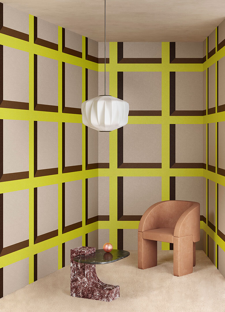
Dots and squares, oh my! Just say yes to this rather fab collab between creative consultants and 3D designers Terzo Piano and Or.nami wallpaper, which playfully toys with trompe-l'œil to stunning visual effect. Think simple graphic shapes and drop shadows inspired by architectural design.

Available in either vinyl or rather covetable silk, there are 4 designs in different colourways to whet your whistle - I’m already dreaming and scheming of a space where I can use them.

Terzo Piano X Or.nami - Pattern 2

Terzo Piano X Or.nami - Pattern 2

Terzo Piano X Or.nami - Pattern 3

Terzo Piano X Or.nami - Pattern 3


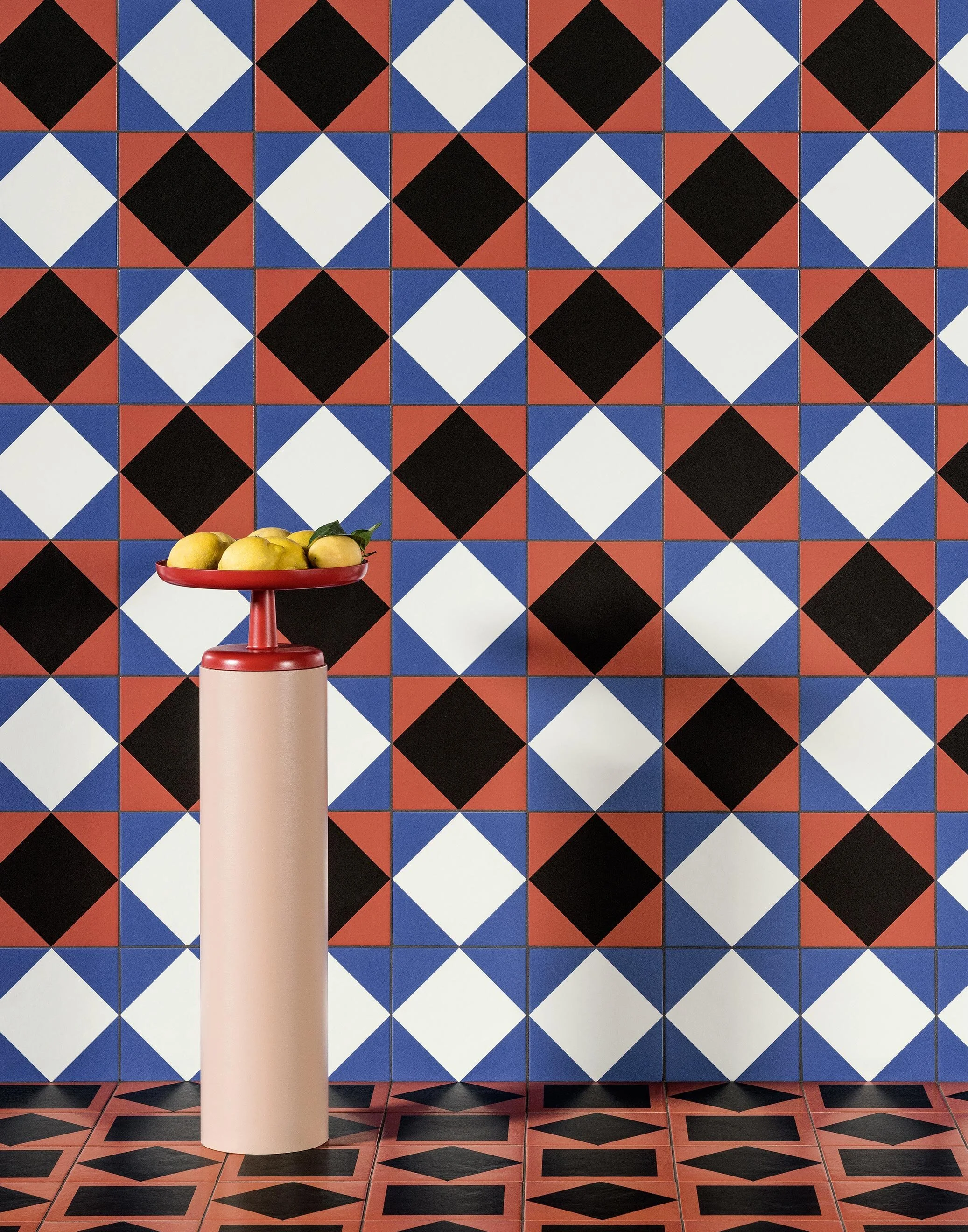
While one of my current projects includes a chic little bathroom in white and grey, this brand new collection by artist and designer Nathalie Du Pasquier for Mutina tiles definitely has me drooling.

More is definitely more here. Du Pasquier’s wonderfully barmy layering of pattern on pattern is key, with a perfect mix of fifties modernism and vintage designs all thrown together with gay abandon. And, if the 41 tiles in the Mattonelle Margherita collection aren’t enough, there’s also 11 coordinating paint colours for all you OCD design fans out there that want everything to match. Seriously.

Oh, and the art direction for the collection’s launch? It’s all feeling very cinematic and inspirational, and honestly I could happily post every single shot, but will show some restraint with the three faves below. Scope out the rest of the collection, here.

Wall: Star, Stripes, Marghe Black. Floor: Double Red, Stripes.

Wall: Star, Stripes, Marghe Black. Floor: Double Red, Stripes.

Wall: Marghe White, Frame Black, Marghe Half White, Marghe Half Black, Line. Floor: Petals, Line. Margherita Paint: Sand Matt.

Wall: Marghe White, Frame Black, Marghe Half White, Marghe Half Black, Line. Floor: Petals, Line. Margherita Paint: Sand Matt.

Wall: Marghe Light Blue, Stripes, Star, Kite White, Square Black, Marghe Black. Floor: Marghe Light Blue, Double Red, Stripes.

Wall: Marghe Light Blue, Stripes, Star, Kite White, Square Black, Marghe Black. Floor: Marghe Light Blue, Double Red, Stripes.


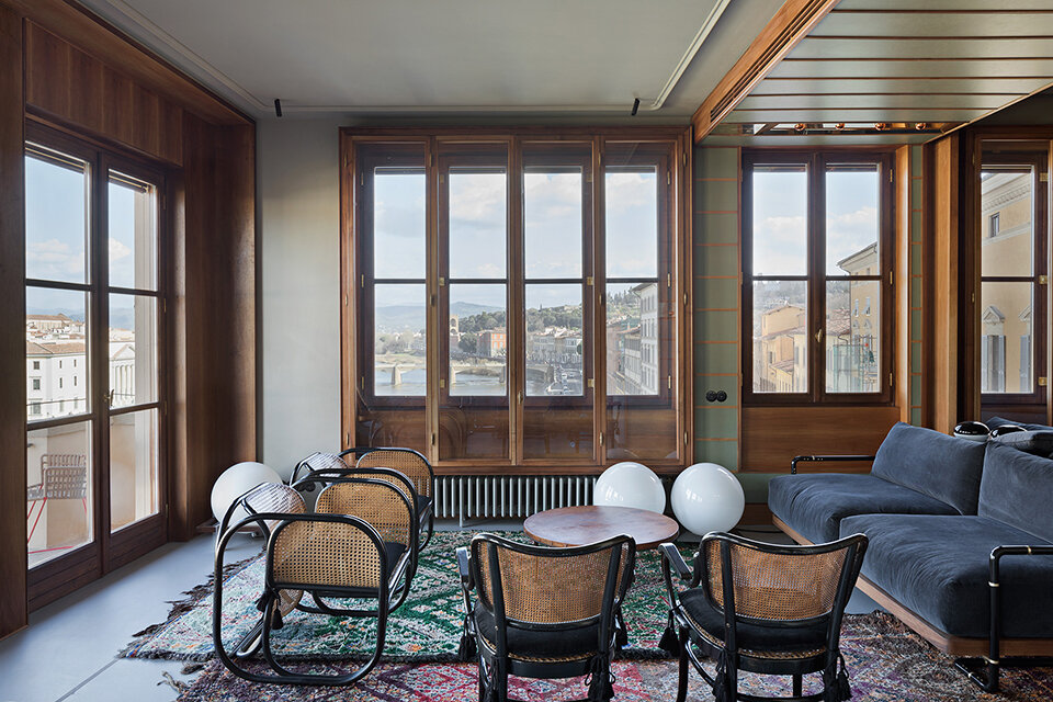
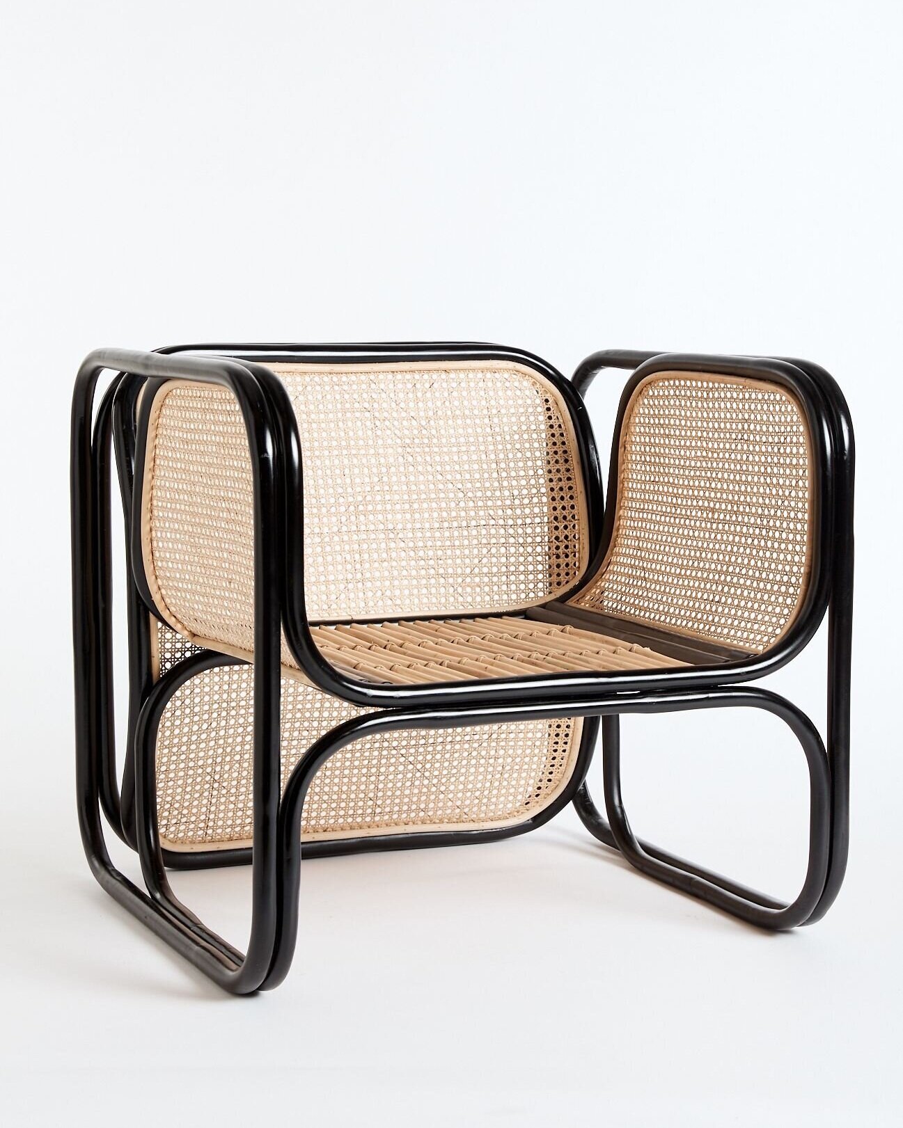
Am I the only person that dreams about chairs? This one in particular sent me down a bit of an internet rabbit hole, to be sure.

I first spotted the vintage originals in this stunning apartment in Florence, with masterfully edited interiors by Massimo Adario (click here to see more). Though they couldn’t look more at home in this space with views across the Arno, these spectacularly curvy seats were originally designed by Czech architect Jan Bočan for furnishing the Embassy of Czechoslovakia in Stockholm in 1972.

While the originals, made for Bočan by Thonet in lacquered bentwood and cane, deservedly fetch a pretty penny, I was fascinated to see that new versions of the chair are de rigueur in all sorts of chic interiors in Australia.

Available in both black and natural from the folks at Worn, and stunningly well priced I might add (I did the conversion), the sad news is that they won’t ship outside of Australia. But, kudos to Worn for their commitment to ethical sustainability, since their Cane Loungers are made of non-chemically treated materials harvested from sustainably managed plantations. Plus, for every chair sold a native tree is planted to help offset carbon emissions.

Brownie points to whoever can send me a source closer to home…

Photo: Laura Fantacuzzi and Maxime Galati-Fourcade

Photo: Laura Fantacuzzi and Maxime Galati-Fourcade

Worn’s Cane Lounger in Black

Worn’s Cane Lounger in Black

Madrid - Bridgehampton - Muskoka

Sometimes, while on the hunt for something to watch, you can end up finding an odd little gem. So, when my husband David stumbled on Danger: Diabolik on the Kanopy streaming platform, I knew we were in for a treat. Filmed in Italy in 1968 it’s definitely camp, with its fair share of sexy costumes, overdubbed actors, dodgy special effects and some major eye candy from the sets. While it was trounced by critics on its initial release, it somehow ended up on Empire mag’s 500 Greatest Movies of All Time back in ‘08. Take a look at the preview here.

Cheers, Arren


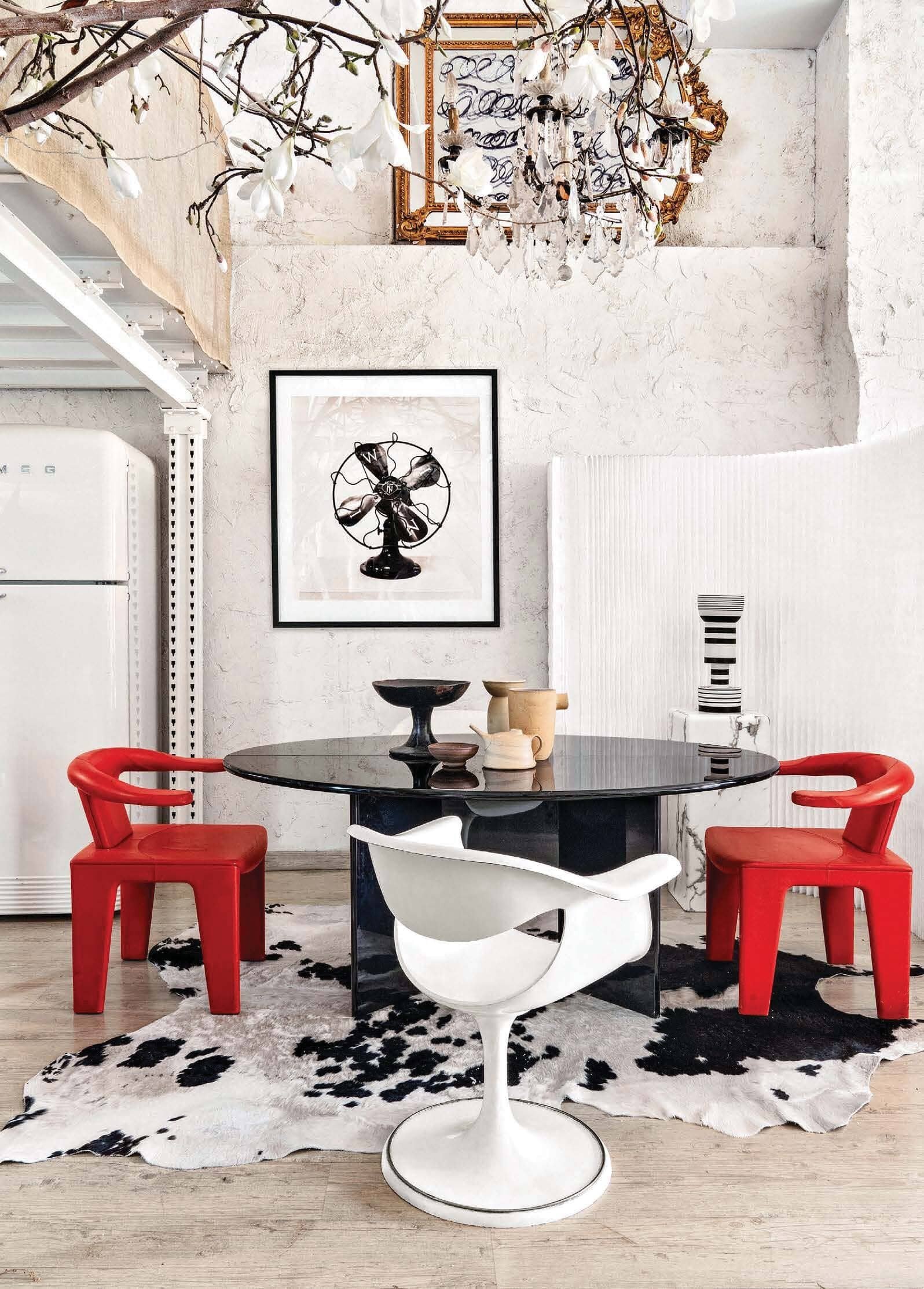
So, we’re in the loft of my latest design crush, photographer Manolo Yllera who, along with shooting fab interiors, definitely has an eye for design himself. Hidden in an old Madrid neighbourhood, between a printer’s and an auto repair shop, it boasts 5 metre high ceilings and is crammed with a wild selection of major design pieces. Lordy.

I’m GAGGED, I tell you. Just look at that chair on the left, it’s a Tre Pezzi by Franco Albini for Cassina. Designed back in 1959, this particular one is a limited edition in Mongolian goat. Could you even?

Styled by Amaya De Toledo, this shoot just popped up in AD China, but you’ll also find more pics on Yllera’s Insta feed.

Photo: Manolo Yllera

Photo: Manolo Yllera

Photo: Manolo Yllera

Photo: Manolo Yllera

Photo: Manolo Yllera

Photo: Manolo Yllera


From Madrid to Bridgehampton, and a veritable design one-two punch, with an interior by Timothy Godbold, styled by Michael Walters.

Godbold’s look is right up my street, always making space for the crazy cool. Ergo, that eye watering Martin & Brockett console moment in the front hall. Pop into the library and you’ll spot a pair of Maralunga chairs by Vico Magistretti upholstered in shearling (it’s deffo a Cassina day). Creep the rest of the interior on Domaine.

Walters’ Instagram (check it out here) is a must follow for interior inspo seekers and midcentury lovers alike. Catch a peek of his projects, plus a slew of fab Palm Springs pics that obvs got me wanting to get back to PS, one of these days.

Photo: Alec Hemer

Photo: Alec Hemer

Photo: Alec Hemer

Photo: Alec Hemer


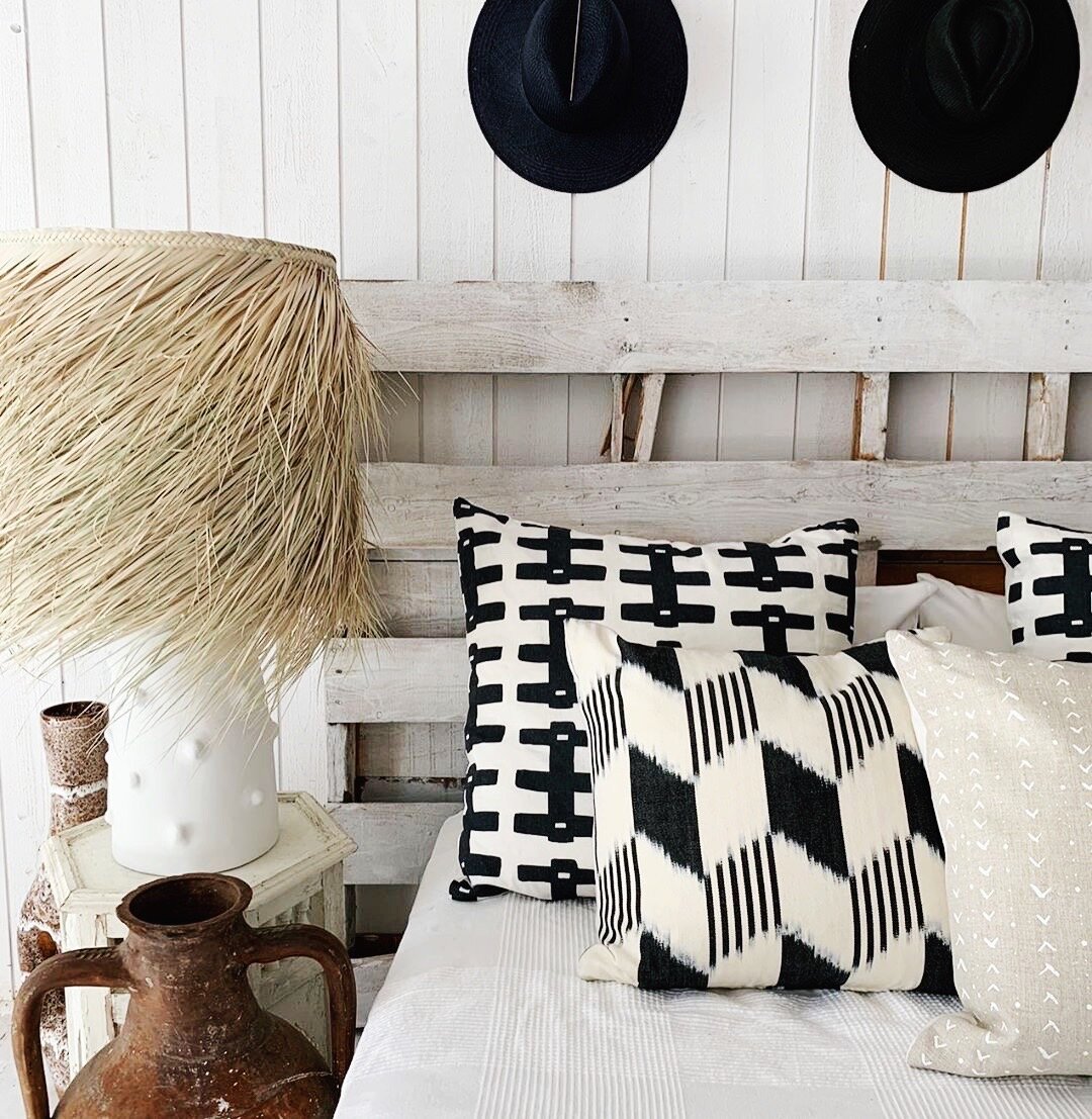
Having shopped flea markets in Paris with designer Montana Burnett, I know what a good eye she has. Monty just posted this snap; a throwback back to last year’s Muskoka pop-up for her online design shop SALT by The Caza Project. Think textured, natural and handmade, all in a pared-back palette of neutrals, black and white. Love. And I have to say, if this is her take on a lakeside cottage, then I’m there with flip-flops on. Roll on summer.

ACS_0954.JPG

We all need a little inspo

Inspiration comes in all shapes and sizes, often completely out the blue. and in these difficult days - well - we could all use a little beauty to get us through…

So, here we go with an occasional series of things that have caught my eye. Yes, many will be via Insta, but who knows what else I can dig up? And of course, if you’d like to send me any recos, please drop me a line here.

Cheers, Arren


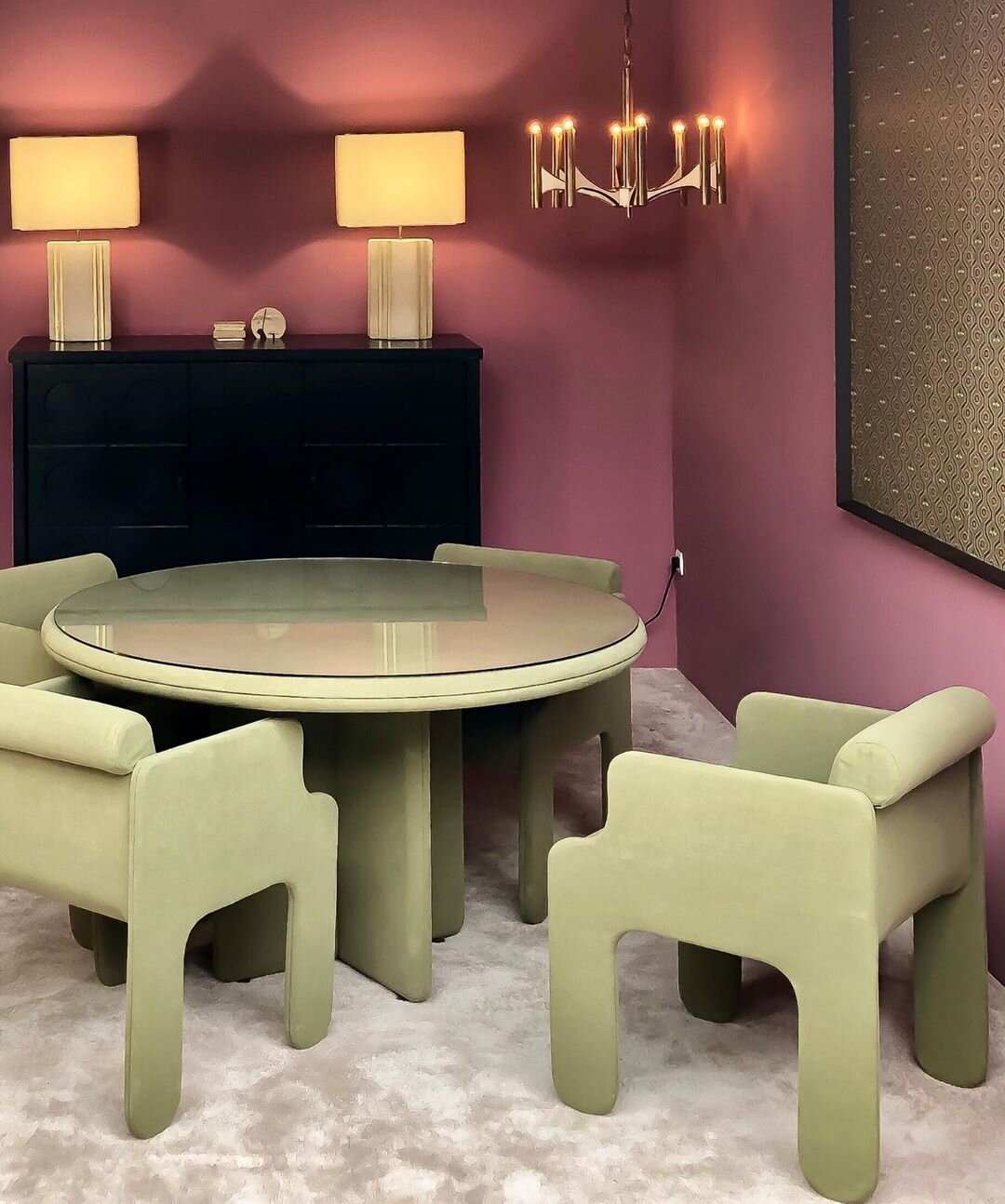
@objectsdaffection aka O.D.A. Galerie is a space in storied Paris flea market Marché Paul Bert curated by stylists and set designer Eve Ducroq and Arnaud Dollinger. In the room sets they create, look for an eclectic selection of vintage pieces styled to give the sense that some very chic homeowners have just strolled off screen to live a fantastically creative life. And, speaking of life, the chalky lime and plum combo in this space is definitely giving it to me right now.


@damienlangloismeurinne_studio aka interior architect Damien Langlois-Meurinne has an eye for sculpture within the architecture of an interior, ergo this stunner of a plaster fireplace. That, plus all of the softly curving furniture in this space have me completely swooning. Modern Parisian glamour at it’s best.

69896741_682032118948116_4887596085082300550_n (1).jpg

Let’s finish with a pop of colour. I love a kitchen island that steps it up in something bright so here, in this flat in Marseille by Paris-based designers @novaobiecta, it’s all of that kelly green, plus those cobalt framed stools. Gah!

Finding 'Found'

So, some smartypants friends of mine are starting a gorgeous new online store called Found that I wanted to give you guys a sneak peek at. It's not quite open yet (the crew are hoping to have everything live in the next few weeks or so), but by the looks of it you're going to want to stop by regularly and check it out. Once things get going you can expect to find a deliciously curated mix of vintage pieces, art and objects, and plans are even in the works to have Guest Pickers stop by with special selections of gear. In fact I heard a whisper of who'll be the first of the bunch and I have to say, it'll be pretty special! Okay, so without further ado, have a look at the pics below (shot by Michael Graydon and featuring some of the items that'll be on offer) so you can really get a feel for Found.

White, no noise

I know it's a Sunday, but what the hey, inspiration struck and I decided to snap a vignette I threw together before we head out en famille to enjoy Woofstock.

That 1984 LA Olympics poster was a fantastic find at last week's neighbourhood yard sale (thx again Brenda for pointing it out!), and both the kooky Sgrafo Modern vase and Howard Miller gold clock are perennial faves too. But, it's the Dyson Air Multiplier that I'm totally counting on as the weather heats up. Yep, it's a fan, but apart from the incredibly sleek bladeless design I love the fact that a) it's way more attractive than the ugly old black fan we used to have hanging around, and b) it's way quieter than the ugly old black fan we used to have hanging around.

Form meets function and keeps you cool - What could be better than that?

A couple o' owls

Can I hear a hoot-hoot? Okay, apologies for the punny intro, but owls are just not going away. This morning I caught a behind-the-scenes Facebook snap of some prop owls that Dwell Studio will be using on an upcoming shoot (here), then there are some incredibly cool owl bookends that Indigo will be intro'ing in August - along with the rest of their fantastic new home collection, not to mention Uhu, the cool wall-mount lamp from Contraforma that's pictured below. I caught the Contraforma line at the ICFF and I hafta say, I was super impressed by the Lithuanian crew behind the line.

And then there's the rather sad looking owl vase in that second shot. It doesn't have a name, and has probably been languishing in a shady corner in my mother-in-law's garden for at least 10 years. Well, I decided to stage a rescue, and its now been brought home, washed and is on its way for a bit of a fix-up. So keep an eye out for more owl pics soon!

Shopping (and buying) a bit of vintage

I Tweeted this morning how my car is currently chockablock with outdoor pillows, vintage watering cans and Italian tiles. And yesterday I hefted, nudged and toyed around with pea gravel, fake grass, ivy and ferns (both real and not), a fake hedge, flowers (more of the real and not real business) and a rather handsome teak garden bench - All for a book cover shoot. Yep, it's been a little on the busy side over the last while.

Luckily it hasn't been all nose-to-the-grindstone, since there was time over the weekend to wake up early and hit the Meister Markt Collector Show with our friend Laura Muir, who luckily brought her camera along to record the proceedings. That vintage airplane poster was a real winner, but a bit too rich for my blood at $75. And then I saw a vase. Loved the design and the fact it's marked 'Italy' is a total plus, and the price? At just $20 I had to have it. We finished off the morning hunting for records to add to my other half's collection, then headed off for a well-earned greasy breakfast. Oh, and for more vintage fun, click here to see what caught Laura's eye. [Images: Laura Muir]

{that one great thing} Michael's Blue Willow dishes

I totally get people who are kind of nuts about collecting, and Michael Penney from House & Home is just one of those kind of nuts. I bet you've seen his stories in the mag, or on the H&H blog, as well as on Design*Sponge. In fact, you'll see his new house featured in H&H's upcoming June issue, where I'm sure you'll catch a glimpse of a wall filled with his that one great thing pick - Blue Willow china.

Michael Penney: My one great thing is my growing collection of Blue Willow china. It started as a love of all things British and cottage-y in style, but I've since decided I like it with almost anything. I love the story behind the pattern (of two young people in love escaping a disapproving father, their souls flying off into the distance represented by two birds) and how the narrative is told on the plates and platters themselves. The clear blue glaze mixed with the time-worn creams and whites is perfection, as are any chips or blemishes that occur over time. This makes the piece look all the better to me!   

I bought a whole lot of dinner plates this past summer at Antiques USA in Kennebunk Maine for very little and have continued collecting everywhere from thrift shops to Cynthia Findlay Antiques (where I got this gorgeous platter). I've since hung the plates on my dining room wall in a symmetrical, geometric pattern radiating out from this central platter. I love the way they look en masse and they really have a big impact that way too. 

I also pick up blue and white ginger jars and vases when I can, and even small bowls and things in Chinatown. I guess I just can't get enough of this English, WASPY staple!

Just a little rad

So thank heavens for the thaw and rising temps, because it meant we could finally get a slew of art hung. Let me explain - Our big ass extension ladder that we keep outside was finally un-frozen enough to drag in and tackle hanging close to a dozen pieces around the house. The big plan was to take on the blank wall in our mondo stairwell, since the other wall has been looking peachy and art-filled for ages so it was high time that we balanced things out.

We found space for stuff picked up in (and dragged home from) Glasgow, London, Buffalo, Tokyo and Hawaii, as well as gifts from friends and vintage finds from our local Goodwill. I love them all, but special mention goes to the largest piece, which is the gorgeous Brooks Brothers Suit (black line) by illustrator/printmaker - and sweetie - Alanna Cavanagh, while another fave is the small RAD print by artist R. Bennett that we grabbed from Chinatown Boardroom in Honolulu. Art is good!

TGIF with LTD

Ah, Friday, the best day of the week. And I'm ending it on a high with a new store that's opened up in my neck of the woods - Love The Design. Stationary designer/photographer Christine Flynn is the talent behind the place, which is jammed with tons of covetable gear - both vintage and new - and with walls filled with Christine's photography. I'm loving the shots of Levi the horse in that last snap, not to mention all the burlap upholstery and that newspaper wall (yum). LTD has been open for less than a week and already there's been a nice bit of buzz about the place (the folks from Covet Garden also stopped by), so it's definitely worth a peek. Ah, and talking of Covet Garden, keep your eyes peeled for a that one great thing post from one of the founders next week! Love The Design is at 1362 Queen St E in Toronto.


{that one great thing} Michelle's store clips

While I'm wrapping my head around a particularly difficult bit of writing today (oh, deadlines), I thought I'd hand things over to the talented Michelle Carangi of Montreal design firm, Holley & Gill, who, along with her husband Conrad Buck, creates gorgeous cushions and headboards with hand-printed patterns - love their Feathers design - in water-based inks on 100% cotton. Anyway, after meeting Michelle at the Interior Design Show I bugged her into contributing that one great thing, and she picked some very handy-dandy vintage clips.

Michelle Carangi: On becoming home owners almost seven years ago, Conrad and I have collected many special little items that have allowed us to inject some personality into our decor. 

Most of our finds have been vintage as of late simply because our taste tends to sway more towards the traditional and classic. Having been lucky enough to have traveled quite a bit over the last couple of years, we’ve collected so many different postcards, business cards and photos from places we’ve been and from people we’ve met. And so, when I found this set of vintage wall-mount store clips from Etsy shop AM Radio, I knew it would be the perfect solution to display them all. 

We need to be surrounded by what we love, and we’ve learned, sometimes the hard way, that buying things because they’re on trend will result in pieces that have no meaning and ultimately end up collecting dust. Whenever I walk by this display, I walk by all of our happy and unique memories and can add to it forevermore.

{that one great thing} Marie-Eve's cabinet

I miss Montreal. In fact, I lived there for 3 crazy/fun years before moving to Toronto. Fellow blogger Marie-Eve Best of Lake Jane calls Montreal home, and I must admit to being more than a wee bit jealous, not to mention that I'm also a tad envious of the lovely little cabinet that Marie-Eve picked as that one great thing. Oh, and if you're planning on heading to MTL any time soon (and you REALLY should) be sure to check out Marie-Eve's Montreal Design Guide that she created for Grace at design*sponge.

Marie-Eve Best: My grandfather worked for the Post Office in High River Alberta for over 15 years. In the 1970's, the Post Office did some renovating and they discarded many of the old pieces of furniture that had been around for decades. My grandfather rescued this antique set of drawers used for storing stamps from being thrown into a garbage pile. He brought it home and it became my dad's bedside table/record stand. Later on, my dad added oak legs to the piece and it became a side table in my parent's living room.  As a child, I remember being so impressed with its automatic locking system. You have to open the bottom drawer in order to unlock the top ones - It still works today! 

When I moved out, I inherited it and used it in almost every room. It was an entryway catch-all, a bedside table, a TV stand, a tiny vanity… Now it sits in our living room and is mostly used as a catch-all for receipts and cables.  Although the piece is over 70 years old, the wood has just the right amount of wear and tear. It's a quirky little item filled with sentimental value.

{that one great thing} Jason Hudson's birdcage lamp

I bumped into Jason Hudson at a party over the Holidays and bugged him about his lovely birdcage pendant lamp that I'd seen over on his great blog These Roving Eyes. Anyway, he was happy to share the story behind the piece, and thus begins a new occasional series on the blog - that one great thing.

Jason Hudson: My partner Jeff fell in love with this old wooden cage when he saw it at an antique shop when he was a kid. He proudly brought it home and it sat in the living room for years. After his father passed away, we found it amongst junk in the garage and I could see that it had a special place in Jeff's memory.  

I'm a firm believer in taking meaningful objects and adjusting them to work in a contemporary setting. Like your Grandma's old piano - the cherry finish isn't working in your mid-century modern dwelling, but it holds a ton of sentimental value, so have that sucker refinished! It's still the same piano, still full of memories, its precious ivories untouched. So make it work! 

Because the honey-coloured wood and sad-Cat-Lady-overtones weren't working for me, I convinced Jeff to let me spray out the cage in a high-gloss black. We wired-it-up with a great Edison bulb and just like that, had our very own, ultra-cool, one-of-a-kind lamp, rife with Jeff's childhood memories but within the limits of our (read: my) personal style. 

It casts lovely shadows on the walls and adds a certain warmth and organic quality the room was lacking before.

Stepping out in Tokyo #2

Funnily enough I'm writing this in London right now, stuck here due to weather (oh well, there's way worse places to be stuck!). But let's get back to Tokyo...

Another of the neighbourhoods we totally loved was Shimokitazawa. It seemed worlds away from the buzzy shopping districts like Shibuya, and had a lovely lo-fi charm all its own with - again - tons of fantastic vintage shops, clothing stores and little places selling Japanese crafts and loads of great neighbourhood cafes. I made friends with a local who was hanging outside of a hair salon, and we hit the vintage motherload in a store called Haight & Ashbury which carried a beautifully curated collection and included that completely wacky and craft-tastic huge tree entirely knitted/crocheted of wool in the middle of the store. For more in Shimokitazawa check out BlinkLondon.

Finally, back on the design side of things and back in Shibuya we totally enjoyed a run through a department store called Loft which included a 60 Vision section, a cool collection of re-issued Japanese 1960's designed furniture (that's the Lobby sofa by Karimoku below), accessories and even some rather tasty looking cookies.


Stepping out in Tokyo #1

A few weeks back I found myself in Tokyo, meeting up with my world travelling other half (you can check out his kid-friendly travel blog here) and my little sister (aka Blink London). Well, it was BRILLIANT, and what an absolute culture shock too. We hit all the sights, shopped ours socks off, and generally wandered around checking out as much as possible. One of the neighbourhoods that we thoroughly enjoyed was Nakameguro, a jumble of streets and alleys filled with a boho mix of fashion and interiors shops, much of them vintage.

Oooh vintage, such a magic word... Anyway, of course we spent the whole day just in this one 'hood and found a slew of cool stuff. Those first three shots are from Hiige which was all about vintage Scandi gear (we scored some great fabric which'll be sewn into cushions soon). Pics 4 and 5 show Hatago International, next door to Hiige, an ultra cool mini shop jammed to the gills with vintage airline paraphenalia. Jantique is next in the pics, and was like hitting a French or Belgian flea market, and then finally Acme Furniture, which was a great mix of vintage industrial gear (lots of it from the US) as well as new pieces. For more, read my sister's fashion-y take on Nakameguro here.

A chair story, part one

I'm definitely up for a challenge, so when Virginie Martocq - Chatelaine's Decor Editor - e-mailed to ask me about re-doing a fleamarket chair for the mag I said sure! So, a day or two later when a rather grubby looking chair showed up on my doorstep I knew the game was on. Luckily I'd recently been inspired by a particular DwellStudio fabric I'd spotted at inVU Drapery called Vintage Plumes (you can see a shot of it here) and set to work figuring out the look.

Step one was to unscrew the dusty old red velvet seat and thoroughly clean the chair. Next, I lightly sanded the frame with some steel wool, and carefully painted two coats in a lovely soft beigey grey called Fashion Grey from Behr. Now, I knew that nailheads would be fun but didn't want to commit to nickel or brass. Instead, I'd seen some white painted nailheads at Home Depot and thought that they might be just the ticket. Well, the colour was waaay too bright a white, but that was quickly remedied by pushing the nails into a cardboard fruit box and spraying the whole lot cream all in one go (outside of course). I dropped the chair off at inVU this morning for the re-upholstery job and can't wait to see how it turns out!

Guest blog / Julia Black: A vintage sensibility

Julia Black: I am a confessed scavenger. When on the hunt for just the right thing for a shoot, for a client, for a gift, or even for myself, I will leave no stone unturned. Just about every week I seem to end up rummaging through antique markets, thrift stores and salvaged good shops for those special things that represent an element of old world style; something that brings a measure of antiquity, authenticity and charm. But, when I’m strapped for time and need to shop somehwhere where everything isn't covered in a layer of dust, I’ll turn to a trusted favourite: Anthropologie. On a recent run through I stumbled upon a tremendous collection of all sorts of wonderful home accessories that reflect decades past. This season some of my faves have an Austen-esque Sense and Sensibility feel about them, and include mis-matched bedding, demure ruffles and faux (but romantic) antique books that are actually boxes. Now that's what I call major vintage-inspired satisfaction!

To read more posts from Julia click here, to check out her cool blog click here, and click here to see her new Get Fresh online videos for CTV!


Shoptastic and restotastic Istanbul

Here's a smidge more Istanbul info for you, though it's definitely not the last of it! The two main guides that we definitely wouldn't have survived without, and you should absolutely grab if you're going, are the Luxe City Guide Istanbul and Istanbul Eats. The Luxe Guide reads like it was written by a stylish insider who's downed a bottle of Veuve and then tells you you should see, here, here and definitely here! As you follow the directions you'll be laughing and spinning around to check street names, must-see shops and attractions. It's definitely fun. Istanbul Eats, on the other hand, was an incredible guide to the best places to chow down with the locals. Some spots were fancy, most were not, but honestly, this guide didn't steer us wrong once. It's based on a blog of the same name, which is also worth a look too - have a boo at it here. Oh, and for a more in-depth look at some of the delish places we hit - almost all from Istanbul Eats - check out my world-travelling other half's kid friendly blog here.

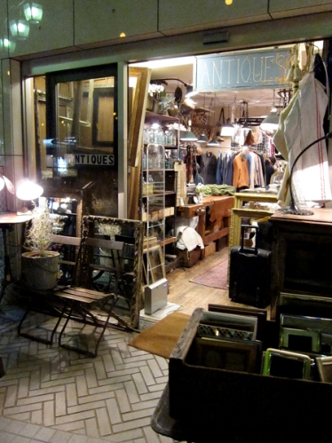
We used the Luxe City guide to traverse the higgeldy-piggeldy back streets in the neighbourhood around The House Hotel to shop vintage. And oh lawdy, is there lots and lots of choice. Basically it's an excuse to get semi-lost and have a poke through crammed-to-the-rafters shops that run the gamut from mid-century retro to grand baroque (we saw a stunning crystal hot air ballon chandelier, really!). I could've filled a tractor trailer, let alone a suitcase! Take a look below at a couple of snaps of what I found...

Gone fishin'

Well, I haven't exactly picked up rod and reel. Nope, I'm chilling out and taking a couple o' days blog break. Hey, it happens to the best of us! In the meantime, I thought I'd share this inspiringly colourful shot of vintage bits and bobs from Hawk Eyes, a lovely vintage shop on Roncesvalles in Toronto (and, if you have a wander along the street while you're there, you could definitely grab a warm plum filled Polish doughnut while you're at it!). Now that's happiness, a sweet treat AND great vintage. See you guys next week sometime!