Chairs, Shelves, Channels

As I write this, Kate Bush is on the record player, her Lionheart album to be exact. While I collect bits and bobs - more on that later - my husband David collects records. Currently his collection stands at more than 600, housed alphabetically in glossy white Besta cabinets from Ikea.

Music is always so perfect in setting a mood. In fact, I think a touch of Kate Bush would fit perfectly in the Venice Beach home included today.

Cheers, Arren


Call me a heathen, but I don’t usually think of Northern Ireland as a hotbed of modern design. Well, Orior has definitely changed that, especially when AD has proclaimed them ‘The chicest furniture company you’ve never heard of’.

Based in Newry, 40 miles outside of Belfast, the company was founded with a Scandi point of view in the late 70’s by Brian and Rose McGuigan . Now with their son Ciaran as Creative Director that mod tradition continues, with a seriously sizzling collection of upholstery and more.

The Bianca chair is a hot pick. Built for lounging, the seat is a total sensual delight in leather and velvet (just say yes to the Brick colour). Supported by a frame in either oak or walnut, the chair’s wingspan hits wide at 46” - This baby needs room to breathe.

Photo: Bianca in Brick (left) and Flamingo (right)

Photo: Bianca in Brick (left) and Flamingo (right)


Try as I might to curtail my habits, I am an inveterate collector of, well, stuff. Early days was Art Deco objects, that gave way to an obsession with scientific glassware, which waned when I slid into white midcentury vases.

So, there is always something that needs a home, a moment to shine as it were, which is why I’m taken by Amsterdam-based designer Mickey Philips ceramic wall-mounted Shelf. Each is handmade, meaning each is slightly different - ‘wobbly’ explains Philips. But, to my mind at least, that makes them even more perfect.

Currently, I’m veering between that sunny yellow or the murky green to display a favourite Rosenthal vase. What colour would you pick?

Photo: Shelf in yellow

Photo: Shelf in yellow

Photo: Shelf in yellow, mint green and dark green

Photo: Shelf in yellow, mint green and dark green


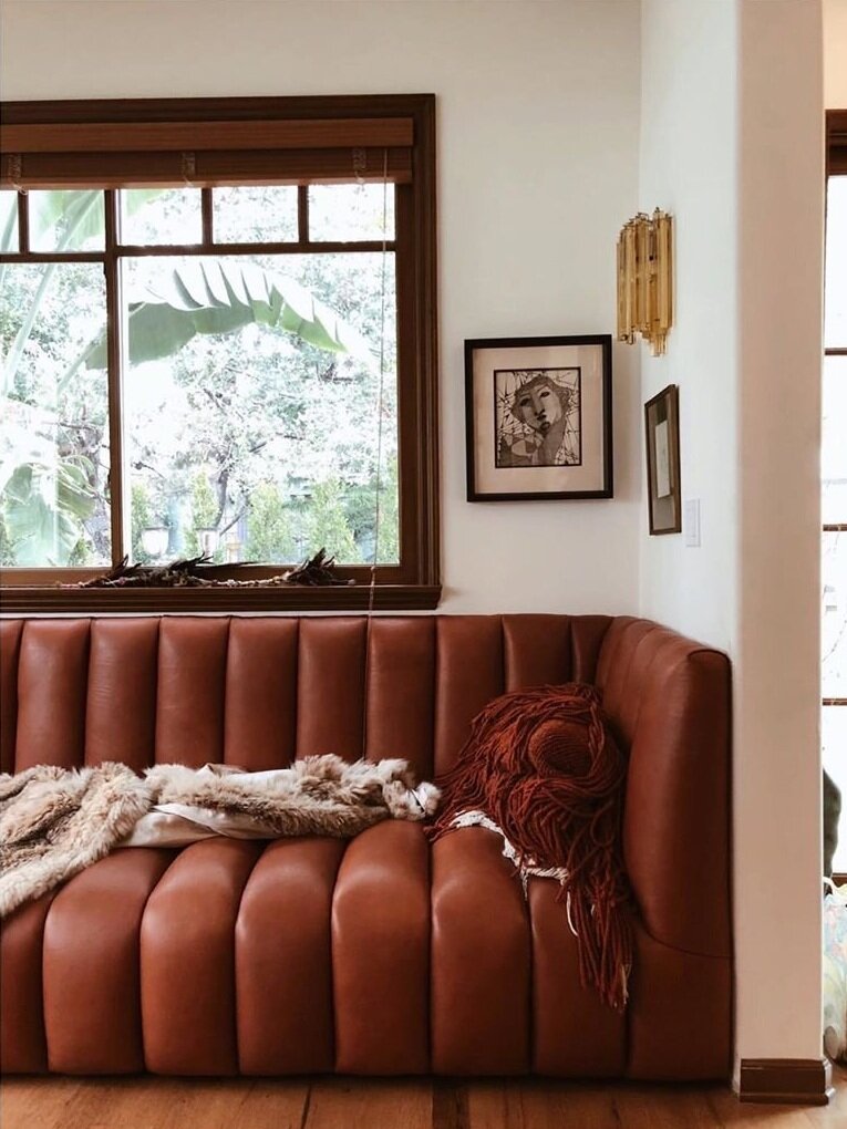
A good designer feels the soul of a space, and that’s what I love about this Venice Beach project by Electric Bowery, where they preserved the charm of a 1927 Spanish Revival, while layering in special moments that makes it feel very now.

That custom channelled leather sofa, designed for the project by Tess Bethune, is the total cat’s pyjamas. And, I love seeing something that feels so contemporary played against the trad wood millwork and funky vintage finds. Boho, but in the best sense of the word. Scope out the rest of the interior here.

Photo: Douglas Friedman

Photo: Douglas Friedman

Photo: Douglas Friedman

Photo: Douglas Friedman

Kelly and The Shapes

How is your creativity? I was reading an interesting post by artist and illustrator Lisa Congdon about what she describes as the ‘Skill Gap’ between our vision and our ability. It totally jibes with how I’ve been feeling under lockdown, thinking about starting a new project and then hitting a wall when I actually give it a try. And I love how she explains that it’s okay to be shitty on the path to greatness. Wise words indeed.

Cheers, Arren


First up, two projects that caught my eye. Both from entirely different parts of the world, both with a different and equally fab point of view, and both using Kelly Wearstler’s Graffito wallpaper. Why do they work??? And what is it about KW’s trademark handpainted pattern that is the boffo touch in both interiors?

Well, if you ask me, it’s the abstract vibe. The theatricality. The DRAMA that this edgy pattern gives. Its become a bit of a classic, no?

Australian designer and stylist Jono Fleming used it to add that oomph on his parent’s place. I’m looooving the modern desert vibe the pattern in Salmon Cream gives, layered against all those soft blushes and naturals in the palette. See the full room shot here, as well as the rather grungy ‘before’.

Design/Styling: Jono Fleming. Photo: Kristina Šoljo

Design/Styling: Jono Fleming. Photo: Kristina Šoljo

Then MONIOMI Design, out of Miami, amped up an already peppy and pattern filled bathroom with a wall in the Onyx Beige colourway. Taking the space from polished Art Deco to something much more current and crush-worthy.

Design/Photo: MONIOMI Design

Design/Photo: MONIOMI Design


I’m such a fan of BTS shots of how a stylist actually lives, playing around with the things they collect themselves, and snapping and sharing the results.

Sania Pell is definitely one to follow on Insta for softly poetic and moody assemblages of things found and collected over time. The shot below is a fave of mine, with its monochrome mix, texture and almost-clutter-but-not thoughtfulness. Not to mention the PATINA!

Styling/Photo: Sonia Pell

Styling/Photo: Sonia Pell


Let’s finish up today with vases. But, ya know, not just any old glass or ceramic vessels. Nope, these ones are knitted. Yes, knitted, by Amsterdam-bases textile wunderkind Charles-Antoine Chappuis. Each of his fantabulous Soft Amphorae series has different coloured sides to max out your hot shelfie lewks, and can be turned upside down, holding water on either end using found glass objects. Knit of linen and recycled yarn sourced from textile factories, the handles are malleable, allowing you to add extra swerves and shapes to a piece as the mood takes you.

Just think how killer a slew of these would be, sitting odd but pretty on a surface. Want your own? Check out the whys and wherefores of where to find them here.

Photo: Charles-Antoine Chappuis

Photo: Charles-Antoine Chappuis

Powered by the letter N

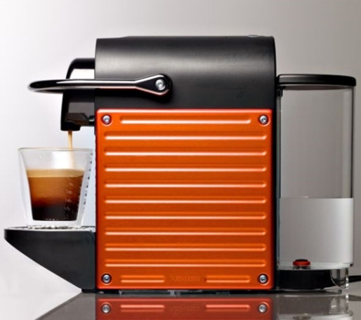
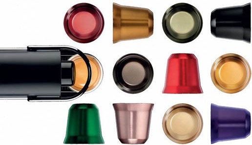
For me to get through a looong day, without any awful mishaps at least, I definitely need to set the ball rolling with an espresso. And to keep me really happy (and well caffeinated) it's just gotta be a short shot of the hot stuff from my Nespresso machine. We have their CitiZ hanging out on the counter, but now I'm a wee bit jealous, since they've just launched Pixie, a compact new machine that can brew a hit of espresso within 25 seconds of being switched on. Oh, and if that's not enough to pique your interest, Nespresso hooked up with a Parisian design crew called 5.5 Designers (seen below monkeying around) for a series of Pixie accessories, including insulated cups inspired by the aluminum coffee capsules.

{that one great thing} Cobi's ashtray collection

Back when she was Editor of Canadian House & Home Cobi Ladner was one of my many bosses (oh, the life of a freelancer). Now, as I'm sure you've seen, she's just launched her very own witty, colourful and happy line of fabrics, furniture and accessories called cobistyle. As you can imagine she's been a little busy, so I've patiently been pursuing her for a *that one great thing* pick, and here it finally is. And seriously, will you ever look at Cobi the same now that you know she's a little light fingered?

Cobi Ladner: I wonder what it says about a person if their 'one great thing' is a collection of stolen hotel ashtrays? Especially if that person has never smoked! I guess I have to admit here, in front of the entire world, that yes, I did personally steal one of these little beauties myself. It's actually my least favourite of the bunch. It's the one from The Plaza hotel in NYC. I was lucky enough to stay at the Plaza for business  (back in the day when Ivana Trump briefly owned it). The crest is only cheaply printed on, probably in China, but I had to have it as a memento. 

I use these little dishes all around the house -  in the bathroom to hold loose jewellery; at the kitchen sink and bedside for my watch; on my desk for business cards (some days I need to remind myself of who I am); on my husband's dresser to hold change. I look for them whenever I'm in junk stores, the Sally Ann and flea markets. It's a total high to find a lovely little dish that originally sat in a beautiful room in Paris, on a dusty shelf in a thrift store in Southern Ontario. Who's suitcase did it travel in and was it a sentimental impulse to bring it home as a memento of a fabulous holiday?   

Although I love to see kitsch in other people's homes - pillows from Niagara Falls, shot glasses from Florida - I'm not into that myself. No, I love the idea of elegance - Paris - London - New York - Darlin', I love ya, but give me Park Avenue.... and the notion that a hotel would have fine bone china from England printed with their fabulous address. 

My favourite little dish isn't here unfortunately. It was from the Hotel Scribe in Paris and was a little fluted square with a fine orange line around it. I loved it so much I tried using it as a soap dish in our powder room and my clumsy 13-year old broke it. So much for the elegance of Paris in our house.  I guess that's what makes it all the more appealing.

It's a mug's game

I've spent the last while researching a couple of feature projects for the likes of House & Home and the National Post and, while I was noodling down an internet back alley, I happened across these rather cool mugs. Okay, while I'm not much for funny mugs, these were inspired by the weird ones that get half forgotten and shoved to the back of the cupboard. They also have a rather nice bit of provenance too, since they were designed by Baptiste Ymonte and Vincent Jousseaume of Atelier Polyhedre and are from a limited edition line called Mug Shot. Now that's a nice way to enjoy your no-foam-half-sweet-lactose-free-vanilla-latte. Baroque and Flash are available online here from Paul Smith.

{that one great thing} Michael's Blue Willow dishes

I totally get people who are kind of nuts about collecting, and Michael Penney from House & Home is just one of those kind of nuts. I bet you've seen his stories in the mag, or on the H&H blog, as well as on Design*Sponge. In fact, you'll see his new house featured in H&H's upcoming June issue, where I'm sure you'll catch a glimpse of a wall filled with his that one great thing pick - Blue Willow china.

Michael Penney: My one great thing is my growing collection of Blue Willow china. It started as a love of all things British and cottage-y in style, but I've since decided I like it with almost anything. I love the story behind the pattern (of two young people in love escaping a disapproving father, their souls flying off into the distance represented by two birds) and how the narrative is told on the plates and platters themselves. The clear blue glaze mixed with the time-worn creams and whites is perfection, as are any chips or blemishes that occur over time. This makes the piece look all the better to me!   

I bought a whole lot of dinner plates this past summer at Antiques USA in Kennebunk Maine for very little and have continued collecting everywhere from thrift shops to Cynthia Findlay Antiques (where I got this gorgeous platter). I've since hung the plates on my dining room wall in a symmetrical, geometric pattern radiating out from this central platter. I love the way they look en masse and they really have a big impact that way too. 

I also pick up blue and white ginger jars and vases when I can, and even small bowls and things in Chinatown. I guess I just can't get enough of this English, WASPY staple!

{that one great thing} Lynda's clock collection

Check in on Covet Garden's 'About Us' page and you'll see that stylist Lynda Felton - one of the 3 folks who started the online mag - is in charge of Style Stuff. No big grand title for her or, for that matter, her two compadres Jessica and Rhonda, which is refreshingly laid-back and just how these 3 talented women roll. I asked Lynda a while back for that one great thing, and this gorgeous vintage collection showed up in my in-box. No surprise, since ask her to descibe her house and she'll say - "It's all old clocks, wasps nests, framed insects, and beat up furniture over here." Lovely!

Lynda Felton: My first clock belonged to my grandfather (the Westclox Big Ben, third from the left, with the silver ring on top) it is over 100 years old and still works perfectly. I love the sound it makes when it is ticking -  gentle and reliable - like my grandfather. The Lux Claridge (second from the right) is from the 30's and it was my grandmothers. My grandparents collected clocks and it was my job to help wind them  - all 37 of them, no matter how hard I tried I could never get them to go off at the same time. It felt like there was always a clock chiming off somewhere in the house.

When I see the old clocks I can't help but think about who might have owned it. What was that person doing in the 20's, 40's? Did this clock get them up for work? What kind of work? Most people had these clocks by their beds, they touched them everyday. These old timers have seen a lot.

My biggest splurge was my Early Bird clock (first on the left). I couldn't resist this fabulous little gem, the bird bobs up and down, pulling the worm out of it's hole in time with the ticking - come on - you have to admit that is pretty neat. See for yourself here... Other than the Early Bird I've never spent more than $5.00 on one and I'm always on the look out for a good deal.

{that one great thing} Paul and Ashley's action figure shelves

Other than being total smartypants, illustrator/designer Paul Dotey and his other half food stylist Ashley Denton (who's work you've seen on the glossy pages of H&H magazine) are also incredibly creative outside of their respective fields. So, with that creativity in mind (as well as a v. cool collection) here goes with Ash and Paul and another post in my new occasional series - that one great thing.

Paul Dotey: My husband Ash has been reading comic books since he was little, and collecting action figures almost as long. We wanted to display them in a stylish way without being too kitsch; we figured if you collect anything you should display it proudly, otherwise why bother? 

Finding a home for sixty plastic figures wasn’t immediately obvious, but while Ash was away for a long weekend I surprised him with a freshly painted bathroom and some slender shelves over the toilet. Four narrow strips of pine from our local Home Hardware did the trick, added a couple of coats of glossy white, and the tiniest of L-shaped brackets since the figures don’t weigh much at all. Of course, the Justice League was standing proudly at centre stage. 

Ash was over the moon! It adds a lot of colourful fun to a room we’re kind of stuck with as renters. More than a couple of our friends have outed themselves as comic nerds, and after a good dinner party we always find a few figures in creative positions. Not surprisingly, almost everyone goes for Green Lantern.

Oh happy day

It's hard to be glum when the sun is shining, even if it is a Monday, so I thought I'd start the week off bright (nope, that is not a typo) with a peek at the swell home of San Francisco-based photographer Nicole Hill Gerulat. These lovely shots are outtakes from Nicole's house shoot for The Nest mag (click here for more). I'm totally digging her sense of style, and confident way with white and colour, not to mention that great camera collection in the last shot! For more from Nicole, check out her portfolio here, and follow along on Twitter here, oh, and the styling on Nicole's house shoot was done by Anthony Albertus.