Anti-cacophony

I don’t know about you, but after the cacophony of the last couple of weeks I feel in need of a complete rest and recharge.

Here’s hoping this week’s faves both inspire and help fill your creative spirit.

Cheers, Arren


I found myself totally spellbound watching Mattea McNurlen at work in this video, painting Moglea’s completely covetable linen bound notebooks. How amazing is that?

Helmed by Chad and Meg Gleason, and based out of their Audubon, Iowa, farm/studio, Moglea’s artful stationery is a colourfully crafted antidote to the blank page. The Swan design is part of their Fall ‘20 collection, but there’s loads more to ogle here, including lots more hand-painted pieces. Love.

120809633_3403479703054482_5285980386016837474_n.jpg
118255665_790009301738139_4465540289017985803_n.jpg

Rough, smooth, modern and organic - Meet Wil & Co. Interior designer Allison Willson recently launched her new lighting collection, and it’s already attracting the right kind of notoriety because, well, it’s rather scrumptious.

Made in Canada of materials that invite you to touch them - think darkly patinated brass, mouth-blown glass in a softly milky hue, and twisted and braided jute - the line consists of five handsome artisan-made fixtures practically begging for the chance to amp up your interior.

Braid.Sconce.Angle.Final_1024x1024@2x.jpg
pill-sconce-dark-angled-1200_1024x1024@2x.jpg

Just breathe.

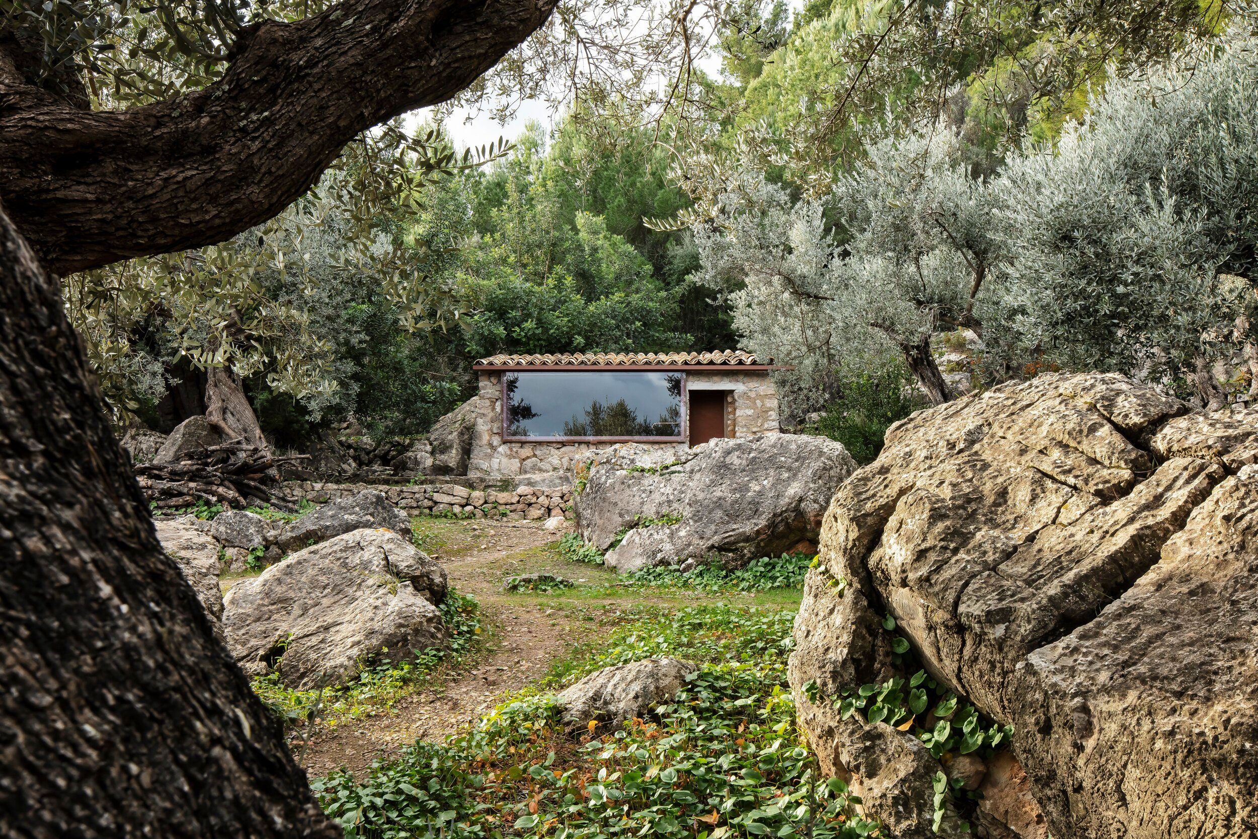
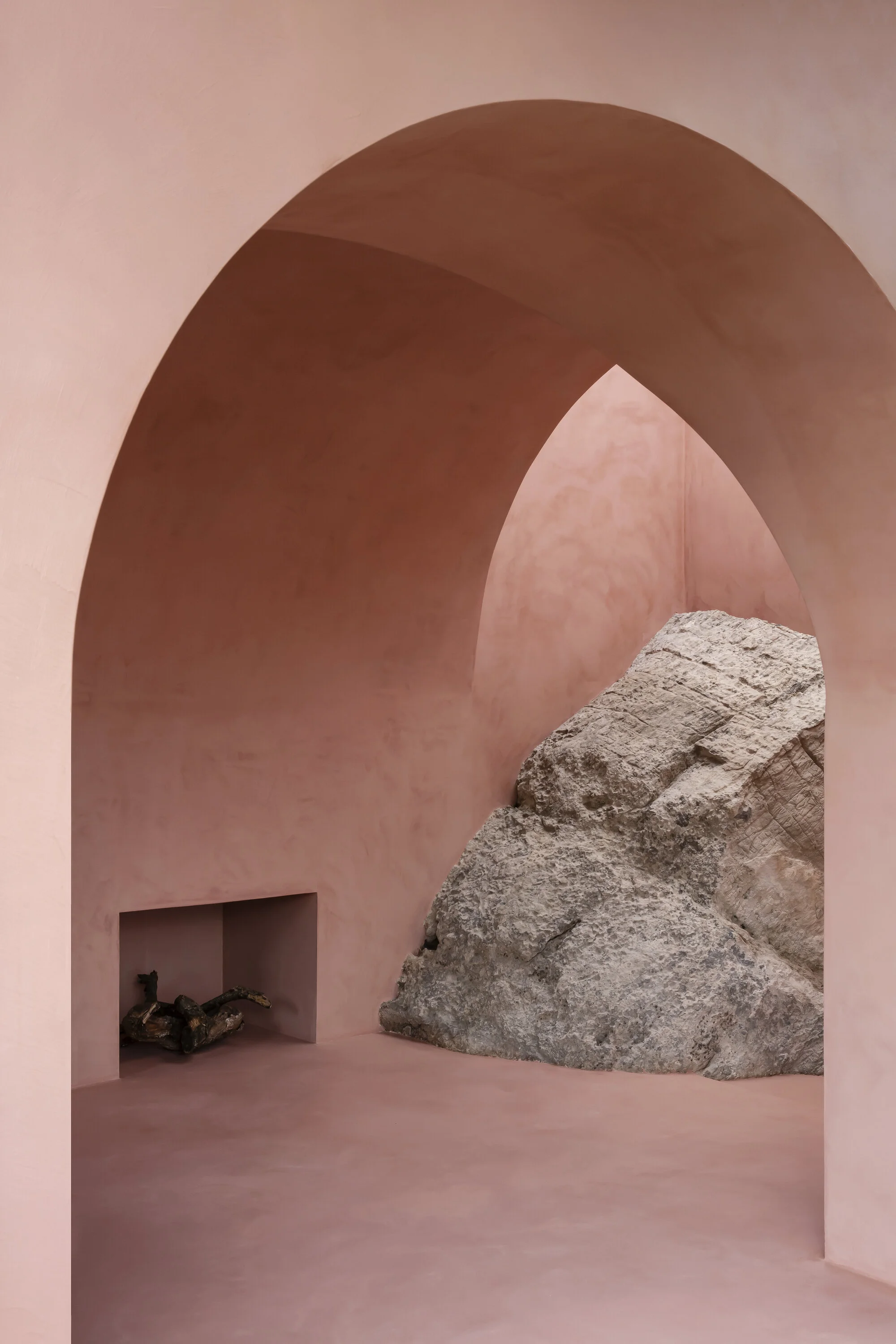
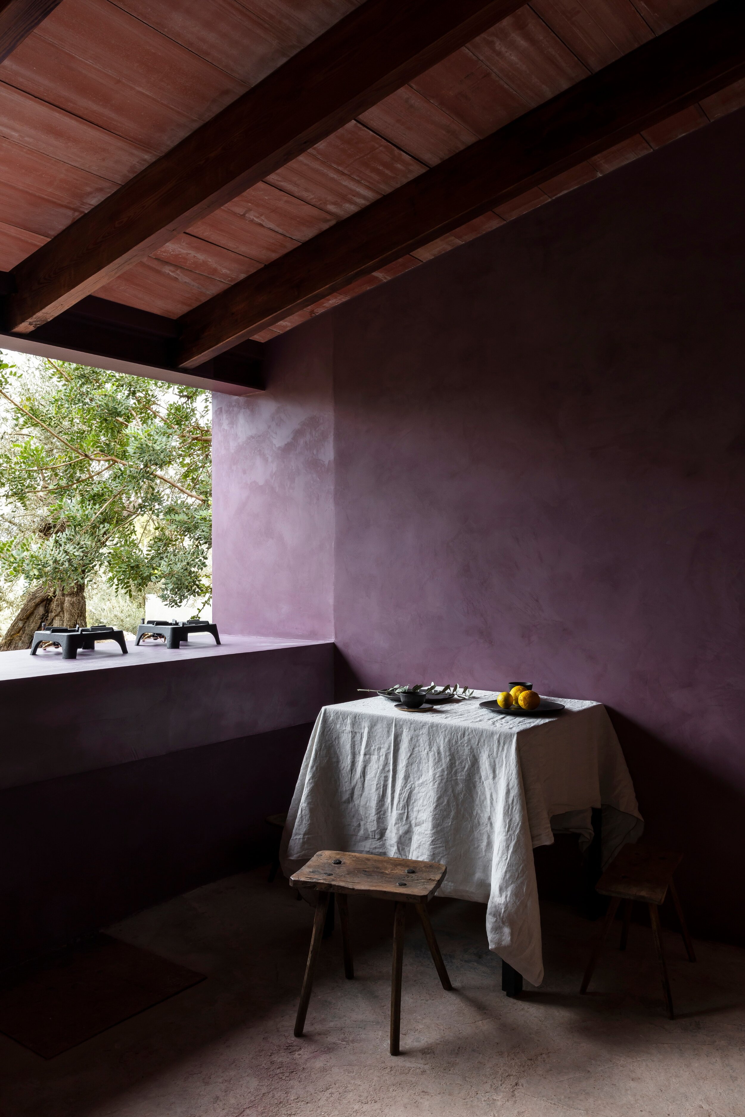
Nestled in the rocky Tramuntana mountains of Mallorca, with views overlooking the Mediterranean, Mar Plus Ask architects have created a project called The Olive Houses. Literally built into the landscape, the two off-grid houses are finished in a palette of pink and purple stucco inspired by the olive trees on the property.

Between the two, you’ll find a simple and spare kitchen, bedroom, bathroom and living space - all powered by solar panels - which the architects Mar Vicens and Ask Anker Aistrup envision as a quiet refuge for architects, artists and writers around the year. See more here.

To quote Liz Lemon, “I want to go to there.”

Photos: Piet-Albert Goethals

f0721dce-4f77-45af-814f-b2a294dddeb5.jpg
MA_OH_07.jpg
e3f3ccab-347c-41f7-b3bf-b07c8d264110.jpg

Pattern, Pattern, Chair

A fun part of my schedule this week was shooting remotely at home for Citytv’s Cityline. The subject was our principal bedroom, a space that had a forced renovation due to some major construction we endured over the summer.

Things have definitely changed in the space, and for the better for sure. I can’t wait to share the results with you, and it’s extra fun looking back at how the space looked when it was shot by Angus Fergusson for House & Home magazine more than 11 years ago.

Cheers, Arren


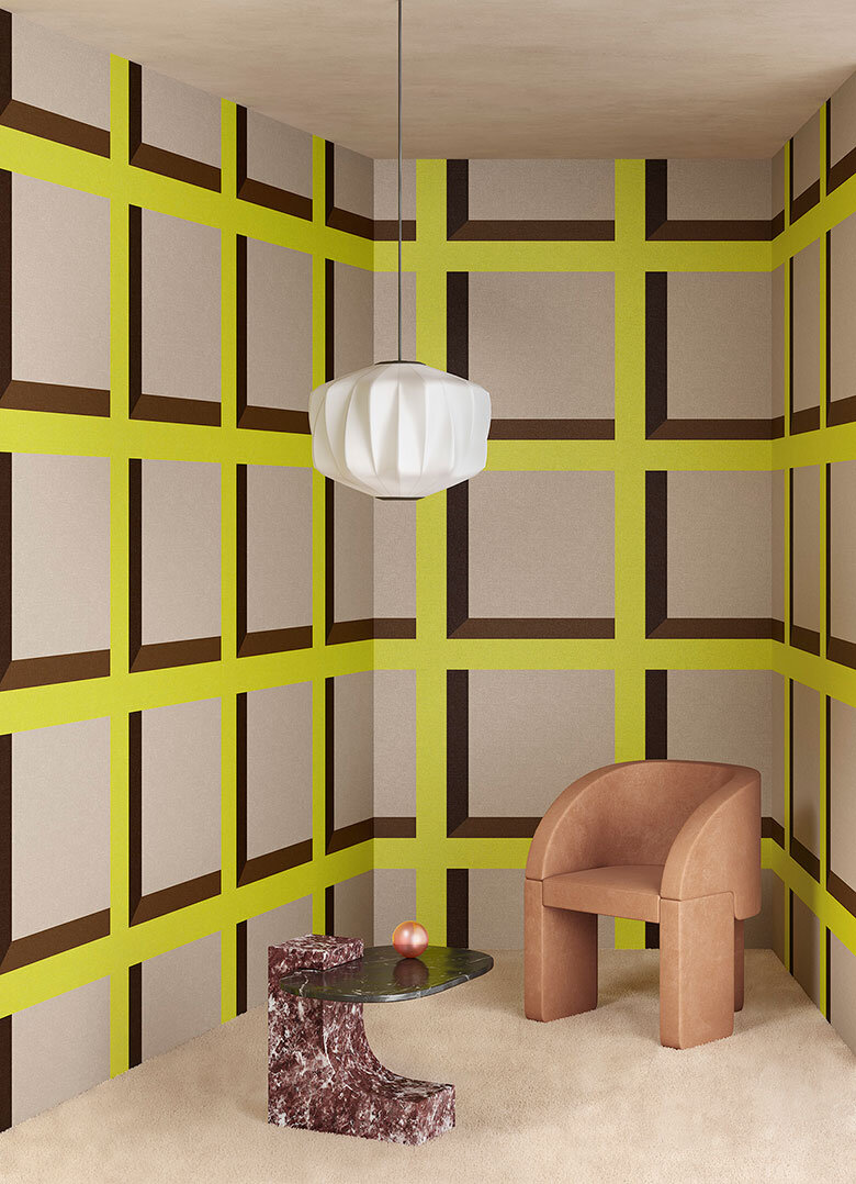
Dots and squares, oh my! Just say yes to this rather fab collab between creative consultants and 3D designers Terzo Piano and Or.nami wallpaper, which playfully toys with trompe-l'œil to stunning visual effect. Think simple graphic shapes and drop shadows inspired by architectural design.

Available in either vinyl or rather covetable silk, there are 4 designs in different colourways to whet your whistle - I’m already dreaming and scheming of a space where I can use them.

Terzo Piano X Or.nami - Pattern 2

Terzo Piano X Or.nami - Pattern 2

Terzo Piano X Or.nami - Pattern 3

Terzo Piano X Or.nami - Pattern 3


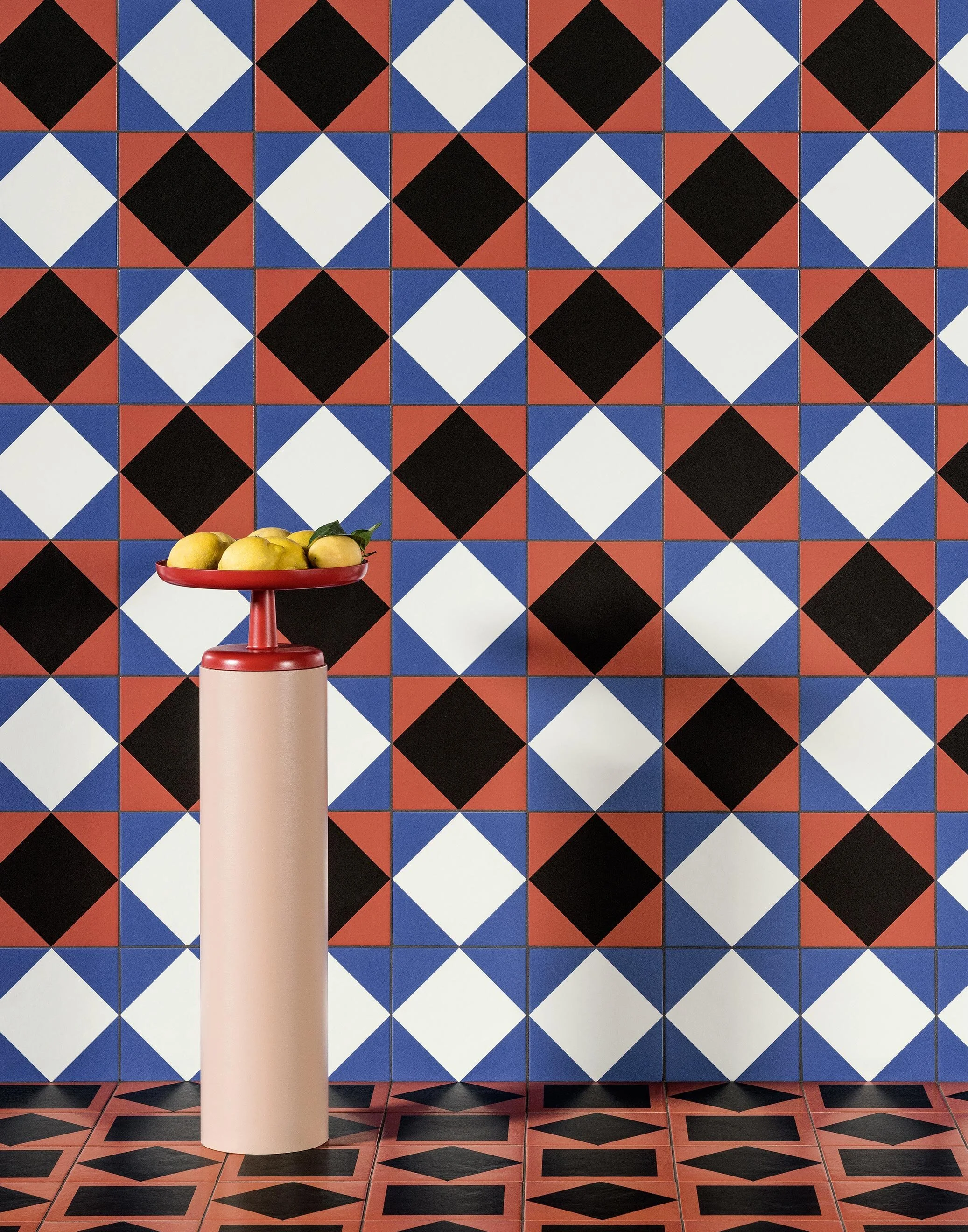
While one of my current projects includes a chic little bathroom in white and grey, this brand new collection by artist and designer Nathalie Du Pasquier for Mutina tiles definitely has me drooling.

More is definitely more here. Du Pasquier’s wonderfully barmy layering of pattern on pattern is key, with a perfect mix of fifties modernism and vintage designs all thrown together with gay abandon. And, if the 41 tiles in the Mattonelle Margherita collection aren’t enough, there’s also 11 coordinating paint colours for all you OCD design fans out there that want everything to match. Seriously.

Oh, and the art direction for the collection’s launch? It’s all feeling very cinematic and inspirational, and honestly I could happily post every single shot, but will show some restraint with the three faves below. Scope out the rest of the collection, here.

Wall: Star, Stripes, Marghe Black. Floor: Double Red, Stripes.

Wall: Star, Stripes, Marghe Black. Floor: Double Red, Stripes.

Wall: Marghe White, Frame Black, Marghe Half White, Marghe Half Black, Line. Floor: Petals, Line. Margherita Paint: Sand Matt.

Wall: Marghe White, Frame Black, Marghe Half White, Marghe Half Black, Line. Floor: Petals, Line. Margherita Paint: Sand Matt.

Wall: Marghe Light Blue, Stripes, Star, Kite White, Square Black, Marghe Black. Floor: Marghe Light Blue, Double Red, Stripes.

Wall: Marghe Light Blue, Stripes, Star, Kite White, Square Black, Marghe Black. Floor: Marghe Light Blue, Double Red, Stripes.


Am I the only person that dreams about chairs? This one in particular sent me down a bit of an internet rabbit hole, to be sure.

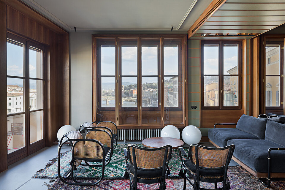
I first spotted the vintage originals in this stunning apartment in Florence, with masterfully edited interiors by Massimo Adario (click here to see more). Though they couldn’t look more at home in this space with views across the Arno, these spectacularly curvy seats were originally designed by Czech architect Jan Bočan for furnishing the Embassy of Czechoslovakia in Stockholm in 1972.

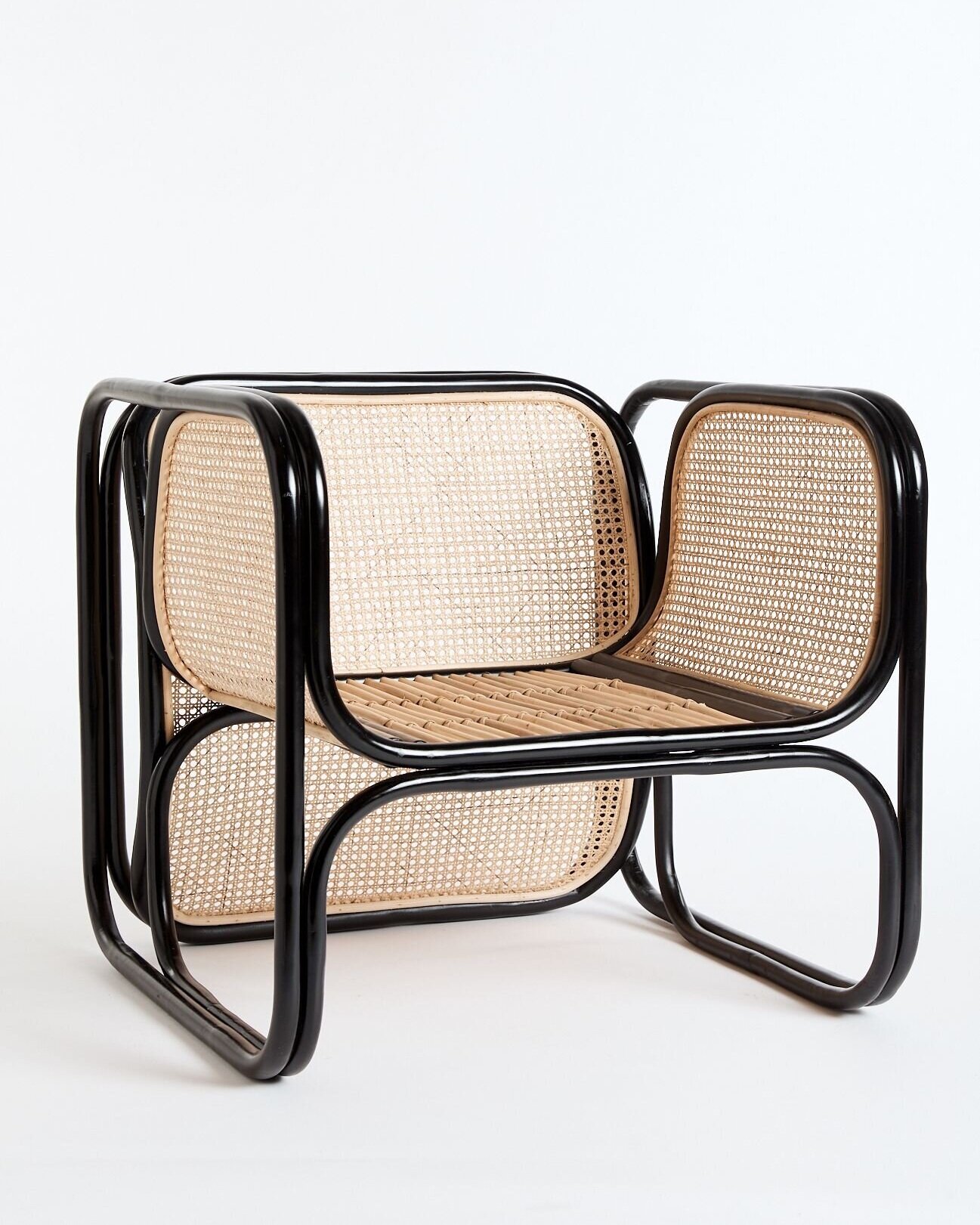
While the originals, made for Bočan by Thonet in lacquered bentwood and cane, deservedly fetch a pretty penny, I was fascinated to see that new versions of the chair are de rigueur in all sorts of chic interiors in Australia.

Available in both black and natural from the folks at Worn, and stunningly well priced I might add (I did the conversion), the sad news is that they won’t ship outside of Australia. But, kudos to Worn for their commitment to ethical sustainability, since their Cane Loungers are made of non-chemically treated materials harvested from sustainably managed plantations. Plus, for every chair sold a native tree is planted to help offset carbon emissions.

Brownie points to whoever can send me a source closer to home…

Photo: Laura Fantacuzzi and Maxime Galati-Fourcade

Photo: Laura Fantacuzzi and Maxime Galati-Fourcade

Worn’s Cane Lounger in Black

Worn’s Cane Lounger in Black

Colour is a political statement

Today, I’m choosing to focus on the good news out of the US, with the Supreme Court finally ruling that the language of the Civil Rights Act of 1964 applies to discrimination based on sexual orientation and gender identity.

And, we’ve been listening to a great Spotify playlist - Transcend - that features transgender, non-binary and gender-fluid artists and is well worth listening to, on repeat.

Cheers, Arren


“Fuck greige,” so says Seana Freeman, who sees the inoffensive non-colour as a cop-out when describing her punchy fuchsia home office. This tint makes a statement, just like Freeman when describing how embracing colour can be a political act,

“People of color have a different relationship with color. Its part of our cultural heritage! Por ejemplo, long before it was trending, black women have been wearing vibrant clothes, nails & hair. Hues like magenta pop against our skin. But often, especially if we are climbing the career ladder, we leave our magenta at home and well... wear greige.”

Read the rest here on Freeman’s Insta, the Geeky Glamohenian, which follows her take on style and the decorating of her art-filled home in North Carolina. Oh, and speaking of art, the standout piece in this shot is Leopard Coat by artist, Kendra Dandy. To see the rest of her space, pop over here to HGTV.

81471369_877561586097025_5241349728196361824_n.jpg

This Toronto home, by architect Tura Cousins Wilson of Ursa architecture and design studio, also embraces colour. This time though, in memory of the architect’s formidable grandmother, Violeta. The Jamaican-born matriarch loved the bright yellow of her country’s flag, so he paid tribute to her with the front porch painted in an eye-popping hue.

While the exterior stays true to its Edwardian roots, inside things are decidedly light, bright, airy and modern. I’m all about that double height living space. Plus, I have to mention the vividly colourful portrait by artist Rajni Perera of Violeta watching the to-ing and fro-ing beneath, all while holding a machete.

And the bathrooms! Sleek and simple, and so smart, with black grout creating a grid pattern with square white tiles. See the rest of Granny’s House here in Ursa’s portfolio.

Tura Cousins Wilson is a founding member of BAIDA, the Black Architects + Interior Designers Association of Canada.

Photo: Andrew Snow

Photo: Andrew Snow

Photo: Andrew Snow

Photo: Andrew Snow

Photo: Andrew Snow

Photo: Andrew Snow


Based in Winnipeg, Manitoba, Destiny Seymour in an Anishinaabe interior designer who also makes a line of handmade goods for the home called Indigo Arrows. Indigenous pottery and bone tool patterns uncovered in Manitoban archeological digs inspire Seymour’s textile designs, which are printed on linen and made up into cushions, quilts and napkins.

Her Copper Arrows lumbar pillows are a fave of mine, but I totally love the made to order Drum Stools. Upholstered in wool blankets, with tops and tails in maple, the stools come in three sizes. Shop the full Indigo Arrows collection here.

Photo: Copper Arrows pillows and Grandmother Moon Quilts

Photo: Copper Arrows pillows and Grandmother Moon Quilts

Photo: Drum Stools

Photo: Drum Stools

Melbourne beckons

I'm thinking about Australia again today, and it's not just because we somehow ended up with yet another dump of snow yesterday (ugh). Nope, snow besides, it was because an e-mail popped up from Andrew Maynard Architects, whose Tattoo House I'd researched for Canadian House & Home's Trendwatch page. The firm's latest project, the Vader House, is an extension on a Victorain terraced home in Fitzroy; a boho neighbourhood in Melbourne - and - it's pretty darned fabulous.

Take a look below of the space and let me know what you think (I know I could move right in). There's obviously a good reason why Dwell called him "One of Australia's most exciting young architects." For more background on the Vader House read the Architect's Statement here, and click here to check out other projects. [Images: Peter Bennetts]