We all need a little inspo

Inspiration comes in all shapes and sizes, often completely out the blue. and in these difficult days - well - we could all use a little beauty to get us through…

So, here we go with an occasional series of things that have caught my eye. Yes, many will be via Insta, but who knows what else I can dig up? And of course, if you’d like to send me any recos, please drop me a line here.

Cheers, Arren


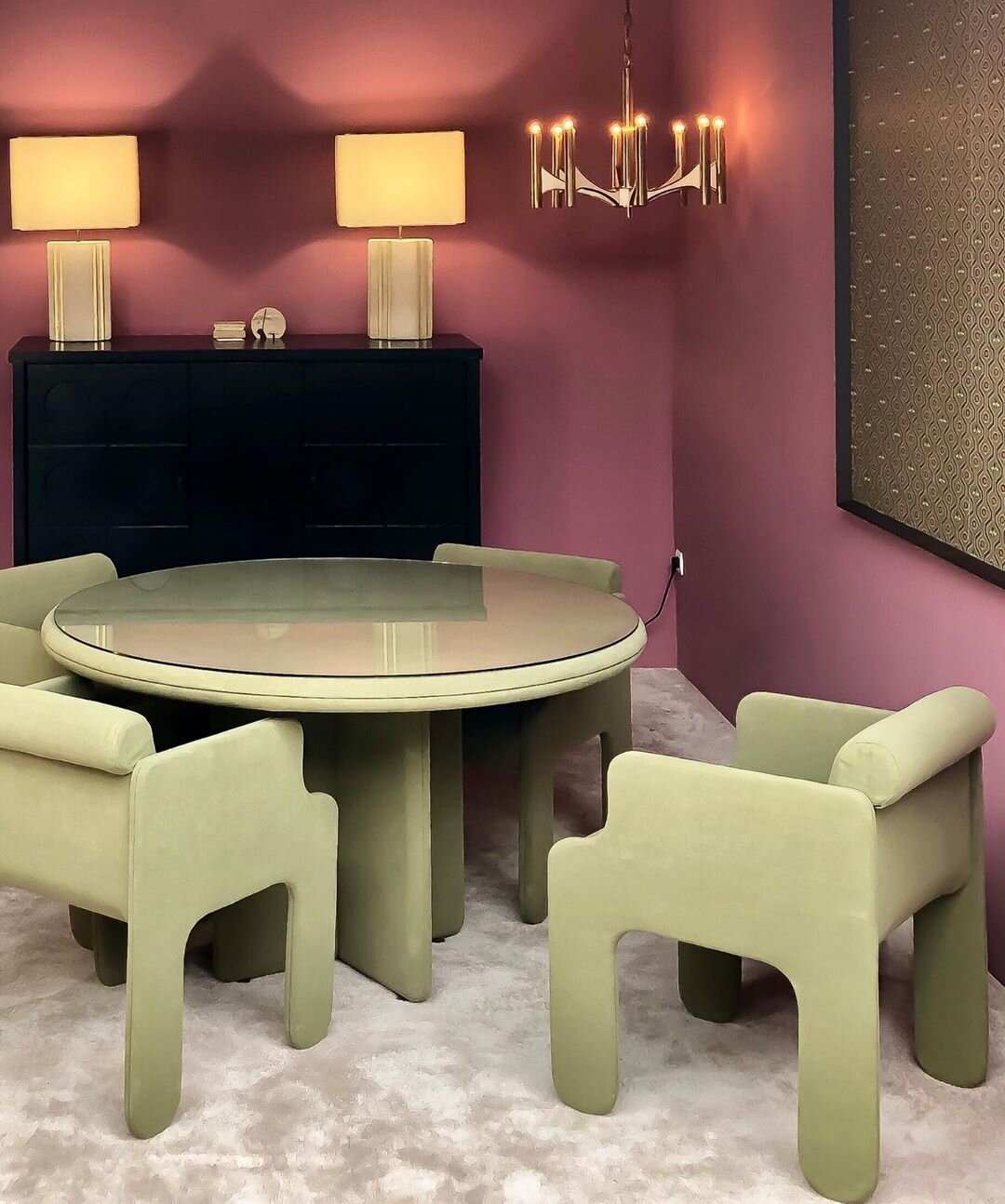
@objectsdaffection aka O.D.A. Galerie is a space in storied Paris flea market Marché Paul Bert curated by stylists and set designer Eve Ducroq and Arnaud Dollinger. In the room sets they create, look for an eclectic selection of vintage pieces styled to give the sense that some very chic homeowners have just strolled off screen to live a fantastically creative life. And, speaking of life, the chalky lime and plum combo in this space is definitely giving it to me right now.


@damienlangloismeurinne_studio aka interior architect Damien Langlois-Meurinne has an eye for sculpture within the architecture of an interior, ergo this stunner of a plaster fireplace. That, plus all of the softly curving furniture in this space have me completely swooning. Modern Parisian glamour at it’s best.

69896741_682032118948116_4887596085082300550_n (1).jpg

Let’s finish with a pop of colour. I love a kitchen island that steps it up in something bright so here, in this flat in Marseille by Paris-based designers @novaobiecta, it’s all of that kelly green, plus those cobalt framed stools. Gah!

Feeling bookish

Over the last while I've been working on some cool projects for Indigo, and - after saying pretty please - they're allowing me to share a couple of the snaps.

Coralie Bickford Smith is the designer behind this F Scott Fizgerald series of books from Penguin Classics. There are 5 books in all, each of which have a fantastically glam Art Deco inspired cover by Bickford Smith, and all of which would make a stunner of a set for your bookshelf. I'm a huge Deco fan, in fact at the age of 12 it was my first collection (I still have the first thing I ever bought, a diamond shaped alabaster dressing table mirror - have a look at it here), and to this day I'm a total sucker for the glamour and artifice of the 20's and 30's. Back to the books... Wouldn't these covers make gorgeous wallpapers? Oh, and if you fancy your own set, Indigo now has them in stock.

West Elm and Etsy's love-in

Hey there. Yep, I know I've been barely hanging around here recently (I'm blaming it on a combo of being blisteringly busy with work, travelling to both New York and Chicago within the past couple of weeks, oh, and getting kinda sick too), but here's something that you guys can really sink your teeth into>>>

West Elm's Toronto store will be hosting an Etsy We Heart Handmade Art pop-up event curated by Fieldguided - that's her smashing carryall pictured below - which'll feature a slew of other local Etsy craftspeople, as well as promising both drinks and tunes. I was in the store yesterday and they were being busy bees getting prepped and clearing space for what promises to be a very busy Saturday. All the deets are below, and yep, Bookhou (a local design fave of mine) will be there with lots of gorgeous gear, including the pillows and artwork pictured below, too.

I'm hoping to make it, but might be entirely exhausted after participating in our mega local neighbourhood yard sale (shout out to everyone who lives in The Pocket!).

New York whirlwind

As I write this I'm close to comatose on my bed at The Hudson hotel in NYC. Yep, it's been a bananas couple of days running around Manhattan checking out everything that's going on during New York Design week and the International Contemporary Furniture Fair, and it's not over yet. Below is a snap of all the catalogs, postcards and mags I've collected so far that caught my eye - and yes, before you ask, I've already edited it down to the stuff I really, really like. Luckily it all fits in the Tom Dixon bag that I snagged, which seems to have gotten the vote of the coolest ICFF bag around (hot on the heels of the gold metallic bag Tom Dixon doled out last year). And keep your eyes peeled, I'll be posting lots of my NYC design faves over the next while...

Getting on the tube

Okay peeps, as a little bit of a sidestep from the normal stuff I post, I thought I'd give you the lowdown on a brand new HGTV Canada show that's just started casting and is need of, well, you!

Friends of mine at Proper Television are on the hunt for houseproud design savvy homeowners (not design professionals) that love their home and are opinionated about style. Into modern or traditional? Just survived a reno? Live in a yurt, a mansion or a condo the size of a walk-in closet? No matter. If you're picked to get on the show you've got the chance to win a cool $1,000.

Here are the deets -

If you live in Southern Ontario and think your home is something special they want to hear from you. Just email the following to casting@propertelevision.com by April 29, 2011: 

  • A short description of you and your home
  • A snapshot of you (jpeg if possible)
  • Up to 5 snaps of your home (jpegs if possible)
  • A daytime telephone number
  • Video isn't necessary at this point but if you insist, upload your vid to YouTube and send the link

Tables, eggs, milk, bananas

Oh I am so getting into the it's-almost-summer spirit, especially since I got to check out all the new PC Home outdoor gear yesterday. My faves were the 3 styles of occasional tables below, all available in peppy colours as well as good old white, and all affordably priced between $25 and $29. If you ask me, they're useful and cool enough to look smashing both indoors and out. Keep your eyes peeled, since the full collection - and there's loads more - will start hitting select Loblaw's and Real Canadian Superstores in the next couple of weeks (I'll definitely be tossing a couple of the tray tables into my cart the next time I go grocery shopping).


Under the covers with Tracie

Last night I was whipping through The Bay, scouting for quelque chose for a shoot, and was stopped in my tracks by a delovely set of linen. This little wonder is called Sienna and hails from an Aussie firm, Aura by Tracie Ellis. The collection, smashing in black and yellow, was inspired by Victorian wallpaper and IMHO would be quite the bedroom statement maker. Loves it. Oh, and I included a close-up of the bedside table, since it has a fab nutty vibe with its mix of a Moooi Rabbit Lamp and a Patricia Urquiola designed T Table for Kartell (not to mention the great matte black wall). Here's hoping the nice peeps at The Bay bring in more of Tracie's line.

A chair story, part two

So you might remember a while back I was challenged to makeover a pretty ugly vintage chair by Chatelaine's decor editor Virginie Martocq, well it's time to share all the pics (thanks VM!) with you lot so you can see the results. Firstly I hafta say it wasn't just me involved, since Virginie also dragged in Tommy Smythe, Jeffrey and Deborah Fisher and Candice Olson to re-do chairs too - And looking at the bunch of them together they couldn't be more different.

That first snap shows the chair in all its - ahem - original glory. Next up there's mine, which looks fantastic thanks to inVU Drapery for the delovely DwellStudio Vintage Plumes fabric, as well as tackling the upholstery (you can see all my prep work here). Then Tommy's chair is ultra chic whith a white glossy frame and wide black and white stripe for upholstery. Jeffrey and Deborah slipcovered and skirted theirs, which did a nice job hiding the rather ugly legs. Finally Candice gave hers a preppy tween feel, dressing her chair in white, kelly green and fuchsia. Got a fave? Then you can vote here. [Images: Roberto Caruso]

Pretty tempting

This time of year is all about predictions and resolutions, especiially when it comes to decor. If you ask me I predict lovely slightly worn out ice-creamy colours will be hot, and I resolve to keep my decor as interesting and as vintage-filled as possible. Talking of predictions, Sico did a lovely job with their colour palettes for 2011, making the three looks they picked very tempting indeed. My fave is Inviting, that's the first one (LOVE the idea of a big patch of colour on the wall), followed closely by the second palette there called Dazzling, just for the sheer colourful hell of it. And finally, a look called Authentic, which - while it's perhaps the least 'me' - has a relaxed time-worn vibe and a great handsome feel to it. Which do you like, and are you feeling inspired to paint?

{that one great thing} Jason Hudson's birdcage lamp

I bumped into Jason Hudson at a party over the Holidays and bugged him about his lovely birdcage pendant lamp that I'd seen over on his great blog These Roving Eyes. Anyway, he was happy to share the story behind the piece, and thus begins a new occasional series on the blog - that one great thing.

Jason Hudson: My partner Jeff fell in love with this old wooden cage when he saw it at an antique shop when he was a kid. He proudly brought it home and it sat in the living room for years. After his father passed away, we found it amongst junk in the garage and I could see that it had a special place in Jeff's memory.  

I'm a firm believer in taking meaningful objects and adjusting them to work in a contemporary setting. Like your Grandma's old piano - the cherry finish isn't working in your mid-century modern dwelling, but it holds a ton of sentimental value, so have that sucker refinished! It's still the same piano, still full of memories, its precious ivories untouched. So make it work! 

Because the honey-coloured wood and sad-Cat-Lady-overtones weren't working for me, I convinced Jeff to let me spray out the cage in a high-gloss black. We wired-it-up with a great Edison bulb and just like that, had our very own, ultra-cool, one-of-a-kind lamp, rife with Jeff's childhood memories but within the limits of our (read: my) personal style. 

It casts lovely shadows on the walls and adds a certain warmth and organic quality the room was lacking before.

Crushing on Binic

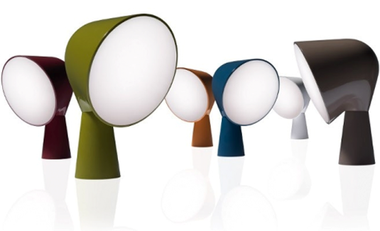
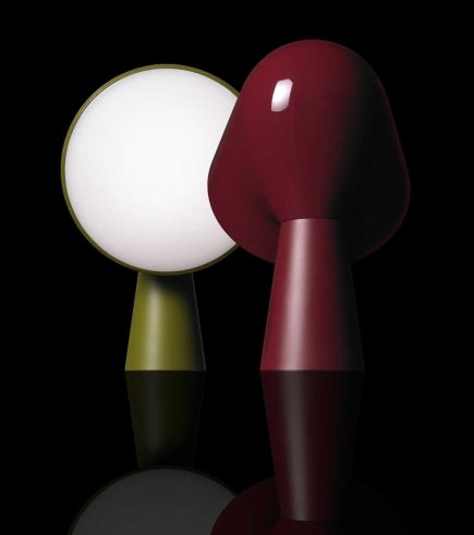
Yep, I'm a card-carrying lampaholic, so when confronted with the quirky cuteness of Foscarini's new table lamp called Binic it was lamp-love at first sight. Ionna Vautrin, the designer behind the diminutive light, was inspired by both a particular kind of small lighthouse found on the coast of Brittany and 'wind socks', those doohickeys used for ventilation on ships. Check out the pics below, and then watch the super little video to follow Ionna's design process and see how Binic went from an idea to reality. Hmmm, I think I want one in every colour...

Feeling a beat

Okay, now I know these have been out for a while, but I was struck by how simple this shot was, and yet how gorgeous that gaggle of Beat lamps look. The Beat line of fixtures is designed by Tom Dixon and inspired by trad indian cooking pots and water carriers. In fact, Dixon tapped skilled craftsmen in Mordabad, Northern India, to create the series out of hand beaten brass (hence the glow-y gold interiors) that are then finished in matte black. And if that isn't enough, the light fixtures are mirrored by an equally stunning set of ovescale vases in an unpolished satin brass. Yum. BTW, that great shot is courtesy of photographer Tom Mannion and stylist Faye Toogood - a creative power couple if ever there was one - from the latest Dixon catalogue. Oh, and if you fancy getting your sticky mitts on all the Beat bits and pieces, check in at Klaus by Nienkamper for more info.

All about the peacock

I have a chair makeover project coming up, and I'm happy to tell you I think I found the perfect fabric at inVU Drapery. I popped in there the other day to check out the new DwellStudio collection that they're carrying which, I hafta say, is all really rather lovely with fantastic hits of yellow, teal and grey all in a smashing mix of prints and solids. But back to me, and back to that chair! The fabric that totally spoke to me at inVU is the DwellStudio Vintage Plumes in Camel. Pretty fantastic, no? The side chair is currently a hefty fleamarket find in dark stained wood, so I'm thinking about lightening it all up by either painting the frame in a soft grey (or going a tad nutty with a harvest gold???) and of course, there will have to be nailheads involved somewhere. Nickel, or maybe even white for those. Hmmm...

Guest blog / Jenn Hannotte: New kid 'off' the block

Jenn Hannotte: It's no secret to Torontonians that the Junction, a west-end neighborhood, has become a go-to spot for amazing decor stores over the last few years. And now open a short skip north of Dundas on Keele is Russet & Empire, a home accessories and gift store. 

Carefully curated by owner Micah Lenahan, she says that the neighborhood was lacking " a lot of options for shopping unless you wanted to buy a big piece of furniture." Now, I'm not talking traditional gifts and accessories. These are vintage toys (with the tags still on!), impossible-to-find soaps, gorgeous jewelry by local artisans and other super on-trend home accessories. Micah says she was aiming to create a gallery-like space by "adding only products that are beautiful and that i can claim that I absolutely love." Open only a month, she has events, and in-house products in the works with new products rolling in all the time. Check out some of Micah's favorite pieces below, then go say hi at 390 Keele St!

To read more of Jenn's take on style, as well as to track her reno project, click here.

Squiggle + stuff = seat

Definitely an intellectual take on a packrats dilemma, the Comfy Cargo Chair by young German designer Stephan Schulz can be jammed with whatever you might have hanging around the house. Cuddly toys, laundry, whatever, I think it's rather sculptural and kind of cool and like how before it's crammed with stuff the wire frame looks like a random squiggle - almost more like an idea of a chair than the real thing.


Checking in, checking it out

Ah, Istanbul. That's where I've spent the last week, walking, exploring and - mmm-mmm - eating! We stayed at The House Hotel Galatasaray, designed by one of my fave design teams, the Turkish firm Autoban (read a great Dwell interview with them here). And oh, let's just say it was pretty fantastic, both the hotel and the city!

Built in the 1890's as a 4-storey mansion - in a neighbourhood that's now quite the hotbed of scrumptious vintage and antique stores (more on that later) - the hotel is owned by Alex Varlik, who's also the smartypants behind a chain of chic restos called The House Cafe that are dotted across the city. Each of the hotel's 20 suites are a lovely modern mix between the historical vibe of the building itself, Autoban's custom furnishings, and quirky/cool touches like the street address marble tiles in the bathroom, the standout gold and white chandeliers (oh, I wish I could've crammed one into my suitcase) and the super fun free-standing showers.

I'll be posting more inspirational stuff on Istanbul soon!

Cool, calm and Nordic

As my grandmother used to remind me, "Horses sweat, men perspire and women glow." Well, right about now I'm possibly a bit more on the horse side of things, since I'm in-studio with the fantastic Canadian Family crew shooting a Holiday feature in 33C (or 91F). Believe me, this late-summer heat and humidity just slightly takes the shine of getting into the Holiday spirit.

Muuto's collection of furniture, lighting and accessories is, thankfully, the epitome of cool, calm and collected Scandi style. That cluster of E27 socket lamps is super cool, and their The Dots wall-mount hooks look lovely and random in the second shot. In Toronto, check out Muuto at Hollace Cluny.

Bright light, bright light

Today I was going to blog about Jimmy Choo boss-lady Tamara Mellon's swanky NYC apartment that was recently featured in Harper's Bazaar, but then had a last minute crisis about it. The place, designed by Martyn Lawrence-Bullard (who I quite admire), is, errr, perhaps a bit too over the top. Take a look here, over on Made By Girl, and let me know what you think. Is it just me, or is the combo of those snake photographs and a McDonald's meal just a bit icky?

Instead I'm going with this super fantastic new bulb designed by Eric Therner. Eric is a young Swedish designer who had the bright idea to create a 2000 hour 15 watt halogen light that's inside a diamond faceted glass bulb. If you ask me, I think it brings a whole new glam twist to the bare lightbulb trend. [Images: Jesper Lindstrom]

Here and there

Today, inspirationally speaking at least, I'm all over the shop. I've been drooling over the design of this new French macaron patisserie that has opened in San Pedro, Mexico, with interiors and branding designed by Anagrama. All very chic and white. Then, keeping with the sweet theme, how about this anti-doily punk owned bakery in Munich, Germany, called F**k the Cake Mix (the real name doesn't have any asterisks, lol) and whipped up - so to speak - by Designliga? A touch edgy, but no less cool. Then, on a completely un-cake related front, I was quite taken with these quirky Bödön stools, which are part of a line called The Gipsy Furniture Collection by Attila F. Kovacs and Zsuzsa Megyesi of A+Z Designers in Hungary - The enameled metal stools double as storage/wine coolers and are topped with printed, embroidered and plain cushions. You can catch the complete collection, which is inspired by Hungarian and Transylvanian folk art, craft and culture, at Tent London during the London Design Festival, happening later on in September. [via Dezeen]

Commiting to Patricia's style

I must have bathrooms on the brain today. You can catch a tour of mine here on House & Home Online TV, and then these rather gorgeous images appeared in my in-box, touting the arrival in North America in early 2011 of Axor's new collection created with a fave designer of mine, Patricia Urquiola. I totally get her commitment to a rather kooky sense of modern style, plus her love of craft, and the way everything is tossed together in a rather un-matched yet glorious way that all adds up to make the bathroom feel almost like a living room. Love. It. All.