guest blog / Jenn Hannotte: Magic ice and other kitchen stories

Jenn Hannotte: You know how when you're living with something you can convince yourself it's OKAY? Like the old fridge that was approximately 4 feet high and held a carton of eggs, a jug of milk and a loaf of bread if you packed it intelligently? NOT OKAY. And I only realized this after my Whirlpool appliances arrived and we set up the new side-by-side fridge (I put the other guy out on the curb for recycling, I didn't hold that much of a grudge!). It wasn't *just* that the kids squealed with disbelief when I got them ice and water FROM THE FRONT OF THE FRIDGE like a magician (we're simple people), but the fact that it's totally roomy and still counter-depth sold me. And the new dishwasher? Our old one was likened to a garbage bag with a hose attached by the appliance installer - and he wasn't far off. We had to close all the doors to the kitchen and basically vacate the house when that thing was running. My new dishwasher is quiet, yes, but it also has cool features (like Sheer Clean) and is smartly designed - something I can really appreciate after using our completely inefficient old monster. And, then there's the slide-in range that leaves more room for the birch plywood backsplash to do its thing, and which has a quick-heat convection oven to get those frozen pizzas cooked chop-chop! So why white, instead of the more expected stainless? White is fresh and modern and especially in a small kitchen like mine, it helps to unite rather than divide. 

Once the engine of the kitchen was installed, Angus Fergusson and Arren came over to shoot these stunning photos. My perpetual kitchen reno is all done and what's the verdict? For me (the only client who matters!), I absolutely love the ambience of this room, it's less a kitchen in the traditional sense, and more a cozy retreat. *AND* everything works, works well and looks good doing it.

Here are the deets:

Counter Depth Side-By-Side Refigerator, Whirlpool Gold Tall Tub Dishwasher,  Electric Slide-In Range. All Whirlpool.

Vintage industrial bins, Avril Loreti tea towel, Imm Living cruet. All Russet & Empire.

Lighting Design. Matthew Birch for Russet & Empire.

Kitchen Design. Russet & Empire Interiors.

Ikea kitchen cabinets, butcherblock counter, Ringskar faucet, Tral work lamp. West Elm Tripod Table. Breville Barista Express espresso machine. Areaware Numbers LED Clock.

>>> Catch the rest of Jenn's kitchen reno here, and click here to check out Jenn's take on style.

Guest blog / Jenn Hannotte: The perpetual kitchen reno

Jenn Hannotte: Last October, after my youngest pulled what looked like 1930s underwear out from behind the radiator in our kitchen, I called John at Cera Stone. "GUT IT," I said. Really, I didn't *want* to renovate the kitchen, I wanted to live with it and save up for the real-deal. 

But after the underwear, and because earlier in the summer I had removed all the cabinet doors because they were covered in SLIME, and because after the bathroom renovation we had a big ol' hole in the kitchen ceiling thanks to the old toilet losing it's shhhhh all over the place - well, it wasn't a kitchen anymore. And so, like I do, I started to rip things apart myself and discovered the original asbestos-tiles, and while not exactly good for the lungs, they were in really good shape which gave me hope for the pine-plank subfloor. Yes, we were going to gut the kitchen, but, no, we weren't going to spend much putting it back! Once everything was out, I decided to have a wall framed out over the messed up plaster that held the old cabinets in place, and we clad it in beautiful birch plywood. The sink, stove and fridge all stayed in the same place to keep costs down. A couple of base cabinets from Ikea, an inexpensive butcher block countertop, rough-pine shelf from Home Depot ($12!) and bingo, we had a kitchen. 

Okay, it didn't go that smoothly - I have hung different cabinets and shelves, moved the fridge around, painted the floors after resolving not to, and painted half a wall black before deciding (surprise!) white it was! This is a temporary kitchen - if temporary means 5 years or more to you. So, because we'll be living with it for quite some time, we figured that we might consider getting some appliances that work. I know people go on about "function and form" all the time, but sometimes I like to ignore that and spend money in places we shouldn't instead of... .getting appliances that work.

And so, this week a new crop of appliances that will bring harmony to the kitchen are set to arrive. Appliances that marry form AND function. I know, what a concept. Once they're here and installed I promise a full kitchen tour. For now, here are some shots of the before and during - and a sneak-peak of the 'after', shot for the Marion House Book last month! (which, incidentally, already looks different!)

For more of Jenn's take on style click here.

Guest blog / Jenn Hannotte: Feeling scrappy?

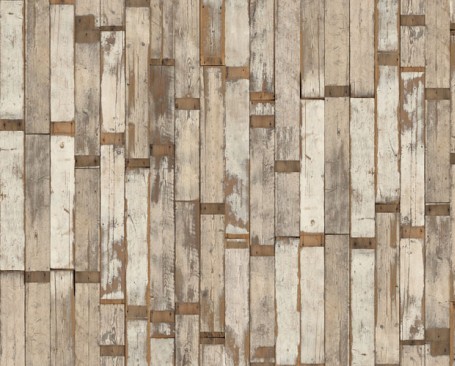
Jenn Hannotte: In our last house, we got a little creative and made a scrap-wood wall in our upstairs-kitchen-cum-nursery (take a look at the first snap below). We found all the wood in the rafters of our garage and cut them down into different sizes and just screwed them into the plaster. The result was a little unusual for a nursery (or a kitchen!) but it really gave the whole room a really warm, rustic vibe. We toyed with the same idea in our current house - in our actual kitchen - but fancied more of a cleaner Scandinavian cottage kinda feel (more on that soon...).Needless to say, I'm a big fan of the whole raw-wood look, so when I saw this wallpaper by Piet Hein Eek I got a little flustered. 

Scrapwood is a series of paper's that give the illusion of...well, duh...a scrap wood wall.. but without all the hassle of the cutting and screwing AND in perfectly complementary hued woods. So while I think of some where to hang my latest obsession, take a look at these images and figure out where you'll want to use it, too.'Cause you will - Obviously.

For more of Jenn's take on style click here.

guest blog / Jenn Hannotte: What's behind door #1?

Arren has been Christmas-ized since July when the magazines do their holiday shoots. Thankfully for the rest of us we don't have to worry about the holidays until about...well...NOW. I've rounded up some out of the ordinary advent calendars to keep the countdown looking cool. 

This trendy pennant look finds its way into the holidays and on to the mantel doing double duty as an advent calendar and taking care of dressing the fireplace. You fill each number with your own treats and can re-use it each year. The second one here is more traditional, but I love it for its patchwork look and shot of turquoise. And for a little irony - if you love these last two you better hurry since they are limited to 50 and the seller says they go quick. For good reason, these gorgeous Amsterdam or Brooklyn streetscapes with a little holiday image behind each door or window will bring a little grin to even the grinchiest of us!

guest blog / Jenn Hannotte: Continuing coffee education

I need to reveal some information about myself to give this post some context. It's not something I'm proud of, but nonetheless, here it is: I am basically inept when it comes to any kind of appliance that when used results in something you're meant to consume. So you can understand that I was a little nervous when I attended the Breville Barista 101 event that promised to turn me from someone who thinks instant coffee is fine, to a coffee connoisseur in one short hour. 

With the skilled assistance of Master Barista Matthew Taylor of Toronto's Mercury Espresso Bar (below helping my neighbor create perfect foam), and the amazing ease-of use of the new Barista Express, I was cranking out cappuccinos  with billowing, frothy foam; latte's with perfect precision and even learning how to make coffee art (okay, so my first, second, and third attempt at that 'art' all resembled a hippo more than the intended leaf or swirl). The Barista Express isn't just for beginners - it has manual espresso options as well, for the more seasoned at-home barista who wants maximum control over their coffee's flavour.

The real test came in the morning at 6am when I usually brew up some thick-as-mud crude and choke it back until I'm sufficiently awake to deal with the day. I didn't know if I'd be willing to make my own espresso, but this thing is seriously so easy (and fun!) for someone like myself that I'm finding the ritual of making coffee beautifuly adds so much to my mornings.

Take a look at some pictures I snapped of that morning at the event, and my creations (don't judge me too harshly!). No, I won't be serving you up a macchiato at Mercury anytime soon, but I will be thoroughly enjoying my own!

guest blog / Jenn Hannotte: A touch of the RT's

Drumroll! Church bells! Fireworks! It's done! After some finishing touches, I was super lucky to have Naomi Finlay come by to take photographs of the final bathroom reveal, and Arren to help style! I am beyond happy with how it turned out - it's got that Royal Tenenbaum edge, but it's got a lot more of 'me' and a whole lot of this houses' heart in it, too. Here's the complete list of materials and other good stuffs used in the shots and in real life:  

Bancroft toilet, Brockway sink with Cannock faucets - Kohler. Daltile Subway and Octagon and Dot tiles, baseboard, Behr Paint in Ashes - Home Depot. Trim tile - Pollock's. Wild Flower wallpaper - Ferm Living. Fords Mill light fixture - Rejuvination Lighting  (Who, I noticed when I went to grab this link have some AMAZING new product). Towels, bathmat, plate - Anthropologie. Shower curtain - Urban Outfitters. Milk glass vases, vintage fan, MOR soap - Russet and Empire. Vintage pharmacy jars - The Arthur. Molger mirror - Ikea. Kartell Componibilii - Neat.

Click here and here to check out the other posts on the bathroom reno (including the awful before shots), and stay tuned, something else is cooking up at the Hannotte house - pun intended. Wink, wink.

For more of Jenn's take on style click here

Guest blog / Jenn Hannotte: The bath equation

Jenn Hannotte: My bathroom renovation began about three months ago, and we're still working on some finishing touches before we can present the BIG REVEAL. But until then (soon, I promise!), I thought I'd recount the story thus far. Trouble is, it's not terribly interesting. Nothing scary jumped out from the walls, there was no layer of black mold ready to poison my children, no hiccups with the contractors or materials. The only reason why it's taken as long as it has is because I had to go and choose things that you can't grab from your local big- box store.

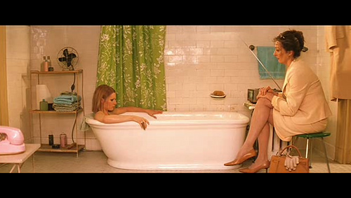
You might recall that my main source of inspiration was the bathroom featured in the film, The Royal Tenenbaums. To get there, we used a lot of classic materials that really fell architecturally into line with the aesthetic of the rest of the house. Always-right and inexpensive Daltile white subway tiles placed 3/4 of the way up the wall from Home Depot, capped with a classic chair rail profile found at Pollock's on Roncesvalles, just down the street from me. For the floors, it was again Home Depot's Daltile in the 'Octagon and Dot' pattern. I sourced a cast-iron clawfoot tub from Craigslist for a steal at $150 including the faucet, shower head and tub surround. The toilet is from Kohler and it's amazing to not be terrified every time we flush like we were with the old one! My favorite piece is the sink - the Brockway from Kohler. It was this baby that we had to wait for a long time to arrive, but it was worth it once installed. 

Without giving too much else away, I found this amazing wallpaper from Ferm Living that looks pretty   much identical to the shower curtain you see behind Margot Tenenbaum that really sets off the entire space. So the question is, class, can this equation be solved?  


Guest blog / Jenn Hannotte: New kid 'off' the block

Jenn Hannotte: It's no secret to Torontonians that the Junction, a west-end neighborhood, has become a go-to spot for amazing decor stores over the last few years. And now open a short skip north of Dundas on Keele is Russet & Empire, a home accessories and gift store. 

Carefully curated by owner Micah Lenahan, she says that the neighborhood was lacking " a lot of options for shopping unless you wanted to buy a big piece of furniture." Now, I'm not talking traditional gifts and accessories. These are vintage toys (with the tags still on!), impossible-to-find soaps, gorgeous jewelry by local artisans and other super on-trend home accessories. Micah says she was aiming to create a gallery-like space by "adding only products that are beautiful and that i can claim that I absolutely love." Open only a month, she has events, and in-house products in the works with new products rolling in all the time. Check out some of Micah's favorite pieces below, then go say hi at 390 Keele St!

To read more of Jenn's take on style, as well as to track her reno project, click here.

Guest blog / Jenn Hannotte: The royal treatment

Jenn Hannotte: Ahh, the sweet, suffocating smell of plaster dust! We're knee-deep in it over here, tackling the family bathroom. When we bought this house, we thought we could live with it for a while. We thought that we could clean it up, and it would be OK. We thought maybe some new towels would help. We thought WRONG. The 'before' picture provides some visual evidence, but the real issue here was the smell. And the strange textures that stained every surface. I won't elaborate, but suffice it to say we are very happy to have it all GONE! It was demo- day here today, and the folks from Cera Stone (who I also used to renovate the main floor of the last house) knocked it out efficiently as ever.
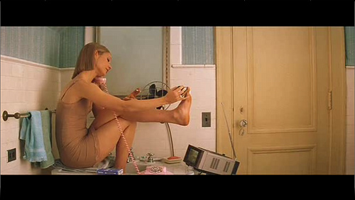
Finding inspiration for the bathroom wasn't a problem. It seemed everything I saw, I loved. Especially anything dark and vintage, with an industrial twist. Like Jenna Lyon's en-suite, or this gorgeous bathroom from House & Home by Connie Braemar. But, I wasn't quite sold on the idea of going to the dark side - something wasn't quite grabbing me. And then, as I do a couple times a year, I was watching The Royal Tenenbaums and there it was, my future bathroom. Nothing dark about it, but oozing original vintage charm with a fresh colour scheme and those great set details found in all of Wes Anderson's films. How close the final product will be to the bathroom Margot Tennenbaum spends  "six hours a day locked up in...watching television and soaking in the tub" remains to be seen, but the hunt is on! [Image 2 via Habitually Chic. Image 3 by Virginia Macdonald]

For more of Jenn's take on style, as well as to see the beginnings of her own reno project, click here.

Guest blog / Jenn Hannotte: What's the 211?

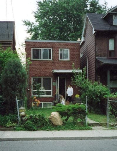
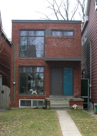
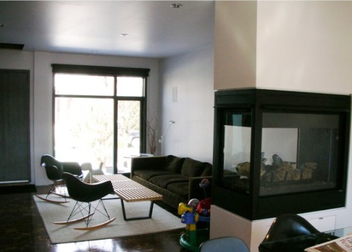
Jenn Hannotte: If you're reading this, chances are it's because you're a design blog-aholic. Never one to leave the party first, I offer to you this new reno-blog (complete with live-cam!) that promises to be thoroughly intoxicating. The Temporale's are a young family who have decided to move up - literally. They've been living in their east-end Toronto home for 6 years and have gutted it and smartly transformed it into a modern nest. But with only two bedrooms and four family members, it was time to make the decision: sell, or renovate? With no where to go but up,  they are constructing a 3rd floor pre-fab addition, and if the pictures from the rest of their home are any indication, it's going to be spectacular. The snaps below show the before and after on the front of the house, and a peek at the interior, before the old roof was peeled off and construction started. Check out 211 Bain to follow along!

For more of Jenn's take on style, as well as to see the beginnings of her own reno project, click here.

Guest blog / Jenn Hannotte: What goes around

Jenn Hannotte: While Arren had the good fortune to physically enjoy the ICFF this year, I had to get my virtual fix and have been scouring all the blogs who have covered it. Apartment Therapy's founder, Maxwell Gillingham- Ryan, recently posted this over-view of some of the new wallpaper designs showcased. What really caught my eye were the new bold florals from London-based pattern designer, Camilla Meijer. Check out her 2010 intro, and compare to a wall in my new home with its original vintage paper. Now that's a bit of a déjà vu!! Maybe I should keep it... [Images 1,2 via Apartment Therapy]

For more of Jenn's take on style click here.

Guest blog / Jenn Hannotte: Movin' on... up?

Jenn Hannotte: Okay, everybody relax. No need to get up in arms about my absence; let me explain. And no, I'm not going to blame it on the kids (this time), I'm going to blame it on Real Estate - capital R, capital E. I let the beast take hold of me again and I've gone and sold our house and bought another one a few blocks away, all thanks to the most amazing agent in Toronto, Nutan Brown. But I had good reason - a couple of good reasons, actually. We moved into our current house about 2 1/2 years ago and transformed it from a gold damask (in a bad way, trust me), brown carpeted, stippled mess into a pretty charming and hip abode if I do say so myself (check out my Flickr page here for the befores-and-afters of that ordeal). The main floor got a new kitchen, new floors, new laundry/mud room and upstairs got a coat of paint on every surface, including the floors. There are a lot of classic elements that remained intact from the 101 year old home that are blended with a modern and trendy reno. And that's the thing, folks - it's trendy. That, combined with a housing market that may or may not 'burst' meant that if we were going to reap the rewards from all our hard work, it was now or never. Thankfully, a young couple fell in love and in 5 short days the showings and open houses were over.

Our new house is a 'forever' kind of home. She's big and beautiful and needs a TON of work, so I'll be sharing some of that work and inspiration here as we move from project to project. Oh...did I mention we have to do it for practically free?* We're dubbing it the No-Money-Makeover and it's going to likely mean Craig's Listing, dumpster diving, recycling, street-walking....no, that's too far....and how ever else we can work towards a 'temporary' solution using cheap and clever tricks until we can get to the big stuff in a few years.

Here are a few snaps of the 'new' house below to kick-start brainstorming! Is that a fire place in the entry way? Why, yes it is! Beamed ceilings in the dining room? Check. Stippled plaster everywhere? Sure!

For more of Jenn's take on style click here.

*A disclaimer: The whole house needs the knob and tube wiring removed - a big job at an even bigger ticket price that needs to be done ASAP. so it doesn't count. Because I said so.

Guest blog / Jenn Hannotte: Feeling cross?

Jenn Hannotte: My favorite new store in Toronto pandering to my want/need/can't have tendencies is Mjölk. Owners John and Juli offer an amazing selection of clean-lined, pale-wooded, Scandinavian and Japanese pieces from the classic Børge Mogensen 2226 Spanish Chair (take a look below, and if anyone out there is wondering if I'd like a gift, the answer is yes: I'll take two), to this gorgeous Hiroshima extension table by Naoto Fukasawa and a set of Arne Jacobsen cutlery to go on top. They also have affordable design objects, like this gorgeous Grass Vase by Claydies for Normann Copenhagen as well as adorable things for the Scandi-wanna-be baby like this cool/odd Norwegian Lice Onesie. But the one thing I really went to see and covet was the Pia Wallén Crux Blanket. It's so soft, so simple and so PERFECT. It's also all-wool, made in Sweden, and $850... Now, I don't like a little thing like price to get in the way of instant gratification, so I headed off to Etsy in search of some Swiss cross inspired textiles and found this coffee sack burlap basket with a cross screenprinted on the front by Brin and Nohl It'll be perfect for toys, magazines, or even small storage in the bathroom. Okay, it's not a blanket, but it's a wee bit more in my snack bracket.

Below you'll see snaps of the 2226 Spanish Chair and the Grass Vase, plus a couple of inspiring shots of the Crux Blanket in action (via Door Sixteen). For more of Jenn's take on style click here.

Guest blog / Jenn Hannotte: Things are piling up

Jenn Hannotte: I've been noticing the floor getting a lot of attention by stylists recently. From piling magazines and books straight off the ground to create side tables, to using the surface to display art and objects. 

It's a fast and dirty way to update a corner or a whole room, and likely won't cost you a penny. Now, I'm not a designer in any professional capacity; I'm a mother of two who usually writes these wearing a house coat and drinking coffee while the baby naps! But I do love design and I think there are a lot of you out there like me, so take a look at my inspiration shots below and how I styled it up in my own home in that last shot. I have a soon-to-be mobile baby, Beatrix, and an off-the- wall 5 year-old, Willa, so it wasn't practical to have things directly on the floor for safety reasons. Instead, I've taken a vintage low coffee table, stuck it in an awkward corner and used books and mags to give the lamp and other objects some practical height, but it also conveys that sort of super-relaxed, eclectic aesthetic that we see in those delicious inspiration shots. [Image 1: Dos Family. Image 2: Andrea Ferrari. Image 3: Manolo Yllera]

For more of Jenn's take on style click here.

Guest blog / Jenn Hannotte: A tale of two tables

Jenn Hannotte: There are two types of Craigslist thrills: when you buy something for cheap and find out it's worth a lot more, and when you find something cheap and you make it worth a lot more - even if you only slap some paint on it. My front room has tried on a couple of coffee tables in the last few months that gave me both types of 'YES!' moments. 

My old coffee table was a $20 purchase that included two end tables. It's now sold since I try to follow a pretty strict 'something in, something out' regime. The shape was ornate and scalloped, and I thought that painting it with a matte finish and juxtaposing it with my otherwise modern furniture would look interesting. I used one of the end tables in my daughter's room as a side table and sold off the other at a garage sale. That's a lot of mileage out of $20! I was able to play with a trend without busting the bank, and that to me is what makes Craigslist and thrifting in general so worthwhile.

My latest find was an impulse buy - I saw it, loved it, and had to have it. I knew nothing about the coffee table, except at $150 was pretty cheap for the going rate of mid-century teak on Craigslist. Within a few hours of contacting the seller, I was on my way home with it, as well as armed with a new little bit of info: that it was manufactured by France and Son, Denmark. Off to Google and within minutes I realized I had a Peter Hvidt & Orla Mølgaard-Nielsen coffee table designed in 1955, and produced by France and Son for 2 years. Designers and manufacturer in hand - and more Googling - I discovered here that my little purchase was worth about $1000!! As you can imagine, I'm not likely to sell it any time soon - even if I could get that kind of return on my meager investment - it looks quite at home in my front room and knowing I won the 'Craigslist lottery' makes it that much more appealing!

You'll see the old scalloped coffee table and end table below, followed along by the shot from Craigslist that got me hot under the collar and, finally, the Danish table sitting pretty in the living room. 

For more of Jenn's take on style click here.


Guest blog / Jenn Hannotte: 15 years in the pantry

Hi one and all, time to welcome a new contributor to the blog, Jenn Hannotte. Jenn has a great eye for style, and practically a black belt in the art of Craigslist, in fact you can see her place (and some sweet finds) in the Spring 2010 issue of Design Lines.

Julie Gibb and Christian Morrison started  Pantry Press by installing a letterpress - you guessed it -  in the pantry of their home in 1995. 

Now, 15 years on, they've retrofitted  the old stables in the backyard of their current home in Toronto's West End and are busy hand-crafting and printing custom wedding stationery, greeting cards, posters and - to use their words - 'all manner of ephemera.' To celebrate, they've opened an on-line emporium where you can buy this poster (among other things) because, hey, everyone can use a reminder. And, if you fancy reading more from the world of letterpress, be sure to check out their blog, dubbed Ink In Your Veins, here.