Sometimes, while on the hunt for something to watch, you can end up finding an odd little gem. So, when my husband David stumbled on Danger: Diabolik on the Kanopy streaming platform, I knew we were in for a treat. Filmed in Italy in 1968 it’s definitely camp, with its fair share of sexy costumes, overdubbed actors, dodgy special effects and some major eye candy from the sets. While it was trounced by critics on its initial release, it somehow ended up on Empire mag’s 500 Greatest Movies of All Time back in ‘08. Take a look at the preview here.
Cheers, Arren
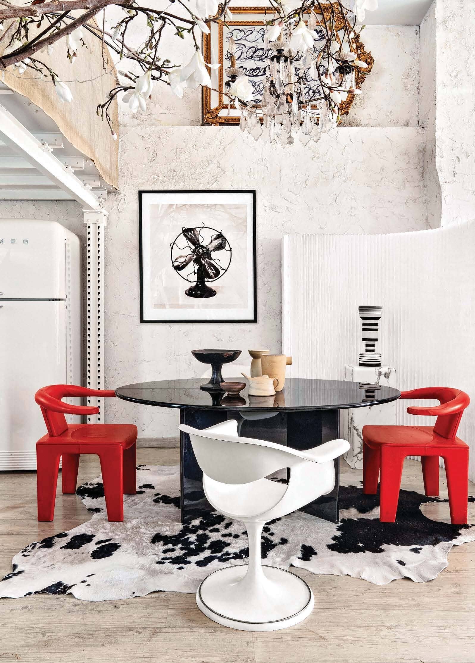
So, we’re in the loft of my latest design crush, photographer Manolo Yllera who, along with shooting fab interiors, definitely has an eye for design himself. Hidden in an old Madrid neighbourhood, between a printer’s and an auto repair shop, it boasts 5 metre high ceilings and is crammed with a wild selection of major design pieces. Lordy.
I’m GAGGED, I tell you. Just look at that chair on the left, it’s a Tre Pezzi by Franco Albini for Cassina. Designed back in 1959, this particular one is a limited edition in Mongolian goat. Could you even?
Styled by Amaya De Toledo, this shoot just popped up in AD China, but you’ll also find more pics on Yllera’s Insta feed.
Photo: Manolo Yllera
Photo: Manolo Yllera
Photo: Manolo Yllera
From Madrid to Bridgehampton, and a veritable design one-two punch, with an interior by Timothy Godbold, styled by Michael Walters.
Godbold’s look is right up my street, always making space for the crazy cool. Ergo, that eye watering Martin & Brockett console moment in the front hall. Pop into the library and you’ll spot a pair of Maralunga chairs by Vico Magistretti upholstered in shearling (it’s deffo a Cassina day). Creep the rest of the interior on Domaine.
Walters’ Instagram (check it out here) is a must follow for interior inspo seekers and midcentury lovers alike. Catch a peek of his projects, plus a slew of fab Palm Springs pics that obvs got me wanting to get back to PS, one of these days.
Photo: Alec Hemer
Photo: Alec Hemer
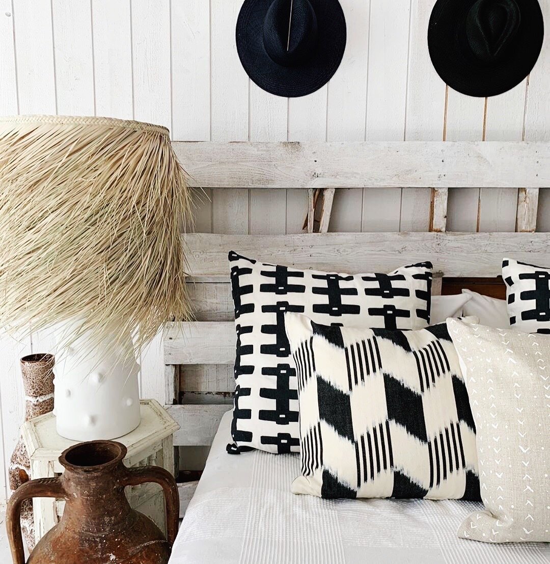
Having shopped flea markets in Paris with designer Montana Burnett, I know what a good eye she has. Monty just posted this snap; a throwback back to last year’s Muskoka pop-up for her online design shop SALT by The Caza Project. Think textured, natural and handmade, all in a pared-back palette of neutrals, black and white. Love. And I have to say, if this is her take on a lakeside cottage, then I’m there with flip-flops on. Roll on summer.


