Starring Roles and Greek Urns

As this week has continued, I think we’re feeling such a shift, such momentum for much needed change in the world. It doesn’t feel like ‘business as usual,’ which must be a good thing. More than statues are toppling right about now…

Cheers, Arren


Can we just make up a word here, please? I’m often taken by an interior and the couldntyoujustmovein-ness of how it looks.

This living room is by the fab Eneia White Interiors, and fits that word to a T. Is that a grasscloth ceiling? Be still my heart. Hello to of-the-moment reeded details. Yes! Can we take a gander at those chairs? By all means. And of course, all of those dark-hued accents ground it perfectly.

I don’t think I’d change a thing…

Below, I’m getting more of the feels with this dining room, part of a cool, calm and collected Upper East Side project by White. Check more or her work here.

Photo: Duke Renders

Photo: Duke Renders

Photo: Nick Glimenakis

Photo: Nick Glimenakis


Details, details, details! Hubert de Givenchy once said “Luxury is in each detail,” and it appears that designer Cheryl Luckett definitely knows that to be true.

As part of her One Room Challenge project, Luckett has not only upholstered doors in linen and finished them with antiqued brass nailheads, she has found hardware with the looks to take a starring role in a silver screen musical.

Sourced through Addison Weeks, the Charlotte-based designer mixed a Michelle Nussbaumer Enamel Star backplate with a Scallop Knob for major Art Deco vibes. In a brass and navy enamel finish the stylish result has left me completely gagged.

For even more style (and more nailheads) check out Cheryl’s upholstery collection for Sylvester Alexander here.

102916606_870264066790994_4860295408070089495_n.jpg

While London-based ceramicist Freya Bramble-Carter imbues her work with a mix of forms and finishes inspired by nature, her recent project, a collab with interior design studio Krokalia, moves in a different direction. Described by Bramble-Carter as a ‘mish-mash’, the pieces combine her organic point of view with Classical Greek pottery. We’re talking inspo from 510-323 BCE.

The urns, vases and bowls, created by Bramble-Carter, and then playfully decorated by designer Pallas Kalamotusis of Krokalia, have such a fresh, handmade feel. Plus, there’s a definite nod to mid-century painted art pottery. More, please!

Freya Bramble-Carter is a member of the Black Artists + Designer’s Guild, a great organization worthy of your support, both financial and otherwise.

Photo: A finished urn and vase

Photo: A finished urn and vase

Photo: Painting in process

Photo: Painting in process

Photo: Ready for the kiln

Photo: Ready for the kiln

Madrid - Bridgehampton - Muskoka

Sometimes, while on the hunt for something to watch, you can end up finding an odd little gem. So, when my husband David stumbled on Danger: Diabolik on the Kanopy streaming platform, I knew we were in for a treat. Filmed in Italy in 1968 it’s definitely camp, with its fair share of sexy costumes, overdubbed actors, dodgy special effects and some major eye candy from the sets. While it was trounced by critics on its initial release, it somehow ended up on Empire mag’s 500 Greatest Movies of All Time back in ‘08. Take a look at the preview here.

Cheers, Arren


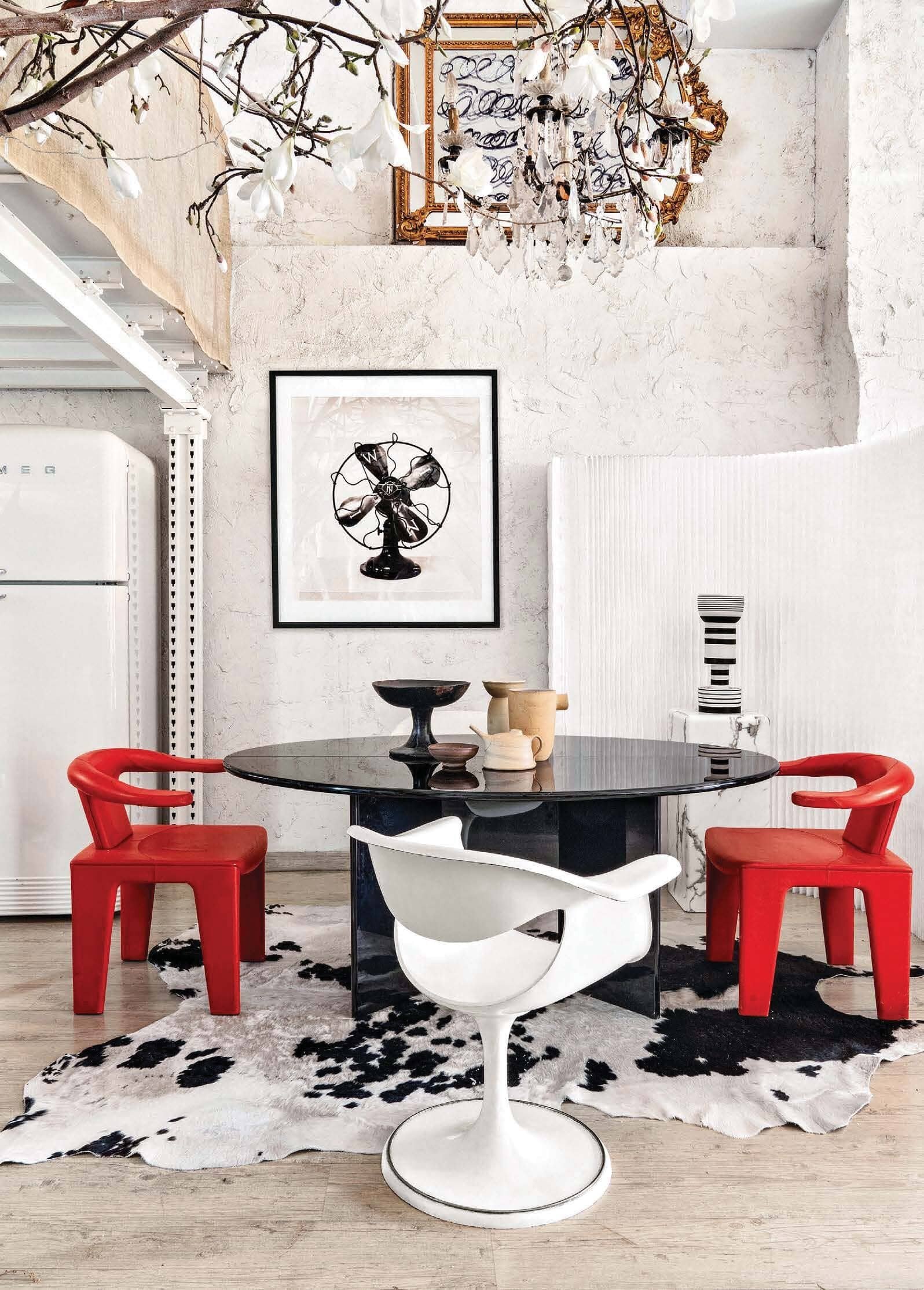
So, we’re in the loft of my latest design crush, photographer Manolo Yllera who, along with shooting fab interiors, definitely has an eye for design himself. Hidden in an old Madrid neighbourhood, between a printer’s and an auto repair shop, it boasts 5 metre high ceilings and is crammed with a wild selection of major design pieces. Lordy.

I’m GAGGED, I tell you. Just look at that chair on the left, it’s a Tre Pezzi by Franco Albini for Cassina. Designed back in 1959, this particular one is a limited edition in Mongolian goat. Could you even?

Styled by Amaya De Toledo, this shoot just popped up in AD China, but you’ll also find more pics on Yllera’s Insta feed.

Photo: Manolo Yllera

Photo: Manolo Yllera

Photo: Manolo Yllera

Photo: Manolo Yllera

Photo: Manolo Yllera

Photo: Manolo Yllera


From Madrid to Bridgehampton, and a veritable design one-two punch, with an interior by Timothy Godbold, styled by Michael Walters.

Godbold’s look is right up my street, always making space for the crazy cool. Ergo, that eye watering Martin & Brockett console moment in the front hall. Pop into the library and you’ll spot a pair of Maralunga chairs by Vico Magistretti upholstered in shearling (it’s deffo a Cassina day). Creep the rest of the interior on Domaine.

Walters’ Instagram (check it out here) is a must follow for interior inspo seekers and midcentury lovers alike. Catch a peek of his projects, plus a slew of fab Palm Springs pics that obvs got me wanting to get back to PS, one of these days.

Photo: Alec Hemer

Photo: Alec Hemer

Photo: Alec Hemer

Photo: Alec Hemer


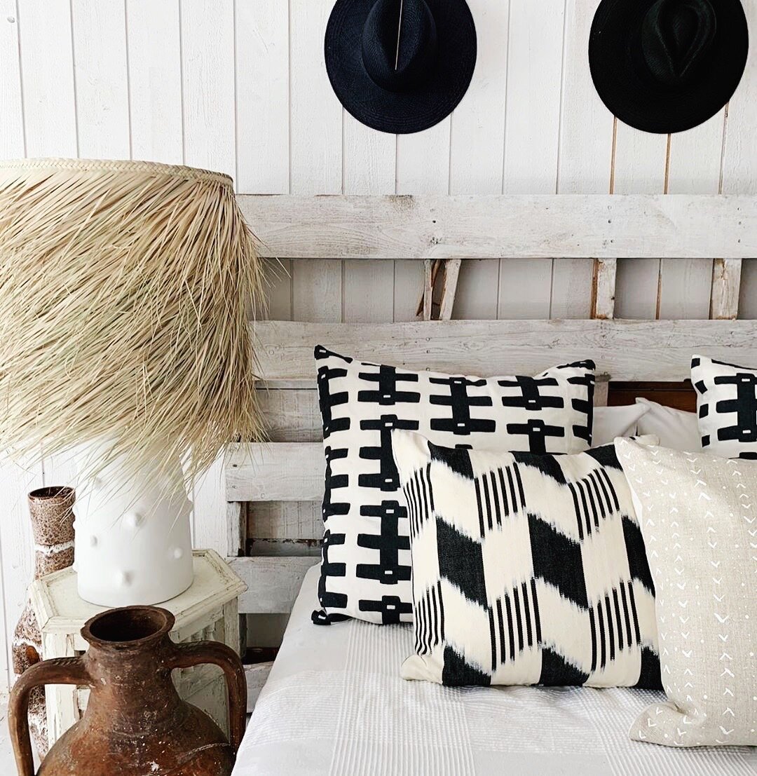
Having shopped flea markets in Paris with designer Montana Burnett, I know what a good eye she has. Monty just posted this snap; a throwback back to last year’s Muskoka pop-up for her online design shop SALT by The Caza Project. Think textured, natural and handmade, all in a pared-back palette of neutrals, black and white. Love. And I have to say, if this is her take on a lakeside cottage, then I’m there with flip-flops on. Roll on summer.

ACS_0954.JPG