Little adjustments

Today I was happy to wear a mask, have my temperature checked, answer a questionnaire and leave my contact info to shop for lighting for a client. Glad to make these little adjustments to my reality as things start to slowly wake up.

And you know what? That’s fine by me.

Cheers, Arren


What’s cooking, Calgary? Well, apparently Jenelle Erickson and Stephanie Smith of SmithErickson definitely know their way around a fab kitchen design.

This first space is giving me all the wows, especially since its a major reno of a ho-hum 90’s home (I’m imagining a dull beige ‘before’). There’s so much great stuff going on here. Not just the colour palette of white, dove and dark grey, but just about every darned thing.

That second kitchen has all of the classics, with the white on white, shaker panels, hits of black and open shelves. But hello, the mitred tiles giving you the frame around the window? That’s the kind of attention to a simple but special design detail that I love - It takes thought, people!

Photo: Michelle Johnson

Photo: Michelle Johnson

Photo: Michelle Johnson

Photo: Michelle Johnson


Okay, so a few folks out there spotted artist Kendra Dandy’s Leopard Coat print in Seana Freeman’s interior, and dropped me a line to say they were longtime fans of Dandy’s work. So, admittedly I have obvs been under a rock!

Yep, you can def call me a new fan of her direct, vibrant and painterly style. But, did you know you can also get her work as wallpaper, too? Check out a couple of my fave florals below, available here through Surface View in the UK. They ship worldwide, so no excuses! With 40 styles on offer, I bet you’ll find one that speaks to you and, as Dandy explains on her Insta, “Getting paid is the sincerest form of flattery.”

Score the rest of her artwork through Society 6.

Image: Watercolour Floral Mural, Orange and Flowers Mural by Kendra Dandy from the Bouffants and Broken Hearts Collection at Surface View

Image: Watercolour Floral Mural, Orange and Flowers Mural by Kendra Dandy from the Bouffants and Broken Hearts Collection at Surface View

Photo: All the Flowers Mural by Kendra Dandy from the Bouffants and Broken Hearts Collection at Surface View

Photo: All the Flowers Mural by Kendra Dandy from the Bouffants and Broken Hearts Collection at Surface View


There are those that can dress a nice table, and then there’s Eric Goujou, the owner of storied tabletop retailer La Tuile à Loup in Paris. For Goujou, the shop’s collection is very much in the vein of that perfect French expression - Art de la table.

With a revolving selection from 30+ French artisans, as well as vintage finds, La Tuile à Loup is a favourite of designers far and wide, and rightly so. You’ll spot Aptware, a classic marbled faience inspired by the coloured soils of Apt, a small town not far from Marseille, as well as painted patterns and splashy, naturalistic designs. Keep an eye out for more loveliness on the store’s Insta, here, which will have you jonesing to host your next dinner party, whenever that might be. Le sigh.

Image: The eye of Tuile à Loup, Eric Goujou

Image: The eye of Tuile à Loup, Eric Goujou

Image: One of a kind marbled dishes

Image: One of a kind marbled dishes

Makeunders and Patterns

Of course I love design, but I have to admit I am a total geek when it comes to science fiction.

So, I was rather pleased to discover that starting back in 1981 NPR had recorded a 14-hour radio drama of the Star Wars trilogy, and you can still listen to it today! Check all the info here.

I plan on popping on the headphones and taking a trip to a galaxy far, far away.

Cheers, Arren


While I might appear to constantly be blatting about coming through with colour, I still appreciate interiors that take a more subtle approach. This living room by designer Dylan Farrell hits that mark, but each piece in this space is a PIECE and, to make that work definitely takes a deft hand.

Curves are key. Look for languidly fluid lines in the of-the-moment Pierre Augustin Rose sofa, and hello, who’d say no to shearling ball toss cushions? And then things stay softly swirly yet sculptural in the handsome Arp table in brass and marble and in the Lady Leveller chair, both designed by Farrell.

This interior is justifiably up for a Belle Magazine and Coco Republic ‘Reader’s Choice’ interior design award. Scope the rest of it out here.

Photo: Felix Forest

Photo: Felix Forest


Let’s get multicultural. Italian designer Elisa Passino was born in Venice, is based in Brussels, and designs stunning tiles made in a small town in Portugal.

I don’t know about you, but tiles definitely speak to me, and in designing an interior, there’s nothing more fun than sourcing and scheming patterns in tile for kitchens and baths. Of course, I’m totally jonesing to use some of Passino’s tiles in a project. Her work is right on trend, mixing Art Deco forms and architectural shapes with a modern eye for colour (think perfectly sun-bleached pastels). Not to mention the fact that each and every tile is screen printed by hand. Love.

The full collection of nine designs is called Geometrie Componibili and comes in an infinite range of fab colour combos. Plus, for a total lewk, Passino has also designed encaustic concrete tiles in solid complementary colours. Clock them here. Love indeed.

Photo: Abaco and Capitello tiles

Photo: Abaco and Capitello tiles

Photo: Screen printing the Obelsico tile

Photo: Screen printing the Obelsico tile


I do enjoy a good makeover, but how about a makeunder?

Timothy Godbold’s latest is deffo in that category - a Palm Beach villa where the ‘before’ might’ve looked more at home on Mob Wives. But, Godbold’s remit was to work with what was there as much as possible (no demolition!), so instead he carefully subtracted, playing up the space and light, and carefully adding in modern touches. Oh, and did I mention the 4 month window he had to get the entire job done?

While the whole house is now stunning (check it here on Introspective, 1stdibs online mag), I love the changes he wrought in the rather OTT kitchen. Scroll down to see what it looked like before Godbold got his hands on it.

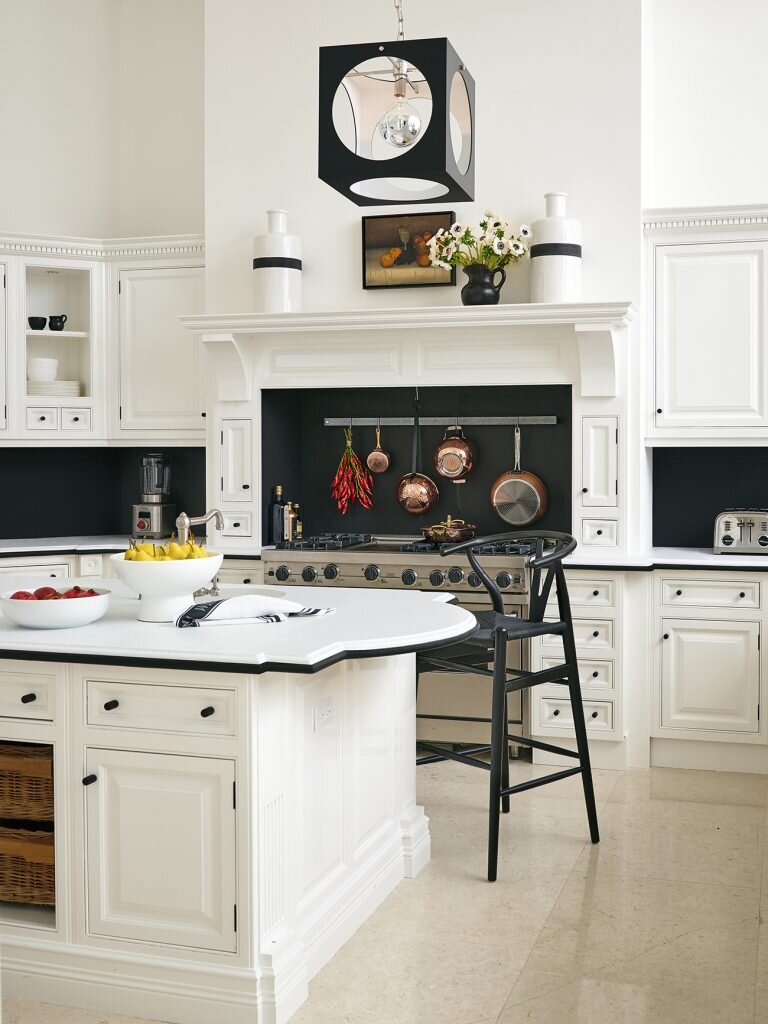
Curlicued corbels were removed, and the faux antiqued cabinetry was freshened up with a coat of Benjamin Moore’s Simply White. Speckled peach granite counters were nixed and replaced with high-contrast white Dolomite marble and black granite trim (the granite also does double-duty as the backsplash). Finally, those tired chandeliers were switched out for a kicky pendant from The Urban Electric Co.

Fab from top to bottom, the interior was shot by Alec Hemer and styled by Michael Walters.

Photo: Alec Hemer

Photo: Alec Hemer

Photo: Palm Beach villa kitchen ‘before’

Photo: Palm Beach villa kitchen ‘before’

guest blog / Jenn Hannotte: Magic ice and other kitchen stories

Jenn Hannotte: You know how when you're living with something you can convince yourself it's OKAY? Like the old fridge that was approximately 4 feet high and held a carton of eggs, a jug of milk and a loaf of bread if you packed it intelligently? NOT OKAY. And I only realized this after my Whirlpool appliances arrived and we set up the new side-by-side fridge (I put the other guy out on the curb for recycling, I didn't hold that much of a grudge!). It wasn't *just* that the kids squealed with disbelief when I got them ice and water FROM THE FRONT OF THE FRIDGE like a magician (we're simple people), but the fact that it's totally roomy and still counter-depth sold me. And the new dishwasher? Our old one was likened to a garbage bag with a hose attached by the appliance installer - and he wasn't far off. We had to close all the doors to the kitchen and basically vacate the house when that thing was running. My new dishwasher is quiet, yes, but it also has cool features (like Sheer Clean) and is smartly designed - something I can really appreciate after using our completely inefficient old monster. And, then there's the slide-in range that leaves more room for the birch plywood backsplash to do its thing, and which has a quick-heat convection oven to get those frozen pizzas cooked chop-chop! So why white, instead of the more expected stainless? White is fresh and modern and especially in a small kitchen like mine, it helps to unite rather than divide. 

Once the engine of the kitchen was installed, Angus Fergusson and Arren came over to shoot these stunning photos. My perpetual kitchen reno is all done and what's the verdict? For me (the only client who matters!), I absolutely love the ambience of this room, it's less a kitchen in the traditional sense, and more a cozy retreat. *AND* everything works, works well and looks good doing it.

Here are the deets:

Counter Depth Side-By-Side Refigerator, Whirlpool Gold Tall Tub Dishwasher,  Electric Slide-In Range. All Whirlpool.

Vintage industrial bins, Avril Loreti tea towel, Imm Living cruet. All Russet & Empire.

Lighting Design. Matthew Birch for Russet & Empire.

Kitchen Design. Russet & Empire Interiors.

Ikea kitchen cabinets, butcherblock counter, Ringskar faucet, Tral work lamp. West Elm Tripod Table. Breville Barista Express espresso machine. Areaware Numbers LED Clock.

>>> Catch the rest of Jenn's kitchen reno here, and click here to check out Jenn's take on style.