Of course I love design, but I have to admit I am a total geek when it comes to science fiction.
So, I was rather pleased to discover that starting back in 1981 NPR had recorded a 14-hour radio drama of the Star Wars trilogy, and you can still listen to it today! Check all the info here.
I plan on popping on the headphones and taking a trip to a galaxy far, far away.
Cheers, Arren
While I might appear to constantly be blatting about coming through with colour, I still appreciate interiors that take a more subtle approach. This living room by designer Dylan Farrell hits that mark, but each piece in this space is a PIECE and, to make that work definitely takes a deft hand.
Curves are key. Look for languidly fluid lines in the of-the-moment Pierre Augustin Rose sofa, and hello, who’d say no to shearling ball toss cushions? And then things stay softly swirly yet sculptural in the handsome Arp table in brass and marble and in the Lady Leveller chair, both designed by Farrell.
This interior is justifiably up for a Belle Magazine and Coco Republic ‘Reader’s Choice’ interior design award. Scope the rest of it out here.
Photo: Felix Forest
Let’s get multicultural. Italian designer Elisa Passino was born in Venice, is based in Brussels, and designs stunning tiles made in a small town in Portugal.
I don’t know about you, but tiles definitely speak to me, and in designing an interior, there’s nothing more fun than sourcing and scheming patterns in tile for kitchens and baths. Of course, I’m totally jonesing to use some of Passino’s tiles in a project. Her work is right on trend, mixing Art Deco forms and architectural shapes with a modern eye for colour (think perfectly sun-bleached pastels). Not to mention the fact that each and every tile is screen printed by hand. Love.
The full collection of nine designs is called Geometrie Componibili and comes in an infinite range of fab colour combos. Plus, for a total lewk, Passino has also designed encaustic concrete tiles in solid complementary colours. Clock them here. Love indeed.
Photo: Abaco and Capitello tiles
Photo: Screen printing the Obelsico tile
I do enjoy a good makeover, but how about a makeunder?
Timothy Godbold’s latest is deffo in that category - a Palm Beach villa where the ‘before’ might’ve looked more at home on Mob Wives. But, Godbold’s remit was to work with what was there as much as possible (no demolition!), so instead he carefully subtracted, playing up the space and light, and carefully adding in modern touches. Oh, and did I mention the 4 month window he had to get the entire job done?
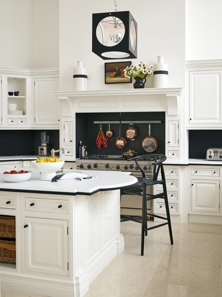
While the whole house is now stunning (check it here on Introspective, 1stdibs online mag), I love the changes he wrought in the rather OTT kitchen. Scroll down to see what it looked like before Godbold got his hands on it.
Curlicued corbels were removed, and the faux antiqued cabinetry was freshened up with a coat of Benjamin Moore’s Simply White. Speckled peach granite counters were nixed and replaced with high-contrast white Dolomite marble and black granite trim (the granite also does double-duty as the backsplash). Finally, those tired chandeliers were switched out for a kicky pendant from The Urban Electric Co.
Fab from top to bottom, the interior was shot by Alec Hemer and styled by Michael Walters.
Photo: Alec Hemer
Photo: Palm Beach villa kitchen ‘before’


