Maximalism, Pattern and Prints

All this sunshine and hot weather has me craving intense colour and pattern. I guess you could say I’m feeling very Cabana magazine…

Cheers, Arren


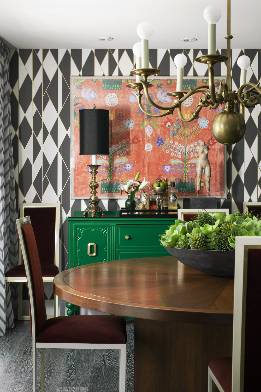
I can count the number of times I’ve been to Calgary on one hand, so certainly not enough to get a real feel for the place. That’s definitely got to change, especially after scoping out the home of designer Martine Ast, who works at renowned interior designer Paul Lavoie’s design firm.

It’s certainly a complete lewk - Colour, pattern and fun (yes, fun!) tossed with a practiced eye into an untouched 70’s home that Ast found in Calgary’s Varsity Estates ‘hood. And the art! That living room wall painted black is such a smart design move, since it’s a perfect setting for 12 bright abstracts by artist Aron Hill.

You’ll spot vintage pieces throughout, including the barmy trellis and bird print chairs in the living room (yes, the fabric is original). Moving on to the dining room, where the standout Kelly green bureau was an old family piece that Ast had lacquered into something altogether more eye catching. Want more? Read all about the project here.

Photo: Eymeric Widling

Photo: Eymeric Widling

Photo: Eymeric Widling

Photo: Eymeric Widling


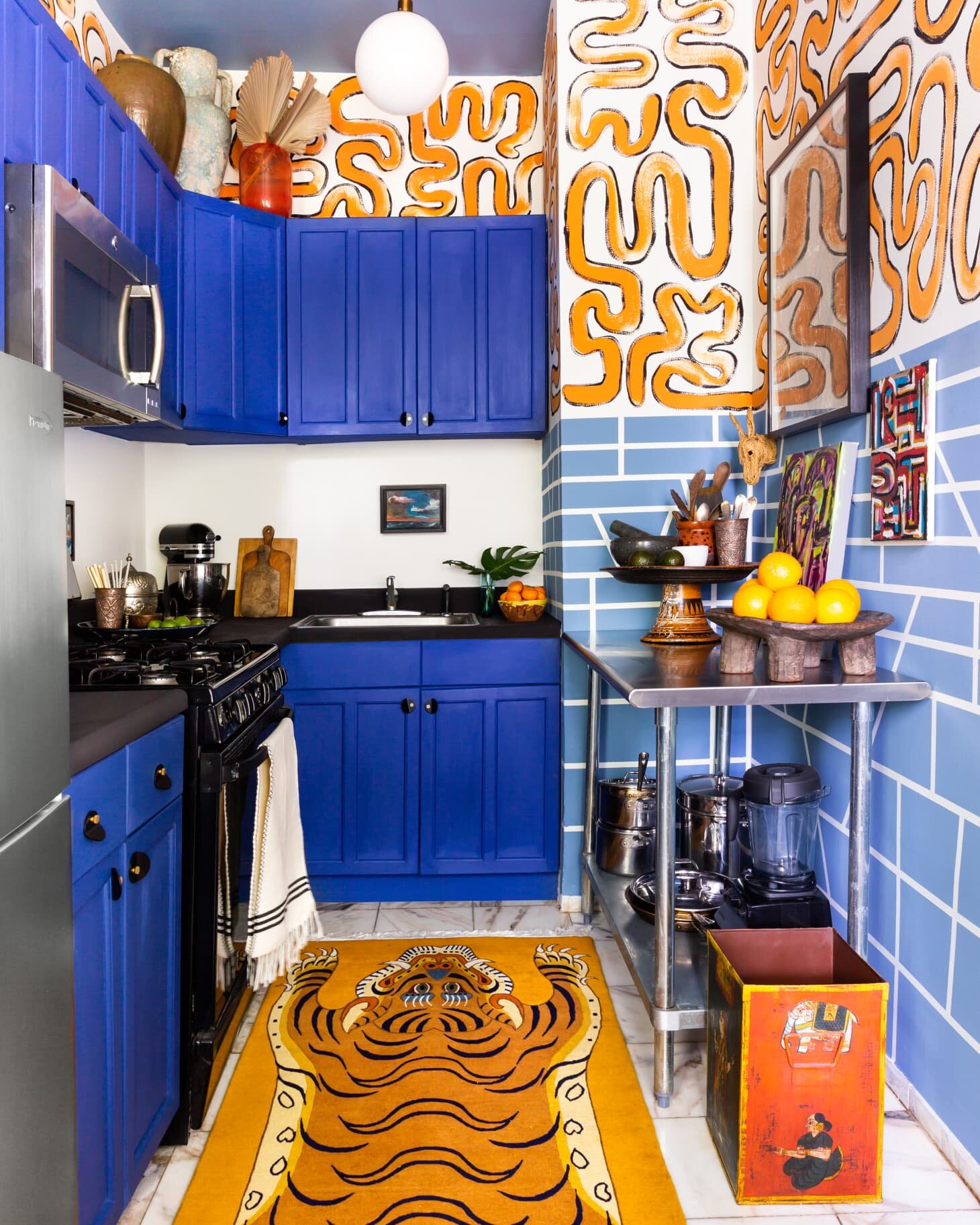
Designer Anthony Gianacakos is a self-described Maximalist. One look at the NYC rental apartment kitchen he tackled with painters tape, a few cans of Annie Sloan Chalk Paint and a wild dose of creativity is all you need to figure that out.

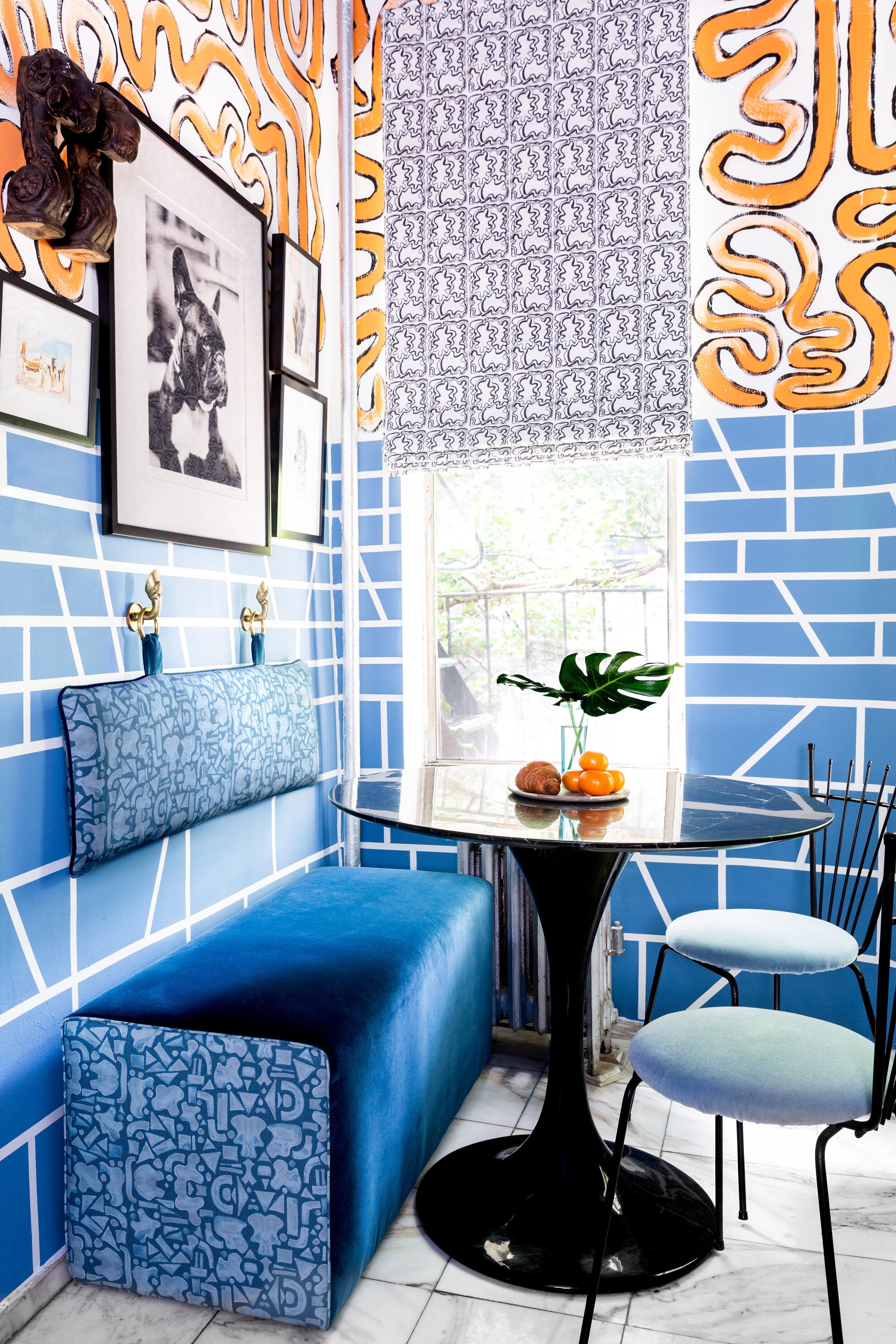
The look was inspired by a trip to Lisbon - think tiles and grafitti - and I’m loving the commitment to colour and pattern in such a small space. Taking on a project like this is no mean feat, and included painting the cabinets by hand in that zingy cobalt blue, not to mention taping-off the tile pattern and then free-handing the orange squiggles above.

Gianacakos’s interior design projects are all imbued with a similarly bold aesthetic, so check out his portfolio here when you have a chance. He’s also designed prints for fabrics and wallpapers in his signature maxed-out style, and you’ll spot his linen Mosaico print on that sweet banquette tucked into a corner of the kitchen.

Photo: Marta Xochilt Perez

Photo: Marta Xochilt Perez

Photo: Marta Xochilt Perez

Photo: Marta Xochilt Perez


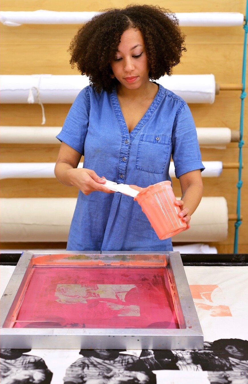
While art of any kind lifts us up and makes us both think and feel, for me it’s the graphic power of screen prints that have a direct line to my heart. I’ve loved checking out the Black Women of Print account on Instagram, founded by printmaker and visual artist Tanekeya Word as a place to discover and celebrate Black women printmakers, past, present and future.⁣⁣

While the work itself is stellar, I do love a look behind the scenes - Word’s own mood board allows a peek into her artistic process and includes her Black is Beautiful print. You’ll spot a rack of drying prints inspired by Hue Magazine by artist Angela Pilgrim, and that final shot shows artist Stephanie Santana at work on one of her pieces influenced by old family photos.

For more on the artists involved, click here to read a feature in Pressing Matters magazine. Even better - buy a print or two directly from the artists and get them up on your walls.

Photo: 2019 Mood Board, Tanekeya Word

Photo: 2019 Mood Board, Tanekeya Word

Photo: Multi Color Hue Print, Angela Pilgrim

Photo: Multi Color Hue Print, Angela Pilgrim

Photo: Artist Stephanie Santana at work on a print

Photo: Artist Stephanie Santana at work on a print

Bold, Blue, Boho

Part of the fun for me in putting these posts together is the hunt. Trawling through everything that’s out there to find the creativity that makes me think, yeah, there is so much great stuff worth digging into. So, I hope you’re enjoying reading these missives as much as I enjoy pulling the threads on the things that I find inspiring.

Scroll up! Today we leap between the creative scenes in London and Paris, and then finish up with a little something in Montreal.

Cheers, Arren


Can’t wait to get my hands on a copy of Bold British Design from photographer Sarah Hogan and writer and creative director Emilio Pimentel-Reid. It’s chockablock with creative talents and inspiring interiors and a must-have for any design-driven bookshelf or well-appointed coffee table.

Pimentel-Reid captured exactly why this book’s theme resonates with me in an interview with interior designer Kit Kemp for her blog, “The designers are bold not just in the sense of being colourful or quirky like illustrator Camilla Perkins, they are deeply original, fearless in their interior choices, either breaking the mould or pushing the boundaries of creativity. Designer and environmentalist, Sebastian Cox, for example has his own woodland from which he harvests timber for his furniture and even grows light shades out of fungus.

They are also bold in personal ways, often unconstrained by rules, joyful (none more so than British Nigerian Yinka Ilori) and courageous both in how an individual product is made or how disparate elements are combined in a room. They also each exemplify many of the characteristics that make this country unique: a sense of humour and an appreciation for history, craft and modernity.”

While you can definitely snap up a copy on Amazon, please support your local independent bookstore!

Photo: Yinka Ilori by Sarah Hogan

Photo: Yinka Ilori by Sarah Hogan

Photo: Sarah Hogan

Photo: Sarah Hogan


I’ll always applaud a well edited vignette, and this one is - excuse my French - some next level shit. It’s found in the Parisian Directoire period apartment of fashion designer Alexis Mabille, and is actually in the kitchen - Can you even? A close perusal of the shelf reveals a collection that includes artwork by Adrien Dirand and Louis-Marie de Castelbajac, along with two Alberto Giacometti plaster heads. But the pop, if you will, is that surprising slew of classic blue Wedgwood Jasperware. Grandmothers beware, your china cabinet may imminently get raided…

With interiors by go-to French architecture and design firm, Humbert & Poyet, you’ll definitely want to see more. Head here to AD for the full reveal, then click here to see a more relaxed, personal take on the space by The Socialite Family.

Photo: Francis Amiand

Photo: Francis Amiand

Photo: Francis Amiand

Photo: Francis Amiand


You can count me as a new fan of Montreal-based design firm, Anthology Creative Studio. Helmed by Kathia Lagacé-Nadon & Karim Guelmi, the firm’s interiors feel perfectly layered and collected over time, and are a natural fit with the #slowdesign movement.

And this kitchen? Well, it’s a stunner, with acres of countertops and dark blue cabinetry, not to mention all the copper fixturing. While copper has long been touted as a hot metal tone for interiors, it’s rare to see it used so well. I know you want to see more, so click here to see the rest of what Anthology Creative Studio has dubbed their Bohemian Vintage apartment.

101297877_293293475398612_9151549897218981888_o.jpg
Kitchen-03.jpg

Something old and something new

Grace Bonney, the founder of Design*Sponge, has always been a thoughtful voice in the world of design. Now she’s stepping back from her influential Instagram account and allowing important new voices to take centre stage. As Bonney explains, “Starting this week I will be working to turn this from a blog-turned-personal platform into a community page dedicated to the voices and work of designers of color.”

Up first on the Design*Sponge Insta is designer NeKeia McSwain, the president of the Black Interior Designer’s Network and owner of Kimberly + Cameron Interiors, who’ll be sharing her style with the account’s 890,000 followers.

Cheers, Arren


O.M.G. Those chairs!

This snap is of one of designer Benito Escat’s latest finds, a set of vintage Missoni rattan dining chairs. I could decide to stop right here for today, and it would be fine - They’re just that good!!!

Escat and his partner, Pol Castells, are the creative duo behind Spanish interior design firm, Quintana Partners, whose look is defined by layered history and vintage fabulousness. It’s all about the patina, baby!

You can glimpse one of their latest projects, hotel La Bionda on Spain’s Costa Brava coast, in that second snap below. Oh, and the Missoni chairs? If you fancy your own, you might just be able to score a set right now on Chairish

106119375_2536791663204608_7381285977846390258_n.jpg
105943624_362338404750160_5866514491488384556_n (1).jpg

I do love a good kitchen design, especially one as handsome as this in a palette of mixed woods with a few hits of gold and black for good measure. We can thank designer Nikki Klugh for this thoughtfully planned space, but for me I’m completely taken with those herringbone floors.

Which got me thinking as to what else was out there for wood flooring. Parquet, anyone? While the name might strike fear into most, and make you think of golden oak flooring in 80’s condos, there is lots out there that’s worth a look.

While it’s not strictly parquet, the Bloc wood tiles by Studio Job for Bisazza, certainly have a similar vibe and backstory. It’s that feel, for sure, but so much more contemporary. And hexagon - yes, please. Anything hexagon with a trompe-l'œil effect will definitely get a high-five from me.

photo: Brady Architectural Photography

photo: Brady Architectural Photography

studio-job-wood-bisazza-tiles-london-design-festival-2016_dezeen_2364_col_3-852x1517.jpg

We’ll finish off today with a bit of inspo from Ikea, with a look forward to what our Swedish friends will be releasing in their new catalogue in August.

The styling is on point and I’m loving the colour palette, and hey, I’m already a fan of the mid-century inspired Rönninge chair in that great mossy green. Oh, and that storage workhorse, the Ivar shelving system, gets an on-trend update with swish bamboo doors. What’s not to love?

PH170248.jpg
PH170281 1.jpg

Little adjustments

Today I was happy to wear a mask, have my temperature checked, answer a questionnaire and leave my contact info to shop for lighting for a client. Glad to make these little adjustments to my reality as things start to slowly wake up.

And you know what? That’s fine by me.

Cheers, Arren


What’s cooking, Calgary? Well, apparently Jenelle Erickson and Stephanie Smith of SmithErickson definitely know their way around a fab kitchen design.

This first space is giving me all the wows, especially since its a major reno of a ho-hum 90’s home (I’m imagining a dull beige ‘before’). There’s so much great stuff going on here. Not just the colour palette of white, dove and dark grey, but just about every darned thing.

That second kitchen has all of the classics, with the white on white, shaker panels, hits of black and open shelves. But hello, the mitred tiles giving you the frame around the window? That’s the kind of attention to a simple but special design detail that I love - It takes thought, people!

Photo: Michelle Johnson

Photo: Michelle Johnson

Photo: Michelle Johnson

Photo: Michelle Johnson


Okay, so a few folks out there spotted artist Kendra Dandy’s Leopard Coat print in Seana Freeman’s interior, and dropped me a line to say they were longtime fans of Dandy’s work. So, admittedly I have obvs been under a rock!

Yep, you can def call me a new fan of her direct, vibrant and painterly style. But, did you know you can also get her work as wallpaper, too? Check out a couple of my fave florals below, available here through Surface View in the UK. They ship worldwide, so no excuses! With 40 styles on offer, I bet you’ll find one that speaks to you and, as Dandy explains on her Insta, “Getting paid is the sincerest form of flattery.”

Score the rest of her artwork through Society 6.

Image: Watercolour Floral Mural, Orange and Flowers Mural by Kendra Dandy from the Bouffants and Broken Hearts Collection at Surface View

Image: Watercolour Floral Mural, Orange and Flowers Mural by Kendra Dandy from the Bouffants and Broken Hearts Collection at Surface View

Photo: All the Flowers Mural by Kendra Dandy from the Bouffants and Broken Hearts Collection at Surface View

Photo: All the Flowers Mural by Kendra Dandy from the Bouffants and Broken Hearts Collection at Surface View


There are those that can dress a nice table, and then there’s Eric Goujou, the owner of storied tabletop retailer La Tuile à Loup in Paris. For Goujou, the shop’s collection is very much in the vein of that perfect French expression - Art de la table.

With a revolving selection from 30+ French artisans, as well as vintage finds, La Tuile à Loup is a favourite of designers far and wide, and rightly so. You’ll spot Aptware, a classic marbled faience inspired by the coloured soils of Apt, a small town not far from Marseille, as well as painted patterns and splashy, naturalistic designs. Keep an eye out for more loveliness on the store’s Insta, here, which will have you jonesing to host your next dinner party, whenever that might be. Le sigh.

Image: The eye of Tuile à Loup, Eric Goujou

Image: The eye of Tuile à Loup, Eric Goujou

Image: One of a kind marbled dishes

Image: One of a kind marbled dishes

Makeunders and Patterns

Of course I love design, but I have to admit I am a total geek when it comes to science fiction.

So, I was rather pleased to discover that starting back in 1981 NPR had recorded a 14-hour radio drama of the Star Wars trilogy, and you can still listen to it today! Check all the info here.

I plan on popping on the headphones and taking a trip to a galaxy far, far away.

Cheers, Arren


While I might appear to constantly be blatting about coming through with colour, I still appreciate interiors that take a more subtle approach. This living room by designer Dylan Farrell hits that mark, but each piece in this space is a PIECE and, to make that work definitely takes a deft hand.

Curves are key. Look for languidly fluid lines in the of-the-moment Pierre Augustin Rose sofa, and hello, who’d say no to shearling ball toss cushions? And then things stay softly swirly yet sculptural in the handsome Arp table in brass and marble and in the Lady Leveller chair, both designed by Farrell.

This interior is justifiably up for a Belle Magazine and Coco Republic ‘Reader’s Choice’ interior design award. Scope the rest of it out here.

Photo: Felix Forest

Photo: Felix Forest


Let’s get multicultural. Italian designer Elisa Passino was born in Venice, is based in Brussels, and designs stunning tiles made in a small town in Portugal.

I don’t know about you, but tiles definitely speak to me, and in designing an interior, there’s nothing more fun than sourcing and scheming patterns in tile for kitchens and baths. Of course, I’m totally jonesing to use some of Passino’s tiles in a project. Her work is right on trend, mixing Art Deco forms and architectural shapes with a modern eye for colour (think perfectly sun-bleached pastels). Not to mention the fact that each and every tile is screen printed by hand. Love.

The full collection of nine designs is called Geometrie Componibili and comes in an infinite range of fab colour combos. Plus, for a total lewk, Passino has also designed encaustic concrete tiles in solid complementary colours. Clock them here. Love indeed.

Photo: Abaco and Capitello tiles

Photo: Abaco and Capitello tiles

Photo: Screen printing the Obelsico tile

Photo: Screen printing the Obelsico tile


I do enjoy a good makeover, but how about a makeunder?

Timothy Godbold’s latest is deffo in that category - a Palm Beach villa where the ‘before’ might’ve looked more at home on Mob Wives. But, Godbold’s remit was to work with what was there as much as possible (no demolition!), so instead he carefully subtracted, playing up the space and light, and carefully adding in modern touches. Oh, and did I mention the 4 month window he had to get the entire job done?

While the whole house is now stunning (check it here on Introspective, 1stdibs online mag), I love the changes he wrought in the rather OTT kitchen. Scroll down to see what it looked like before Godbold got his hands on it.

Curlicued corbels were removed, and the faux antiqued cabinetry was freshened up with a coat of Benjamin Moore’s Simply White. Speckled peach granite counters were nixed and replaced with high-contrast white Dolomite marble and black granite trim (the granite also does double-duty as the backsplash). Finally, those tired chandeliers were switched out for a kicky pendant from The Urban Electric Co.

Fab from top to bottom, the interior was shot by Alec Hemer and styled by Michael Walters.

Photo: Alec Hemer

Photo: Alec Hemer

Photo: Palm Beach villa kitchen ‘before’

Photo: Palm Beach villa kitchen ‘before’

Bringing The Looks

I’ve been having a bit of a design moral dilemma on Instagram with the number of fabulous interiors which, once you check in on the details, do not actually exist. Yep, 3D visualizations are the deepfakes of the interior world, and they’re kind of bumming me out.

You see, to me at least, part of the art of interior design is dealing with the reality of clients, budgets, contractors and trades - plus the sourcing of fabulous furnishings - to end up with something that’s real and tangible. That’s where the real beauty is.

Thoughts? Should I just get with the program, double tap and be done with it?

Cheers, Arren


While my accidental fascination with green continues, this particular room is so much more than the wall colour. Truthfully, it has also been given a generous helping hand by those mile high baseboards and that deep panelled window, but I have to tell you, this time I’m going gaga for the furnishings.

The shot is from that design mag marvel, House & Garden UK, which always brings serious LOOKS to the fore. I wish I could tell you the creative minds behind it, but alas the Google machine is no help - Any ideas?

Okay, back to the bits and bobs that make it special. Let’s start with the fab Hepplewhite sofa from Ensembliers London, shall we? The blue and white fabric is TO DIE FOR, but it’s the eye for detail and the fully upholstered legs that are really delivering the goods. This crew is not messing around. That sofa, plus the weird tramp art style table and kooky yellow wrapped frame chair, oh, and the art! It all adds up to perfection.

edward.jpg

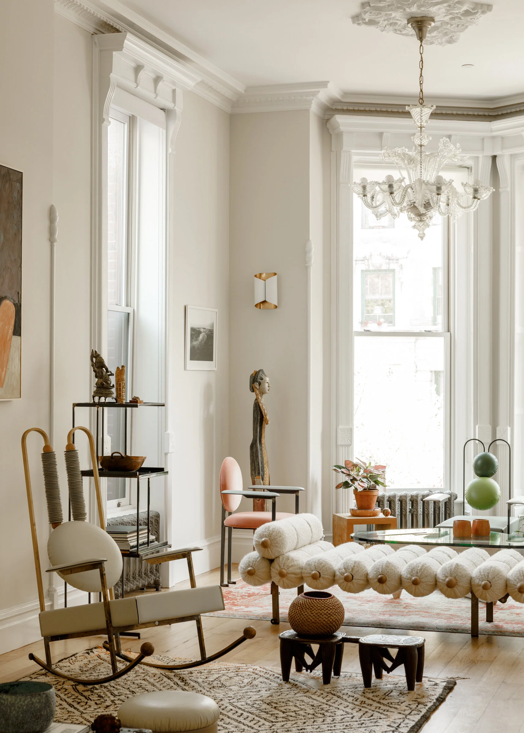
While many of you - well, maybe it’s just me - constantly scream, not another Jeanneret chair, when trawling through interior images, help is at hand. This week, I’ve been spotting chairs by designer Mario Milana instead. And I couldn’t be happier.

If the first shot below looks familiar, that’s because Milana’s rather stunning Brooklyn abode was featured in AD, and has just made a reappearance in the pages of Living - Corriere de la Serra. That’s his Rulla Lotto rocker in the foreground, and his Masand lounge in behind, but it’s his fun, fun, fun dePostura dining chairs that seem to be having a bit of a moment. Literally. Chair. Heaven.

Photo: Max Burhalter. Styling: Colin King

Photo: Max Burhalter. Styling: Colin King

dePostura dining chair. Photo: @PalermoUno

dePostura dining chair. Photo: @PalermoUno


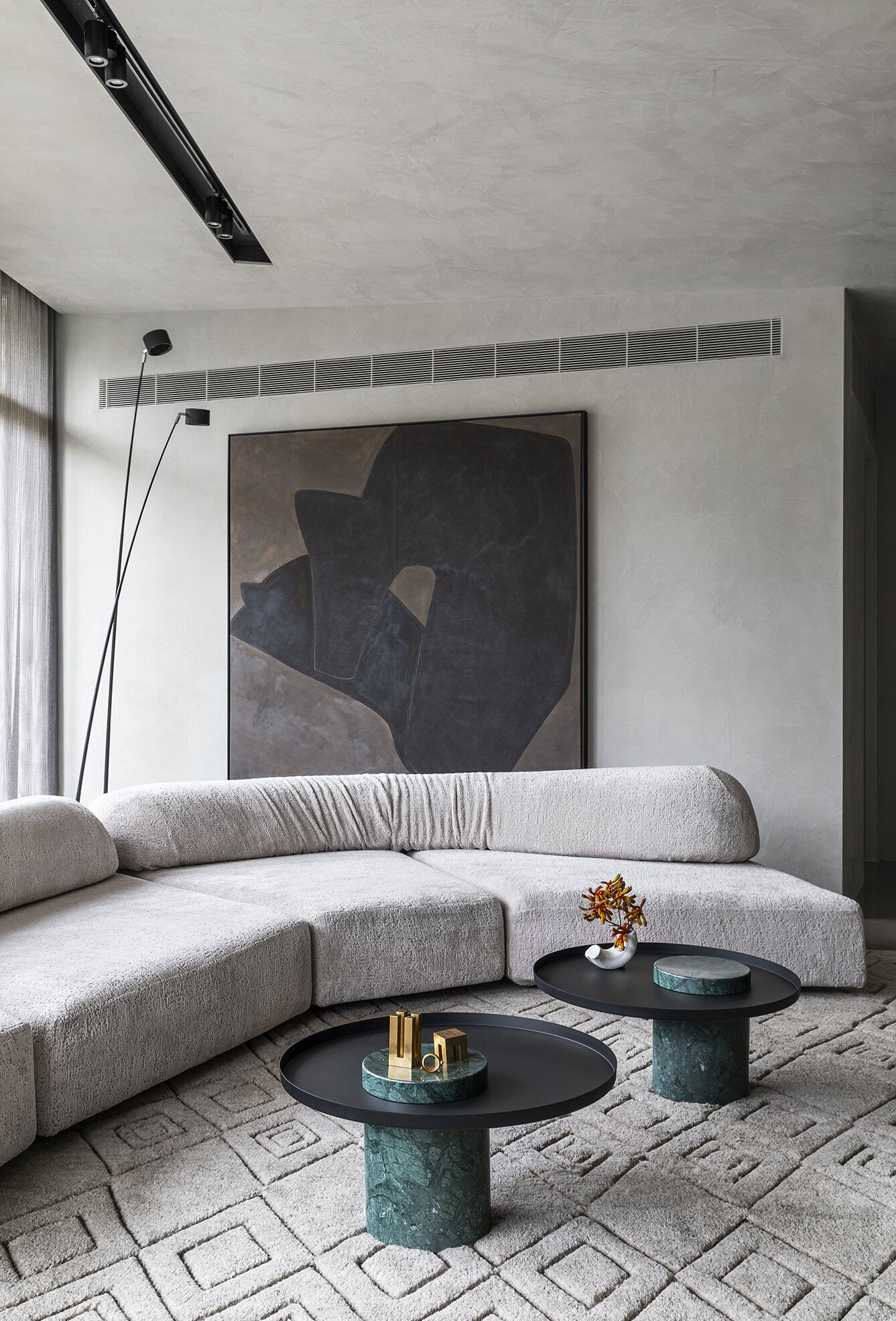
Australian designer Chelsea Hing’s latest project is a stunner. Orchard House is the name, and Hing describes it best - “Avant-garde furniture, art & objects were layered to create a deliberate tension in an otherwise monochromatic palette.”

That tension definitely comes to play in the kitchen, with the scene stealing Verde Rameggiato marble slab counter set against the murky blue-green painted cabinetry and that boffo Shogun lamp from Artemide. And hello, that lamp! Designed in 1986 by Mario Botta it has deservedly attained design icon status.

Moving onto the living room, I had a complete, have I died and gone to heaven, moment over the Edra On The Rocks modular sofa and Indian green marble Salute tables from La Chance. Lordy!

You really must check out the complete Orchard House interior on Hing’s website. Styled by Beck Simon, it’s a winner baby.

Photo: Rhiannon Taylor

Photo: Rhiannon Taylor

Photo: Rhiannon Taylor

Photo: Rhiannon Taylor

We all need a little inspo

Inspiration comes in all shapes and sizes, often completely out the blue. and in these difficult days - well - we could all use a little beauty to get us through…

So, here we go with an occasional series of things that have caught my eye. Yes, many will be via Insta, but who knows what else I can dig up? And of course, if you’d like to send me any recos, please drop me a line here.

Cheers, Arren


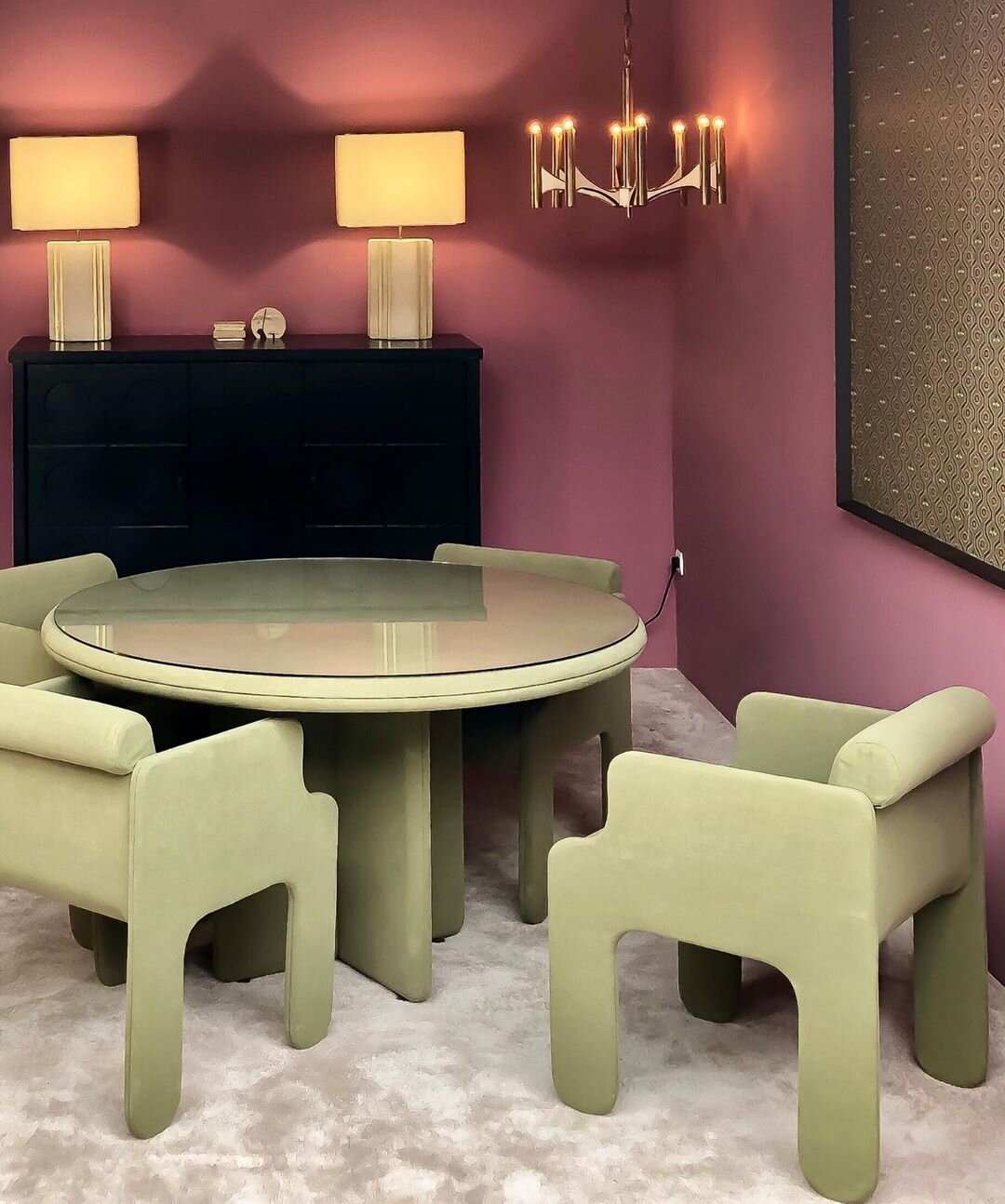
@objectsdaffection aka O.D.A. Galerie is a space in storied Paris flea market Marché Paul Bert curated by stylists and set designer Eve Ducroq and Arnaud Dollinger. In the room sets they create, look for an eclectic selection of vintage pieces styled to give the sense that some very chic homeowners have just strolled off screen to live a fantastically creative life. And, speaking of life, the chalky lime and plum combo in this space is definitely giving it to me right now.


@damienlangloismeurinne_studio aka interior architect Damien Langlois-Meurinne has an eye for sculpture within the architecture of an interior, ergo this stunner of a plaster fireplace. That, plus all of the softly curving furniture in this space have me completely swooning. Modern Parisian glamour at it’s best.

69896741_682032118948116_4887596085082300550_n (1).jpg

Let’s finish with a pop of colour. I love a kitchen island that steps it up in something bright so here, in this flat in Marseille by Paris-based designers @novaobiecta, it’s all of that kelly green, plus those cobalt framed stools. Gah!