Pattern, Pattern, Chair

A fun part of my schedule this week was shooting remotely at home for Citytv’s Cityline. The subject was our principal bedroom, a space that had a forced renovation due to some major construction we endured over the summer.

Things have definitely changed in the space, and for the better for sure. I can’t wait to share the results with you, and it’s extra fun looking back at how the space looked when it was shot by Angus Fergusson for House & Home magazine more than 11 years ago.

Cheers, Arren


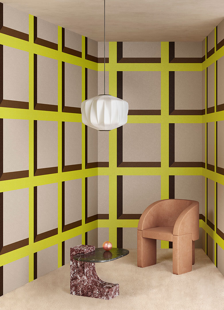
Dots and squares, oh my! Just say yes to this rather fab collab between creative consultants and 3D designers Terzo Piano and Or.nami wallpaper, which playfully toys with trompe-l'œil to stunning visual effect. Think simple graphic shapes and drop shadows inspired by architectural design.

Available in either vinyl or rather covetable silk, there are 4 designs in different colourways to whet your whistle - I’m already dreaming and scheming of a space where I can use them.

Terzo Piano X Or.nami - Pattern 2

Terzo Piano X Or.nami - Pattern 2

Terzo Piano X Or.nami - Pattern 3

Terzo Piano X Or.nami - Pattern 3


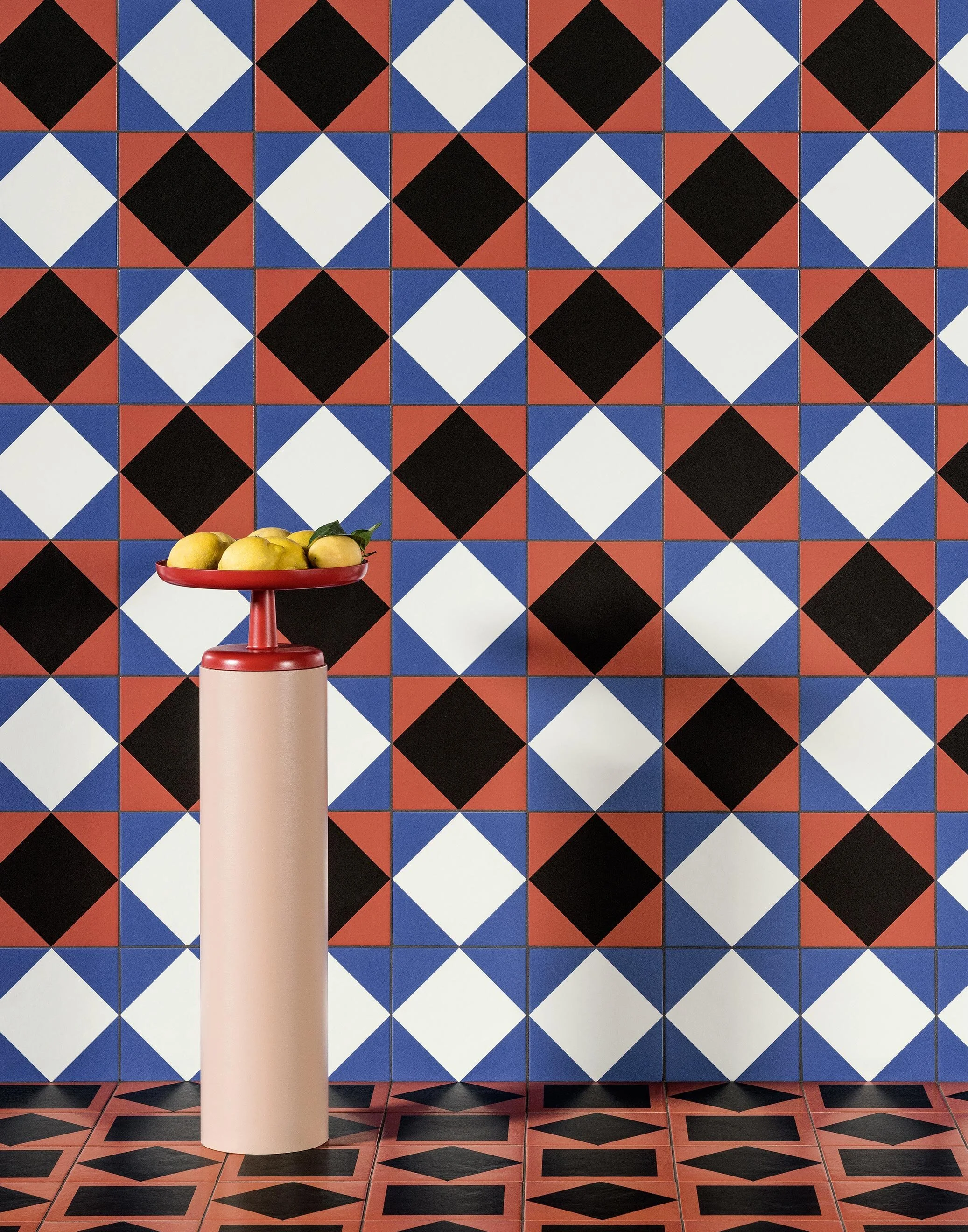
While one of my current projects includes a chic little bathroom in white and grey, this brand new collection by artist and designer Nathalie Du Pasquier for Mutina tiles definitely has me drooling.

More is definitely more here. Du Pasquier’s wonderfully barmy layering of pattern on pattern is key, with a perfect mix of fifties modernism and vintage designs all thrown together with gay abandon. And, if the 41 tiles in the Mattonelle Margherita collection aren’t enough, there’s also 11 coordinating paint colours for all you OCD design fans out there that want everything to match. Seriously.

Oh, and the art direction for the collection’s launch? It’s all feeling very cinematic and inspirational, and honestly I could happily post every single shot, but will show some restraint with the three faves below. Scope out the rest of the collection, here.

Wall: Star, Stripes, Marghe Black. Floor: Double Red, Stripes.

Wall: Star, Stripes, Marghe Black. Floor: Double Red, Stripes.

Wall: Marghe White, Frame Black, Marghe Half White, Marghe Half Black, Line. Floor: Petals, Line. Margherita Paint: Sand Matt.

Wall: Marghe White, Frame Black, Marghe Half White, Marghe Half Black, Line. Floor: Petals, Line. Margherita Paint: Sand Matt.

Wall: Marghe Light Blue, Stripes, Star, Kite White, Square Black, Marghe Black. Floor: Marghe Light Blue, Double Red, Stripes.

Wall: Marghe Light Blue, Stripes, Star, Kite White, Square Black, Marghe Black. Floor: Marghe Light Blue, Double Red, Stripes.


Am I the only person that dreams about chairs? This one in particular sent me down a bit of an internet rabbit hole, to be sure.

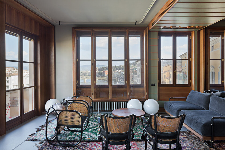
I first spotted the vintage originals in this stunning apartment in Florence, with masterfully edited interiors by Massimo Adario (click here to see more). Though they couldn’t look more at home in this space with views across the Arno, these spectacularly curvy seats were originally designed by Czech architect Jan Bočan for furnishing the Embassy of Czechoslovakia in Stockholm in 1972.

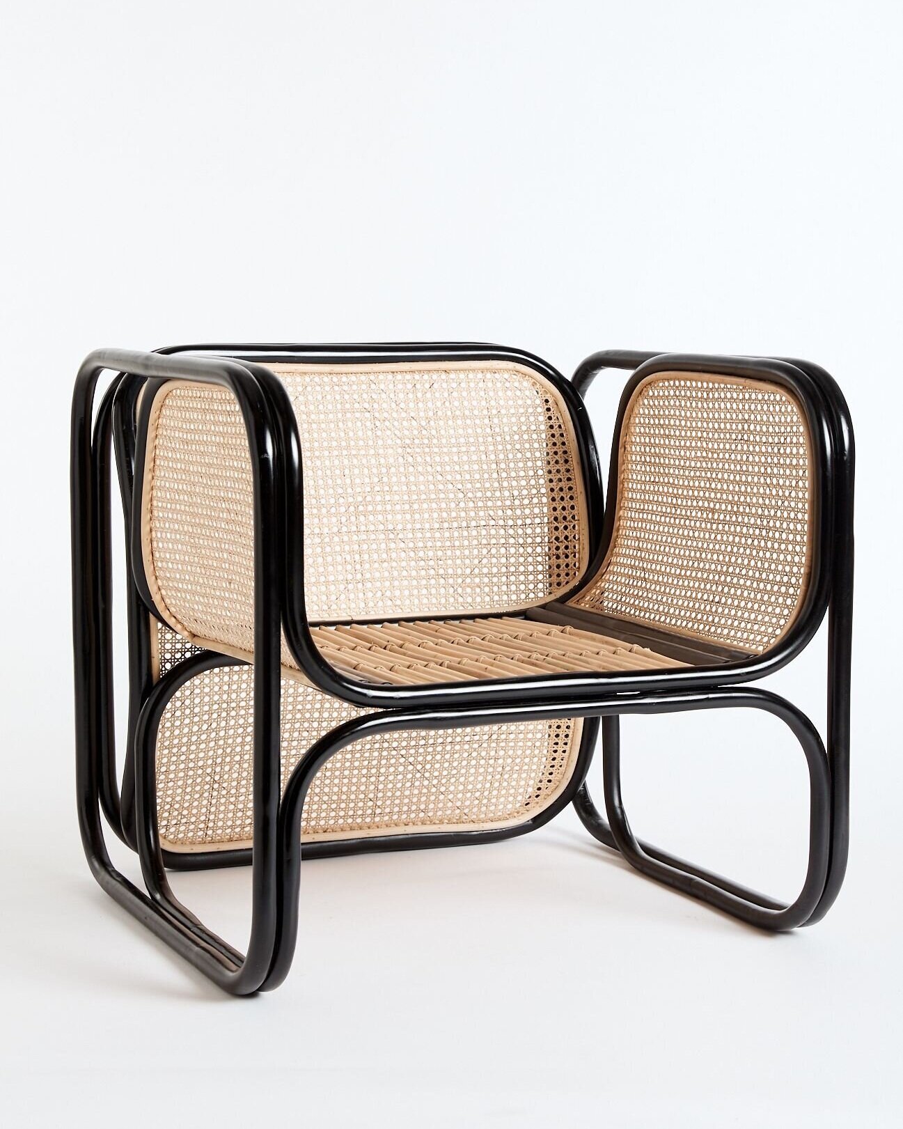
While the originals, made for Bočan by Thonet in lacquered bentwood and cane, deservedly fetch a pretty penny, I was fascinated to see that new versions of the chair are de rigueur in all sorts of chic interiors in Australia.

Available in both black and natural from the folks at Worn, and stunningly well priced I might add (I did the conversion), the sad news is that they won’t ship outside of Australia. But, kudos to Worn for their commitment to ethical sustainability, since their Cane Loungers are made of non-chemically treated materials harvested from sustainably managed plantations. Plus, for every chair sold a native tree is planted to help offset carbon emissions.

Brownie points to whoever can send me a source closer to home…

Photo: Laura Fantacuzzi and Maxime Galati-Fourcade

Photo: Laura Fantacuzzi and Maxime Galati-Fourcade

Worn’s Cane Lounger in Black

Worn’s Cane Lounger in Black

Something old and something new

Grace Bonney, the founder of Design*Sponge, has always been a thoughtful voice in the world of design. Now she’s stepping back from her influential Instagram account and allowing important new voices to take centre stage. As Bonney explains, “Starting this week I will be working to turn this from a blog-turned-personal platform into a community page dedicated to the voices and work of designers of color.”

Up first on the Design*Sponge Insta is designer NeKeia McSwain, the president of the Black Interior Designer’s Network and owner of Kimberly + Cameron Interiors, who’ll be sharing her style with the account’s 890,000 followers.

Cheers, Arren


O.M.G. Those chairs!

This snap is of one of designer Benito Escat’s latest finds, a set of vintage Missoni rattan dining chairs. I could decide to stop right here for today, and it would be fine - They’re just that good!!!

Escat and his partner, Pol Castells, are the creative duo behind Spanish interior design firm, Quintana Partners, whose look is defined by layered history and vintage fabulousness. It’s all about the patina, baby!

You can glimpse one of their latest projects, hotel La Bionda on Spain’s Costa Brava coast, in that second snap below. Oh, and the Missoni chairs? If you fancy your own, you might just be able to score a set right now on Chairish

106119375_2536791663204608_7381285977846390258_n.jpg
105943624_362338404750160_5866514491488384556_n (1).jpg

I do love a good kitchen design, especially one as handsome as this in a palette of mixed woods with a few hits of gold and black for good measure. We can thank designer Nikki Klugh for this thoughtfully planned space, but for me I’m completely taken with those herringbone floors.

Which got me thinking as to what else was out there for wood flooring. Parquet, anyone? While the name might strike fear into most, and make you think of golden oak flooring in 80’s condos, there is lots out there that’s worth a look.

While it’s not strictly parquet, the Bloc wood tiles by Studio Job for Bisazza, certainly have a similar vibe and backstory. It’s that feel, for sure, but so much more contemporary. And hexagon - yes, please. Anything hexagon with a trompe-l'œil effect will definitely get a high-five from me.

photo: Brady Architectural Photography

photo: Brady Architectural Photography

studio-job-wood-bisazza-tiles-london-design-festival-2016_dezeen_2364_col_3-852x1517.jpg

We’ll finish off today with a bit of inspo from Ikea, with a look forward to what our Swedish friends will be releasing in their new catalogue in August.

The styling is on point and I’m loving the colour palette, and hey, I’m already a fan of the mid-century inspired Rönninge chair in that great mossy green. Oh, and that storage workhorse, the Ivar shelving system, gets an on-trend update with swish bamboo doors. What’s not to love?

PH170248.jpg
PH170281 1.jpg

{that one great thing} Jen's (two)one great vintage chair(s)

Can someone please explain to me how it's already Wednesday? I'm having a really work-y week and time is just whizzing by, which is why I'm super glad Jenn Hannotte's *that one great thing* pick popped up in my inbox, since she's always such a smartypants whilst I am - right now at least - feeling awfully fuzzy in the brain department. And yes, before anyone says anything, I know Jenn is slightly cheating by picking 2 things, but that's just how she rolls...

Jenn Hannotte: My One Great Thing is actually Two Great Things, but their stories are the same and I didn't want to leave either one out! When I was living in Winnipeg (holla!), I was working as an art director for a specialty advertising company. I was 20 years old, and while I cared a great deal about how my various apartments looked, I didn't really *know* anything about the history of industrial/furniture design. In a corner of the office sat these two chairs, stacked and dusty. I thought they looked cool and asked the boss if I could buy them, but he generously (it turns out!) gave them to me. This was my first experience exploring the history of an object; I turned over the chairs and discovered they were Fritz Hansen chairs and went to eBay (pretty much the only source at the time!) and learned their worth. From there, armed with a little more information I soon found myself hooked on learning about the history of design. I consider the discovery of these chairs the fuel for my passion for design, and on the downside, the impetus to my chair addiction! They always make an empty corner pop, and they've always worked with whatever look I'm loving. Here's round-up of their recent history of resting places in my various homes as an homage.


More chair business

Sheesh, you would think that I have a one track brain and it's all about chairs. Today I was checking in on fabric options for the wonderfully kooky vintage pair below, scored by my client/friend Marija who obviously has a really great eye. Of course we had to buy them, since they were so darned cool (as well as amazingly well-priced), but it's taken us (as in me) a while to get the fabric options together. We'll be simplifying the design a fair bit - no tufting - and I would love to see if the refinisher can hack off that little glued on moulding detail before they're re-sprayed (probably in a cream or soft grey). The first fabric pic shows a few samples from the racks at DFO, the second is a slightly more luxe collection of possibilities found at Kravet in Designer's Walk. Do you have a fave? Currently the random Greek Key-ish pattern in the middle of the first snapshot is the front runner, though that herringbone from Thom Filicia could be very handsome.

A chair story, part two

So you might remember a while back I was challenged to makeover a pretty ugly vintage chair by Chatelaine's decor editor Virginie Martocq, well it's time to share all the pics (thanks VM!) with you lot so you can see the results. Firstly I hafta say it wasn't just me involved, since Virginie also dragged in Tommy Smythe, Jeffrey and Deborah Fisher and Candice Olson to re-do chairs too - And looking at the bunch of them together they couldn't be more different.

That first snap shows the chair in all its - ahem - original glory. Next up there's mine, which looks fantastic thanks to inVU Drapery for the delovely DwellStudio Vintage Plumes fabric, as well as tackling the upholstery (you can see all my prep work here). Then Tommy's chair is ultra chic whith a white glossy frame and wide black and white stripe for upholstery. Jeffrey and Deborah slipcovered and skirted theirs, which did a nice job hiding the rather ugly legs. Finally Candice gave hers a preppy tween feel, dressing her chair in white, kelly green and fuchsia. Got a fave? Then you can vote here. [Images: Roberto Caruso]

Seriously fun

Saw this chair a couple of secs ago on Twitter and thought how great it was, and now here I go sharing it with you lot. It's a fantastically quirky Victorian club chair (love the turned black legs and casters) that's been upholstered in a metallic silver print on a dark purple Irish linen called D'ya-think-e-sauras, from PaperBoy in the UK. Victoria Cramsie of PaperBoy scored the chair at an auction, one of a pair, she's now itching to get the other one re-upholstered too. Check her firm out for lots of seriously fun prints on fabric and wallpaper - you should really take a look at Animal Magic and Hand Made - that are nice and un-sugary, and a v. sophisticated take on designs for kids. Oh, and thanks to Victoria (aka PaperBoyLondon) for posting the shots on TwitPic!