Finding 'Found'

So, some smartypants friends of mine are starting a gorgeous new online store called Found that I wanted to give you guys a sneak peek at. It's not quite open yet (the crew are hoping to have everything live in the next few weeks or so), but by the looks of it you're going to want to stop by regularly and check it out. Once things get going you can expect to find a deliciously curated mix of vintage pieces, art and objects, and plans are even in the works to have Guest Pickers stop by with special selections of gear. In fact I heard a whisper of who'll be the first of the bunch and I have to say, it'll be pretty special! Okay, so without further ado, have a look at the pics below (shot by Michael Graydon and featuring some of the items that'll be on offer) so you can really get a feel for Found.

White, no noise

I know it's a Sunday, but what the hey, inspiration struck and I decided to snap a vignette I threw together before we head out en famille to enjoy Woofstock.

That 1984 LA Olympics poster was a fantastic find at last week's neighbourhood yard sale (thx again Brenda for pointing it out!), and both the kooky Sgrafo Modern vase and Howard Miller gold clock are perennial faves too. But, it's the Dyson Air Multiplier that I'm totally counting on as the weather heats up. Yep, it's a fan, but apart from the incredibly sleek bladeless design I love the fact that a) it's way more attractive than the ugly old black fan we used to have hanging around, and b) it's way quieter than the ugly old black fan we used to have hanging around.

Form meets function and keeps you cool - What could be better than that?

Shopping (and buying) a bit of vintage

I Tweeted this morning how my car is currently chockablock with outdoor pillows, vintage watering cans and Italian tiles. And yesterday I hefted, nudged and toyed around with pea gravel, fake grass, ivy and ferns (both real and not), a fake hedge, flowers (more of the real and not real business) and a rather handsome teak garden bench - All for a book cover shoot. Yep, it's been a little on the busy side over the last while.

Luckily it hasn't been all nose-to-the-grindstone, since there was time over the weekend to wake up early and hit the Meister Markt Collector Show with our friend Laura Muir, who luckily brought her camera along to record the proceedings. That vintage airplane poster was a real winner, but a bit too rich for my blood at $75. And then I saw a vase. Loved the design and the fact it's marked 'Italy' is a total plus, and the price? At just $20 I had to have it. We finished off the morning hunting for records to add to my other half's collection, then headed off for a well-earned greasy breakfast. Oh, and for more vintage fun, click here to see what caught Laura's eye. [Images: Laura Muir]

More chair business

Sheesh, you would think that I have a one track brain and it's all about chairs. Today I was checking in on fabric options for the wonderfully kooky vintage pair below, scored by my client/friend Marija who obviously has a really great eye. Of course we had to buy them, since they were so darned cool (as well as amazingly well-priced), but it's taken us (as in me) a while to get the fabric options together. We'll be simplifying the design a fair bit - no tufting - and I would love to see if the refinisher can hack off that little glued on moulding detail before they're re-sprayed (probably in a cream or soft grey). The first fabric pic shows a few samples from the racks at DFO, the second is a slightly more luxe collection of possibilities found at Kravet in Designer's Walk. Do you have a fave? Currently the random Greek Key-ish pattern in the middle of the first snapshot is the front runner, though that herringbone from Thom Filicia could be very handsome.

{that one great thing} Jason Hudson's birdcage lamp

I bumped into Jason Hudson at a party over the Holidays and bugged him about his lovely birdcage pendant lamp that I'd seen over on his great blog These Roving Eyes. Anyway, he was happy to share the story behind the piece, and thus begins a new occasional series on the blog - that one great thing.

Jason Hudson: My partner Jeff fell in love with this old wooden cage when he saw it at an antique shop when he was a kid. He proudly brought it home and it sat in the living room for years. After his father passed away, we found it amongst junk in the garage and I could see that it had a special place in Jeff's memory.  

I'm a firm believer in taking meaningful objects and adjusting them to work in a contemporary setting. Like your Grandma's old piano - the cherry finish isn't working in your mid-century modern dwelling, but it holds a ton of sentimental value, so have that sucker refinished! It's still the same piano, still full of memories, its precious ivories untouched. So make it work! 

Because the honey-coloured wood and sad-Cat-Lady-overtones weren't working for me, I convinced Jeff to let me spray out the cage in a high-gloss black. We wired-it-up with a great Edison bulb and just like that, had our very own, ultra-cool, one-of-a-kind lamp, rife with Jeff's childhood memories but within the limits of our (read: my) personal style. 

It casts lovely shadows on the walls and adds a certain warmth and organic quality the room was lacking before.

Stepping out in Tokyo #1

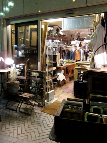
A few weeks back I found myself in Tokyo, meeting up with my world travelling other half (you can check out his kid-friendly travel blog here) and my little sister (aka Blink London). Well, it was BRILLIANT, and what an absolute culture shock too. We hit all the sights, shopped ours socks off, and generally wandered around checking out as much as possible. One of the neighbourhoods that we thoroughly enjoyed was Nakameguro, a jumble of streets and alleys filled with a boho mix of fashion and interiors shops, much of them vintage.

Oooh vintage, such a magic word... Anyway, of course we spent the whole day just in this one 'hood and found a slew of cool stuff. Those first three shots are from Hiige which was all about vintage Scandi gear (we scored some great fabric which'll be sewn into cushions soon). Pics 4 and 5 show Hatago International, next door to Hiige, an ultra cool mini shop jammed to the gills with vintage airline paraphenalia. Jantique is next in the pics, and was like hitting a French or Belgian flea market, and then finally Acme Furniture, which was a great mix of vintage industrial gear (lots of it from the US) as well as new pieces. For more, read my sister's fashion-y take on Nakameguro here.

A chair story, part one

I'm definitely up for a challenge, so when Virginie Martocq - Chatelaine's Decor Editor - e-mailed to ask me about re-doing a fleamarket chair for the mag I said sure! So, a day or two later when a rather grubby looking chair showed up on my doorstep I knew the game was on. Luckily I'd recently been inspired by a particular DwellStudio fabric I'd spotted at inVU Drapery called Vintage Plumes (you can see a shot of it here) and set to work figuring out the look.

Step one was to unscrew the dusty old red velvet seat and thoroughly clean the chair. Next, I lightly sanded the frame with some steel wool, and carefully painted two coats in a lovely soft beigey grey called Fashion Grey from Behr. Now, I knew that nailheads would be fun but didn't want to commit to nickel or brass. Instead, I'd seen some white painted nailheads at Home Depot and thought that they might be just the ticket. Well, the colour was waaay too bright a white, but that was quickly remedied by pushing the nails into a cardboard fruit box and spraying the whole lot cream all in one go (outside of course). I dropped the chair off at inVU this morning for the re-upholstery job and can't wait to see how it turns out!

Gone fishin'

Well, I haven't exactly picked up rod and reel. Nope, I'm chilling out and taking a couple o' days blog break. Hey, it happens to the best of us! In the meantime, I thought I'd share this inspiringly colourful shot of vintage bits and bobs from Hawk Eyes, a lovely vintage shop on Roncesvalles in Toronto (and, if you have a wander along the street while you're there, you could definitely grab a warm plum filled Polish doughnut while you're at it!). Now that's happiness, a sweet treat AND great vintage. See you guys next week sometime!

Is it #1, or #2?

I'm having a table lamp dilemma. Last week, while sourcing vintage suitcases for a book cover shoot (not an easy task, I might add) I came across a crazy cheap - and fantastically lovely - table lamp at Goodwill. Then, about an hour later, I scored a brand spanking new never used vintage drum shade at the Sally Ann. Talk about kismet! I have a home for it, but it means I'll have to say buh-bye to a great lamp I already have.

Okay, so first up is the one that's been sitting pretty on that side table for quite a while. The base and silk shade are from Restoration Hardware. Next is the vintage lamp and shade I just couldn't say no to. The base was $10 and the shade $4, while the Resto lamp probably came in at a slightly pricier $300, or so. Which should stay and which should go?

Where will you live?

This wall sculpture/candle holder was one of those irresistable finds that I couldn't not bring home. Yes, it's vintage - dated 1970 and made in the USA by Syroco - and is a grand 41" wide and the price, well, when Mike at Mike's Music (who has a vintage section in the basement of his store) said $15 my eyes glazed over and in a flash I was rifling through my pocket to pay for it. Now though, there are issues. It's too big to hang on the fireplace by a couple of inches, and almost every other spot in the house already has something hanging above it. In other words, I have no idea where it's gonna live. In the meantime, while I'm waiting for inspiration to strike, you'll find it leaning on a wall between a velvet painting of Julius Caesar, a Warhol of Grace Jones, and a paint-by-numbers canvas of Madonna.

Vintage goldmine

On Sunday I headed cross border with a couple of friends to hit a fantastic junky 4th of July outdoor antique market in upstate New York. Hello, did we ever do well, and no, before you ask, I cannot reveal the exact destination since it was a complete goldmine of great stuff at crazypants prices (if I told you I would definitely be hung, drawn and quatered). Here's a few shots of what we ended up with, as well as the one that got away...

These mirrored vintage bulbs will look amazing in a shadow box, or individually set on little wood block stands. When the guy said "$5 each. or $20 for the box" they were immediately snapped up. Oh those flags. You can't really tell, but each one is hand sewn and gorgeously aged. One of my friends bought 3 (they were $5 each), and then we bugged her until she went back and bought a big pile of them to sit pretty in a tall vase. Here's the one that got away, 'cos we didn't have the room or the need - a lovely beaten up black and gold dresser, with mirror, that was tagged at $40 (I just hope it went to a good home!).

Then here's what I dragged home - I paid $2 for this cool little Charlie Chocks advertising doll from the '70's, that's now found a spot on a white dresser, and (okay, this a bit of an odd one) an acrylic portrait on canvas that was a score at $10 which, bizarrely, looks like me as a teen, right down to the floppy Hugh Grant hair and the dweeby glasses.

Should they stay, or...

Should they go? Yes, they're awfully nutty, in fact, irresistably so - I scored a whole tea set (sadly, without the tea pot) the other day when I stopped in at  Value Village. 4 mugs, 4 side plates, plus a cream and sugar, and all shockingly 1980's and Post Modern looking. The pattern is called Clouds and was designed by Fujimori for Japanese firm Kato Kogei, yep, in the mid-80's sometime. The colour combo of sugary pink, grey and black is such a hilarious throwback to a time that style forgot, but really, should I keep them or should they head to eBay? And if they stay, will I think of Duran Duran every time I have a cup of coffee?

Money is an object

If money was no object I would be flying to London today so I can be well rested in time to wave a bidding paddle at tomorrow's Phillips de Pury & Co Design auction. Alas, money is an object, so instead I'll be staring longingly at pictures of the following lovely items which are up for sale - The fantabulous Georges Jouve circa 1952 table lamp, which I would give my eye teeth for (since I can't afford the cool $22,500 estimated sale price). There's a really fab set of painted stainless steel cutlery designed by Alessandro Mendini for Alessi which, hmmm, I thought was a relative bargain until I realized the eye-popping price tag is for a single place setting (the pattern reminds me of this cool wallpaper by Basso and Brooke for Graham & Brown). Finally, after all that rabid gotta-have-it bidding, I would happily take a snooze in that handsome and rare painted steel and suede 70's armchair by Mario Cecchi. Oh, there's lots more to swoon over for sure, so take a look here at the 220-page catalogue, and thanks to Raymond Girard for pointing the way on Twitter.

Buh-bye memories

My grandparents dining room set plays a large part in my childhood memories of happy times spent tucking into a Sunday roast, with a giant wobbly trifle for pud, and a glass of fizzy shandy to wash everything down. The glam set now resides in my sister's London flat, but not for much longer. It's too big. In fact, the imported from Italy in the '50's dining suite is on the humongous side, crowding into almost half of her living room, with the buffet slotted rather tightly into a spare bedroom. Once it's all been sold off on eBay, she'll be looking into a Tulip table with Bertoia Side Chairs as a considerably less space-eating alternative. And, as much as I'd like to swoop in on her auction and have everything crated and shipped over the Atlantic, we definitely don't have the room for it either. So it's a bit of a sad buh-bye... Take a look below, it's rather smashing, no?

California dreaming

Right about now, at the tail end of winter, I'm at my wits end with the cold and the grey and my dreams turn wistfully to California. I'll noodle through real estate websites and find Palm Springs gems like this and this that I've been trying to talk friends into buying. Then reality sets in, and the sun - thankfully - comes out.

But it's good to dream, and it's extra good to dream on a blurry post-Oscars® Monday morning. So, when I found this gorgeous Santa Monica home splashed across the glossy pages of the LA Times Magazine, I knew I had to share. The home is owned by photographer Dewey Nicks and was designed with a nod to mid-century California style by architect Barbara Bestor. The interiors are smashing, and shake together kid-friendy glamour with a keen vintage eye by designer Paul Fortune. Maybe the Nicks family needs a pool boy?

---------------------------------------------------------------------------------------------------------------------------------

Hey, where did the shots go??? Well, I got a rather nasty legalese e-mail regarding copyright infringement, so they just had to come down. Sucks, huh? And the first time that I've ever been asked to do that too! In the meantime I'll be checking in with the Barbara Bestor to see if she has any shots available (check out the rest of her firm's portfolio here, it's brill). If you fancy scoping out the original LA Times article, click here.

A swift little before and after

While I was running around like a chicken with my head cut off rustling up pieces for my space at IDS10 I realized that I needed a chair. Not just any chair, but one that felt vintage and cool, yet was bathroom appropriate. So, I headed to Mieda Design - the upholstery shop I always use - and talked my friend Dan into swiftly re-doing one of his own chairs for the space. That grubby old orange chair below had been sitting looking sorry for itself on the shelf for oh, nearly 10 years, and Dan had never gotten around to re-doing it. The original foam upholstery had totally died (and was turning to dust), so it was high time for a makeover. I needed vinyl to make the chair feel like a fit for the bathroom space, so we plunked for a Maxwell Fabrics number in a glossy and slightly crinkled antiqued metallic silver. Dan sprayed out the teak base in a basic black (yes, horror-of-horrors, lol, but if you ask me, I think it looks great) and managed to get the chair redone in under a week. Anyways, take a look below at the before and after shots. And the chair? After its stint at IDS10 it's now sitting pretty in Dan's living room.

Guest blog / Jenn Hannotte: A tale of two tables

Jenn Hannotte: There are two types of Craigslist thrills: when you buy something for cheap and find out it's worth a lot more, and when you find something cheap and you make it worth a lot more - even if you only slap some paint on it. My front room has tried on a couple of coffee tables in the last few months that gave me both types of 'YES!' moments. 

My old coffee table was a $20 purchase that included two end tables. It's now sold since I try to follow a pretty strict 'something in, something out' regime. The shape was ornate and scalloped, and I thought that painting it with a matte finish and juxtaposing it with my otherwise modern furniture would look interesting. I used one of the end tables in my daughter's room as a side table and sold off the other at a garage sale. That's a lot of mileage out of $20! I was able to play with a trend without busting the bank, and that to me is what makes Craigslist and thrifting in general so worthwhile.

My latest find was an impulse buy - I saw it, loved it, and had to have it. I knew nothing about the coffee table, except at $150 was pretty cheap for the going rate of mid-century teak on Craigslist. Within a few hours of contacting the seller, I was on my way home with it, as well as armed with a new little bit of info: that it was manufactured by France and Son, Denmark. Off to Google and within minutes I realized I had a Peter Hvidt & Orla Mølgaard-Nielsen coffee table designed in 1955, and produced by France and Son for 2 years. Designers and manufacturer in hand - and more Googling - I discovered here that my little purchase was worth about $1000!! As you can imagine, I'm not likely to sell it any time soon - even if I could get that kind of return on my meager investment - it looks quite at home in my front room and knowing I won the 'Craigslist lottery' makes it that much more appealing!

You'll see the old scalloped coffee table and end table below, followed along by the shot from Craigslist that got me hot under the collar and, finally, the Danish table sitting pretty in the living room. 

For more of Jenn's take on style click here.


A snap in the laundry

I am a magpie at heart, and honestly can spy cool bits and bobs at twenty paces. My antique dealer granny, Lena, is probably to blame, since she dragged me along to jumble sales as a kid. She would bribe our way to the front of the line so we could head in and scour the tables before the hoi-polloi had a chance. Ah, childhood memories, lol.

Last night I spied that cool Snap tin below at a friend's house, high on a shelf in their front hall. Up until that point it held their dog Trav's cookies, and now it's sitting pretty on a shelf in our laundry room. Honestly, I offered to pay, but in the end I think we swapped it for tomatoes picked from our garden. So, thanks Michael, Jen and Trav! Those cool Number Mason Jars to the left are these fresh finds from Pottery Barn, while that rather odd carved teak bull I snagged ages ago at a Value Village. Oh, and don't worry about Trav; his cookies are now housed rather smartly in a vintage Peanuts lunch box.

This, now that

These chairs last showed up on the blog here. And now, after refinishing the frames at Beresford's, and re-upholstered by Mieda Design in a lovely grey wool I scored at Kobe Fabric's outlet store, this is the result. We have a mis-matched set of 8 all together, set around a reclaimed scaffolding plank dining table that we built ourselves. That vintage lamp was a great find too - A good mate (hello Morgan) grabbed it at Rogue Gallery for me and then kindly passed it on. The wall colour is a stunning dark grey - Ralph Lauren Paint's Palais Royal - which you can pick up at Home Depot. It's nice to see what a lick of paint and a bit of fabric can do, no?

Snap judgement

I do love good photography, combine that with vintage modern objects that are for sale and I'm solid gone. Roan Barrion of Modern Love (who I've posted about here before) certainly has a way with a camera, and has an eye for finding special and unusual pieces that could finish off any interior. Take a peek below and you'll see what I mean. Oh, and Modern Love is based in Winnipeg which adds that nice dab of Canadian cool, though of course Roan will happily ship worldwide. He's also just launched a Facebook page for Modern Love (check it here), so I suggest you become a fan so you can instantly see all of his latest finds, not to mention all that brill photography.


Bookmark and Share