Finding 'Found'

So, some smartypants friends of mine are starting a gorgeous new online store called Found that I wanted to give you guys a sneak peek at. It's not quite open yet (the crew are hoping to have everything live in the next few weeks or so), but by the looks of it you're going to want to stop by regularly and check it out. Once things get going you can expect to find a deliciously curated mix of vintage pieces, art and objects, and plans are even in the works to have Guest Pickers stop by with special selections of gear. In fact I heard a whisper of who'll be the first of the bunch and I have to say, it'll be pretty special! Okay, so without further ado, have a look at the pics below (shot by Michael Graydon and featuring some of the items that'll be on offer) so you can really get a feel for Found.

Just a little rad

So thank heavens for the thaw and rising temps, because it meant we could finally get a slew of art hung. Let me explain - Our big ass extension ladder that we keep outside was finally un-frozen enough to drag in and tackle hanging close to a dozen pieces around the house. The big plan was to take on the blank wall in our mondo stairwell, since the other wall has been looking peachy and art-filled for ages so it was high time that we balanced things out.

We found space for stuff picked up in (and dragged home from) Glasgow, London, Buffalo, Tokyo and Hawaii, as well as gifts from friends and vintage finds from our local Goodwill. I love them all, but special mention goes to the largest piece, which is the gorgeous Brooks Brothers Suit (black line) by illustrator/printmaker - and sweetie - Alanna Cavanagh, while another fave is the small RAD print by artist R. Bennett that we grabbed from Chinatown Boardroom in Honolulu. Art is good!

Vintage goldmine

On Sunday I headed cross border with a couple of friends to hit a fantastic junky 4th of July outdoor antique market in upstate New York. Hello, did we ever do well, and no, before you ask, I cannot reveal the exact destination since it was a complete goldmine of great stuff at crazypants prices (if I told you I would definitely be hung, drawn and quatered). Here's a few shots of what we ended up with, as well as the one that got away...

These mirrored vintage bulbs will look amazing in a shadow box, or individually set on little wood block stands. When the guy said "$5 each. or $20 for the box" they were immediately snapped up. Oh those flags. You can't really tell, but each one is hand sewn and gorgeously aged. One of my friends bought 3 (they were $5 each), and then we bugged her until she went back and bought a big pile of them to sit pretty in a tall vase. Here's the one that got away, 'cos we didn't have the room or the need - a lovely beaten up black and gold dresser, with mirror, that was tagged at $40 (I just hope it went to a good home!).

Then here's what I dragged home - I paid $2 for this cool little Charlie Chocks advertising doll from the '70's, that's now found a spot on a white dresser, and (okay, this a bit of an odd one) an acrylic portrait on canvas that was a score at $10 which, bizarrely, looks like me as a teen, right down to the floppy Hugh Grant hair and the dweeby glasses.

A sweet bonjour from San Fran

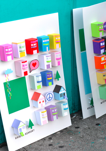
Happy Tuesday folks! Well, if you weren't feeling happy before, you certainly will have at least a twinge of the jollies after checking out the work of multi-disciplinary designer Chloe Fleury (who's work I came across on Daily Imprint). Originally from France, Chloe hopped the pond and now calls San Francisco home. Check out her series called The place i live, which was inspired by the love of her adopted city. The set of 3D posters have caused such a stir that she's been swamped with requests from people trying to buy them. Sadly, they're not up for grabs, just part of Chloe exploring her creative process, which is also inspired by cats, cupcakes and fashion. Now there's a girl after my own heart. Check out her portfolio here, and follow along on her French girl in San Fran adventures on her blog here. Oh, and yes, that's Chloe in the last shot with the pink paper ice cream!

Guest blog / Julia Black: Art and fashion

Julia Black: I’m not going to pretend to be an art connoisseur by any means, but I do believe I know what I like, and I definitely like the work of Michael Adamson. I came across one of his fantastic oil-on-canvas abstract paintings at a weekend brunch at Holt Renfrew's swank Holt’s Café in Toronto, a few Tweets later (thanks to the Twitterverse!) and I'd tracked him down. Michael studied at the prestigious Emily Carr University of Art and Design in Vancouver and, since then, has been exhibiting in Toronto, New York, London and Tokyo. Now based in Toronto, his passionate work explores vigorous textures and magnificent colours, but, I thought it best to get Michael's inspiration in his own words, “ever changing confluences of art history, social actualities and (my) personal life”. Complex, thoughtful, and undeniably beautiful, take a look below at a snap of his breathtaking large-scale work (it's 50' long and 8' high and was created with artist, Nicole Katsuras) in situ at Holt Renfrew, as well as a piece called Far Shore, and you'll see what I mean. Now, I have to convince my friends to allow me back into the brunch circle because it seems I was rather absent from our table conversation!

To read more posts from Julia click here, and click here to check out her cool blog.

Love 'this'

I see lots of cool stuff in my travels, but occasionally I'm suprised by a sweet bit of a mash-up between something cool, something creative, and something witty. It's the this globe below, snapped by Aesthetic Outburst blogger Abbey Hendrickson in her own home, that happily caught me by surprise, though if you were to spin the globe it would read f this s, which just happens to be a fave epithet of mine when things are - ahem - not going as planned. Of course there is a story behind the f this s globe, which Abbey explains here as being in mourning for not being able to swear out loud now that she has a family. Be sure to check out the rest of Abbey's great blog, it's a lovely mix of inspiration, art, craft, kids and collecting.

5 quick questions: Alanna Cavanagh

I've had a bit of a design crush on the work of ultra-talented illustrator and printmaker Alanna Cavanagh for quite a while, so I'm glad to have cornered her into answering 5 quick questions. You might have seen her illustrations in the likes of Real Simple and the New York Times, but most recently I saw her work hanging in the home of Bev Hisey, where after years of looking at an - imho - awful painting of a blobby lifeless figure floating in the ether, I was happy to see one of Alanna's gorgeous Big Orange Scissors prints sitting pretty on the wall instead. And for that Alanna, I really really have to thank you.

Below you'll find shots of both Big Orange Scissors and Brook Brothers Suit (Green), plus a behind-the-scenes snap of Alanna tea staining one of her Penguin Books cover prints. Next, a peek at Alanna's own place, a shot of a space that currently inspiring her, and finally a super cute portrait photo/illustration mash up. Click here to read more 5 quick questions! [Portrait photo:Janet Kimber]

Arren Williams: What's inspiring you right now?

Alanna Cavanagh: Josef Frank Textiles, Illustrations from the 1950s, the colour limey green, swiss miss blog, springy tulips, Selvedge magazine, Graphic designer Paul Rand, Decoupage artist John Derian, The Workroom on Queen West and most especially: my new 'hood Parkdale.  

AW: Is there anything that drives you crazy when you walk into a space?  

AC: If it's too white and minimal I don't feel comfortable. For me I need to be surrounded by lots of warm wood, cozy textiles, and piles of books to feel at home. 

AW: What's the next thing you have your eyes on for your own house?  

AC: I would love a velvet tufted couch in a jewel tone like turquoise - I'm on the look out for a used one. In the meantime I have my eyes directly set on Benjamin Moore's 'Florentine Plaster' paint. It'll soon be on the walls of my bathroom.

AW: How would you describe your look, and has it changed over the years? 

AC: Fleamarket Chic with a dash of New Romantic! 

I absolutely love a MIX: of high and low, traditional and modern, and new and old. I also love to include whimsical pieces like old birdcages, and vintage signs to make sure the space never feels too serious.

In terms of colour I always paint my walls grey (Benjamin Moore Chelsea Grey is a fave) and then add lots of juicy tones like pink and orange which really POP off the grey.

And of course I love displaying a lot of art. I've always been a sucker for a salon wall. Every time I see one in a magazine I rip it out. My style has always been the same but happily these days I have a bit more high to add to the low. :-)

AW: What's next on the horizon? 

AC: I've just completed 3 new silk screen prints which you can find here on my website. I've also illustrated a campaign for Air New Zealand, and a book cover for Penguin books, and am now working on a tote bag design for Good Egg ( the wonderful food shop in Kensington market). Look out for it in June!

Guest blog / Julia Black: Old school movie style

Julia Black: Ever since I can remember the Oscars® have been somewhat of a religious holiday for me, and every year I start counting down the days way before the spectacular event. Of course all the award shows leading up to the Oscars are also scribbled into my agenda, and the most recent ceremony, on the 21st of February, was the BAFTA (British Academy of Film and Television Arts) Awards at the Royal Opera House in London’s Covent Garden. Checking into the BAFTA's I discovered illustrator and graphic designer extraordinaire, Tavis Coburn. Tavis was commissioned to design the program covers of the five Best Film nominees, and he brought each film to life in his brilliant retro-style. I love his work, and how his inspiration - 1940s comic book art, the Russian avant-garde movement and printed ephemera from the 50s and 60s - informs his take on each film. Now, with his illustrations in mind, I am over-the-top excited for Sunday night! Oh, and btw, The Hurt Locker won Best Film at the BAFTA's! Click here to see more of Tavis Coburn's work, as well as his online store. [images via: Joey deVilla]

To read more posts from Julia click here, and to check out her cool blog click here.

Guest blog / Julia Black: Follow that sign

Julia Black: Boris Bally has a talent for discovering a second life for one of the most mundane things that surround us at - ahem - every turn. Street signs. An extraordinary industrial designer and metalworker, he continually creates pieces that provoke conversation, and often times, a chuckle or two. His humorous yet sophisticated furniture, installations, jewellry and even flatware mashes up recycled street signs, scavenged weapon parts and found industrial materials in a process he calls humanfactured. I love how on-trend his pieces feel from both a green angle (Bally reckons he's upcycled close to 70 tons of signage in his career so far), as well as how they'd add a lovely jolt of colour and wit to a space. Click here to check out all the galleries that carry his work in the US, Canada and further afield. From the top: BroadWay Armchairs, Small Square Transit Tables, Transit Chairs.

To read more posts from Julia click here, and to check out her cool blog click here.


3 for the framers

I could totally blow the bank on artwork, and have fortunately/unfortunately found someone new on Etsy to jones over. I don't know much about Hocus, except she has a bit of a thing for vintage Danish pottery, and that she (?) is a designer/illustrator based in Toronto. Her work is sweet, but not too sugary, and I love all the textures and detail in each piece. Below you'll find all three of her limited edition, signed and numbered prints - Key Finder, Feathers and Snyder Goes For Walkies. For my money I think they'd all look brill in simple white gallery frames, hmmm, now to find a spare wall to hang them...

A modest veil in Vancouver

Yes, the Winter Olympics in Vancouver are pretty inescapable right now, and yes, I'm not exactly a sporty type (to say the least). One thing that has caught my eye, and just about everyone else's in Vancouver, is the gorgeous facade of the Vancouver Art Gallery. The piece, titled A Modest Veil, is by artist Michael Lin and was commisioned as part of the Vancouver 2010 Cultural Olympiad. I've seen shots of it turn up on Twitter (thanks to Flare Mag's Lisa Tant), and on Facebook (courtesy of designer William MacDonald) as well as all over Flickr, so wanted to see what else I could dig up.

Lin is known for his monumantal murals which reference trad Taiwanese fabrics, with their intense colours and stylized floral patterns. In the past his work has shown up on the floor and walls of places like P.S.1 in New York and the Musee d'Art Moderne de la Ville de Paris, though by size alone A Modest Veil was a massive task; each panel was hand-painted and then mounted on a huge framework to cover the museum's Goergia Street frontage. If you fancy, you can snag a piece of Michael Lin for your own place, since he designed a carpet called Formosa for Nanimarquina (though I'd love to know what's gonna happen to the Vancouver piece once it comes down). For fun, I've also added in a Youtube interview with the man himself. [Image 1: Cara_Rouge on Flickr. Image 2: CityCaucus.com on Flickr] 


I want an axe (no really, I do)

Well, we do have a crappy one that we bought when we were chopping out 20 years of roots and weedy sapplings in the garden. In fact, I lie, that is actually axe number 2, since the first we bought snapped after a couple of whacks. To quote William Morris, “Have nothing in your house that you do not know to be useful, or believe to be beautiful.” That is the reason we need an axe from Best Made Co.

I discovered Best Made while working on this piece for the National Post (they've created a special Hudson's Bay Company axe), then realised that they've been featured in a ton of spots, including *Wallpaper and I.D. magazine. Check out a couple of beauties from their Fall /09 collection, Bluerightby and Sam Hain. Below you'll find a snap from the firm's Manhattan workroom, and finally some Axe art (seriously) shot by Adrian Gaut, and available for purchase. For even more Best Made Co you can follow them on Facebook and Twitter, and click here to read how the two owners met in '84 as kids at Camp Ahmek in Algonquin Park. 


A fashionable seat

Rick Owens. Rick Owens. Rick Owens. If you don't know who he is, the NY Times - for one - thinks him influential enough to dedicate this Profile In Style to the man and his passions. He's actually a Paris-based American fashion designer (here's his website; his look definitely on the darker side), who also designs limited edition furniture with a sculptural Neo Gothic vibe. His influences range from Modern design icons like Eileen Grey, and artists like Brancusi, to the skate parks of his native California. Cool? Definitely. Brutal? Yep. The kind of thing you'd like in your house? Well, I think I could find a spot, but how about the rest of you?

If you're in the UK over the next while you'll be able to see more of Owen's work at the London gallery of Sebastian + Barquet.


What's a Hoogovens?

Last weekend we played around with a new toy - a GPS - and plugged in the addresses of a bunch of Goodwills and Value Villages far and wide. We ended up hitting Barrie, Orillia and Newmarket zigzagging all over the place. The haul at the end of the day was quite impressive; a nine-drawer teak dresser, a dining chair, two barstools, three pieces of artwork and a dozen records. How much did we splurge? Ummm, the princely sum of $50 on the lot.

One of the pieces of artwork, a signed and numbered print snagged for $5 in Barrie, really caught my eye (I love the industrial look of it). We brought it home, snapped off the water damaged frame and Googled the artist; Michael John Hunt. Well, la-di-da, we found him and sent off an e-mail asking if they could decipher the name of the piece and give us any background on it. A day or two later Rosemary Hunt e-mailed us back - "The etching was commissioned by the Hoogovens Steel Group which was a Dutch based steel manufacturer. The commission was placed during the 1980's through the Pieter Breughel Gallery in Amsterdam, with whom Michael had an association for 30 years since 1976. We are racking our brains to try and remember why the etching was commissioned - we think to celebrate something, but we can't remember what!" How cool.

Fast love

Just a quick one - The rain has just stopped bucketing down (finally) and I must pop out and get that grass seed done. Yesterday we ran out of daylight prepping the soil and digging out all the bleedin' weeds on out on our hands and knees so it's now or never! The lovely print below arrived in the mail yesterday from some wonderful friends in Scotland and totally made my day (thanks Sara, Steve and Eve!!!) so I thought I'd let you see it too. It's the Love print in Poppy Red by Bold & Noble in the UK (take a boo in the April issue of Living Etc to see more of their work). Yes, they will happily ship to Canada and they also have some luvverly kid's alphabet prints too, so they're definitely worth checking out.


Bookmark and Share

Ready for a thank-you

Normally, we have a drawer somewhere in the house dedicated to cards and ribbon (giftwrap is stored elsewhere, lol), but in our current state - still in set-up mode at the new house - lawd knows where all that gear might be. We always try and keep a bunch handy for thank-you's and birthdays, so I tend to grab them whenever they catch my eye. These lovely cards, illustrated by Meg Mateo Ilasco and printed on walnut veneer, definitely stopped me in my tracks this fine Friday a.m.

Meg has her own web store where you can find more of her work (here); and make sure to check out her new Utile line too, which is pared back and graphic and all about organizing. The Boheme Veneer designs below: Vases and Vessels (my fave), Hanging Rattan Chairs and Macrame Pattern sell for $5 US each, or $14 US for 3. And yes, Ms. Mateo Ilasco will happily ship to Canada.


Bookmark and Share

In bed with art

Here are a couple of shots that I wanted to share that appeared recently in Report on Business magazine. I had great fun styling this gig and working with photographer Michael Graydon, as well as with the fab folks at RoB (Hi, Clare and David!). The concept was to create bedrooms inspired by some incredible artwork and, I have to say, I do love the results.

It might look all calm and restful, but we shot in the midst of a snowstorm just before everything shut down for the Christmas Hols. Yes, it's a real Edward Burtynsky in the second shot; 'Nickel Tailings No. 36' to be exact. Clare managed to borrow the piece for a couple of hours for the shoot, and it was very gingerly hung on the studio wall. Strangely, we couldn't get our hands on the real 'Pic Island' by Lawren Harris (lol) since it's hanging in the McMichael Canadian Art Collection. For more info, and to check out all the sources on the shoot, click here.