Giving it is all about my take on what makes a great gift. Phew, since last week my brain has been totally wrapped up in creating an overgrown English garden in a studio for a book cover shoot. Fun and lots of work... Anyways, back to gifting! I am a huge fan of Canadian designer Virginia Johnson, and just love her point of view, whether it's illustrating a book for Kate Spade or creating printed fabrics that always feel loose, fresh and summery. So, you can guess I was super happy to discover she'd created a special lightweight scarf smothered in bright and sketchy elks as part of HBC's new Hudson's Bay Company Collection. If you fancy one, or fancy giving one to a v. special person, then check out the full collection at The Bay's Queen Street location (yep, along with Best Made Co's point blanket inspired axes).
The forecast is grey and cool
Well looky-loo, my mate Bev Hisey has finally got with the technological times and opened the doors on her online store. It's filled with a special selection of best sellers of her handmade wool and wool blend pillows, blankets and carpets, as well as a few super snazzy web exclusives too. I'm such a fan of Bev's gear and think she has such a singular way with colour and pattern. I also know how hard she works both physically and creatively on everything she turns her hand too, and yep, of course I've posted about her before (you can see more of her stuff right here). Oh, and while you're noodling around her site be sure to check out In The Woods At Night. It's Bev's latest hand-knotted wool carpet inspired by one of her grandmother's paintings and tagged - of course - with the socially conscious RugMark label, though it's Pippin, the beyond beautiful owl, that (almost) steals the shot by photographer Donna Griffith.
Below you'll spot a few of my all-in-grey current design crushes from Bev's online store. The River Rock carpet and throw, and the slightly punky and random Flocked Letter pillow.
Chocolate and pretty paper
Sheesh, no rest for the wicked; I've been running around all over the place. No complaints though, since I've got a slew of cool projects on the go. The main one I'm completely jonesing over right now is designing a one bedroom suite inspired by Hershey's chocolatiest Milk Chocolate ever! Yes, I've tried the chocolate (delish!!!) - I had to, all part of the inspiration process, lol. Today myself and Karen Sealy hooked up to start the ball rolling on pulling everything together. Karen is doing the living room and I plunked on the bedroom and we've been wrangling drapes at inVU, sourcing furniture at Elte and wall-to-wall carpet from Carpet One, picking out wallpaper (I've found an absolutely brill paintable one from Graham & Brown) and deciding on a colour palette. The clock is ticking...
In the meantime, I wanted to share the great snap below. That wallpaper, though it looks quite stunningly modern, was first designed back in Ingram Taylor in 1897. It's called Arboretum and is available from Charles Rupert Designs; a smashing Canadian resource for historically accurate papers and fabrics. Be sure to check out the rest of their new Garden Collection, which is all eco-friendly and printed in the UK.
Two floors of fabulous
Okay, it's gush time. This morning I took a wander around the yet-to-open new 9,000 sq ft Teatro Verde store in Toronto and jeez louise, is it ever jammed to the gills with the most gorgeous gear. Teatro's owners, Shawn Gibson and Michael Pellegrino, and their stellar staff (hello John!) have been working night and day and have definitely outdone themselves. The 2-floor store features everything for the home (there is some absolutely standout lighting) as well as mini boutiques that showcase gear for kids and pets, not to mention a whole section dedicated to yummy Assouline books and - as always - Teatro's lovely fresh flowers. Take a look at the snaps below to get a feel of the place, I'll definitely be popping in again soon, since I spied a mini white ceramic cactus that I could definitely find a good home for (lol). The store opens this Friday at 100 Yorkville Avenue and, if you need any more reason to go, Donna Hay will be on hand to sign her new book No Time To Cook between noon and 1pm.
Very extraordinary chickens
I popped in to Ultra on the the afternoon of their re-opening in February and was met by controlled pandemonium. I sidestepped some workers and said hello to cool as a cucumber co-owner Charles Khabouth, who vowed they'd be ready for that evening's event. Luckily the dust settled, and everything went off without a hitch.
One of my favourite Toronto design firms - Munge Leung - is behind the restaurant's rather glam re-do, including those showstopping 15ft tall curtains printed with mondo images by photographer Stephen Green-Armytage, taken from his book Extraordinary Chickens. The curtains flank a huge solid oak table and 24 hi-gloss lipstick red charivari chairs. Not to take anything away from those chickens, but that table - designed and created for the space by edgy firm Castor - is quite the stunner too; it's a massive 25-feet long solid oak number supported by a quirky mix of vintage, baroque and hand-carved cast aluminum legs. Click here to see the table under construction, and make sure to stop in at Ultra for a cocktail or spot of dinner sometime.
Light and composition
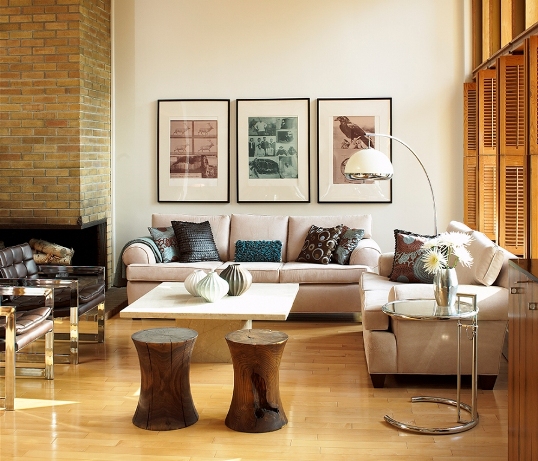
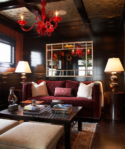
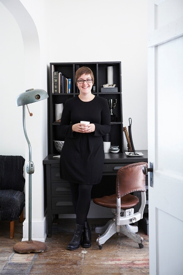
The last time I saw photographer Michael Graydon was just before Christmas, in the grip of a pretty evil snowstorm, when we worked on this feature for Report on Business Magazine. I always enjoy working with him (he has such a calm and thoughtful point of view, and a beautiful way with light and composition) so I thought it would be fun to post some of his work. The five shots below represent just a smidge of what he's done, so make sure to check out more from his portfolio here; in fact, I'm happy to say that some of the work we've done together over the years is there.
The first four shots were seen in Canadian House & Home (that's ceramic artist, Jennifer Graham pictured in #4), and the last - but by no means least - is from Canadian Family.
In bed with art
Here are a couple of shots that I wanted to share that appeared recently in Report on Business magazine. I had great fun styling this gig and working with photographer Michael Graydon, as well as with the fab folks at RoB (Hi, Clare and David!). The concept was to create bedrooms inspired by some incredible artwork and, I have to say, I do love the results.
It might look all calm and restful, but we shot in the midst of a snowstorm just before everything shut down for the Christmas Hols. Yes, it's a real Edward Burtynsky in the second shot; 'Nickel Tailings No. 36' to be exact. Clare managed to borrow the piece for a couple of hours for the shoot, and it was very gingerly hung on the studio wall. Strangely, we couldn't get our hands on the real 'Pic Island' by Lawren Harris (lol) since it's hanging in the McMichael Canadian Art Collection. For more info, and to check out all the sources on the shoot, click here.