Finding 'Found'

So, some smartypants friends of mine are starting a gorgeous new online store called Found that I wanted to give you guys a sneak peek at. It's not quite open yet (the crew are hoping to have everything live in the next few weeks or so), but by the looks of it you're going to want to stop by regularly and check it out. Once things get going you can expect to find a deliciously curated mix of vintage pieces, art and objects, and plans are even in the works to have Guest Pickers stop by with special selections of gear. In fact I heard a whisper of who'll be the first of the bunch and I have to say, it'll be pretty special! Okay, so without further ado, have a look at the pics below (shot by Michael Graydon and featuring some of the items that'll be on offer) so you can really get a feel for Found.

TGIF with LTD

Ah, Friday, the best day of the week. And I'm ending it on a high with a new store that's opened up in my neck of the woods - Love The Design. Stationary designer/photographer Christine Flynn is the talent behind the place, which is jammed with tons of covetable gear - both vintage and new - and with walls filled with Christine's photography. I'm loving the shots of Levi the horse in that last snap, not to mention all the burlap upholstery and that newspaper wall (yum). LTD has been open for less than a week and already there's been a nice bit of buzz about the place (the folks from Covet Garden also stopped by), so it's definitely worth a peek. Ah, and talking of Covet Garden, keep your eyes peeled for a that one great thing post from one of the founders next week! Love The Design is at 1362 Queen St E in Toronto.


Stepping out in Tokyo #1

A few weeks back I found myself in Tokyo, meeting up with my world travelling other half (you can check out his kid-friendly travel blog here) and my little sister (aka Blink London). Well, it was BRILLIANT, and what an absolute culture shock too. We hit all the sights, shopped ours socks off, and generally wandered around checking out as much as possible. One of the neighbourhoods that we thoroughly enjoyed was Nakameguro, a jumble of streets and alleys filled with a boho mix of fashion and interiors shops, much of them vintage.

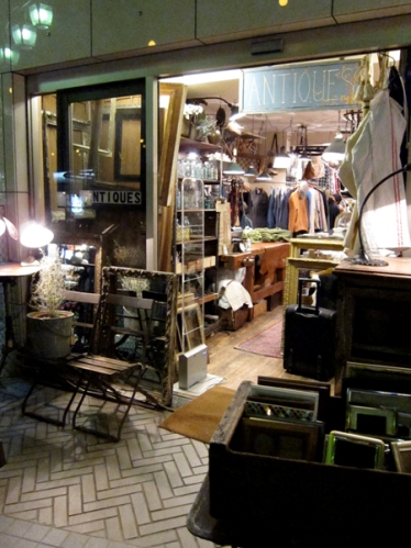
Oooh vintage, such a magic word... Anyway, of course we spent the whole day just in this one 'hood and found a slew of cool stuff. Those first three shots are from Hiige which was all about vintage Scandi gear (we scored some great fabric which'll be sewn into cushions soon). Pics 4 and 5 show Hatago International, next door to Hiige, an ultra cool mini shop jammed to the gills with vintage airline paraphenalia. Jantique is next in the pics, and was like hitting a French or Belgian flea market, and then finally Acme Furniture, which was a great mix of vintage industrial gear (lots of it from the US) as well as new pieces. For more, read my sister's fashion-y take on Nakameguro here.

Spring has sprung

Right now I'm sitting in Vancouver, amazed at all the blossoms on the cherry trees, stunned by gorgeous tulips in full bloom and gobsmacked by a rather warm breeze that doesn't have any clue what 'wind chill' is. Yep, it'll be short lived, since I'm only here for a day on the last stop of a whirlwind tour for Graham & Brown wallpaper (I was in Calgary yesterday, and Edmonton the day before). A major shout out to all the great folks I've met along the way, including everyone at Breakfast Television and Shaw TV !

Spring is definitely springing, and not just in balmy Vancouver. These gorgeous snaps of what HomeSense is offering up this coming Spring and Summer are a lovely taste of warmer days to come and have a bright and fresh vibe to them, oh, and they were shot by my talented mate, photographer Angus Fergusson. I'm totally loving those antiqued metal chairs and the knit ottoman (they're definite hot picks), as well as the smashing shadow box framed butterflies!

Craft in kind

Okay peeps, have you been to the One of a Kind show yet? I took a super fast runthrough the other day and saw some great stuff, and will be finding time over the next couple of days to head back to grab a few things. The show is such a part of the Holiday season for me, and a wander through always puts me in the mood (let alone sampling all the shortbread). So, if you need any more convincing, just check out the vignettes below - which I can totally tell were shot at photographer Michael Alberstat's studio - and are crammed with lots of cool crafted One of a Kind gear.

Two floors of fabulous

Okay, it's gush time. This morning I took a wander around the yet-to-open new 9,000 sq ft Teatro Verde store in Toronto and jeez louise, is it ever jammed to the gills with the most gorgeous gear. Teatro's owners, Shawn Gibson and Michael Pellegrino, and their stellar staff (hello John!) have been working night and day and have definitely outdone themselves. The 2-floor store features everything for the home (there is some absolutely standout lighting) as well as mini boutiques that showcase gear for kids and pets, not to mention a whole section dedicated to yummy Assouline books and - as always - Teatro's lovely fresh flowers. Take a look at the snaps below to get a feel of the place, I'll definitely be popping in again soon, since I spied a mini white ceramic cactus that I could definitely find a good home for (lol). The store opens this Friday at 100 Yorkville Avenue and, if you need any more reason to go, Donna Hay will be on hand to sign her new book No Time To Cook between noon and 1pm.


Bookmark and Share

The orange and the pink

One of my favourite finds at this year's IDS was this fantabulous orange and pink rug wool by Ikea (it's the Stockholm Figur); I just couldn't get that take-no-prisoners colour combo out of my head. So I was happily surprised when I saw this marvy Helix Ribbon pillow by Dransfield & Ross (available through the lovely folks at Teatro Verde) in a similar colour. It's not only the colour - I love that they're both rocking a modernized version of marquetry patterning, tipping towards a retro digital calculator vibe on the Ikea rug.  

Light work

It's been quite mega busy, what with the Interior Design Show (Did you go? What did you think btw?), major painting and priming happening at our place (we've sorted out the main floor, yay! Pics to come...), and then taping CityLine yesterday morning (watch for the show next Monday!). But of course I took time to slack off yesterday and hit my fav Goodwill with my friend Jasmine. I do have my reasons - we still need a long low dresser for the bedroom - but I still managed to find lovely stuff we definitely don't need, like a tooled brass vase-shaped lamp base that sat smartly on a black plinth. All for $9.99. How could I say no? Ummm, I had to, the last thing we need right now is another vintage lamp with 'personality'; if I bought all the ones that spoke to me I'd be tripping over them by now, lol.

While I was sourcing for CityLine I stumbled across this pendant fixture from West Elm and thought it was just so darned interesting that it was worth a post. I'm all over the mix between old and new; it has the feel of one of those star fixtures, but the faceting takes it an entirely different direction.

On the carpet

If I haven't been carrying a box I've had a paintbrush in my hand (which is why I've missed out on posting on the blog), oh the joys of a new home, lol. Yesterday I escaped the drywall dust for a bit and met up with my mate, and rug designer extraordinaire, Bev Hisey. She's just launched her new designs for '09, one of which - Dity Dishes - will be debuting at Radiant Dark 2009, an exhibit of Canadian design curated by Made. The show runs from Feb 5th to the 8th, so make sure you check it out.

Some of hew new work comes with a back story, here's the deelio - Cross My Heart, in wool and silk, was inspired by a neighbour's heart surgery. Sightlines came about from Bev's recent eye exams. Dirty Dishes was inspired by a Petrie dish. Escort was patterned after shredded fishnets from her teenage daughter's punk phase (Bev is thankful it was a short lived phase!). One last important thing - Bev's rugs, as always, are stamped by Rugmark, guaranteeing no child labour was involved in their manufacture.


Over black?

The iPhone is such an iconic design object that's marvellous to hold and play with, let alone place a call, but, does it's slick black finish really match 'you'? Urban Outfiitters have stepped in with a series of happy/edgy/cool artist designed skins to mash things up a little, and take the look beyond basic black. I've picked a couple of my faves below which totally have a decor vibe - Blue Willow by Colin Thompson which, yep, happily borrows from your Gran's china, and Bunny Blossom by Kozyndan totally feels like a vintage wallpaper (I see it working with a navy velvet sofa, pea green wingbacks, a glass waterfall coffee table and an oak herringbone floor - but that's just me...).


A pitcher is worth...

I'm thinking calm thoughts - We are having painting issues. One bedroom is totally sorted, thanks to Zinsser Bulls-Eye 1-2-3 from Home Depot. We'd suspected we were dealing with oil-paint and wanted to play it safe (it's a transforming primer). For the second bedroom, in a wildly bad idea, we switched to a regular latex primer. Yeh, no. As soon as we started slapping it up the walls started to bubble and flake - somewhere underneath that old latex is a layer of oil paint that's causing nasty problems... We're going back to the house tonight to sand the walls and seal everything up with the Zinsser. Lesson learnt, lol.

So, in an effort to get to my 'happy place' here's a quick look at an instant collection that I'd love to make room for - Pitchers. The first is modern with a trad blue stripe, from the Chophouse line by Terence Conran for Royal Doulton. The second is an Ikea classic, Dryckjom, that has the look of a hand-thrown piece at a smidge of the price. The third has muscular minimalist lines; Cove from Crate & Barrel. The fourth, called Kooky Feathers, is all hand-painted and witty from Anthropologie (where else?). The fifth is a major splurge - the pretty Still Life Water Pitcher by Job Smeets from that temple of design; Moss.


Under glass

I love a good window display, they can be just so inspiring. In fact it was one of my first jobs, working in the display department at Selfridges in London, errrrr, a very long time ago...

I happened upon the three windows below, designed for the Big Window Challenge; a competition that's happening right this minute in NYC, dreampt up by the savvy folks at Bloomingdales & Apartment Therapy New York. The first, called Bridget's Bridge and designed by Curtis Robertson, is inspired by a paint-by-numbers painting. The second, The Downtown Chalet designed by Jane Mount, is meant to make you feel a little Swiss. The third, The Bachelor Party designed by Patrick J. Hamilton, is styled to evoke New York at night.

Take a minute and click here to vote for your fave, take a look at more shots of the spaces, and to guess which I voted for (it's currently in the lead...).

via laidbackchick on Twitter

Saved by Saralisa and Sagan

I've been driving myself bananas looking at options for shower curtains, hooks, towel rails and toilet roll holders for the basement bathroom (have a look here). I'd hit every fancy bath supply store I could think of (ummm, no, I won't spend $80+ on a toilet roll holder) and stopped in at every big box imaginable and, seriously, there was bupkis worth lugging home. So luckily yesterday, on a run through Ikea scouting for a makeover I'm working on for CityLine, inspiration struck.

I turned a corner and there was Saralisa; a new line of fabric that just landed the shelves that has the chops to make an absolutely boffo shower curtain. Not sure whether I'll be plunking for the white or the black, but y'know, at a chintzy $6.99 a yard maybe I'll make 2! The other big save was Sagan for all the hook, rail and toilet roll holder business. Hefty and modern in a bright chrome finish - Just what I'd been searching for, and that swish little roll holder is a very budget friendly $14.99...


Fresh and Finnish

I'd given you a sneaky look at Marimekko's Spring /09 releases here, but since there's so much smashing gear from them this season I wanted to post more. The patterns range from playful to edgy in colourways that span warm and bright to high contrast black, white and grey. In fact, after looking through their new line and continuing collections, I think we might be picking one of their fabrics as a drapery choice for our new living space (it's a toss-up between Frekvenssi by Harri Koskinen and Marhaba by Ikka Suppanen).

Another hot announcement is the launch of a new line of Marimekko wallpapers, produced by Italian firm Sirpi S.p.a. The papers are expected to hit shelves sometime after April and will be debuting shortly at all the best design trade shows (take a boo at the first shot below to see one of the papers, the following three shots are a taste of Spring). And, talking of wallpaper, if you'd like a Marimekko background wallpaper for your computer click here.

In Canada, touch base with the wonderful Marimekko Vancouver for info on the collections (they can get their hands on the whole shebang) and, of course, to have anything shipped chez vous. [Images: Copyright 2009 Marimekko Corporation. All rights reserved]


Urban goes garden

I know, it's all bare branches and frostbitten ground out there (at least in this neck of the woods) but soon enough it'll be time to think green and garden, and guess what? Last year Urban Outfitters rather slyly opened up a new home and garden concept called Terrain that would be totally worth the drive to, errr, Glen Mills, Pennsylvania (outside of Philly). Terrain at Styer's is the full name, since they've set up shop in the old Styer's nursery and the goal, says Urban Outfitters, is 'to transform the local garden center into an experience that celebrates the beauty and abundance of nature, while offering an eclectic mix of garden-inspired products tailored for the contemporary customer.' This is all especially exciting since the plan is to eventually open up to 50 locations across the country, though sadly, who know's now whether that'll go ahead...

Take a boo below to get a taste of the place - It's eclectic, rustic and thoughtful and yes, it all looks gorgeously lush and inspiring. On site there's a hothouse, a seasonal exterior plant area, landscape services, and a cafe (what a pretty place to tie the knot!) as well as a beautifully merchandised store. [Images 2, 4, 5 by mytoenailcameoff on Flickr]


Ticking over

I've always been intrigued by clocks and must've caught the fascination quite young; my Dad had a dozen antique clocks in the living room, a few of which chimed on the quarter hour, though never quite in synch, which I'm sure got in the way of me watching Blue Peter and Doctor Who. The black and white clocks I picked below are, imo, all a bit on the cool side and, in a lucky twist, none cost a gazillion dollars.

The first is from Seiko and, strangely, I stumbled across it at a watch repair booth at Sears and not on the shelves of a posh design store. This 8" diameter clock has a modern feel, a hefty chrome frame and can either sit on a surface (it has a stand) or wall mount. If you fancy hunting it down the code is QXG124K, and expect to shell out $55. The second was first manufactured back in the 1930's - the Kit-Cat Clock, who's comical expression, swinging tail and hilariously googly eyes that roll back and forth have made it quite the iconic timepiece. Touch base with Ergo Industries for a Canadian retailer (this little black and white kitty sells for around $73), or check out Kit-Cat in the US for all the other available colours. Finally, in another odd discovery, I found the classic wind-up Big Ben alarm clock - designed by Ellworth Danz for Westclox in the mid-sixties - on the shelves at Wal-Mart for a smidge under $20.


It's all going O.K.

It's official, Orla Kiely has ruined my weekend - We're heading off for a bit of cross-border fun and of course will be hitting Target, who have just released the fact that they'll be launching an Orla Kiely line of housewares that'll hit shelves Feb 1st. Ummm, I'll be there this weekend, not February!

The line of tableware, storage and even swanky aprons is all happily patterned with her trademark look (yes, the de-lovely pear print makes an appearance) and will most probably sell out within minutes. C'est la vie is all I can say...

Not content with cornering the housewares side of things, Ms. Kiely's line of mid-Century inspired furniture, for Heal's in the UK, has also set hearts a flutter. The rich walnut collection is peppered with Orla's patterns and warm colours, and has a classic style that echoes vintage Brit and Swedish furniture. The Lusk Sofa, as well as the Rowan dining table and chairs (all below) are some of my fave's. And, just to confirm that she obviously plans to take over the world, Bewley's Tea in Ireland recently released a Kiely designed tea caddy for their Gold Blend, which has already been spotted on eBay.


Orla Kiely for Target via sfgirlbybay 

Iffy on the table, but the chairs are a go

While the kitchen at our new house is well on it's way to getting completed (yay!) my mind has been wandering to the dining area and how it might get sorted. We'll have a skinny slice of a long table (that at least has been decided, and there isn't room for anything else) but, while I've been saying that wood might be nice, I've been rolling around the idea of something slick and white instead. For dining chairs we'll be doing an eclectic mash-up of painted charity shop specials, that's for sure (I can't abide the red leather dining chair I'm sitting on right now...) but still, I'm in need of inspiration.

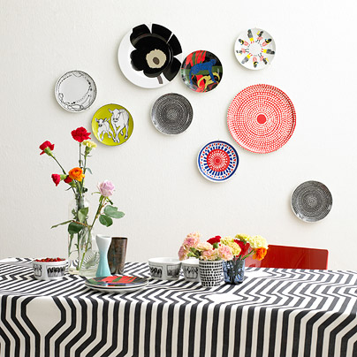
Here are a few shots that caught my attention; bits and pieces of which are floating in jig-saw puzzle pieces around my brain, trying to fit together. The first shot is the latest from Marimekko for Spring /09 (more to come on that delicious front), and I'm loving all the colour and pattern. The second feels eclectic with Bruno chairs paired with a white farmhouse table. The third is the freshest gear from e15, who're on their way to show at IMM Cologne, and I'm all about those old Thonet chairs with their blocky white table (and don't even get me started on that great herringbone floor...). In the fourth that rustic table totally works, paired with lots of white and very barmy lighting. And finally, an 'in my dreams' white painted industrial space that rocks out with a Tulip table and chairs. [ Image 2, 4 Mai Linh, 5, Bertrand Limbour. Via Marie Claire Maison]


What's new? Lots!

Getting a sneak peek at what some of my favourite retailers will be intro-ing for '09 is always super exciting and always gets the decorating part of my brain all happy. Take a boo at what's coming -

West Elm plunks for low-slung sofas and hits of lemon yellow, olive green, burnt orange and turquoise, and has totally upped their well-travelled vibe with Moroccan-ish tray tables, poufs in suede and cotton dhurrie, and ceramic camels and elephants - very Modern Souk.

CB2 (yes, they do ship to Canada) takes a more urban approach with a mix of modern and ethnic touches, orange, yellow and lime and on-trend touches of tie-dye (really!). I loved the rustic South American feel of this set of vases.

Zara Home slaps pattern on pattern in turquoise, sandy gold, cream and amethyst (all v. Moroccan again but with more of a layered flea-market twist) to make quite the chic impression - that striped gold glassware is just fab.


Dry off with a Schnabel

A real artwork by Julian Schnabel is probably out of your snack bracket (mine too, lol) but in an odd pairing, dreampt up by Works on Whatever to help fund major civic artwork, you can splurge on a Schnabel beach towel for the princely sum of $50. The line for '09, launched at the most recent Art Basel Miami,  and made up of works by 4 top-line artists - Julian Schnabel, Raymond Pettibon, Ed Ruscha and Karen Kilimnik - is available through Works on Whatever as well as online through everyone's favourite; Target (though if you don't have any beach time planned, they'd also be quite the chic and swanky way to doll up an all-white bathroom).

Click here to order from Target (they definitely don't ship out of the US - ugh), and click here to see the full line from Works on Whatever (chuck them an e-mail to convince them to ship further afield). WOW is still showing last years collection as available too, which means I might be able to trade-up my kitschy WalMart hula girl for a Jeff Koons smiley monkey! From the top: Schnabel, Pettibon, Ruscha, Kilimnik.