Just a little rad

So thank heavens for the thaw and rising temps, because it meant we could finally get a slew of art hung. Let me explain - Our big ass extension ladder that we keep outside was finally un-frozen enough to drag in and tackle hanging close to a dozen pieces around the house. The big plan was to take on the blank wall in our mondo stairwell, since the other wall has been looking peachy and art-filled for ages so it was high time that we balanced things out.

We found space for stuff picked up in (and dragged home from) Glasgow, London, Buffalo, Tokyo and Hawaii, as well as gifts from friends and vintage finds from our local Goodwill. I love them all, but special mention goes to the largest piece, which is the gorgeous Brooks Brothers Suit (black line) by illustrator/printmaker - and sweetie - Alanna Cavanagh, while another fave is the small RAD print by artist R. Bennett that we grabbed from Chinatown Boardroom in Honolulu. Art is good!

No parking allowed

Yes, our media room used to be a drive-down garage, but that all changed back in the '80's sometime (way before we bought the house) when, in a rather hare-brained scheme, the old owners bricked up the garage door and filled in the driveway to create a v. dingy basement apartment. Oh, it was a delightful surprise when we discovered that that there was only one layer of bricks and some rotten chipboard holding back all the in-fill, take a look here, which meant we had to do a major bit of re-construction.

Fast-forward to now and things are all peachy - That's a Gus* Carter sectional sofa, silk velvet pillows and woven cane hassocks from Constantine, and a fab hand-knotted floor cushion from Bev Hisey. The striped velvet curtains have been discontinued at Ikea, but you can still get your hands on the Kvartal curved curtain rail, as well as the wall-mount Besta Burs DVD storage (topped with a few of my fave collectibles). On the other side of the room you'll catch a white leather tufted chair, an end table, and more of the shaggy rayon rug, all from Elte. Then there's more of that great Ikea Besta media storage, working both as a stand for the LCD TV, and mounted on the wall (we had fun tricking it out with Dioder LED lighting strips). The paint colour is Palais Royal by the no-longer-available Ralph Lauren Paint line from Home Depot. And, thanks again to Angus Fergusson for doing such an outstanding job in shooting the house for House & Home!

The last of up top

While the sun is beaming outside, I thought I'd let you know I've just worked on my first Holiday project (for inVU Drapery), and have been finding glitter in all sorts of odd places. Yep, it's Christmas in July in my world! Anyways, I'm still working through posting the rest of the House & Home feature, and thought it was time to flip you the last shots of the top floor.

First up is my home office which, as David would be happy to tell you, is often ignored in favour of the sofa. We had a piece of glass cut to fit the width of the room and set it on top of a pair of Ikea's Vika Lerberg trestle bases. The chair was picked out of a neighbour's garbage, the rug - look closely - is actually a macro view of botulism, from a series of rugs by Bev Hisey called Dirty Dishes, and the vintage lamp is from Zig Zag. And, honestly, it doesn't normally look as tidy as this. Then, in the second bedroom (ignoring the two smiling goofballs), between a pair of great Ikea bookshelves that have sadly been discontinued, you'll find a re-finished vintage sofa that originally looked like this, and a poster from Shelf. Oh, and that's another Bev Hisey rug on the floor, called Mommy Dearest, which has a pattern of wire coathangers woven into it. Then there's a snap of a dresser, which was a crazy-cheap Goodwill find for $15 that was refinished in white at Beresford's. It's topped with paintings by Zebedee Helm, a pair of Foo Dogs dragged home from Macao, and a print by Bold & Noble. And, as always, the talent behind all these great shots is Angus Fergusson.

Principally speaking

Where, oh where, has the week gone? All my best laid plans of it being a quiet week have literally been chucked out the window, and now it's practically the weekend for heaven's sake! Getting back on track, I wanted to show you lot the pics of the principal bedroom and bathroom from the House & Home feature (shot by Angus Fergusson, of course), so without further ado, here we go.

That first pic shows the bedroom under construction, when we'd knocked out the teensy old closets. Now the walls are all papered with grasscloth from Design by Color, the upholstered headboard and bedskirt are in my fave David Hicks designed Hexagon House Chenille from Lee Jofa, and the cream velvet curtains are from inVU Drapery. The ceiling fixture and lamp on the left of the bed are both vintage, while the one on the right (as well as the shades for both lamps) was snapped up at HomeSense. The closet now runs wall-to-wall, and is the Pax system with Vinstra doors from Ikea, and really, we couldn't live without all that built-in shoe storage, lol. The night tables were a sweet $10 each from Value Village, and the dresser was from Frontier, both were refinished to match in that khaki tone by Beresford's. On the dresser is a kooky vintage lamp, enamelled boxes from AT Design, and above there's a lovely West Elm mirror.

The bathroom was tiny, filthy and all pink, so we knocked out the walls and made it 18" wider to make the space that bit more generous. The vanity is KraftMaid kitchen cabinetry, the integral sinks and counter is Corian, and the walls are tiled in a Carrara marble lookalike porcelain tile called Montova, and yep, it's all from Home Depot. The sconces are from CB2, the mirrors are from Walmart (really), and the towels are Ikea. All the plumbing fixture and fittings in the space are from Kohler, and include the swish Oblo wall-mount faucets, the Purist Hatbox toilet (you can just about see it in the reflections) and the ceiling-mount WaterTile shower head. Oh, and I have to give a shout out to Home Depot Installation Services, as well as our contractors Cera Stone, for all their amazing work on the bathroom!

On the (main) level

Yep, the August issue of House & Home is finally out (with our place in it), so I thought it was high time to finally share the heinous 'before' and the lovely 'after' of the main floor of our house! So you can get your bearings, that first pic is me standing pretty much where the coffee table is now, looking back towards where the kitchen ended up, and all before the walls came down to finally open the space up. For more scary before shots click here.

Here are the deets on those glossy after shots, photographed by Angus Fergusson -

In the living room the sofa, chairs, tables and ceiling fixture are all vintage. The ottoman is from Bev Hisey, a couple of the pillows on the sofa are from The Rug Company, the Montigo fireplace is from Odyssey Fireplaces, and the rug is from Sears. Spot looks awfully cute in this next shot, against the brill Manderley wallpaper from Graham & Brown. That's a Besta cabinet from Ikea (crammed with records), topped with a turntable, a Tivoli radio and a vintage lamp. I made the dining table out of scaffolding planks and a vintage table base, and all the chairs were super-cheapy vintage finds refinished by Beresford's and, all the doors and windows in the house are Jeld Wen. The KraftMaid kitchen cabinets, Corian countertop, glass tiles and Quality Craft bamboo flooring are all Home Depot, oh, and the stools are vintage. The fantastic stainless steel slide-in gas range with downdraft (no need for a range hood!), dishwasher and French door fridge are from Jenn Air. In the powder room, the wallpaper was dragged home from BHV in Paris, and the teensy sink is from American Standard. And finally, a major shout out to our contractors, Cera Stone!


Finished out front

Okay, just a quick one - I'm having a barmy week, and next week will be the same - but I did want to share this while I had a sec. Take a look below and you'll see the finished front of the house!!! You'll have to excuse all the exclamation marks, but compared to the way it looked when we bought the place (take a look here), it's a MASSIVE difference. Major thanks go to our stellar contractors, Cera Stone, who pulled it all off on very short notice (thanks John!), and thanks too to our next door neighbours who kindly allowed us to park the skids of interlock bricks on their driveway while all the prep work was happening. Oh, the bricks - We went with the Charcoal Cobble Lite Paving Stone from Home Depot, laid in a nice and chic herringbone pattern, which works fantastically well with the facade of the house that the contractors painted in Farrow & Ball's dark and lovely Railings. I popped in a couple of close-up shots below so you could get a better look. And finally, how fantastic (and eco-efficient) are the Jeld-Wen windows and front door? Gotta fly, but what do you think?

Getting it going out front

The driveway is happening!!! Luckily our Plan B worked out (major thanks to my brill contractors), and on Friday a big yellow backhoe made fast work of excavating all the old concrete and aphalt. Believe me, I was happy to see it all carted away. The next day, a crew arrived and everything was levelled, then the forms were built and set in place for the concrete curbs that will run from the house to the sidewalk. Plus, for some extra greenery - and really because we don't need parking spots for 3 cars - the crew also built forms for a second raised planting bed. Then the Home Depot flatbed truck arrived with our delivery of the chic and simple charcoal grey interlocking brick I'd picked out (more on that soon). Finally, the concrete mixer showed and gingerly backed into the driveway, dumping 8 cubic yards to create a stable bed for the interlock and to fill the curb and planter forms. Oh, and did I mention this was in the midst of a busy neighbourhood yard sale that we were participating in? Thanks to a v. kind neighbour (hi Mrs Fong!), we were able to set up all our bits and bobs on a yard a couple of doors down while all the construction action was happening on ours...

Before the crew shows up to lay the interlocking brick in the next day or two the painter is here slapping up a couple of coats of Farrow & Ball's super durable and environmentally friendly Exterior Masonry paint in Railings on the facade of the house. Okay, I will admit to butterflies when it first started going up, but imho, I think it looks totally fantastic!

Where we were, and where we're at

Well, while the interior of the house has been completed for a while (you'll see the results in the August issue of Canadian House & Home!), the exterior of the house has been somewhat of a head-scratching work in progress. That first shot below shows the house in all its grimy pink curtained glory when we first bought it, the second, after the fantastic energy-efficient new Jeld-Wen windows went in during the midst of the reno (check out more reno snapshots here). The thing is, the driveway still looks pretty much the same, complete with tired asphalt and broken concrete.

So now I'm on a mission to get it looking at least passably attractive, though the main issue is the mammoth size. It's 20' x 30' with parking for 3 cars. Seriously. I'd been noodling around materials and decided initially on simple and modern exposed aggregate concrete (take a look here), and got a couple of quotes. Errr, one arrived at an eye-watering $16,000. So now we're Plan B-ing it and looking at different options. Oh, and did I mention I want to get this done in the next couple of weeks? Wish me luck.

Bright and clean

Okay, well I'm happy to drop a little taste of our completely finished house. It's the laundry room, which is in the current issue of Canadian House & Home, and to quote a 1968 cigarette slogan You've come a long way baby. To see how vile it actually looked when we first bought the house click here. Yep, that's ugly, lol. Not to mention all the weird stuff we discovered when we ripped out the old basement kitchen - Part of a garden fence was behind the wall and the ceiling was suspended with sticks from apple boxes and an old chair leg. Seriously.

Here's a quick rundown of what you're looking at: We maxed out on storage and usability with Ikea kitchen cabinets fronted in Abstrakt white hi-gloss doors and a Numerar countertop (just out of view on the left there's a Lagan sink with a slick white Ringskar faucet). Built into the cabinetry on the left are the fantabulous  GE Profile SmartDispense laundry pair, more on them here. That sweet carpet is the Spun hand-knotted runner by Bev Hisey, and the wood floor beneath is actually this TrafficMaster Allure vinyl plank from Home Depot. [Image: Angus Fergusson]

Space invaders

My yesterday started rather early, with making a perfect bed at 5.30am. Perfect, since I'd spent more than an hour ironing sheets, the duvet cover and shams the night before. This, of course, was all in aid of our house shoot. Believe me, there'd be no other way I'd be up at that rather ungodly hour or would ever be caught ironing our linens.

8am hit and photographer Angus Fergusson showed up with a car jam packed with equipment and his two assistants (hi Kim and Jackie), and then Meg Crossley from House & Home arrived and we got to work. Main floor first, catching the kitchen, dining room and living room while the light was with us. Top floor next, working through the master bedroom and office. Then to the basement for the media room and laundry area. Finally, back up to the top floor to catch the master bath. 10 hours later and after lots of can I just move that and love it and crazazy good (thanks Meg for that one) and the shoot was done. Phew. We popped a bottle of Veuve and then headed off to The Tulip for a well earned celebratory dinner (their chocolate cake is crazazy good, lol). 

That snap below shows Angus and his camera crammed into our shower, working on a shot of the bathroom vanity. Unfortunately that's all I can show of the shoot without giving too much away. You'll have to wait patiently to see the results show up on the glossy pages of H&H in 2010, and hopefully - fingers crossed - I'll be able to share all the shots at that point too! 

Saint David of the Stairwell

I feel like I should just have the paint roller duct taped to my hand, lol. For the last couple of weeks we have been pretty much painting non-stop, and that includes getting someone in to paint all the trim and doors in the house. The last room is almost done (I'm typing while paint is drying upstairs), so there is light at the end of the tunnel. David, my sainted other half, is the one who should get major kudos though, and maybe a medal and a knighthood too, since he took on painting the wrought iron spindles in the stairwell. It was a job and a half, chiselling off old paint, sanding, priming and painting each and every wiggly bit of iron up three flights of stairs. Oy.

That stairwell has been a challenge (I went mano-a-mano with the acrobatic job of priming and painting the walls and 15 foot high ceiling) and not just from a paint perspective. Nope, we were going too and fro over whether to keep the original banister and spindles. Twice we had it quoted to switch everything out to something custom and modern in tempered glass and steel, and twice the quote came back at $8,000. Gulp. So, instead of auctioning off a kidney, we decided to embrace the kitsch and re-work the original one. As for the old gouged and cracked gold handrail; I managed, after a fair bit of Googling, to find a company to come and replace it for a spanky new one in white. The price? Way less than $8K and from a local company no less - Alku. So, if you've got a place from the Fifties or Sixties and need a new vinyl handrail, check them out. 

Buh-bye serial killer's den

We are totally ending the week on a high note. The laundry area is now a picture of streamlined modernity, completely kitted out with Ikea kitchen cabinetry to maximize on desperately needed storage (errr, coz we had none, lol). Just take a look at that first shot below, snapped when we first bought the house 13 months ago. Ummm, yep, it was obviously the vile den of a serial killer. If anything, the photo makes it look way nicer than it was - Seriously.

I hafta tell you the Ikea installers were stellar. Apart from doing a brill job fitting the cabinets into quite the wonky space, they swept up after themselves and left the place spotless. So, here's the what's what in laundry land, with a few extra pics below to help figure things out - Abstrakt white hi-gloss doors, aluminum and white Numerar countertop, Strecket handles, a Lagan sink and a completely gorgeous white Ringskar faucet (which'll be installed on Monday). It's laundry love fo' sho'.


A pocketful of sunshine? No, a van full of furniture

The house has been turned upside down, and I've been relegated to a small island in the middle of the living room whilst controlled pandemonium occurs, well, everywhere else. The Ikea installers (hello guys) have almost finished all the cabinetry in the laundry area, plus they've started in on the Besta media storage for the basement tv room and the Pax wardrobe in the bedroom (more info on that soon). Oh, and Rod the wallpaper guy is about to put up the last panel of grasscloth in the bedroom and then he'll be onto the paper for the living room and powder room.

Below is the truck full of furniture that we drove, bleary eyed and very early, out to Tim the furniture finisher to get sprayed. We managed to fit a motley crew that included eight dining chairs, two 2-drawer end tables, a 4-drawer chest and a 9-drawer dresser. We'll have to wait a week or so, but everything will be coming back in either a lovely Benjamin Moore Oxford White or Baffin Island. In the meantime all of our clothes have been relegated to plastic bins dotted hither and yon. Ummm, when will this be over? lol

The uproar continues...

Mucho is happening on the house today (yay). Rod, my intrepid wallpaper guy, has started in on the grasscloth in the bedroom. It's a Gramercy wallcovering available through Design By Color and it's already looking mah-vellous. And Rod, ever the perfectionist, is carefully cutting the paper down so each wall has equal sized panels. Take a look below at the first few pieces up on the wall...

Downstairs in the basement we have the Ikea installers working their magic fitting the kitchen cabinetry into the laundry area. I'd planned out the cabintery last week with the Ikea Kitchen Planner - we went with the yummy hi-gloss Abstrakt white doors - then everything was delivered in super-zippy fashion. Now the work is happening very, very fast. A few hours ago all that was down there was this SmartDispense laundry pair from GE Profile, and by tonight most of the cabinetry will be finished. Phew! Oh, and btw - the latest Ikea catalogue smacked down on my doorstep this morning, so in a quiet moment (lol) I'll be leafing through and dog-earing all my new faves.

And then finally, that last shot is the media room, after we'd gone to town with the Ralph Lauren Paint in Palais Royal (take a look at the before here).


Living in uproar

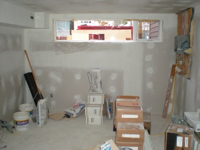
After taking a bit of a breather from the reno side of the house project we're back at it, nose to the grindstone on the last push to getting everything nice and done. Yes, things are a little crazy - Everything has been pushed away from the walls and covered in plastic so our painter can get at the baseboards, doors and windows. Then, while that's going on, we're taking on the painting of the walls before the wallpaper happens (hopefully next week). That first snap below is a reminder of what the basement media room looked like in the midst of the reno, the second is where we're at today; the walls and ceiling are finally primed, all ready for some gorgeous Ralph Lauren Palais Royal to get slapped up. The rest of the basement walls and ceilings were primed too, and next we'll be taking on our mondo stairwell, where we'll be attempting the rather acrobatic job of priming and painting that space as well. Wish us luck!

Unexpectedly lovely

While I do love discovering cool things in very unexpected places, some places are more unexpected than others, so, you can imagine my slight surprise when I actually found the rug for our living room online at Sears. It was well-priced, all wool, and I loved the cut pile and loop pattern, so in a couple of clicks and a couple of days it made its debut. I plunked for the Dynasty rug in Natural Grey and, as you can see below, it looks quite smashing. That vintage Tulip Side Table was another unexpected find, discovered in Quebec in the midst of a friend's Mum's annual fancy dress party. Dorothy had snagged it at a yard sale, and after much cajoling and whining on my part kindly agreed to let us drive home with it. In other words, keep your eyes peeled; you never know what you might stumble across...

No guts, no glory

Sheesh, this week is just running away with me! I've been working on deadlines for House & Home, coming up with some very cool projects for the next few months and working with a client on her lovely Arts & Crafts home. And, on top of all of that, I've been working on getting the house closer and closer to being finished.

One of the exciting things to come home to was the fact that - thanks to the always fab crew at Mieda Design - a fair chunk of our re-upholstery is nearly complete. That onetime grungy 70's gold cord sofa (take a look at the before here) has had the guts ripped out of it and the frame partially re-built (Dan from Mieda explained how sinuous springs can do a real number on a wood frame over the years). I also had the frame built up to increase the seat height and you'll spot the first of the semi-attached waterfall back cushions making an appearance. And yep, that rather vibrant plum fabric you see on the cushion will be covering the whole sofa...


People, places, palette

For the next couple of days I'll be in the wilds of Wisconsin at the Kohler Editor's Conference, learning all about the history of the brand and checking out all their fabulous kitchen and bath products. I'm not alone, since Kohler has kindly invited a slew of design editors from around the world including, yay, a great bunch of Canadians - Janette Ewen (who you'll know from CityLine), Danny Sinopoli (the Globe & Mail's Design & Decor Editor) and Cameron Macneil (House & Home Design Editor). We had a meet and greet last night where I tasted a bunch of delish Wisconsin cheese and had a lovely chat with Pramiti Madhavi, Editor of Elle Decor India.

While I'm here eating cheese, lol, things are moving along on the home front. The fabrics have finally been dropped off at Mieda Design so the upholstery can begin and we've finally plunked on a wallpaper for the living room. Take a look at the palette below for a rundown of what's what - The background shows Graham & Brown's Manderley wallpaper in Golden, the next fabric is David Hicks Hexagonal House Chenille in Stone by Groundworks which'll be glamming up a headboard for the bedroom, that tweedy fuschia will totally revive this vintage gold sofa, and the teal velvet from DFO will completely sort out these vintage aluminum chairs.

Thonet-ish and Thonet-redux

This is turning into a bit of a slow slog looking for dining chairs... We need eight in all and have found three so far that fit the bill. Check out the first shot below of the miscreants in question. I'm now constantly on the hunt for chairs (we found one this weekend, yay), but of course I've added a degree of difficulty. The look I want is a mix-and-mash of bistro/diner/cafe style chairs that don't, to my eyes at least, have a hint or country about them. They'll possibly end up getting sprayed white and upholstered in perhaps a silvery gray; all the better to contrast with our rustic scaffold plank dining table.

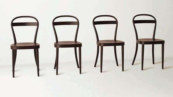
Thonet chairs would be the total ideal since they're workable, durable and still feel classic, even though they first hit the floor more than a century ago. To drive me entirely bonkers Thonet has gotten together with Japanese retailer Muji and created a chic and simple Thonet for the 21st century, influenced by one of Thonet's original releases; the No. 14 chair. Check out the second snap below, and to read more on the project click here. They'll be available at Muji stores worldwide this Spring, so when we're in London I'll be trying to squeeze one or three of them in the suitcase.


Drag bars, dining rooms and stairwells

That chandelier below - now happily hanging in our stairwell - was such an amazing find, so good in fact that I told friends about them and... It is vintage, but funnily enough, the store has carried stock of them for the last 30+ years. While it was sitting in a box waiting for the electricians to hang it a friend spied it and asked me to grab one for her dining room (it looks fab in her all fuschia space), and then an interior designer friend saw it and decided to snag one to add a bit of sparkle to the stairwell of a nightclub he was working on; a Latino drag bar called El Convento Rico. Needless to stay, I don't think the store has very many left, lol.