Drink it, sit on it

I'm a bit barmy for a good chair, and pretty much anything from Emeco makes the list fo' sho'. Love their story (the aluminum Navy Chair was first made for US submarines during WWII) and love how they've hooked up with big names like Starck, Gehry, Foster and Putman and now, errr, Coke. Stay with me here people. Emeco's latest just-launched-in-Milan chair is the 111 Navy Chair, made of 111 recycled PET plastic 20oz Coca-Cola bottles. The 111 is seriously gorgeous, ultra light, has a great green story - Emeco has the potential to recycle 3 million plastic bottles a year - and comes in six swish colours selected by Laura Guido-Clark. Oh, and the extra sweet part is it'll be about half the price of the original aluminum Navy Chair (which, btw, contains 80% recycled aluminum). Fancy getting hooked up? Then pop on over to DWR, since they'll have the exclusive.

Guest blog / Julia Black: Just for the (green) taste of it

Julia Black: Coca-Cola Classic cans might always be, well, classic but the iconic red and white striped pop could be going naked. The design team of Ryan Harc have created a green alternative to the can, albeit a chic silver kind of green. The guys behind Ryan Harc, Ryan Loon and Harc Lee, have designed Colorless, a monochromatic all-aluminum Coke can with a pressed, convex logo, all without any toxic paints and finishes. In forfeiting Coke's bold colours their proposed design will reduce air and water pollution, and takes out the secondary stage of removing the can's ubiquitous paint job once it's sent to be recycled, saving a whole bunch of energy in the process. Although the Colorless concept has yet to be picked up by the folks at Coca Cola, you can visit Harc Lee’s BehanceNetwork portfolio page here and click to give your seal of approval, and - who knows - we might just see the colorless cans on shelves sometime soon (in time for Earth Day?).

To read more posts from Julia click here, click here to check out her cool blog, and then you should really click here to check out Julia's Green Geek video post for HGTV.ca!

Julia Black: Staying in the closet

With New Year’s resolutions and must-do lists in mind, just the thought of tackling my closet gives me a headache. This January, not only do I need to clean mine, I also need to source an entirely new closet system that can smartly handle all my clothes and accessories, all while staying within a relatively thrifty, post-holiday budget. Thankfully, West Elm has once again managed to answer my prayers in efficiently chic home décor, this time with the Bergen Closet Collection. All the shelves, drawers and racks within the line are both stackable and portable, so I'll get that posh custom look and can always take it with me should I ever want to move! The icing on the cake: The collection (available in chocolate & white) is made with FSC-Certified wood veneers (which means it’s using material from sustainably managed forests), uses eco-friendly hardwood construction (so no MDF and therefore less glue and other icky stuff) and is finished with water-based stains and lead-free lacquer. If that isn't good news enough, most of the hardware is made from recycled materials. Love!

To read more posts from Julia click here, and to check out her cool blog click here.

Julia Black: Milk, no cookies

When hunting for eco-friendly alternatives to painting furniture while we were shooting Pure Design, I was ecstatic to discover Homestead House Paint Company, Canada’s only milk paint manufacturer. I was even more thrilled to learn that beyond the 45 shades of all natural, enviro-friendly milk paint, they also have wood stains, 100% acrylic latex paint, and traditional oil paints (linseed or hempseed oil, just like the pioneers used), all of which are eco-awesome! If you can't find a colour you love (like the pretty robin's egg blue called Loyalist) all of Homestead's natural, biodegradable, VOC-free and all around earth-friendly paints, stains and finishes can be matched to any colour you wish, and can be used on just about anything - both indoors and out - that you fancy. So, as we look forward into the New Year, we can also look back and appreciate that some historic design tricks are in fact the way of the future. Cheers to a healthy, clean and environmentally kind 2010!

Check out the snap below to see Nadine and Jacques' gorgeous Homestead House milk-painted cabinet (and lovely living room) from a recent episode. [Image: John Queenan]

To read more posts from Julia click here, and to check out her cool blog click here.

Dark and cold

Last night, as the temperature dipped once again (ugh), I stopped in at the opening of Radiant Dark, and I have to say, the show is totally worth checking out. The mix of all-Canadian designed pieces on show bridges the line between concept, art and design with some exceptionally cool results. Take a look below for a couple of quick snaps I took -The Stag (Tapestry) by Grant Heaps crosses paint-by-numbers with pixelated 1" squares of fabric stitched together - how cool. And more of Bev Hisey's Dirty Dishes; circular rugs inspired by bacteria, viruses and Petrie dishes. Other highlights for me include the In The Round (Dining Table) by Luflic that pairs felted wool covered legs with a polished glass top, and Propellor Design's Dram (Chandelier) that re-cycles vintage glassware into a very covetable light fixture.

Radiant Dark, organized by the fabulous folks at Made, opens today and runs until Feb 8th, click here for more info.


Absolutely bananas

This totally made me laugh this morning - I needed it since a wee bit of stress is kicking in about us packing and moving into a semi-ready house, plus we still need a ceiling fixture for the new living room, and this one is just about the coolest/funniest one I've seen.

The Chiquita Chandelier, yep, made of Chiquita Banana boxes, was designed back in '03 by Netherlands based designer, Anneke Jakobs, who was obviously way ahead of the curve with the trend of 'upcycling'. And, if you fancy your very own chandelier chez vous, Anneke gives you two choices; either order one directly from her, or get thrifty and crafty by downloading the PDF instructions (here) to make one yourself. If there's a run on banana boxes at your local grocery store, don't blame me...


Via Elle Decoration South Africa

And in this corner...

It's been a big week for the house project and I have to say, after popping in there today, that it really does look like we'll get in there by Feb 1st.

On the kitchen front, Home Depot's Installation Services have done a bang-up job on the initial install on the Venicia cabinetry in prep for the appliances that arrive next Tuesday (yay Jenn-Air!). Once the appliances are in, the countertop will be templated (we're going with a Corian surface and an integral sink). And then, when the counter arrives (in around a week to 10 days), we'll be able to finish by tiling the backsplash.

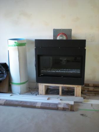
One thing we had our fingers crossed for was a fireplace for the main floor and yep, we managed to squeeze it into the budget. It's a swish letterbox style direct vent gas unit by Montigo (the flue goes straight out the exterior wall) that we sourced through Odyssey Fireplaces, who installed it nice and swiftly a couple of days back. Cera Stone, our great contractors, will be framing and finishing the surround this week. Take a boo at how it looks right now, and how it might look once finished, though we're currently kind of taken with the fireplace surround in that Marimekko shot in the post below...

And finally, under all that protective paper, is our delish new bamboo floor that we scored at Home Depot - Quality Craft carbonized bamboo in a Gunstock stain (it's the middle tone in the sample board below). While I was researching flooring choices the whole sustainable side of bamboo made so much sense - Bamboo can be harvested in 3 years, while oak needs 125 years to reach maturity.

To check up on the reno, and to see what's happened so far, click here.


Urban goes garden

I know, it's all bare branches and frostbitten ground out there (at least in this neck of the woods) but soon enough it'll be time to think green and garden, and guess what? Last year Urban Outfitters rather slyly opened up a new home and garden concept called Terrain that would be totally worth the drive to, errr, Glen Mills, Pennsylvania (outside of Philly). Terrain at Styer's is the full name, since they've set up shop in the old Styer's nursery and the goal, says Urban Outfitters, is 'to transform the local garden center into an experience that celebrates the beauty and abundance of nature, while offering an eclectic mix of garden-inspired products tailored for the contemporary customer.' This is all especially exciting since the plan is to eventually open up to 50 locations across the country, though sadly, who know's now whether that'll go ahead...

Take a boo below to get a taste of the place - It's eclectic, rustic and thoughtful and yes, it all looks gorgeously lush and inspiring. On site there's a hothouse, a seasonal exterior plant area, landscape services, and a cafe (what a pretty place to tie the knot!) as well as a beautifully merchandised store. [Images 2, 4, 5 by mytoenailcameoff on Flickr]


3x modern kitchens, 1x sexy chair

I'm apparently well and truly kitchen obsessed. Now any glimpse of a swish new cabinet or sleek countertop has me all googly-eyed, so of course, when I caught sight of DWR's latest - a capsule collection of cabinetry (pardon the alliteration) - I was, well, drooling.

Designed exclusively by Nilus de Matran for Design Within Reach, DWR: Kitchen is set to order in three finishes; black oak, white and walnut. The line is entirely free of exterior hardware, which is thankfully one less excruciating decision if you ask me and, since the cabinetry is designed as a modular system, it's built to be portable, so when you move it can come along with you!

Of course I can't leave it there. Another DWR exclusive for /09 is a petite group of chairs designed for Emeco by iconic French designer Andree Putman for the recently redesigned Morgans Hotel in NYC. The Morgans chair, handmade of 80% recycled aluminum, is available in a trio of sexy finishes - brushed anodized aluminum, satin black and gloss white. Mmmmm, is all I can say to that.

Green, peace and cheers

Happy Hols one and all! I'm off for a couple of days of turkey and rest, after we dig out the car from a snow drift, lol, and head out of the city. Below is the Peace Bird, a collage by Christopher Bettig for Artists to Watch (a fab greeting card company), and my card of choice this year that I snagged at Urban Outfitters - I loved the design and since it was printed with soy ink on recycled paper, how could I resist? Cheers!

I'll go for One

Work at the house continues apace and we're making decisions left, right and centre to keep things moving in the right direction. The basement had major issues - it looked like a serial killer's hangout and had been horribly re-wired at some point by a maniac with a death wish, so anything we do is an improvement, lol.

First up is the basement bathroom, it's all sorted and ordered (yay!), so hopefully the chic and terribly water efficient American Standard Champion 4 toilet, with 6L water consumption, is winging it's way here as I type this. Along for the ride, and again from American Standard, is the mod Ravenna pedestal sink and clean-lined Serin tub. The jam on this part of the project is the sleek and handsome One series of faucets that we're going with for the tub and sink; all swish and sparkly in a polsihed chrome finish. Lovely, and the whole shebang can be ordered at Home Depot.

The space will be finished off with satin white subway tiles that will be laid stacked from floor to ceiling (take a look at the inspiration shot below) and a Marine light for above the sink (a thrifty fave of mine). Hmmm, what to do for a mirror?

Take a look here to catch up on the rest of the fun and games with the reno. 


Green is good

While we're dealing with some scheduling issues on our reno (the windows are arriving after the kitchen = ugh) a couple of cool projects dropped into my inbox and I thought they were worth sharing. Moss Sund Architects did a brill job on both these Toronto homes.

Neither are new builds, they're both modern and thoughtful renos of modest family homes that maximize green solutions - Each has geothermal heating, is designed for passive solar heating and is kitted out with a green roof and rain harvesting system. And, everything used on the homes was locally sourced, recycled material.

The first is an update on trad High Park brick home with a 2-storey addition. The second took a Beach bungalow and gave it a modern second level (love those cedar shakes). Click here for more info and to take a boo at the interiors.