Hot seats and beachside villas

It feels hot enough to fry an egg on the sidewalk, so thank heavens friends introduced us to Botica’s Spanish Valencian Orange Gin. Poured over lots of ice and served with good tonic (or, in our case Italian mandarin soda), it’s the perfect antidote to this July heat.

Cheers, Arren


How incredible! Designed as an intensely creative endeavour between Thabisa Mjo of Mash.T Design Studio and South African furniture makers Houtlander, the Hlabisa Bench features a stunningly sinuous pink basketweave backrest woven by Zulu master weaver Beauty Nxongo.

Watch Nxongo at work on the bench here, working in locally harvested palm that is all dyed by hand. Oh, and if pink is not your thing? The Hlabisa Bench is also available in a slightly more sober, though no less graphic pattern - Take a gander here.

Houtlander_2019_Hlabisa-Bench-pink-diamond_seating_1.jpg
Houtlander_2019_Hlabisa-Bench-pink-diamond_seating_5.jpg
Image: Beauty Ngxongo, master weaver of Zulu baskets, and Stephen Wilson of Houtlander

Image: Beauty Ngxongo, master weaver of Zulu baskets, and Stephen Wilson of Houtlander


“A creative village by the ocean where music, art, design, food and wellness play together,” is an apt description of the ace new Potato Head hotel in Bali. Sustainability is the focus, with award winning architecture designed by OMA and collabs on furnishings with big name design talents like Faye Toogood and Max Lamb. There’s a lot to love, but - thanks to the current situation - we’ll have to wait to enjoy it as the project is in hibernation until later this year.

In the meantime, you can ogle some of the fab pieces included in the rooms, like Lamb’s Study Chair. The cool seat is made by local Balinese craftspeople from a confetti-patterned recycled plastic material from Smile Plastics (watch the video below).

Each chair comprises of 833 recycled plastic bottles - seriously stylish and sustainable or, as Potato Head would say, #GoodTimesDoGood.

potato head hotel - furniture shots-14-IMG_4368.jpg
desa-potato-head-seminyak-bali-hotel-potato-head-studios-amenities-max-lamb-chair-768x1024.jpg

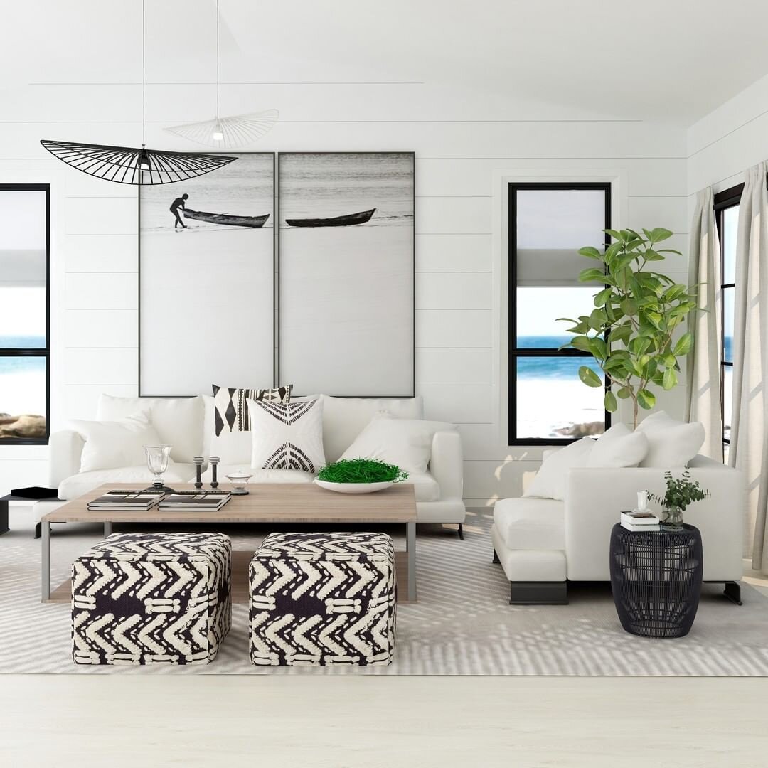
We’re dialling in more of those summer vibes with interior designer Alicia Ruach’s take on a laid-back beachside villa..

As Rauch explained to House & Home, “I love the contemporary beach house vibe! The warm wood tones and crisp whites juxtaposed with black accents add a punch of drama and interest. This style is a sophisticated coastal retreat that you would find on the picturesque coasts of South Africa.”

It’s good to dream, right?

104935950_1040302526386880_4844853422456682402_n.jpg

Checking in, checking it out

Ah, Istanbul. That's where I've spent the last week, walking, exploring and - mmm-mmm - eating! We stayed at The House Hotel Galatasaray, designed by one of my fave design teams, the Turkish firm Autoban (read a great Dwell interview with them here). And oh, let's just say it was pretty fantastic, both the hotel and the city!

Built in the 1890's as a 4-storey mansion - in a neighbourhood that's now quite the hotbed of scrumptious vintage and antique stores (more on that later) - the hotel is owned by Alex Varlik, who's also the smartypants behind a chain of chic restos called The House Cafe that are dotted across the city. Each of the hotel's 20 suites are a lovely modern mix between the historical vibe of the building itself, Autoban's custom furnishings, and quirky/cool touches like the street address marble tiles in the bathroom, the standout gold and white chandeliers (oh, I wish I could've crammed one into my suitcase) and the super fun free-standing showers.

I'll be posting more inspirational stuff on Istanbul soon!

No holds barred

This brought a tear to my eye - A peek inside the stunningly intense interiors of the just-opened Viceroy Miami, designed by Ms. Kelly Wearstler. The spaces are all entirely about sparkle, verve and panache with a keen sense of eccentricity and style (can you tell I've been reading Diana Vreeland's biography? lol). Here's a word or two from Kelly on her inspiration “…a blend of modern sophistication with a dash of exotic flair and timeless East Asian accents. The color palette is multi-layered with sumptuous tones, which off-sets the classic forms and organic finishes – antiqued mirror and brass, onyx, stone, marble and wood.” Anyhoo, I'll let the pictures speak for themselves...

From the top: The main lobby and detail. a vignette from the resort's Signature Restaurant, a view of the express lobby, a look at Club 50 on the 50th floor (think of the views of Biscayne Bay), and finally; one of the rather swish looking bedrooms kitted out with KW linens and robes. Plus, to check out my 5 Quick Questions interview with Kelly, click here.


Bookmark and Share

Living the (fantasy) life

Palm Springs. Can we move there? I get almost compulsive about a place one we've visited, constructing a fantasy life that involves buying a place, settling in and becoming a local. Lisbon and Rome are on the list, but it's Palm Springs where I practically lost my marbles - It's cool, quirky, and about as laidback a place as you can find. Other than emptying that imaginary bank account, the closest we'll get to moving down there is scoping the interiors of the Parker Palm Springs hotel (designed by Jonathan Adler, and which has a lobby I'd happily try and cram into my carry on, take a look below).

Parker%20Palm%20Springs%201.jpg

Parker%20Palm%20Springs%202.jpg

Parker%20Palm%20Springs%203.jpg