Carmen - a lover or a fighter?

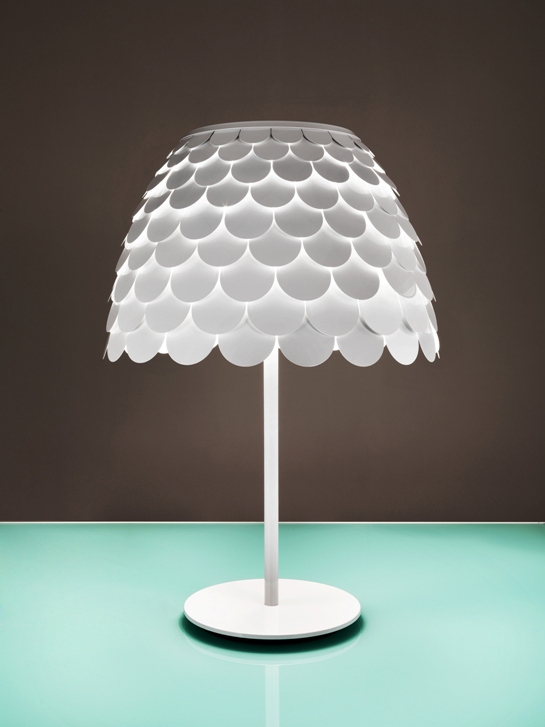
This'll have to be quick-sticks for me, since I'm about to slap some fresh-caught Chinook salmon on the grill and uncork a lovely red - It's been that kind of day. I did want to taken a sec to share my favouritest (I know, it's not a word) lamp that I spotted at the ICFF a while back. It's Carmen from FontanaArte, and comes in the lovely table version below, as well as a pendant option too.

I think it's the witty shape, and the crisp lines in white powder-coated steel that make me just love it so. Funnily enough Héctor Serrano, the designer behind Carmen, was inspired by medieval armour, but if you ask me I see more of a frilly bathing cap thing happening. To each their own I guess. Oh, and I also scored a snap of Serrano's notebook with his initial sketches for the line. Don't you love getting a peek into the creative process?
 

A couple o' owls

Can I hear a hoot-hoot? Okay, apologies for the punny intro, but owls are just not going away. This morning I caught a behind-the-scenes Facebook snap of some prop owls that Dwell Studio will be using on an upcoming shoot (here), then there are some incredibly cool owl bookends that Indigo will be intro'ing in August - along with the rest of their fantastic new home collection, not to mention Uhu, the cool wall-mount lamp from Contraforma that's pictured below. I caught the Contraforma line at the ICFF and I hafta say, I was super impressed by the Lithuanian crew behind the line.

And then there's the rather sad looking owl vase in that second shot. It doesn't have a name, and has probably been languishing in a shady corner in my mother-in-law's garden for at least 10 years. Well, I decided to stage a rescue, and its now been brought home, washed and is on its way for a bit of a fix-up. So keep an eye out for more owl pics soon!

New York whirlwind

As I write this I'm close to comatose on my bed at The Hudson hotel in NYC. Yep, it's been a bananas couple of days running around Manhattan checking out everything that's going on during New York Design week and the International Contemporary Furniture Fair, and it's not over yet. Below is a snap of all the catalogs, postcards and mags I've collected so far that caught my eye - and yes, before you ask, I've already edited it down to the stuff I really, really like. Luckily it all fits in the Tom Dixon bag that I snagged, which seems to have gotten the vote of the coolest ICFF bag around (hot on the heels of the gold metallic bag Tom Dixon doled out last year). And keep your eyes peeled, I'll be posting lots of my NYC design faves over the next while...

Brief, colourful and pixelated

Sheesh, I'm having two short weeks in a row, what with the ICFF last week and the just-happened long weekend. At least we got the planting done on our back yard vegetable beds (I can't wait to check out the Tigerella tomatoes!), but other work beckons so I'll keep this brief - What are your thoughts on pixels? And, for that matter, fractal patterns? Have we all had enough, or, is this all still - to quote Martha - a good thing? I don't know about you, but I could totally work the brand spanking new Cristian Zuzunaga for Nanimarquina hand-knotted wool Digit rug into my place at a moment's notice...

Spectacular and charming

Out of all the gazillion things that passed in front of my eyes at the ICFF, two were standouts for me for very different reasons.

First up, let's deal with the spectacular side of things with the Steel Cabinets designed by Sylvie Meuffels for JSPR. You'll know JSPR from these rubber covered baroque chairs, but Sylvie, a cum laude graduate from the Design Academy Eindhoven, is a bit newer on the scene. The handmade cabinets she's designed are wonderfully barmy, with a nod to both architectural forms and dusty old museum displays. They're brill, and I can imagine them filled with collectibles or turned into a terrarium - I just wish I had the space for one!

On the charming end of the scale is the work of Brit designer Matt Pugh. While Matt is well-known for his signature Owls (which I wouldn't mind a flock of some day), it was his playfully simple - and entirely anti-serious - Cat and Silly Duck lamps that managed to plaster a grin on my face, even after a very early Porter flight from Toronto to New York. Can't you see these looking ever-so-cute in a kid's room?

Patching it up in NYC

I'm in NYC right this second, check-check-checking out the world of design in and around the International Contemporary Furniture Fair. After walking the show (and interviewing folks like Amy Butler, Kelly Hoppen and Matt Carr) I ventured further afield to have a look at all the off-site exhibits. There's been some awful stuff (sorry, but I really don't want wall sconces and table lamps made of real squirrels and mice), and there's been some fantastic stuff, like the chance to see the tribute by artist Tal R for the 50th anniversary of the Arne Jacobsen Egg Chair at ABC Carpet & Home. There are masses of the quilted patchwork covered chairs on show at ABC, and each has a different feeling. I've included a couple of my faves below, one of which feels really quite nutty, while the other has almost a preppy vibe to it. Then, for the crafty types out there, there's a close-up of the fabrics from one of the other chairs. Finally, a shot of the man himself, surrounded by some of the tonal chairs he produced. Yay for patchwork!

Say hello to Amy and Kelly

Well, here's a nice sneak peek at the brand spanking new Graham & Brown wallpaper collections designed by Amy Butler and Kelly Hoppen that'll be launching this weekend at the ICFF in New York! First up are Amy Butler's deliciously patterned Temple Tulip, Georgia and Fountain. Next are Rose, Hicks and Vintage Flock, all from top Brit interior desiger, Kelly Hoppen. Oh, there's more, but that's all I can get away with showing you for right now! Any faves?

Know your ABC's

Madeline Weinrib is a firm fave for her delovely work in flatweaves, hand-knotted carpets and pillows, and now she's branching out. Upcoming for Ms. Weinrib is Allemande, her first foray into wallcoverings produced for her by posh wallpaper firm Studio Printworks (who're also working with artists like Michele Oka Doner and Kiki Smith). Yep, it's a damask pattern, and yep, it's black and white, but take a closer look and you'll see a free-and-easy painterly quality to the pattern that keeps it all nice and fresh and unexpected. Allemande will be on show in NYC at ABC Carpet & Home - the famous store founded by her grandfather, Max Weinrib - in mid-May and will definitely be worth a peek. I'll be popping down to New York soon for the upcoming ICFF so will let ya know how it looks! Take a look below at a couple of snaps of the silkscreened paper, including a close-up shot and, somewhere in the pattern, you might spy a little extra scribble that could be MW's initials... Oh, and if you fancy checking out Madeline Weinrib products in Toronto, check in at Y&Co.(via INK+WIT)


Open doors

The idea of buying things that last has really been on my mind lately, at the ICFF the idea of 'anti-throwawayism' was quite the trend across the board. Fast fashion, and now fast decor, is here to stay, but hopefully people will look for better quality in everything they buy - its just more sustainable.

I came across this glam cabinet by Somerville Scott & Company this morning and just loved the attention to detail; the lacquered hits of red and green, and metallic leaf, against the ebonized walnut are wonderful. For most of us this is totally out of our snack bracket, but an investment piece like this - that mashes up art, design and craftsmanship - will stay fabulous for years to come.

Somerville%20Scott%20%20Co%201.jpg

Somerville%20Scott%20%20Co%202.jpg