Boxing day

Storage is on my mind - I've been noodling around different ideas to keep everything organized in the office at the new place as well as the media room, let alone what I'm going to do with all the collectibles that, ahem, keep on appearing. This popped up on my screen the other day and struck me as smart, simple and - since it's customizable - just about the coolest option I've seen in a while.

Stacked, designed by Julien de Smedt Architects for Muuto, is a series of white open cubes that simply clip together to form any number of storage solutions. I can totally see it looking chic filled with books and white pottery against a snazzy wallpapered wall. In Toronto look for the Muuto line at Bergo.

Dark and light

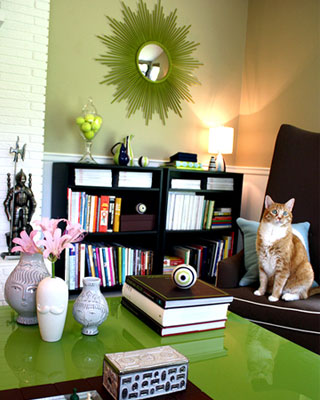
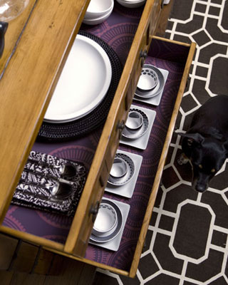
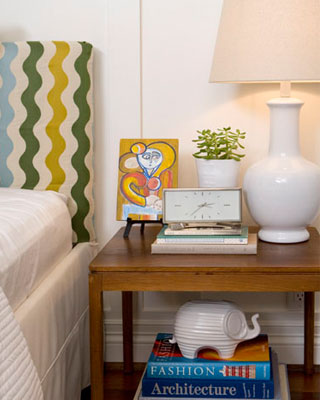
Chiaroscuro - The interplay of dark and light. There's a $10 word; drilled into me at a tender age by my Art History teacher who's Scottish brogue sauced every word she carefully pronounced (I've never heard 'r's rolled better). It popped into my head as I was scrolling through the beautiful work of photographer Annie Schlechter who, I discovered, has shot for both Jonathan Adler and Kelly Wearstler as well as quite the laundry list of top design and decor mags.

Take a look below at a brief selection of images that hit me as fabulous - interesting interiors shot with an eye to style, colour and texture - and be sure to click here to check out the rest of Annie's portfolio. Oh, and don't be stealing that ochre and concrete colour combo from the first shot; I have my eye on it for our new place.


Paper plain

I'm messy. Right now, and as per usual, I'm sitting at the dining table with a slew of press kits, piles of paper and assorted business cards scattered hither and yon. Everything is important, everything is right now and yes, it's a mess. Other than hiring a personal assistant (lol) I daydream about getting more organized, and how it'll all be different once we have a real live office space in the new house. In the meantime, I'm jonesing for Susyjack's thoroughly modern and beautifully patterned collection of office supplies and 100% post-consumer recycled paper goods.

Irresistible colour and pattern aside, how cool is the Day of The Week Clip Set? And those jumbo Cork Backed Desk Clips, Notes and Notebook are simply marvy and, as Susyjack says - 'Pretty Useful'. Click here to shop, and make sure to take a sec and check out designer Susan Connor's blog Heysusy for her take on inspiration, fashion and design.


With the grain

While I was waffling on about wood grain the other day I was remembering one of my favourite faux bois pieces; the Plynyl Woodgrain Floormats from Chilewich. These mats hit the floor late last year and are a cool modern take on the faux bois trend, add in the fact that the super durable woven vinyl surface is bonded to a comercial grade slip-proof backing and you've got something that'll survive a game of tag or a pitcher of grape juice.

The mats are available in 3 colours - dogwood, driftwood and pecan - and 4 sizes. Click here for the full list of Canadian retailers.


Good scents

"Good taste in design by no means depends on money." So said the late David Hicks, the ultra influential interior designer who's wit and style is still echoed and emulated by many a designer at work today. Apples, as they say, don't fall far from the tree, which is why it's no surprise that his daughter, India Hicks is a triple threat - author/model/designer - in her own right. Her latest endeavour is a collaboration with Crabtree & Evelyn on India Hicks Island Living, inspired by her own sense of style (think a kicked back and relaxed version of Colonial) and shown to gorgeous effect in her book Island Life, available here.

I love the look of the packaging on the Island Night candle; the sculpted silver coral is a sophsiticated touch. Ms Hicks worked on the design as well as the scent - and yes, it smells mah-vellous.

Prints charming

Never say never, but I shudder to think that faux-finishing might make a comeback. I can just about deal with faux woodgraining (even Martha gave that a go) but I'll dig in my heels if ever anyone suggests bagging, dragging, ragging or marbling. Stencils, on the other hand, feel quite right with all this print and pattern that's been going on and British firm The Stencil Library have oodles to choose from. Their range covers off Chinoiserie, Regency, Deco and Mod with just about every pattern imaginable (from peacocks and trellis to tractors and camouflage). One of their latest endeavours is a re-dux of an 18th Century idea, when grand houses dedicated a room to prints and pictures that were pasted directly on the wall - kind of like large scale scrapbooking for the Pride and Prejudice set.

Take a boo below at a few of the different styles, I think they're rather fun; and yes, they ship to Canada.


Tea with Joe

Wednesday was all about deadlines. I was literally glued to my laptop, banging away to get a gift guide done for the National Post (look for it mid-Nov) so, by the time I was done, I was desperately in need of a cuppa. I was in luck; Dammann Freres, a storied French tea company that's been around since 1692 - honestly - is making it's debut at Pusateri's glam Flower & Gift store up on Avenue Road in Toronto. The store is well worth a visit (I don't wanna hear from any whiners about needing passports to head north of Eglinton), and the tea? Delish. My fave was L'Oriental, a flavoured black tea with citrus-y notes, but there's quite the range to choose from, and at $18 for a pretty tin they'd make an easy-peasy hostess gift. Oh, and the rest of the store is jam-packed with beautiful flowers and scads of vases and accessories, many of which were exclusively hunted down for the store.

Next stop was the Joe Fresh Style fashion show for Spring/Summer '09 down at the tents for L'Oreal Fashion Week. I sat with the Flare crew and thoroughly enjoyed the looks tripping down the runway, but for me it was so all about the colours. Navy, grey, white, grey/blue, a buttery ecru, acid yellow and hits of sorbet brights. All I could think about is what a fresh and modern colour palette that could be for a space!

Take a look at the snaps below for a feel of Pusateri's store, the tea, and the Dammann Freres swish patterned teacups and teapots, as well as one sneak peek from the runway.


5 quick questions - Kelly Wearstler

With a polished yet edgy take on uptown chic, and a very fashion-forward view on style, Kelly Wearstler rocks the glossy world of interior design. Her signature look is a high-tone mix of vintage and new, the odd and unusual, and often features elements that take a keen sense and educated eye to actually pull off - Almost like a design version of a circus high-wire act. She's been featured in Vogue, on the cover of Domino and, I've raved about her on the blog before (take a look here). Kelly has lots on the go, no surprise there, so I can't tell you how happy I am that she found time to answer 5 quick questions!

Below you'll see quite the glam Bauble Box from KW's collection for Bergdorf Goodman, as well as a couple of shots of the Tides South Beach (photography, Annie Schlechter). Kelly was shot by Mark Edward Harris.

Arren Williams: What's inspiring you right now? 

Kelly Wearstler: I derive inspiration from everywhere - travel, nature, fashion, art, architecture, modern technology... everywhere. 

AW: Is there anything you'd like to see banished from interiors? 

KW: A drab, visually uninspiring space is never in style. 

AW: What's the next thing you have your eye on for your own place?

KW: I'm still in the process of designing my current home, so I'm looking for so much at the moment, especially amazing art for my house. 

AW: How would you describe your current style and how has it changed over the years?

KW: My style is always evolving so it's impossible to pinpoint it exactly. I'm a Modernist at heart, and, of course, I love all colours. Since I began my career as an interior designer I've learnt to educate and train my eye, leading me to become more confident, and sassy in my work.

AW: What's next for you?

KW: So much! This past year I opened my boutique at Bergdorf Goodman, where I have a line of decorative accessories and introduce about 20 new pieces every season. I also created my first collection with The Rug Company. Most recently, this Fall, I created a 150-piece collection of fabrics and trimmings with Groundworks at Lee Jofa. Up next is a line of bedding, table linens, decorative pillows and throws. I'm also working on several hotels - including Vicerory Miami and Anguilla, set to open in the first half of 2009 - as well as residential projects. 


Vintage potential

In my books there's nothing more fun than shopping vintage, and Toronto definitely has quite the brill selection of stores to check out. On a recent Saturday we'd biked down to Queen Street East and, ummm, ended up buying vintage sofas in two of our favourite stores. This is a twofold problem - #1, we weren't planning on this at all, and #2, we really won't be in the new house until January 1st. So, I had to chat up the upholsterer we always use - Mieda Design - to store them for us for a while (thanks Dan!). The reason they made the cut for the new place is because of their lines - they're both unusual and have an anti run-of-the-mill feel - and vintage is certainly a thriftier option when it comes to buying furniture, even if it does have to be re-done.

The first one we snagged was at Zig Zag; it's is on the small side for sure and will probably end up in the office. Despite the vile fabric we saw past the ugly granny vibe and will probably end up spraying the brown wood frame out in a glossy white and then re-upholstering in a graphic print. I think it'll look super sweet.

The second, found just up the road at Ethel, is so much a 70's redux of a Chesterfield that it totally felt right for the direction we want to go. This one will make quite the statement in the living room, and it'll feel a whole lot fresher in a rich velvet rather than the stained harvest gold corduroy. In fact we weren't the only ones that saw the potential - It was just rented for a movie set on a flick that's currently filming in the city. Too funny, our sofa is a celebrity...

In bed with Style

I snuck into the Style at Home Show on Friday morning for a quick runaround before my crazy day started. The Dream Master Bedroom Suite was quite the stunner, created by senior design editor Margot Austin and her talented crew, so I took a few snaps in between setups while the suite being shot for CityLine (congrats on CityLine's new host being announced btw - Tracy Moore!). I'm totally digging the wallpaper and all the touches of gold, and I do believe that's the Lulu DK Matouk bedding from Elte that I posted about here - Enjoy!

Sneak peek - West Elm

Phew, the time has whizzed by in a total whirlwind, so mucho apologies for going awol and not posting quite as regularly as I might like. The last two days have seen me zipping around town in a truck for a setup at a chef's competition and then having a proptastic time dressing a set for tv. Ummm, where is my glass of wine???

Okay, lets hit rewind to Wednesday night and the simply wonderful opening of West Elm in Liberty Village. I was in 7th heaven wandering round since the store is so much my vibe right now - Modern-ish with a warmer edge and a touch of wit; in other words design that doesn't take itself too seriously. The store is huuuge, way larger than their Chelsea store in NYC, and the loft space really works for all the room sets, wall of chairs and wall of occasional tables as well as (sorry, it's so soon) quite the bombastic selection of Christmas decorations. Who knew I needed a jumbo glass ball covered in crocheted lace? Well, let me tell you, I really, really do...

Here are a few fave picks from the night as well as some shots to give you a taste of what the store is all about.

#1 Copper Table Lamp - This made me go weak at the knees. Hammered Copper with a metallic lined black shade. Mmm, irresistible. $229

#2 Ice Crystal Pillow Cover - A swish silk cover (one of tons) that I fell for. Love the faceted pattern and the colour combo. $29

#3 Narrative Squirrel - How cute, and there's a rabbit and turtle to round out the menagerie and sit pretty on your mantle. $18


5 quick questions - Jonathan Adler

Okay, this is just marvy - Jonathan Adler kindly said yes to being interviewed for the blog, so here we go!

Just to recap; he's one of my top design heroes who initially started as a potter and then, when his look caught the eye of stylish types, sauntered with an impressive amount of verve and wit into almost every aspect of the home (y'know, I can't think of anyone else who'd think of launching a scented candle with the name of Hashish!). When he's not overseeing his mini empire you'll catch him on Bravo TV, in his role as head judge on Top Design, and recently Jonathan tied the knot with his other half Simon Doonan, writer and sassy creative director of Barneys New York - So major congrats!

Below you'll see snaps of Ojai, his fab new line of dinnerware, as well as a peek at a glam interior project in NY (photography, Annie Shlechter). And click here for more on Adler's 'Happy Chic' style.

Arren Williams: What's inspiring you right now?

Jonathan Adler: I'm kinda' feeling rustic these days. My bloke and I are building a new country house and we're feeling very earthy and natural. After all, I am first and foremost a potter.

AW: What will drive you bananas when you walk into a room?

JA: Excessive technology on display. I hate those newfangled lighting systems that never work and require teams of engineers and repairmen and all those weird-ass television remote situations that are incomprehensible. I like my technology simple and intuitive.

AW: What's the next thing you have your eye on for your own place?

JA: I'm waiting for our new OJAI dinnerware to arrive chez nous. I love it. It's bold and poppy but rustic and crafty--everything that I love.

AW: Is style inherent?

JA: I grapple with this issue all the time and go back and forth. I think anyone can have passable style, but great style is innate.

AW: What's next on your agenda?

JA: I'm opening a couple of new stores, one on the Upper West Side and one in Santa Monica. And, I'm always doing squillions of decorating gigs and making new furniture and trying to find time to work in my pottery studio. I'm very, very lucky. When I first started my career as a potter, my dream was to never have a proper job again and to find an audience for my work. At the time, my idea of success would have been a life of hawking my wares at rain-soaked craft fairs if it meant I could earn a living making pots. The creative opportunities and experiences I have now are totally unexpected and thoroughly appreciated and I never take any of it for granted. So, next on my agenda is more design and more fun!


Daytripper

Over the long weekend we jumped in the car and headed east, after getting a bit cabin crazy in the teensy apartment. Port Hope was the final destination, since we were on the hunt for Fall colours as well as cute town to wander round in. Well, check and check.

Of course we ended up shopping, how could we not; there are scads of antique and vintage stores along Walton Street and on a couple of the side streets too. The best store by far, and well worth the drive, is Michael Thomas Antiques where Michael, the owner, presents a well edited selection of furniture and accessories. The store is only 2 months old yet already has a very sophisticated vibe and yes, we bought something - A giant round brass tray cocktail table that'll look simply smashing in our new place. Take a look below to get a feel of the place (I think I might be going back for that set of chairs).
More, please

You can never have too much art! The wonderfully quirky artwork below is the latest from Angela Adams, but you might know Angela better as a rug designer (her modern, arty rugs are available through Design Within Reach as well as Home Depot). When this appeared in my in-box yesterday I have to say I was immediately drawn to the colours and almost folky vibe, and then when I checked out the website I was even more surprised - The archival prints, taken from her rug designs, start at an eminently affordable $65 US. Not too shabby, and a delightfully personal way to dress up your walls! Click here to look at the full listing of prints (put me down for Rain in 12"x16").

Oh, and if you're tweaking about the wallpaper - I got word that it's a sneak peek from Ms. Adam's new collection of sustainable contract wallcoverings, available early next year from MDC.

J'adorable

Jonathan Adler is a complete and utter design hero for me. Okay, I'll gush a little more - How could you not love someone that's on a one man mission to bring his 'Happy Chic' vision to the world? His work runs from pottery to lighting, furniture and rugs and is witty, irreverent and always interesting and, on the couple of occasions I've met him, he couldn't have been more charming (I've even received the occasional thank-you note when I've featured his gear in a mag; how nice!). Click here to check out the interior he did for The Parker Palm Springs Hotel - I could so move in.

I was taking a boo at a great website the other day -- PointClickHome -- when I discovered that he'd judged a Happy Chic Home contest. Take a look below at some of the winning results and, of course, read the reason's why they made the cut (click here for more). Happy, chic, and in Jonathan's words - j'adorable.


Keeping calm

For me at least, this is the design equivalent of a one-two punch - Keep Calm Gallery are a Brit firm and one of my total faves for affordable, graphically inspired art (they ship worldwide too). It all started with their 'Keep Calm and Carry On' print, inspired by a vintage WWII poster, that caught on with design types across the globe and has popped up in quite a few house shoots since. I've included their latest edition below, printed in metallic gold (v. on trend), because it's still so fab.

Well, now they branched into the world of tea-towels! Can I hear a woop-woop? Laugh as you might, this has got me extremely excited (click here to read more about my mania). The towels are printed on heavy-duty cotton and have the same smart graphic vibe as Keep Calm's posters - I love!

The towels can be ordered online from their new store The Manicule, and if you're in Toronto, head straight to Up To You to buy them in person. Look below to see 'Stand The Heat' and 'Tea Revives You'.


Clearly chic

How small is your kitchen? If you're in a condo or even a standard Victorian row house then you've gotta think smart when it comes to everything that you pick up, so anything that stacks or nests is a major bonus. I picked out these glasses for their sheer style as well as for their smart stackability, take a look -

High: The Alpha set of 5 stacking tumblers, and a bowl with lid, in mouth-blown crystal by Lobmeyr from the NYC temple of design - Moss.

Medium: Joe Colombo's sculptural 5 in Uno set of glasses from the nice folks at Design Within Reach.

Low: The Rigi is a stacking double-walled thermo glass that'll keep a latte hot and won't singe your digits, from Bodum.


Totally floored

Jennifer had posted a question asking whether Flor modular carpet tiles shipped to Canada, and yes, thankfully they do. The question gave me a chance to re-visit their site and to take a look at all their new gear (there's lots!). I love their stuff but y'know, I'm not the only one - If you click here to check out the 'Pretty in...' post you'll see Flor tiles in cream looking very ladylike in Samantha Pynn's living room.

Below are my three top picks from Flor's latest selection of patterend tiles, though do make sure to check out all their textures and solids, and don't forget to take a peek at the v. swanky Martha Stewart collection too. From top to bottom - Stitch In Time hits that whole handmade needlepoint trend with a very sweet patchwork twist. Skully is edgy, darker and punky (yes, it's skulls, lol). And finally, Hello Down There stays cool and urban with a satellite view of a cityscape.

Bright idea

You've just gotta love Ikea - They knocked it out of the park with their Kulla table, celing and floor lamps, which are well on their way to design classic status, and now they've done it again with the Ikea 365+ Brasa pendant light. It's the Brasa's cool and simple Scandi style that caught my attention as well as the fact they're finished the same way as the Kulla line - in a crisp yet slightly glossy powder-coated steel. Now I don't want to give you too many ideas, since I have the perfect spot for the white one in my new place (and lawd knows I'll be peeved if they sell out), but I can totally see one of these little darlings hanging over a rustic wood table, and looking smashing doing it.