Pretty in...

I was searching for a shot from Style at Home of Samantha Pynn's home to include with my interview with her (click here to read it), and of course I came up empty handed, so you can imagine my surprise when one popped into my inbox this morning! Lucky indeed, since it's just the prettiest space, with her trademark shots of pink and a polished feel that's modern with a touch of 40's glam about it. If anything, it puts me in mind of the interiors in one of my current fave films, 'Miss Pettigrew Lives for a Day', a frothy flick set in pre-war London that's well worth renting. 

This leads me onto something that'll definitely be worth booking into your calendar this month - The first ever Style at Home Show that'll be debuting down at Exhibition Place in Toronto on Oct 17th. They have quite the laundry list of fab presenters that includes Samantha, Margot Austin, Colin McAllister and Justin Ryan, Sarah Richardson, Lynn Spence and Tommy Smythe. You can book your tickets here, and it looks like you'll definitely be getting your design money's worth.

Here's that shot I mentioned, snapped by one of Sam's favourite photographers; Virginia Macdonald (make sure to check out her stunning portfolio).

Hot shop

West Elm is finally opening in Toronto and the countdown is on. It's caused quite the flurry in the Flare magazine offices (those gals know style when they see it) and a few editors have already been scoping online so they can make a beeline once the doors open on October 16th in Liberty Village. It's a favourite of mine too, they hit the nail on the head for that modern, fresh and (wonderfully) affordable vibe. I've snagged an invite to the preview and will post a few hot picks as soon as I can, but in the meantime take a peek below to see what all the buzz is about.

Make mine red

I accidentally came across the work of Avril Loreti yesterday while I was wading through resources and trying to tie up a gazillion loose ends on features I'm working on (yes, I'll e-mail Australia to see if I can get a larger image of a teacup...). Honestly, checking out her witty line on Etsy was quite the welcome treat (click here to visit her Etsy store).

Anyhoo, of course I found a favourite, and while it was a toss-up between the Mustache Handkerchiefs and her Wine Ring Cocktail Napkins it was the napkins that won out. I think they'd make a brill hostess gift , plus they make me fondly remember back to when a guest managed to throw a glass of red across a freshly painted white wall. Nice.


Season-less

I thought it would be fun to share one of my favourite shots from work this Summer - It was a Weekend Decorating story for Canadian House & Home that was all about re-working and re-thinking wicker for the home. Morgan Michener and I pulled this story together and it was shot for the July '08 issue by Angus Fergusson (make sure to check out his mah-vellous work). As we move into Fall I wanted to pop the shot onto the blog mainly because wicker, rattan and cane are now on everyone's radar and have moved beyond the 'hot weather only idea' that most of us had. Love the black painted dresser and the silvery metallic cane wallpaper that is super subtle yet super chic.

Have it, want it

I made Pear Butter on the weekend, I know, very Martha of me, but we ended up with two bags full of ripe pears from my in-law's garden and I had to think of something. Apparently I'm part of a trend, lol; a new generation getting into preserving, canning and pickling and all that jazz. I have to tell you, listening to my Italian contractors talk obsessively about the best way to make and can tomato sauce (the trick, apparently, is to let the tomatoes dry for a day or two to concentrate the flavour) I'm not the only one. My trick for the Pear Butter (it's all in the pureeing) was the indispensable and goodlooking Ikon Blender from Breville - Check out their line if you're hunting for well-designed countertop appliances.

Otto can't make a smoothie, but how about a shot of espresso? This little guy is the very racily styled  '08 Australian design award winning stovetop espresso machine that has caffeine fanatics drooling. You'll have to sign up online and wait a little for an Americano, since the first orders ship out in November.

Oh and btw, the Pear Butter is delish.


Pillow talk

What can I do to make my sofa look better? Well, the first thing you can do grab the pillows the sofa came with, y'know, those matching ones, unzip and keep the fills (you never know when you might need them) and then drop the old pillow covers off at a charity shop. Honestly, it's for the best.

Just like the current penchant for vintage one-of-a-kind lamps the world of pillows has shifted from matchy-matchy to something altogether more unexpected. Pillows, please and thanks, do not have to match your sofa, so step up the sophistication and get shopping! Now, if you're a 'Paris apartment' type the pillows below might not be for you, but they are ever so mid-century cool, and have the history to back it up. This is the Art Collection, a line of vintage prints re-issued by Swedish textile firm Ljunbergs that Design House Stockholm has run up into a swanky line of pillows. Luckily they're available online here, and just think how they'll gussy up your beige sofa!


5 quick questions - Samantha Pynn

Apart from being quite the style savvy gal (after all, it's not for nothing that she's Style at Home's Design Editor and a guest expert on Citytv's CityLine) Samantha Pynn is one of my closest friends. And I have to tell you, anyone that can survive a marathon New York shopping trip with me is a real keeper (as long as we managed to hit Jaques Torres Chocolate a couple of times she was happy). As you might know Sam has been snapped up by HGTV to host her own show - Pure Design - which debuts Tuesday night at 8pm. The concept for the show is 'pretty but with a twist of green', so it's definitely on-par with Sam's real life and her own personal design philosophy (yes, she really does wash her floors with hot water and lavender oil). I thought it might be fun to put Sam on the spot and ask her a couple of questions -

AW: What drives you nuts when you walk into a space?

SP: Floor plans that revolve around the television - let's get back to conversation!

AW: And what's your current favourite colour combo?

SP: These days it's all about lavender and pale grey, but I'll always love all manner of blues and pinks - they'll always work for me. And, recently, touches of orange have been creeping into my work too; it's energetic and full of life.

AW: What's the next thing that you'd love for your your place?

SP: I've had my mind on a custom made octagonal ottoman, upholstered in hemp with a bronze nailhead detail. Textured and polished!

AW: Vintage or new in a space?

SP: It's all about a mix. Vintage is the best way to add personality and to do something unpredictable. Like finding an old wingback chair and covering it in a modern fabric, then painting out the legs in a bold colour. Add that chair to a room and you'll get a beautiful kind of tension with your new pieces, things get layered and sophisticated.

AW: What's next?

SP: I'm on my way to my favourite yoga class - It's one step at a time!

Watch the birdie

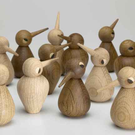
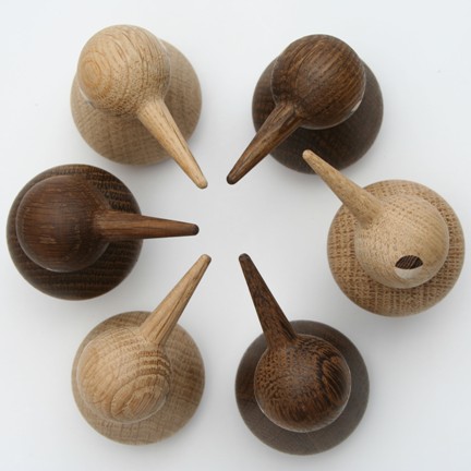
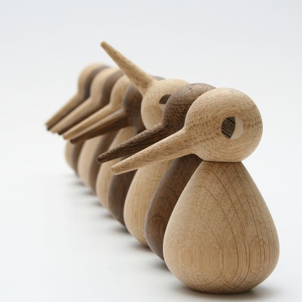
Cute, yes, but covetable design objects too. These birds were first designed back in 1959 by Kristian Vedel and have now made it back into production through Architectmade, a v. cool Danish firm that's carefully bringing design classics back to life. Each bird is handmade in oak by a wood turner in a small village in Denmark, there are 3 sizes (representing 3 generations), and the body can be flipped and the head moved to give these little sweeties as many different personalities as you might like.

If you fancy picking up your own little flock check out Ella + Elliot for more info.


Art happens

Last night was the opening of Art Interiors 15th anniversary show which had the fun concept of letting 15 folks, me included, pop in and pick out a piece that they loved. Art Interiors is a very modern style of gallery - an un-fusty, relaxed and very un-intimidating place to visit that is usually stacked to the rafters with artwork large and small. You can even register here (I'd rather get art as a gift than a set of pots and pans any day). Looking around at the gallery walls the results couldn't have been more diverse, but the most interesting thing for me was reading each and every quote that gave the reasons why the piece was chosen. Art makes such a personal statement and is an integral part of any interior - 'the cherry on the cake' as one person said - so seeing what Suzanne Dimma, Samantha Pynn and Brian Gluckstein might actually hang on their walls is very cool indeed.

The show runs from September 26th to October 7th - Have a look below at the photography piece I picked, by artist Alex Taves; I was drawn to the dreamy blurry colours and the way it brought back childhood memories of travelling abroad (and that's just how everything looks once my specs are off).

Sneak peek - Crate & Barrel

Today started off with the best of intentions and then slipped into something akin to a Keystone Cops movie, except my car chase involved multiple stops across the city picking up props for a photo shoot while fielding phonecalls and e-mails. Fun? Let's just say I'm glad to be home.

Okay, back to the beginning - The Crate & Barrel press preview this morning! All I can say is that I was like a kid in a candy store, wide eyed at all the beautifully stocked shelves and making mental notes as to what was a 'right now' purchase and what could be grabbed 'later'. I was impressed with the bang-on colour choices and how they really seemd to speak to everyone from contemporary, to trad, to eclectic; and all done with a particular C&B sensibility.

Here are my 3 top picks -

#1 Decorative Globes - Practically every design editor had stashed a bunch of these in their shopping basket. They'd sit v. pretty nested in a bookcase or would look marvy stacked in a bowl (definitely this season's alabaster egg...). From $6.95.

#2 Mistral Pillow - Flame stitch is having a major moment (I'm seeing it everywhere) and this pillow is a smashing example. The colours have a warm Fall vibe, jewel-y but not too much, so grab a couple for your sofa. $46.95

#3 Alpha Table - A kind blogger sent me a link to this (thanks Kareena!) so I was jonesing to see it in person. It has a hot 70's feel (in a good way), but to make it totally mine I would have it sprayed out in white. $995


Good shop, good cause

Everyone is buzzing about Crate & Barrel opening in Toronto at Yorkdale this week, on the 25th to be exact. I'll luckily be getting a sneak peek , but if you fancied a swanky night's shopping in advance of the hoi polloi on Thursday morning then I've got a bit of news for you.

Crate & Barrel will be hosting a special Private Preview Party to benefit Toronto's Ronald McDonald House on the evening of Wednesday Sept 24th. A $50 ticket will get you cocktails and appetizers, with a little music to while away your shoptastic time and complimentary valet parking (so you won't be struggling across the lot with all those bags). Click here for more info (the page link is on the right) and to buy your tickets.

And so to bed

Have you ever had a wander round Elte? It's such a treasure trove of a store that just seems to go on for miles and miles, and, with discoveries around every corner, you might just need to stop into their cafe for a reviving shot of espresso. I was scouting there recently for projects for CityLine, mulling things over and generally lollygagging around, when a lovely line of bedding snapped me back into focus.

Clean, crisp and bright with graphic trellis-y patterns they were just a breath of fresh air. The line is LULU DK MATOUK, and it's the latest endeavour from the multi-talented designer Lulu de Kwiatkowski. Take a boo below and tell me you couldn't do with an extra hour or two of hitting the snooze button (I'm totally loving the cool-as-a-cucumber navy and white combo). Oh, and for more Lulu, hunt for her new self-titled book from AMMO Books.

I heart Kelly

Kelly Wearstler is taking over the world, and believe me, the world will look all the better for it. The fashionable Ms. Wearstler, who's portfolio hits all the top notes, is one of my favourite interior designers; swanky hotel design (The Viceroy, The Tides and Avalon to name a few, click here to take a look), a collection of carpets for hot Brit firm The Rug Company, a chic design boutique in Bergdorf Goodman, and, not forgetting her sassy judging duties on Bravo's Top Design - Honestly, how does she find the time? I'm always slipping her work into Flare, and if you check the Oct issue of Canadian House & Home you'll find an interview with KW on pg 58 (love the shoes and that wonderfuly wacky chair).

And there's more... A new fabric collection for Groundworks at Lee Jofa. I had the chance to check it all out yesterday at the new Kravet/Lee Jofa showroom and was totally wowed. The look is modern with strong Asian influences that put me in mind of wood block prints, lacquerware and vintage kimonos, all nicely rounded out with flame stitch and Ikat patterns. You'll definitely see some of this fabric at work in my new place...


Fashion tech

First off, thanks to the witty and well dressed folks behind Fashion File's cool blog for giving me a mention. Check it out for their behind-the-scenes insight on what's happening on the street and on the runway!

More on the fashion front - HP hooked up with designer Vivienne Tam on a swanky new Special Edition clutch-sized laptop that debuted in Tam's NY Fashion Week runway show. I'm loving the signature red case with it's funked-up floral motif (imagine it as wallpaper, mmm) that picks up on prints in the collection - definitely more chic than geek. The word is that you'll be able to get your well manicured hands on it in October.

Spanish Eccentric

Maybe it's a Brit thing -  I'm always inspired by eccentricity, and in the design world who better expresses it than one of my current faves - Jaime Hayon. Wacky, surreal and downright fabulous are trademarks of his style; this guy creates his own rules and follows his own very odd heart (can you imagine any other designer having a shot taken wearing a pink fuzzy bunny suit?).

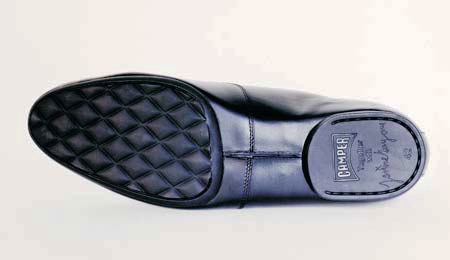
Hayon and Camper Shoes are a smart fit - both are edgy yet iconic Spanish brands - so it was only natural that a sneaker collection from the witty designer ended up hitting stores;  "a sporty shoe with a touch of elegance" is how he descibes them. And, since I'm such a sneakerhead, I'd love one in every colour....

Take a look below at the shoes and check the quilted detail on the sole and how it picks up throughout his work. Following on is a store he designed for Camper in Paris and a v. glam restaurant, La Terazza del Casino, in Madrid.

Laundry Love

So, I have to admit, while pulling together Style Scout for Saturday's National Post - all about the sudsy world of washers and dryers - I ended up shopping for our new laundry room. Sleek design, smarty-pants features, seductive colours and of course energy efficiency and water conservation all came in to play.

It really was love at first sight with the just launched GE Profile SmartDispense laundry pair. Their SmartDispense dishwasher had caught my eye a while back (read a TreeHugger review here) - and this new washer is just as jammy: it only needs to be topped-up with soap every 6 months. Add in Stain Inspector to take care of everything from grape juice to motor oil, and CleanSpeak, which lets the pair 'communicate' to seamlessly figure out how best to dry a load, and you have a winning combo. And finally, by switching out an old top loader for this Energy Star darling you'll save up to 14,000 gallons of water a year (that's like 3,000 showers). Need I say more?

Just smashing

The ceramic stool/end table has turned into quite the must-have decor item for today's spiffy home. Originally found in a traditional drum shape and patterend in blue and white (or a riot of Asian blooms) they've hit just about every level - Check out the House & Home collection at The Bay for one in white and also the on-trend metallic Convex Drum Table from the soon to open West Elm. And, while these chic multi-purpose stools hit the Eclectic nail on the head, if you're a bit more clean-lined and modern, are you completely out of luck?

Nope! I just checked out Avenue Road (it's a bit off the beaten track but well worth the trip), where they showcase lots of yummy and v. luxe collections, and discovered a new line of tables from Christophe Delcourt. IKO, OKO, OBI, OUM and OUK are the four styles that can be ordered in a whopping range of 18 glazes, including metallics, brights, and, of course, white. Chic and modern indeed.

Technorati Profile

Paris address book

For whenever you might get there, here are my picks for favourite (and affordable) places to hit in Paris -

La Touristique:

The Palais Royale is well worth finding to take a stroll through it's formal garden and art installations, all wrapped by an arcade filled with vintage stores, galleries and fashionable spots. And, for a respite from all that shopping in the Marais district, make sure to stop in at the Musée Carnavalet. The museum covers the history of Paris, but it's the manicured gardens that are well worth seeing.

Le Shopping:

BHV

A hilariously odd department store, and Parisian institution, with a huge hardware filled basement and lots of cheap and chic decor on the 4th floor (I found some fab wallpaper here). Call me strange, but I love to check this place out! 14 rue de Temple


Marche au Puces, Porte de Vanves

My fave Saturday morning antique/junk market, especially since it’s less pricey on the whole than Les Puce de Saint-Ouen at Porte de Clignancourt; it’s totally do-able by the time it’s done (1pm), and has the best selection come rain or shine. Avenue Georges Lafenestre & Avenue Marc Sangnier (Metro Porte de Vanves - line 13)


Habitat and Zara Home

Habitat is a fab UK home store with cool design-y product that’s priced a bit higher than Ikea (they’re owned by them); I could fill a couple of suitcases from this place. Despite the address change Zara's decor store - Zara Home - is right next door and has a fashionable, well travelled vibe and again - inexpensive gear. 30, Boulevard Capucines and 2, Boulevard de la Madeleine


Fauchon

Quite the most glam grocery store you might ever come across, their packaging is extra swanky (love all the hot pink) and their decorated eclairs are magnifique! Place de la Madeleine


Maison Berthillon

An iconic French ice cream maker on Île Saint-Louis, and a great place for a tasty treat after visiting the Notre Dame de Paris cathedral. 31, Rue St Louis en l'ile

Below are snaps of the Palais Royale, the garden at Carnavalet, the Vanves flea market and a window display of those marvellous eclairs at Fauchon.


French dish

Today I was at Maison & Objet, an amazing trade show with the best of the best from the world of home decor (and the reason of my visit to Paris). It was quite the slog since not only is it jam packed with just the most amazingly inspirational and, well, cool stuff ever (like jellyfish chandeliers, hand-painted wallpapers and covetable accessories) it's also massive - Each hall is at least the size of a couple of football pitches and there are, ummm, seven plus to zig-zag through, lugging more and more catalogues as you go. I'm now physically and visually exhausted - so much to see and so far to walk!

Of course walking in Paris is the key thing to do, since you never know what you might discover. Meandering along rue Saint-Honoré we came across what looked like a store right out of the late 19th Century, with old wood shop fittings, cracked plaster walls and the smell of beeswax. Of course, nothing was as it seems, since this was the retail location for Astier de Villatte, and the shelves were piled with some of the most gorgeous and unusual handmade white dishware I've ever laid eyes on. Take a look below (I just can't get over those star plates...), and in Toronto check out French Country for the line.

Funny business

Yesterday morning I was getting grubby, and covered in stray sparkles, dressing a Christmas tree in downtown Toronto for a shoot, and now I'm jetlagged and just getting back to my Paris hotel room after a press event held at the top of the L'Institut du Monde Arabe (an incredible Jean Nouvel designed building on the Left Bank). It's a funny old business for sure (and look for more from Paris shortly).

Talk tonight turned to the subject of colour. Myself and friends were chatting with trend powerhouse Nelly Rodi about what's she's seeing next for both fashion and decor - always an interesting subject - and I was reminded of a great shot I had seen from Anthropologie that is just smashingly gorgeous, showing their utter commitment to colour and pattern. Take a look -