Slightly north of Acapulco

Last week a very nice bloke showed up at my door with a van full of very cool chairs. He'd been asked to stop by by a friend of mine who thought I'd really like his stuff, and yep, I have to say that friend is totally on the ball. The bloke in question is Paul of Innit Design, who has just started to import the Acapulco Chair into Canada from Mexico. Originally designed by a French tourist in the 1940's - so the story goes - since then it has managed to find a spot in both chilled out beach resorts and the chic neighbourhoods of Mexico City. And, apart from being really rather swish, I'm happy to report that the chair is eminently comfortable, looks brill both indoors and out, and is even available in a super fun kid-sized version.

Tune into CityLine on Citytv this coming Monday to see the chairs in an ultra-colourful vignette I pulled together. Or, if you fancy giving one a try, pop into Hollace Cluny, Urban Mode and Ella & Elliot (for the kid's version). You can also click here to see Innit's full list of stores.


A fashionable seat

Rick Owens. Rick Owens. Rick Owens. If you don't know who he is, the NY Times - for one - thinks him influential enough to dedicate this Profile In Style to the man and his passions. He's actually a Paris-based American fashion designer (here's his website; his look definitely on the darker side), who also designs limited edition furniture with a sculptural Neo Gothic vibe. His influences range from Modern design icons like Eileen Grey, and artists like Brancusi, to the skate parks of his native California. Cool? Definitely. Brutal? Yep. The kind of thing you'd like in your house? Well, I think I could find a spot, but how about the rest of you?

If you're in the UK over the next while you'll be able to see more of Owen's work at the London gallery of Sebastian + Barquet.


Say hello to Lonny

Okay, how about we dub this Good News Wednesday? Back in July, Michelle Adams (ex-Domino Mag staffer and now queen of printed organic fabrics at Rubie Green) and her mate, photographer Patrick Cline announced they'd be starting Lonny Magazine, an online decor mag, this Fall. Well, a taste of the mag has surfaced, including a lovely mission statement that just has me drooling in anticipation; take a boo at the lovely snaps below and let me know what you think. Make sure you check out MA Belle - Michelle Adams' great blog - and for more on Patrick Cline click here for a quick interview with him. And, if you fancy, you can become a fan of Lonny on Facebook here.


Monday is Tuesday

Ahhh, the bite of a long weekend. Tons of time to hang with friends and wander about in a warm-weather daze, and then bam; Tuesday hits and we're all pointing our noses back at the grindstone. Blurgh, is all I can say to that.

Saw these while noodling through one of the many design sites I check out, and, well, my jaw dropped. Is it the black, the beautifully styled shots, or is it the fact that they look tufted? No matter, they're darned delicious. I have quite the thing for tufting and managed to score a tufted white ceramic stool the other day for the bathroom (from HomeSense) so, when I saw these, I couldn't resist posting them. Rex Ceramiche Artistiche is the company behind the tiles. They're called Capitonné - which is actually the technical term for button tufting - and come in 14 colours including both a matte and glossy finish. Yum.


Bowling 50's

Lovely news this morning from Normann Copenhagen about the company reviving a design classic; the Krenit bowl. The fine-edged and ultra-simple enamel bowls, designed by Herbert Krenchel in 1953 (they won a gold medal at the Milan Triennale in 1954) were in production until 1966, and now have hit hot collectible status. Normann Copenhagen's re-issue comes in three rather sober colours - white, blue and green - so we'll just have to keep our digits crossed that they go and get all the original happy colours (like the red and yellow) back into production. Krenit is available in two sizes, including the large never-before-produced badekarret size (which translates into English as bathtub) and, well, I totally fancy a slew of them scattered down the centre of my dining table...

That first snap shows the original bowls, the second is Mr Krenchel himself, and the third shows the new Krenit bowls in all the available colours. If you'd like to get your sticky mitts on them, drop Canadian online design retailer Lumiaire a line to see when they'll be available.


PS I love you

The other day I overheard an interior designer say how much he hated Ikea, slagging it off as cheap and nasty, and I thought to myself how he'd completely missed the point. Their affordable design means that anyone and everyone can have access to cool gear, no matter what stage of life and how deep their pockets might be. I've gotta say, if you're too posh to have Ikea in your house, then you obviously far too posh for me, lol.

The new Ikea PS collection is finally in select stores across the country (hello Boucherville, Etobicoke, Edmonton and Coquitlam) and is definitely on the cool side. The line employed hot designers such as Hella Jongerius, and edgy all-woman Front Design group, to come up with a slew of fab stuff. In researching the stories behind each piece I stumbled across a bunch of Ikea PS videos that I thought would be sweet to share. The first gives an animated overview of the collection, the second (subtitled in French) digs deeper and follows Hella Jongerius to India where the Mikkel wall hangings are made - and how brilliant that each one is signed by the craftswoman that made it... Click here to check out the rest of the videos (be sure to watch them in HD).


AWOL in TO

Yep, the last couple of weeks have been, shall we say, major (to quote Ms. Victoria Beckham). Basically we rocked out and got just about everything finished on the house. Seriously. Everything. I am exhausted, as is my other half, and oh, since we weren't quite busy enough we brought home an impossibly cute Whippet puppy on Sunday.

So, what with the arrival of Spot the Whippet, painting, painting and more painting, furniture deliveries out the wazoo, wallpaper going up and hanging artwork, not forgeting the nailbiting time I had watching Dan and Craig of Mieda Design gingerly maneuver a 10ft long upholstered headboard up the stairs - well - no time to regularly post. Anyhoo, I'm back at it and sharing a taste one of my current fave lighting collections. It's called Havana, is designed by the always witty Jonathan Adler for Robert Abbey, and is available from quite a few spots across the country. Apart from lusting over that 3-Light floor lamp (I so have the perfect spot for it), there's another piece I totally fancy; the desk lamp. Take a boo here to see it, and the rest of an online gallery for the Style Scout feature I do for the National Post's Post Homes section.


An odd dose of green

It seems that Malachite green is on its way to being quite influencial, though not just the colour (which is wickedly intense and very '40's to my mind) by the actual pattern of the stone itself. I've spotted it popping up over the last while and think it's sensational, though I've yet to commit to it 100%. Osborne & Little has two new wallpaper collections that feature both the stone and the hue. First up is Palais Chinois from a new collection called Pompadour (influenced by the Marquise de Pompadour, the fave mistress of Louis XV). That second shot is Kishangarh (try saying that three times fast) from the Indian styled Sariskar collection, featuring silhouettes of perfume bottles in Malachite. Both look very dishy in that green, though if that's all a bit too much there are safer options too. Osborne & Little is available through the design trade at Primavera.


Wall hate, Flor love

I hate our walls, there, I've said it. The painting continues in our household and the walls have, ahem, not been exactly co-operating. There's been bubbling, mainly because some of them are a delightful combo of old cheap latex paint over even older oil paint, mixed in with patches of new drywall and new plaster. So now we have one wall in our stairwell that, after priming, looks like a releif map of the moon. I think we'll be getting the professionals in to sort it out...

Elsewhere, luckily, things have been going better in painting world, and our palette of Ralph Lauren Paint's Poncho White, Moonlight and Palais Royal is looking fantabulous. To take my mind of all the painting we still have to do (there's lots) I thought it would be a nice treat to check out what's new from Flor. Love their carpet tiles, and love the new Alexander Girard design Flora rug, which is available in three colourways. And for more on Alexander Girard click here.

The Thonet obsession continues...

While waiting for the paint to dry I hit the internet and stumbled across Suzy Hoodless, onetime Wallpaper* mag staffer and now an interiors guru with her fingers in quite a few pots (check out her Osborne & Little wallpaper line). Anyhoo, I was happy to discover that she appears to be as obsessed as I am with Thonet chairs. Take a boo below at a couple of her spaces, both with the chairs in question - La-di-da, don't they look lovely? My mismatched (and rather motley) collection of vintage Thonet-ish dining chairs are destined to be sprayed out in a crisp white sometime soon, that is, if the sprayer guy ever comes back off vacation and answers his phone...


More yellow (please)

I was at Holt Renfrew's press preview this morning for Holiday '09 and saw oodles of covetable bits and baubles but one of the things that most impressed was the three main colourways that had been set up - Black (sexy, sophisticated and slightly dangerous), Cream/Pearl (romantic and natural but with a sheen), and then finally my fave; Brights (juicy tints and unexpected combos of pinks, acid yellow and plum). I am loving the Brights since they just have the happiness factor down pat, and the yellows on show made me think of Tivoli Audio's latest iPal radio release that comes in a hi-gloss citrusy yellow. The sound on these little monkeys is beyond fab (we have a Tivoli Model One hooked up to this turntable), but if yellow isn't your bag then it also comes in a glossy black and red. Yum.

Colour clash

Take a boo below at the brill home of Andrew Bannis; it just makes me drool with all that stunning African wax print and batik fabric. Love the crazy patterns and odd colour clash combos and how they work so well together, and I especially love how they don't match. Check out Royal Hut - the firm Bannis and his business partner Louise Kay are behind - to see gorgeous bed and bath linens trimmed with the patterntastic fabric (love the Java Collection, btw). And, to get even more wax print into your life, look up Foundation4 on Etsy to score those great pillows. [Interior images: James Merrell, via the Telegraph]


Puzzle piece

Hmmm, do I have room for another wallpaper in the house? lol. Maybe... When I saw Puzzle from Graham & Brown in person I immediately started planning where and how it could fit into our scheme. It's quite the hardwearing little monkey - splash resistant, UV resistant and scrubbable - and the faceted textured hi-gloss pattern is really quite fantabulous. Oh, and sneak peek alert; I'll be visiting G&B when I'm in the UK soon, so I'll hafta let you guys in on whats coming down the pipe in print and pattern!

French bananas

Good lawd, I must be on some kind of colour jag - While working on an upcoming Style Scout for the National Post I discovered Maison Desalle, and their US distributor TK Collections, manufacturers of handmade French rattan bistro furniture (which I am suddenly totally bananas for). The frames are ultra traditional and incredibly hardwearing, but it's the woven patterns on the seats and backs that made my jaw drop. Maison Desalle offers them in 53 jazzy patterns and 29 colours, take a boo below; to me they almost feel more African in style. Click here to watch a video of the chairs being constructed. And, if you fancy, click here for my Paris Address Book.


Lemon and vanilla

Mmm-mmm, what a juicy way to start the week. I stumbled across this Heals living room shot and thought it was definitely yummy enough to share. Love the simplicity of the space and the bold citrus yellow and creamy vanilla white; just think how easy-peasy it is to pull a room together using a two colour palette. For more inspirational colour take a look here at a mix of blue and white.

Bathroom-a-palooza

Here we go, in one fell swoop, oodles of bathroom inspiration from the Kohler Design Centre. I wandered around and snapped away since the place is filled with bathrooms by quite the laundry list of top-line designers that include Clodagh, Laura Kirar and Tristan Butterfield (he's in charge of all of the interiors in Kohler's ads). Anyhoo, scroll down and take a look. I love the tiled walls on the dressing area of the Laura Kirar space, and all the panelling detail in tones of cloudy pink in the the secretive and romantic interior by Tristan Butterfield.


Going a bit gold

Yesterday, apart from sneak peeks behind the scenes at what Kohler sees as some of the emerging trends in kitchens and bath, I was struck by how much I actually do love their new gold finishes. To go by the proper name this is Vibrant Moderne Gold, available in faucets in both brushed and polished finishes which, btw, looks absolutely smashing with their new satin-y Honed White glaze for sinks and toilets. I never thought gold would really do it for me, but the warmth of this new tone is way different from all that polished brass that we've trying to get rid of for years.

The hi-tech articulated Karbon Faucet now comes in the new gold finishes, a bronze and a stainless steel and chrome with black detailing as well as all their standard finishes. In other words there's a Karbon for everyone, lol. This interesting dude is currently available in a deck mount and wall mount for the kitchen but we heard (which is very cool) that they'll be expanding Karbon into bathroom faucets too. Take a boo at the snaps below, and let that gold sink in a bit, pardon the pun. And take a look at the Karbon in chrome in my kitchen here.


Stooled out?

Have you had it with this mania for stools, ceramic and otherwise? They're kind of all over the place right now which makes me think that we might have had enough, but, as of yet, there seems to be no stopping them. In the last day or so I've fairly tripped over stools in faceted glossy white and metallic, a pewter glazed tree stump (roots n' all), and Asian influenced fretwork. And now there's these ones, totally hitting that ethnic craft vibe, with an intricate chasework pattern wrapped all over the surface in v. on-trend copper and a perennially safe nickel. Big plus with this design is the fact that the top flips off to reveal storage beneath. Whadya say, could you do with a couple hanging about? Punched metal stools, Graham & Green.

Little eccentricities

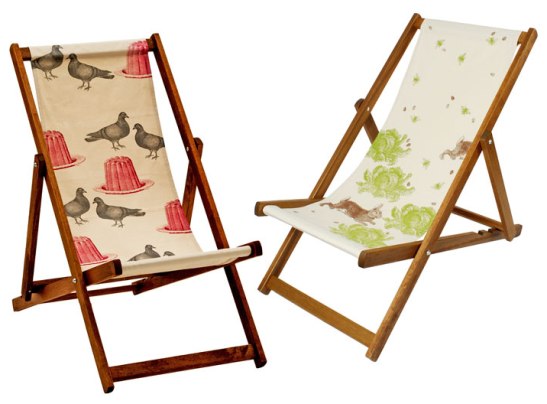
You'd think the Brits were eccentrics, sitting on a deckchair in gale force winds, desperately trying to enjoy a hint of warmer weather. And you'd definitely be right, lol. Luckily that quirky attitude also makes it's way into lovely collections of prints and patterns by folks like Thornback & Peel. Theirs is a world where Victorian jelly moulds and pigeons happily scatter across wallpapers and fabrics and rabbits and cabbages frolic on a cushion. Love their new deckchairs (they have teatowels and t-shirts too) - I could totally see myself sitting in one and enjoying an ice lolly or a '99' by the seaside...


Just a square or two more...

Well, here's the rest of the interiors shots of the Hershey's Milk Chocolate Suite, including the rather nasty before snaps of the bedroom and living room (as you can see it was all a bit tired looking). I think Karen Sealy and I managed to pull off quite the miraculous makeover in just a couple of days - she took on the living room and my challenge was the bedroom - and I wanted to send a major shout out to everyone who helped make it happen. First off, thanks to Hershey's for the oppurtunity (and all the delicious inspiration!). Mucho thanks to Elte for all the gorgeous furniture and linens, inVU Drapery Co. for the luxe vanilla velvet drapes, linen sheers and fun toss pillows, Carpet One for finding the perfect carpet to replace that stained old wall-to-wall, Graham & Brown for the stunning paintable wallpaper and Para for the perfect paint, Teatro Verde for yummy accessories and flowers so breathtaking that no-one could believe were real, photographer Angus Fergusson for shooting the three chocolate bar prints above the dresser and illustrator Paul Dotey for designing that fab I Heart Hershey's poster, all framed in Ikea's great Ribba frames! If there's anything you'd like the deets on that I've forgotten just drop me a line... [Photography: Stefano Barbera]