Almost, but not quite

The neighbours must be loving us - All this snow and ice has meant the filled-to-the-brim skip out front of the house can't be picked up yet (fingers crossed for a slight melt soon), and now it's a wee bit more full with packaging from the kitchen install. Yup, the kitchen is going in (can I hear a woot-woot?); the Home Depot installers arrived yesterday and the work has begun on fitting all the de-lovely Venicia by Kraftmaid cabinets.

We went for the Mirra Collection Carina doors in Bianco Gloss (take a boo below at a Venicia kitchen in the Chianti Gloss, and squint to see it in white and not red, lol). They're chic and simple flat panel doors with a swish integral aluminum pull for a seamless and ultra-modern look. The planning process at the store was great; we worked with Georgina (she's a treasure!) who knows the Venicia matrix upside-down, totally maxing out on all our storage needs. Make sure to click here and read up about all the Venicia cabinet's bells and whistles.

Picking out appliances was, as usual, eye-wateringly difficult since there is so much fab gear to choose from. I firmly believe that once you pick the range/cooktop everything else will fall into place and, since our range will sit smack dab in a peninsula, we decided to go with one that had a downdraft extractor so we didn't have to worry about a ceiling-mount rangehood. Tada! Jenn-Air had the perfect solution, we went with their Dual Fuel Slide-In Downdraft Range, which led us to pick their Cabinet Depth Side-by-Side Refrigerator and the Energy Star rated Built-in Dishwasher - All in stainless steel with a great modern industrial vibe.

For the countertop and integral sink we're set on Corian (though I'm flip-flopping on the colour), the faucet is the fantabulous new Karbon articulated kitchen faucet from Kohler, and the backsplash a ribbed white glass subway tile from Daltile called Taffeta - All available to order through Home Depot.

Click here to see the story so far on what's been happening on our mondo reno - We're finally in the home stretch, with a move-in date of Feb 1st!


What's new? Lots!

Getting a sneak peek at what some of my favourite retailers will be intro-ing for '09 is always super exciting and always gets the decorating part of my brain all happy. Take a boo at what's coming -

West Elm plunks for low-slung sofas and hits of lemon yellow, olive green, burnt orange and turquoise, and has totally upped their well-travelled vibe with Moroccan-ish tray tables, poufs in suede and cotton dhurrie, and ceramic camels and elephants - very Modern Souk.

CB2 (yes, they do ship to Canada) takes a more urban approach with a mix of modern and ethnic touches, orange, yellow and lime and on-trend touches of tie-dye (really!). I loved the rustic South American feel of this set of vases.

Zara Home slaps pattern on pattern in turquoise, sandy gold, cream and amethyst (all v. Moroccan again but with more of a layered flea-market twist) to make quite the chic impression - that striped gold glassware is just fab.


Deconstructing Ilse

The Crown in Old Amersham, the second inn by design guru Ilse Crawford for Dhillon Hotels, recently opened up and has already received raves from the likes of British Vogue. The 16th century half-timbered building now rocks a quiet and thoughtful modern rustic vibe, miles away from its past incarnation which undoubtedly included red velour, flocked wallpaper and polished brass odds and ends. I really dig Ms. Crawford's work (I've waffled on about her before here) and wanted to share her point of view, and deconstruct the look, since it's so on trend.

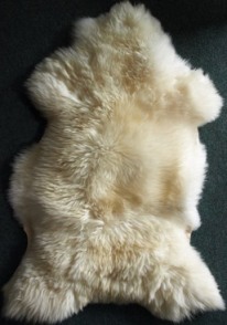
The interiors of The Crown are pared back with an eclectic mix of furnishings, all tied together in a simple neutral palette. The Durant Stretcher wing chair from Martha Stewart Furniture with Bernhardt (available through DeBoer's) would feel handsome and modern upholstered in grey wool. This Windsor Chair, handmade by John Fowler in Nova Scotia, has a classic silhouette in a dark finish - layer in a sheepskin and you're done. Vintage Ercol chairs are a hot Brit collectible, but the company just launched Originals to re-visit the company's mid-Century heyday. The restaurant at The Crown is all about locally sourced ingredients, with a menu designed by Rosie Sykes, served on hefty earthenware and aged pewter; try this charger from Williams Sonoma. Original wide-plank barnboard (check Revival Flooring) feels fresh with a round braided jute rug from West Elm. Finish it all off with walls in Dauphin Estate Emulsion and trim in Mahogany Oil Eggshell by Farrow & Ball.


Black and white and Italian

I love a bit of Piero Fornasetti, the Milanese artist and designer who's iconic imagery still feels as bizarre and fascinating today as it did when his work first appeared on the scene back in the '50's. His most recognizable designs are of a woman's face (apparently a 19th century opera singer called Lina Cavalieri) which became a central theme in a collection called Tema & Variazioni. Over 350 of his designs were originally produced as plates; depicting her enigmatic face in a slew of different aspects - tattooed, swallowed by a crocodile, turned into a butterfly, and poking out her tongue.

Get hooked up with the gorgeous plates at Palazetti, check out the Fornasetti Collection of wallpaper from Cole & Son, visit Fornasetti directly for access to original vintage items, and shop AT Design Home for accessories and more. But the latest news is of a limited edition Blu-ray disc from Detour Designs that takes Tema & Variazioni and artfully animates it into a surreal 50 minute tour de force for your flatscreen (I can't think of a chic-er way to unwind).

Take a look below at the disc and a couple of screenshots, as well as some of Fornasetti's other work.

Taking it one shot at a time

Lawdy - Making it through this time of year without major stress-related meltdowns or pulling the blankets over your head takes one thing - a good espresso. It's the kick in the pants to get my day going and then again at 3pm when I'm fading and need another jolt (I'm rocking a shot of Nespresso Mandarin as I type).

Funnily enough I got on the caffeine train rather late; I started drinking it when researching a coffee segment for Citytv's CityLine and haven't looked back since. I found our current coffee and espresso cups at Zellers (suprisingly chic and modern glass numbers) but passing time and the fact that they break at the drop of a hat means I'm on the hunt for new options.

Here's what's on offer across the board - #1 A smart and simple heatproof glass from Williams Sonoma. #2 Mod and off kilter cups from the Cuisine line at Crate & Barrel. #3 Comfortably squished and sculptural Supple cups from Alessi. #4 A glam and gold sparkler from Zara Home. #5 Taika by Iittala feels cool and a bit chintzy in black and white. #6 Handmade and a touch 50's feeling by EmmaLitten of White Doll Arts on Etsy. #7 Nobody does pretty granny chic like Anthropologie with their Amelia cup and saucer. #8 Illy's latest from the Art Collection is a set designed by artist William Kentridge.


Feeling blanc and edgy

Stylistas and design junkies take note - The apartment atop the Cité de l’Architecture et du Patrimoine museum in Paris, designed by Art Deco era architect Jacques Carlu (yep, he's behind the Carlu in Toronto too) has a new resident. Courtesy of Elle Decoration and Ikea the space was given over to edgy fashion house Maison Martin Margiela for a complete re-design. The newly all-white interior is open to the public to tour - until Oct 01/09 - and shows quite the creative back-flip compared to its last decorator, Christian Lacroix, who dressed the space in a riot of colour and Baroque touches.

The walls have been covered with black and white 'photocopies' of a trad Hausmann style apartment, draped with silvery curtains and the floors mirrored in places or finished in a confetti covered trompe l’oeil surface that mimics white parquet. Piles of furniture feel sculptural slipcovered in white cotton and even a grand terrace, that overlooks the Eiffel Tower, is covered in white fake grass. The total effect is of a party that's been abandonded by its guests, and apparently this is just the start of something for Maison Martin Margiela, since they're now considering launching their own home line and taking on design projects.

Click here to take a video tour of the space (and practice your French!), and take a look below at the results. The last couple of shots show Christain Lacroix's version - Quite the difference, no? [images 1-3: Maison Martin Margiela/Marie-Pierre Morel. 4,5: Jean-Marc Pallisse]


Are you sitting down?

Never a good way to start a conversation, especially when it's either coming from a doctor or a contractor - You just know it's not going to be good news. Yesterday, while I was at Elte sourcing a gorgeous carpet for a project, that sentence popped up in a call from our contractor. Oy. I told him to go ahead, since if I fell it would be onto a plush pile of rugs.

Here's the deal: On our roof we have a homemade skylight which we wanted removed (it's way ugly and in an odd spot in our teensy back bedroom) so the guys went up to take a peek. Ummm, not only does the skylight have to go, but the whole roof has to be replaced. Yep, a new roof. Apparently there is just a single layer of tar paper up there, and the wooden substrate is also on it's way to rotting out too. So there's no choice, a large wedge of our budget will now be used to fix the roof, and pretty sharpish too; the chance of a flood or a leak after the guys have done such a stellar job on the interior would be devastating. Take a look at all the work that's happened so far on the place here.

A flat roof specialist will be popping by on Tuesday to survey the job and hopefully, with a bit of luck and a few days of good weather, it'll get done nice and soon. Merry Christmas indeed (I think I might have just lost my Holiday spirit).

I'm not in London but I would like a teapot

I do like it when trad companies like Wedgwood get a little subversive. In place of all the lovely gear they normally do with folks like Martha Stewart and Barbara Barry they've taken an edgy side-step to collaborate with illustrator Will Broome on a line destined for Flash - a swanky yet short lived pop-up restaurant that has appeared in London, at The Royal Academy of Arts Burlington Gardens, as part of the Academy's GSK Contemporary Season. The restaurant closes for good on Jan 19th (click here if your heading to the UK and want to try and get a table), but the Will Broome collection, limited to 1000 pieces in each style, will continue to sell through Wedgwood until they've all found a good home.


Let there be discounts

'Tis the season for sample sales, and here's one that's definitely worth hitting - Bev Hisey, maker of fab carpets and cushions (yes, admittedly she's a friend but I do love her stuff; see more here) and Charlotte McKeough of Brave Brown Bag (a line of indestructibly chic bags that come in tons of colours) are getting together to hold a Winter Solstice Sale at Bev's studio space in Toronto. Head down to 1066 Dundas Street West on Dec 19th and 20th, between 10am-6pm, to score major discounts on some really wonderful gear and to meet them both.


Free art now!

You've gotta love ReadyMade magazine, and their cool DIY take on design and living. Their latest jolly jape lets you download and print your own artist designed posters from their website (click here). Dubbed 'Poster Children', the collection of five pieces is inspired by state-sponsored artwork produced in the US during the Great Depression, and used to promote everything from hygiene and health to vacations and theater.

Here we go - The first is by Nick Dewar, the second is from Mike Perry, the third is courtesy Christopher Silas Neal, Open created the fourth and, last but not least, Christoph Niemann came up with the fifth. Oh, and people, did I mention that they're free!?! Grab some high quality paper, choose 'best' in properties and get printing.


Ladies first...

I was lucky enough to be picked as one of Canadian House & Home Magazine's favourite blogs for their always fab Jan '09 Trends issue, along with quite the glam bunch - Jan Halvarson of Poppytalk, Marie-Eve Best of Lake Jane, and Kim Johnson, the Canadian half of the team behind Desire to Inspire. Jan, Marie-Eve and Kim have all already posted about the issue (thanks for the kind mentions one and all!), so now I wanted to pipe up and share some of the shots H&H just posted here on their website that give the inside scoop on our workspaces.

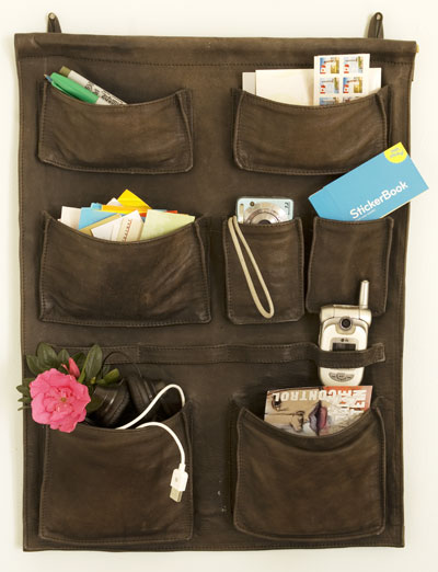
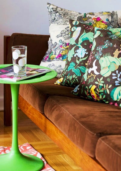
A few of the pics are below - Jan (not pictured) and the peek at her bookshelf was shot by Janis Nicolay, Marie-Eve and quite a v. fab vintage leather wall storage piece was snapped by Angus McRitchie, and Kim and her fantabulous desk were caught on film by Jordan Craig. Currently I'm working off the dining table piled high with papers and press kits (not too swanky for sure), which is why I'm pictured smack dab in the middle of the living room surrounded by some of our gear that didn't make it into storage, the second shot is of a favourite vintage tulip base with a Moroccan tray top I glued together and painted green (btw, I was shot by the always lovely Virgina Macdonald, take a look here at more of her work).

The magazine just hit the stands, so feel free to pick one up and doodle a mustache on my mug. Oh, and so ya know, House & Home's website is in the midst of a re-design and will launch all polished and shiny looking in Jan of 2009!

No butcher or candlestick maker

I really do dig a good eclectic vibe, so this morning's aha moment (at exactly 7.18am, before my first espresso) was having the luck to hit upon Baker Studio's swish online catalogue. This high quality line debuted in '07 and was refreshed with new intros in '08 that fit with a particular decorative approach; one that's more about wit and style than anything else. There's touches of Ming, a hint of Egypt, Danish pokes it's nose in, and even the British get a hello.

I'd take them all if I could, but here's a taste of the line below. I'm very much into the lacquer, antique brass and cerused oak finishes (still all on the up-and-up in my book). Enjoy. Oh, and you'll find Baker Studio at Studio B.


Feeling the blues

Blue and white has been stuck in my head recently, but not in an old fashioned granny kind of way. There are elements of that (check that Delft plate - it's actually a rug) but the palette speaks to me more of a Danish / Moroccan combo more than anything else. It feels fresh, light and modern, and even a touch wintry, especially with that hit of berry red in the Marimekko print.

The inspiration shot is an interior styled by Moooi (available at Klaus by Nienkamper, who btw, are having a special discounted shopping night on Dec 16th, from 5-9pm). Next up is that laughably cool and surreal Moooi rug, Carpet 1. Then we move on to Marcel Wanders splashy take on trad blue and white for an exhibition called Fragiles. We couldn't have not included Madeline Weinrib, with a vinatge chair covered in Ikat and a Suzani pillow (the MW line is available through Y&Co). Ikea's collection for the Holiday's, Kallt, has note cards that are chic enough to make it way beyond the end of the year. And here's that sweet Marrimekko print - Pakkanen.


Say hello to Helen

I've kind of secretly been a fan of Helen Acraman's work, and now everyone and their magazine reading best friend knows, since I blabbed about it in the Jan '09 issue of Canadian House & Home. So much for keeping secrets, lol.

Helen's artwork is storybook cool, bright, happy and quirky; it's just the thing to give a blah wall a decorative slap in the chops, and is waaaay affordable too. A fresh green 20 is all you'll need to score one of her limited edition prints, and that's pretty unbeatable if you ask me - I bet one of her works would make the perfect prezzie either for someone on your list over the hols, or for a housewarming bringalong. Check out Helen's Etsy shop here (her seller name is zukzuk) and click here to take a boo at her sweet blog.


With thanks from a Cephalopod

In such times as this (nope, I'm not going to mention the 'e' word...) it's good to remember your p's and q's; in other words, it's nice to say please and thank-you. I know, your Mum probably drummed this into you as a kid and you, like me, probably just heard blah-de-blah as she mentioned, for the zillionth time, "Say thank-you"!

Sending out a card to say thanks is, I think, one of the simplest and nicest things to do; especially this time of year. And, since we mentioned zillions, Etsy has just about that many sellers who offer mutiple letterpressed and handmade ways to say thank-you. Check out my picks below: #1 Armato Design & Press gets witty with a funny faux French thank-you. #2 Faye + Co feels posh and pretty (and comes in different colours). #3 Cracked Designs uses a cool retro phone to say it with mod style. #4 Serimony has a happy-go-lucky octopus do the work for you.


First, the good news

Not content with launching shockingly affordable collections from the likes of Karl Lagerfeld and Comme des Garcons (which always sell out in munutes) H&M is set to debut it's own home collection in Feb '09. But, before you get too excited, the bad news is there are currently no plans to bring it to North America; H&M Home will only be available online in select European countries. So, check your family tree and shoot off an e-mail to that long lost cousin of yours in the Netherlands if you're hell bent of scoring some of this ultra fresh gear.

Of course the looks are totally on trend- #1 is edgy and urban in black and white. #2 shows the slide towards a natural eco feel. #3 is all about youthful colour and pattern (love that Lisolette Watkins designed pillow!). #4 is a classic combo of navy and white realized in a fresh un-stodgy way. 


Via Husmusen 

Oh (aluminum) Tannenbaum!

For some people Christmas is a time to let go and bring out the shrunken apple head dolls, reams of multicoloured lights, odd tchotchkes and battered nativity scenes. For others it's still an oppurtunity to make a style statement.

The tree below, snagged from Hammacher Schlemmer, is a redux of a classic 1950's aluminum tree in all it's sparkly artificial glory. And, while the homeowner didn't go to town and plunk for the Color Wheel projector from HS (now it's green, oh, now it's blue!) he did head to The Bay to grab those swank turquoise glass ornaments. Chic and simple!

A crafty institution

Toronto's bi-annual One of a Kind Show is quite the handmade, craft and artwork institution, so much so that the folks behind the show have now brought One of a Kind's to Vancouver, New York and Chicago. I can't remember the last show I missed and walking it, other than the excercise (lol), is always so inspirational since there's just such a feast for the eyes.

As always, I've ended up picking out a few best-in-show that I thought would be worth sharing -

Wendy Walgate's world is dreamy, odd and Alice in Wonderland-ish. My friend Morgan turned me onto her work, and I must say I became an instant fan - I love how her artwork plays with memories, collections and colour. 

Flakes stationary has a collaged feel that I totally get (love those Holiday cards). Ashley Stapleton's work is witty and pretty and her new calendars, debuting at the show, are smashing.

Kyla Francis caught me with her hand-printed enamel sneaker design as well as that hilarious mug inspired by haircuts spotted at the One of a Kind. She has such an irreverent, modern and young take on decorative work.

The show runs until Dec 7th, so make sure you get down there and hit the aisles!


Good cause, good vintage auction

Modern design junkies take note: ModernLove, that fab Winnipeg-based online retailer of hot vintage finds, is at it again with their 5th annual charity auction of 20th Century design and decorative arts to benefit the Canadian Cancer Society. From Nov 28th until Dec 8th Roan Barrion, the dude behind ModernLove, will be listing quite the eclectic slew of items on eBay; some by big names, some just plain so-cool-I-gotta-have-it. And yes, they're happy to ship around the world.

Take a peek below at some of the items that'll be showing up, there's some well swish gear, as well as a limited edition t-shirt emblazoned with the iconic Eames rocker. Check in for more info here, and get ready to bid!


I'll go for One

Work at the house continues apace and we're making decisions left, right and centre to keep things moving in the right direction. The basement had major issues - it looked like a serial killer's hangout and had been horribly re-wired at some point by a maniac with a death wish, so anything we do is an improvement, lol.

First up is the basement bathroom, it's all sorted and ordered (yay!), so hopefully the chic and terribly water efficient American Standard Champion 4 toilet, with 6L water consumption, is winging it's way here as I type this. Along for the ride, and again from American Standard, is the mod Ravenna pedestal sink and clean-lined Serin tub. The jam on this part of the project is the sleek and handsome One series of faucets that we're going with for the tub and sink; all swish and sparkly in a polsihed chrome finish. Lovely, and the whole shebang can be ordered at Home Depot.

The space will be finished off with satin white subway tiles that will be laid stacked from floor to ceiling (take a look at the inspiration shot below) and a Marine light for above the sink (a thrifty fave of mine). Hmmm, what to do for a mirror?

Take a look here to catch up on the rest of the fun and games with the reno.