Splash pad

With all the stuff I'm working on right now, things are varied to say the least - In no particular order (and without giving too much away); fairies, christmas trees, bedrooms, bathrooms, sofas and washers and dryers. Ah, the life of a freelancer!

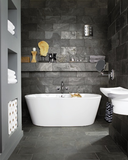
Other than all of the above (it's making my head swim) I've had my mind on bathrooms. We have 3 in the new place to re-configure, re-design and re-consider. Size, space and style are all at play, let alone actually deciding on fixtures and tiles. Phew. So, I'm on the hunt for inspiration and found quite the sophisticated spot while flipping through Home Depot's new DreamBook magazine. Love the dark grey stone tiles and that free-standing bathtub is definitely an ultra glam statement. Take a look -

Tick tock

Fonts, lettering and any kind of graphic layout just always get my attention when it comes to design. Back in my teens I had to choose between graphics and fashion - I chose fashion (fool!) and now look where I am, lol. Our old place had a few great graphic pieces that always got lots of attention, like the Last Night A DJ artwork that hung above the fireplace (take a look here). I guess the graphic thing runs in the family; my brother is head of Typography & Design at a top London ad firm (thanks again Christian for the sweet logo design you did for the blog!). He's also responsible for buying us the Last Night A DJ print as well as some other great pieces he's found for us over the years, hmmm, perhaps he should consider a second career as an art adviser?

The pic below shows a very modern take on an old fashioned flip-style digital clock that has a scattershot approach with lots of different fonts. The Font Clock is from Established & Sons, an ultra edgy Brit firm, and is designed by Sebastian Wrong. In Toronto check out Ministry of the Interior, they carry the line, as well as a mondo selection of other interesting gear.


Sweet petite

Who doesn't love a makeover? Canadian House & Home must've figured out that just about everyone does, as their Makeover special issue has just hit newstands with a resoundingly pleasing thud. There's ton's of great stuff to check out, but my fave is the feature produced by design smarty-pants Stacey Smithers. It's a quiet riot of creamy greys, warm acidy yellows and spicy pinks (yummy) that all adds up to quite the chic look - I could totally move in.

Now, fairs fair - Stacey is a mate of mine (I can hardly think of anyone else I'd rather share a highly calorific meal with, lol), but this place is quite the marvel compared with it's grubby past. You'll have to check the mag for those scary before shots, but take a peek below to get a taste of a young couple's sweet new home. Photography by Donna Griffith.

Global view

I have a feature coming up for the National Post's Post Homes magazine for September that I've spent a fair bit of time working on this week. Much of that time has me searching through online catalogues to see what's new and what will fit the feel and direction of the story. Mostly it's point, click, snore - especially when I can't find exactly what I'm looking for. Design Within Reach is always a go-to site for me because, well, they just have the right stuff - A well edited and stylishly modern collection of 'tools for living' (I cribbed that from their website, lol, but I think it says is all!).

The globes below are new additions at DWR, and I'm very glad for their arrival. Set on a vintage credenza or stashed in a bookshelf, they're just the ticket for a well-travelled, modern design object. The mint globe has a slight 40's feel, while the black is all business.

Rich and woodsy

I know, the rich and woodsy shots below aren't exactly seasonal, but there's a good chance that you haven't seen them before so I thought it would be fun to share. I totally enjoy doing tabletop styling for food shoots, it's such a welcome change from working on big unwieldy room sets. I love shopping for props too, and have quite the collection of vintage and new bits and pieces, picked up whenever we're travelling and snagged at spots like Value Village. Keep an eye out for shoots I did with Canadian Family, coming up later this year.

Art Director and friend, Jason Kang, kindly sent these shots through. I've asked Jason to check since we all worked on this quite a while back, but I'm remembering these were all shot by the same crew - Top photographer, George Whiteside, and lucious food styling by Lasha Andrushko. And, have you guessed who these were shot for? Well, I suppose I'll let the cat out of the bag - Kraft.


Hot shot

I love a good espresso (not expresso, please, lol), and starting my day with a shot is quite the best thing since sliced bread. We have the Nespresso Le Cube espresso machine in white, which looked awfully posh in our last kitchen (take a look here) and now sits rather snugly on our teensy temporary apartment countertop. Apart from the fact that it's practically idiot-proof (the foil capsules take care of that) the design is clean, simple and modern - All you need in a countertop appliance.

Now Nespresso is jacking things up for Fall with more choice in their colour finishes. A racy and kinda Eighties hi-tech matte Black and a v. lovely Bronze Patina (which would look very swish with Jenn-Air's Oiled Bronze appliances). Plus, and this is a big plus, they're also intro-ing a larger sized milk heater / frother; the Aeroccino Plus. Which (again with the idiot-proof) does a masterful job of making the kind of cappuccino foam that a seasoned barista would be proud of. All this new gear is available in September - check out Nespresso online, or visit one of their two Canadian boutiques at The Bay in downtown Toronto and Vancouver. Take a peek at the Le Cube Bronze Patina and Aeroccino Plus below.

Junior envy

There's been quite the overload of kid's well-designed furniture recently, and honestly, isn't it about time? Enough of the dullsville offering that has been on the market for years, now creative parents want their kid's spaces to be just as cool as the rest of the house (after all, If it's all B&B Italia in the living room why should Junior have to suffer).

Nurseryworks (available at stores across Canada) is at the top of the kiddie food chain when it comes to cool gear. Their latest offering for Fall /08 is uber swanky and has me all envious - The Vale and Harvard headboards are quite the chicest thing but only come in twin and full. Darn.

Brighton bizarre

As a kid I spent lots of time in Brighton, on the south coast of England. And now, whenever we travel back to the UK, we always try and head down to walk the Promenade and see the sights. One of those particular sights is The Royal Pavilion which, to this day, still takes my breath away. How crazy/amazing is it? Well, take a look below. Yup, it's in England, not India (and the interiors are just as bizarre as the exterior, with a dragon in the dining room and palm trees in the kitchen). And, while the warm beige stone exterior adds a nice air of class, I do miss the garish old pink and blue paintjob that I remember from my childhood.

For a touch of updated Regency madness I thought I'd include this charming Currey & Co table, which I think would look just smashing set next to a clean-lined modern sofa.

Image copyright The Royal Pavilion & Museums, Brighton & Hove


Chic and easy

By now everyone and their best friend has had a chance to peruse the new Ikea catalogue and dog ear pages, me included. I thought I'd post a couple of favourite roomsets that get my vote for their lashings of inspirational style (love those Kelly green closet doors) as well as being super affordable. Chic and easy on the wallet - Who can beat that?

The first shows the Grimen bed, that rocks a way Italian vibe at just a smidge of the price, the second shows just what a bit of imagination and a few Ribba frames can do.

Style blender

While you might think that I have completely my own way with the way the new place will look, think again. It's the same for us as for most couples - Compromise. Ugh, such a dirty word (lol). And David, who's quite the comedian, has given some thought on a design direction and has decreed that it should be Robot Chic. Robot Chic? Honestly, if he had his way we'd be living in a Daft Punk video wearing crash helmets with LED lights flashing across the visor. Cool, perhaps, but maybe not so livable (I think I might get a headache from all the glaring lights).

In an effort to be understanding I've found the perfect item that'll meet halfway between Robot Chic and, well, reality - The lampbase (very him) and shade (very me) are both available through the always edgy Urban Outfitters.


Get cultured

Object Factory, running at the Gardiner Museum until Sept 7th, is a must see exhibit. Featuring ceramics from a laundry list of big name artists and designers - like Cindy Sherman and Ettore Sottass  - they also have some lesser known, but no less cool, work on display too from edgy young firms like Industreal. Another one to check: The Ornamental Inheritance pieces by studio Jo Meesters, which takes vintage trad blue & white pieces and sanblasts them to create intricate urban landscapes. Take a look at the pic below, which riffs on a 17th century Dutch still life vibe.

Pretty modern

Bev Hisey is one of the craziest (in a good way, lol) friends that I have, she's also one of the most talented. Bev and I were chatting today while I was in the midst of a haircut - which prompted the barber to ask what we did, always an interesting one to answer... Most people might not realize that Bev is a one woman operation, a tough gig for sure. She's always pushing the envelope with her work and is constantly working on something new. Below are a couple of pics that Bev and I worked on together, shot by Donna Griffith. I think she's a bit of a Canadian treasure...


House work

Buying and selling a house takes alot of time. Add in my crazy schedule, that this week included a NY press trip for Samsung, and then deadlines for Flare for October, Canadian House & Home for November, and the National Post for next weekend as well as August, and well, it's a wonder I know what day it is. So, thanks mostly to David's tenacity, we now have the keys to the new place (yay!) and have already popped a cork in celebration with friends. Now the work can begin...

After flying in yesterday from NY I managed to make it to the Holt Renfrew Holday /08 preview. There was, as usual, lots of fabulous things that ranged from blow-the-budget glam (like an Alexander McQueen gold skull and leather tassel keychain) to the affordable (organic spreads from Brit brand Daylesford Organic), and lots of fashionable must-haves in between. And then there was something I was extra happy to find - MOR Cosmetics. Now, before you get in a kerfuffle, no, this isn't turning into a beaty blog. Nope, the MOR line is, hands down, the most beautifully packaged collection I've seen in ages - the creators, an Australian couple, obviously have an eye for intense pattern, inspiring colourways and odd historical references. Love it.


Hot plate

Apologies for not posting yesterday - We had to spend time at the lawerys signing multiple bits of paper for the new house and then I headed off to the airport for a press trip to NY. After an eventful flight (delays, bumps and then a slight near miss) we finally landed and headed in to the city, checked in and immediately went, ummm, shopping. lol

I dragged a few of the gals along with me, and, with an hour to spare before a scheduled meeting, we got a fair bit done. Uniqlo for a bit of affordable fashion, Japanese style, CB2 for a cool slice of modern housewares and furniture, and then one swift aperitif at Balthazar.

CB2 is right up there for me for well-priced gear for the home (and yes, they can ship internationally) - It's always stylish, on-trend and directional. I thought the plates below were hilarious, and at $2.95 would make for a witty and affordable touch mixed with all-white dinnerware. Good thing I'm here with a small overnight bag, otherwise there'd be a ceiling fixture coming home with me too...


My other house is a castle

I'm not really sure what it is about this shot that draws me in. Sure, the e15 Shiraz sofa is chic, simple and just slouchy enough to be truly lounge worthy, but it's more the vibe of the shot - kind of a 'Granny left me this castle, but I'm a modern gal' feel that's just so refreshing.

Shiraz%20e15.jpg

I heart Barbara

Barbara Hulanicki is a total style/design hero for me. It all started when my stylish Mum used to head up to the Biba store in Kensington for a fashion fix in the Seventies and bring home beautifully packaged products stamped with that curlicue Biba logo. Fast forward to this year's ICFF in NY and I got to meet Barbara, and her assistant Likorish, at the Graham & Brown wallpaper stand where I was marvelling at all the gorgeous patterns on display, including a new collection by her. Viva in Black Gloss was one of my favourite patterns.

Viva%20-%20Black%20Gloss.jpg