It's (not) a wrap

Fashion designer Diane von Furstenburg is best known for her iconic wrap dress, but here's something altogether non-fashion related from DvF that was just too jammy not to share. Diane (along with best friend and interior decorator Olivier Gelbsmann) is in the midst of working with Claridge's, a posh London hotel, on re-designing 20 suites and rooms that are all expected to be finished by the end of this year. Here's a few snaps from the four rooms that are ready so far, one of which - the Piano Suite - rents out for an eye-watering $13,850 a night. I'm all over the nutty prints and high-contrast shenanigans, but what do you think? [Images: Claridge's]


Oh, my darling

This a.m. - way before my first coffee - I was completely charmed by these Marionette pillows. Designed by Darling Clementine (of Etsy fame, see there gorgeous shop here), and inspired by 1950's finger puppets, the prints started life as a set of cards, and then, when ferm LIVING spotted them, they turned four of the six characters into pillows. Aristo Katt, Elle Elephant, Mr Frank Fox and Posey Panda are printed on organic cotton, and are available online at Branch. Oh, and I've also included a snap of that fantastic wallpaper, it's called Ferris and is from ferm LIVING too, hook yourself up with a few rolls here.

Seriously fun

Saw this chair a couple of secs ago on Twitter and thought how great it was, and now here I go sharing it with you lot. It's a fantastically quirky Victorian club chair (love the turned black legs and casters) that's been upholstered in a metallic silver print on a dark purple Irish linen called D'ya-think-e-sauras, from PaperBoy in the UK. Victoria Cramsie of PaperBoy scored the chair at an auction, one of a pair, she's now itching to get the other one re-upholstered too. Check her firm out for lots of seriously fun prints on fabric and wallpaper - you should really take a look at Animal Magic and Hand Made - that are nice and un-sugary, and a v. sophisticated take on designs for kids. Oh, and thanks to Victoria (aka PaperBoyLondon) for posting the shots on TwitPic!

Commiting to Patricia's style

I must have bathrooms on the brain today. You can catch a tour of mine here on House & Home Online TV, and then these rather gorgeous images appeared in my in-box, touting the arrival in North America in early 2011 of Axor's new collection created with a fave designer of mine, Patricia Urquiola. I totally get her commitment to a rather kooky sense of modern style, plus her love of craft, and the way everything is tossed together in a rather un-matched yet glorious way that all adds up to make the bathroom feel almost like a living room. Love. It. All.

Ice cream sandwiches

I don't know what it's like where you are, but around here we've been in the grip of a bit of heatwave. And, while I love the heat of high summer, all I can seem to think about is ice cream sandwiches - they haunt my every waking moment. The Chipwich is high on my list of faves, closely followed by the Oreo Ice Cream Sandwich. Low rent and delicious, and it's all I can do to not run to the corner store right this second to buy one.

Luckily I've found something that might (hopefully) break the ice cream sandwich spell - Crate & Barrel's series of appetizer plates are not only super gorgeously bright, piece-by-piece they're almost as cheap as a Chipwich. I'll be buying all ten of them to mix in with all my white dishes, how about you?

Vintage goldmine

On Sunday I headed cross border with a couple of friends to hit a fantastic junky 4th of July outdoor antique market in upstate New York. Hello, did we ever do well, and no, before you ask, I cannot reveal the exact destination since it was a complete goldmine of great stuff at crazypants prices (if I told you I would definitely be hung, drawn and quatered). Here's a few shots of what we ended up with, as well as the one that got away...

These mirrored vintage bulbs will look amazing in a shadow box, or individually set on little wood block stands. When the guy said "$5 each. or $20 for the box" they were immediately snapped up. Oh those flags. You can't really tell, but each one is hand sewn and gorgeously aged. One of my friends bought 3 (they were $5 each), and then we bugged her until she went back and bought a big pile of them to sit pretty in a tall vase. Here's the one that got away, 'cos we didn't have the room or the need - a lovely beaten up black and gold dresser, with mirror, that was tagged at $40 (I just hope it went to a good home!).

Then here's what I dragged home - I paid $2 for this cool little Charlie Chocks advertising doll from the '70's, that's now found a spot on a white dresser, and (okay, this a bit of an odd one) an acrylic portrait on canvas that was a score at $10 which, bizarrely, looks like me as a teen, right down to the floppy Hugh Grant hair and the dweeby glasses.

Soft and sweet

There are so many ugly pillows in this world (believe me, I've seen more than my fair share), but what about finding ones that are cool and edgy, with a bit of a fresh street feel, huh? I bet I've got you there. This a.m. I was oohing and ahhing over Andrew Sebastian's line enough that I wanted to toss three faves of his artist designed pillows at ya. Up first is LA Hands designed by the Dissizit crew, next is Cult from the LA clothing firm Acrylick, and finally FFinder by t-shirt brand Foreign Family. Super sweet, and - thankfully - miles away from blah and boring.


Flat on the floor

Oh, kilims, flatweaves, whatev's, just get them in your house! Today I found myself ogling these kilims while I was hunting down that kooky rug by Patricia Urquiola that looks like a knitting sampler (it's called Mangas, take a look here). They're Catania and Palermo, designed by Sandra Figuerola for Gan, and - imho - they're pretty much on the fantastic side of things from the world of what's underfoot (I'm totally digging their cool patchworky vibe). The nice part about kilims in both wool and cotton is that, for the most part, they actually won't cost you an arm and a leg (and another leg) in the same way that a hand-knotted wool carpet might. Affordability and style, you've just gotta love it.

Guest blog / Julia Black: Money in the bank

Julia Black: I often get asked some rather entertaining questions when it comes to shopping for home décor, but nothing quite as kooky as the latest question about piggy banks from an adorably determined 10 year-old kid. Apparently, my sources tell me the kid with the coolest piggy bank wins the popularity vote in school (who knew?). I admit, I hadn’t spent much time tracking down piggy banks in the past, but knew I was onto a winner when I came across the J Schatz Egg Bank. If you’re not familiar with Mr. Schatz, well. I recommend taking a moment for a peek inside his creative and slightly unconventional mind. The clever designs from J Schatz are wonderfully unique, all while being mindful of the environment, using energy-saving production methods and 80% recycled content in their packaging. His handcrafted ceramic earthenware Egg Banks are finished in nine vibrant high-gloss colours, and can store up to 2, 494 coins –a great start for tuition savings, a trip to Disneyworld, a first apartment or even early retirement! Check out all of J Schatz's products here and discover just how fantastic (albeit peculiar) his collection is. Maybe next year birdfeeders will be the new it item for kids, oh, and luckily J Schatz makes those too. 

To read more posts from Julia click here, check out her cool blog click here, and click here to see her new Get Fresh online videos for CTV!

Jacob, is that you?

I have a confession to make, I absolutely HATE our doorbell. There, I've said it, and it feels quite liberating to get that off my chest. Okay, maybe hate is a bit much. Press it and it'll work, sort of, in a dreary warbling digital way, as if actually making any sound at all is an awful lot to ask. It's wireless, and was the most inoffensive one I could find off the shelf but now, with the house all painted in Farrow & Ball Railings and the new house numbers going up shortly (don't ask about the mailbox, that's another story all together), it just isn't up to snuff. So, while I entertain fantasies of smashing it with a hammer, I've also been looking at the one I really really want, by the Danish design firm of Jacob Jensen. Yep, it'll run me around the price of 30 Grande Frappucinos to actually get one, but one look below and you'll see why I'm smitten. The first snap shows the standard wireless model, which comes pre-programmed with 5 sounds (including the sound of Jacob Jensen knocking on an old wooden door), while the second shows the latest USB model which, as well as coming with the standard 5 sounds, also lets you download your own. Just think, Ke$ha could be screeching about brushing her teeth with a bottle of Jack every time someone rings your doorbell.

In praise of zig zags

One pattern I don't have in the house, and believe me, I have a lot, is zig zag. I've always loved it from afar, and meant to incorporate it somewhere, it's just never happened. The pattern works brilliantly in floorcoverings - The Madeline Weinrib Zig Zag rug has gotten miles and miles of coverage (and is adored by, well, just about everyone), West Elm has their version, and now Nate Berkus has gotten in on the act with one for HSN (currently on sale, too!). And, while a graphic black and white zig zag feels the most classic it's also a little bossy, I fancy it a fair bit more when the colours are softened slightly, like in a couple of the interior shots below. Oh, and for fun, I thought I'd start things off with my current fave in zig zag patterns that have a messier, more painterly and hand-done vibe to them - which I would L.O.V.E. to see turned into fabric, wallpaper or rugs, btw - TOMS Black Tangier Men's Vegan Classic slip-ons, and the Zig Zag tea towel by The Near Future over on Etsy. [Image 3 here, 4 here, and 5 here]

Jonesing over a table

I'm totally jonesing over smartypants Karen von Hahn's new outdoor coffee table upcycled from an old Simpson's-Sears department store sign (the lovely vintage script logo hails from 1953). Karen discovered the sign in a junk-filled emporium she dubbed 'the sheds' out in Bayfield, Ontario, and lugged it home. Her handy-with-tools other half then popped a piece of plywood beneath, and screwed on those fancy-schmancy metal legs she'd ordered from Hairpinlegs.com to create, if you ask me, the perfect spot for a tall and frosty glass of Pimm's. Love how the Kelly green of the sign picks up on the green in her outdoor furniture upholstery, and also how Karen so snappily whacks the nail on the head regarding al fresco style - "Everybody is so busy recreating either a Tuscan villa or a South Beach nightclub in their backyard that nothing has any real style." Check in on Karen's blog here, and be sure to check out her new Style Czar column for the Toronto Star's Weekend Living section. Oh, and you'll see inside Karen's home very shortly too, since she'll be gracing the August issue of House & Home along with little old me.

Getting your print on

I have a real thing for graphic interpretations of pattern as well as anything with a nice bit of lettering on it. So, with that in mind, I thought it would be fun to share a bit of that, errr, passion with you lot today. First up is artist Richard Woods, who block-prints simplistic and iconic patterns like wood grain, brickwork, Tudor architrectural detail and historical wallpaper and fabric patterns onto walls, floors and, well, just about anywhere. His work with Sebastian Wrong for Established & Sons, called WrongWoods, is a total fave of mine. The WrongWoods rug below is the latest piece in their collection, plus I wanted to add in one of their furniture pieces which - sigh - I will own one day (in TO it's available through MOTI). Plus, there's a snap of Richard's latest work, an installation called Woods' Blocks that the Perry Rubenstein Gallery will be showing at the upcoming Design Miami/Basel shinding (June 15-19). Nutty but cool, no?

Next up, continuing the graphic printy business, I thought I'd chuck a bit of fashion your way in the shape of handbag designer Anya Hindmarch's latest collaboration, a project with street artist Ben Eine (if you love the Care Bears, you'll love his site, lol). The duo worked on four bags in all, though Loot and Booty get top marks for me with the choice of lettering and the colours. Luvverly!

Big and squooshy

It's grey and rainy in my neck of the woods. Good for the garden (the heirloom tomatoes are growing gangbusters), but it really makes me want to curl up on the sofa with Spot and take a snooze. From a design perspective I'm in Cloud Cuckoo Land today, dreaming about spectacular houses that I'll never own, filled with furniture that's way beyond my snack bracket. So, Roche Bobois' inspirational interior shots are just the ticket - Up top you have the big and super squooshy new Voyage Immobile sectional designed by Cedric Ragot. Love all the kooky stripes on the sofa, let alone that art installation/giant pickup-sticks game, though the floor lamps are a wee bit alien-ish for my liking. Then there's the stripe-tastic Rythme modular sofa designed by Studio Missoni Home (the rug and tables are by the SMH too), but, what I really want to know is, where the heck did they find that insanely huge hi-gloss orange and khaki spinning top?

Fun on the Thames

Josie Curran has a lovely house, except it's on a boat, on the river Thames, moored on an island by Hampton Court (Henry VIII's palace - well worth a look-see whenever you're in the UK). I totally love her eclectic style and how open and airy the houseboat feels, with white walls and tons of pattern and colour. Look out her living room window and you might see a family of ducks swimming by. Seems like perfection to me! Oh, and apart for having the kind of house - errr, houseboat - that I'd give my right arm for, Josie is also the author of Organised Fun: A Treasure Trove of Games and Tomfoolery, a book filled with the jolly japes and games that kept everyone laughing before the advent of tv and the internet. Check out her blog here. (Via Times Online. Photography: Jake Fitzjones)


Back in the bathroom

Hey, I'm finally able to share all the shots by Angus Fergusson (including the spooky before snaps) from that bathroom project I did with Canadian Family mag. It's a pretty sweet makeover and, I hafta say, quite the dramatic change from a bathroom that looked liked something out of the Bates Motel into a bright, glossy and very practical space.

Here are the deets: We re-used the perfectly sized vintage sink (after a very good clean that involved Polident tablets), then changed out all the other fixtures and fittings to pieces from Kohler, including a v. smart WaterSense Escale toilet. We subway tiled from floor to ceiling, and then finished the sloped ceiling in tongue-and-groove, both scored at Home Depot. The floor was penny tiled in marble from Saltillo which, apart from being gorgeous, is nice and safe to walk on with wet feet (and yes, the floor was heated too, with a True Comfort kit from Home Depot). Shelving was added in above the loo, and two marble-lined nooks were added in in the bath area (the surfaces were angled slightly so they drain properly). Finally, the pretty shower curtain was custom made by Tonic Living, and the towels and bath mat were a mix-and-match between Anthropologie and HomeSense. What do you think?

A sweet bonjour from San Fran

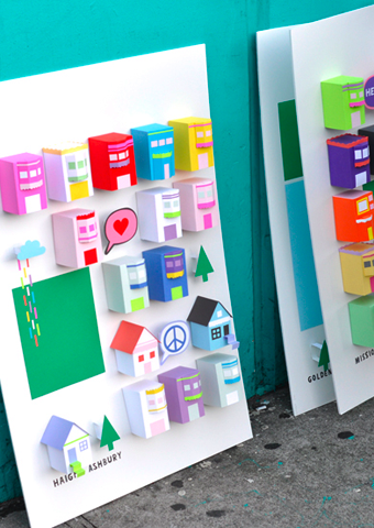
Happy Tuesday folks! Well, if you weren't feeling happy before, you certainly will have at least a twinge of the jollies after checking out the work of multi-disciplinary designer Chloe Fleury (who's work I came across on Daily Imprint). Originally from France, Chloe hopped the pond and now calls San Francisco home. Check out her series called The place i live, which was inspired by the love of her adopted city. The set of 3D posters have caused such a stir that she's been swamped with requests from people trying to buy them. Sadly, they're not up for grabs, just part of Chloe exploring her creative process, which is also inspired by cats, cupcakes and fashion. Now there's a girl after my own heart. Check out her portfolio here, and follow along on her French girl in San Fran adventures on her blog here. Oh, and yes, that's Chloe in the last shot with the pink paper ice cream!

Roughing it

Sometimes, in the midst of renovation hell, while you're ripping down walls and tearing out old plaster, something unexpectedly gorgeous can suddenly appear. Just check out these shots by Donna Griffith, over on my friend Bev Hisey's new blog, covering her full-on back to the studs reno. That got me thinking, about how imperfection and history in a space really can add gobs of charm. Have a look at the snaps below from Zanotta. Those rooms wouldn't look half as cool with plain old beige painted walls. But really, do you want to be brushing flakes of plaster off your shoulders every time you toss yourself into that sleek William sofa, or sit down for a bite at the Album table? Well maybe, especially if it would mean living with those vintage herringbone parquet floors...

Guest blog / Julia Black: Mr. Dixon's emeralds

Julia Black: One of Arren's faves, Mr. Tom Dixon, has gone and done it again. He's wowed the design industry with a new pair of sculptural light fixtures to add to his Pressed Glass Family. Bead and Top, the soon-to-hit-the-marketplace duo, have been creating quite a buzz (word is, they'll be available late July through ABC Home) and, consistent to Mr. Dixon’s industrial style, they reveal the honest imperfections of a manufacturing process originally conceived to make car headlights and glass electrical insulators. The two distinct shapes have a gorgeous heft and smashing green cast to them, and strike me as jewelry for your ceiling. I can totally see them hanging in spectacular clusters and, with that green hue, they make me feel very Dorothy in the Emerald City.

To read more posts from Julia click here, and click here to check out her cool blog.

Pass the s and p

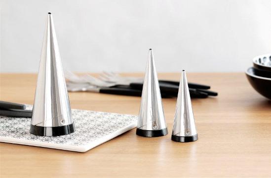
I have a great set of Dansk cutlery, Parallel Diamond to be exact, but it doesn't stop me from jonesing for other tabletop loveliness. Take the Scandi firm Gense as a case in point, who've been creating flatware and other essentials for the past 150 years. Their Focus de Luxe line of cutlery first hit the table in 1955, when it was launched at the H55 exhibition in Sweden (and where it was snapped up by the likes of Grace Kelly). Don't you think it would make slapping together a PBJ sandwich a fancy affair? The latest from Gense is the re-introduction of their Shakers, designed by Pierre Forssell and first debuted back in '55 too. Seriously. I doubt you'll find a chic-er way to chuck some s and p over french fries or tip sugar into your coffee.