Hair meets tech

Hmmm, I saw this in the UK at the Conran Shop and was intrigued. It's one of Dyson's latest gizmos, a self-cleaning dog grooming attachment for your vacuum that can tackle long and medium-haired dogs. The Groom Tool is now available online in Canada, so if you've got a 4-legged shedder in the house - though it won't work on our pup Spot since he's short haired - it might be something worth grabbing. Oh, and the video? It's a cute/gross look at why you might need one...


Tacky gold modern white sparkly graffiti

Hello! Where has the last week gone? Well I finally got back to Toronto from London, and then a couple of days later my suitcase arrived (it was enjoying an extended vacation in Amsterdam). And now I'm back at work, trying not to get too snowed under by shopping for prezzies and writing Christmas cards.

London was definitely fun, and it's always inspiring to check out all the Holiday windows in all the stores. This year they were all over the taste scale, from good lawd that's awful to how fantastic! Here are my faves - First up like start with purposefully tacky and over-the-top at Harvey Nichols. Their windows were awash with tinsel in every colour possible, and this tree, standing outside of the front entrance look crazy/cool and bedraggled all at the same time. Thoughts? At fashion-forward Dover Street Market the windows had a graphic doodled/graffiti vibe, and yep, that's a giant white plaster elephant in the window. Next let's go cool, modern and white at The Conran Shop, who created a white-painted pathway and forest of trees out of wood, and then threw in zillions of mini white ceramic mushrooms to finish it off. At Selfridges (where I worked in my - ahem - younger days), part of the store was filled with massive mirror balls that delicately rose and fell, shooting sparkles everywhere. And finally, just for the sheer fun and wit of it, Mulberry filled one of their Bond Street windows with gold handbag helium balloons and topped it off with a humungous gold bag in the other. It looked fun and fantastic and was literally stopping shoppers in their tracks. [Image #6: Blink London]


Stepping out in Tokyo #2

Funnily enough I'm writing this in London right now, stuck here due to weather (oh well, there's way worse places to be stuck!). But let's get back to Tokyo...

Another of the neighbourhoods we totally loved was Shimokitazawa. It seemed worlds away from the buzzy shopping districts like Shibuya, and had a lovely lo-fi charm all its own with - again - tons of fantastic vintage shops, clothing stores and little places selling Japanese crafts and loads of great neighbourhood cafes. I made friends with a local who was hanging outside of a hair salon, and we hit the vintage motherload in a store called Haight & Ashbury which carried a beautifully curated collection and included that completely wacky and craft-tastic huge tree entirely knitted/crocheted of wool in the middle of the store. For more in Shimokitazawa check out BlinkLondon.

Finally, back on the design side of things and back in Shibuya we totally enjoyed a run through a department store called Loft which included a 60 Vision section, a cool collection of re-issued Japanese 1960's designed furniture (that's the Lobby sofa by Karimoku below), accessories and even some rather tasty looking cookies.


All on the table

Now December is off and running it's definitely time to start getting into the Holiday spirit, so I thought I'd share a project I recently worked on with one of my fave photographers (and good friend) Angus Fergusson. It's three Holiday tabletops, each with an entirely different feel, and all sourced from the shelves at HomeSense.

Up first is probably the most trad of the lot, it's kind of a twist on candy canes and red and green, though the olive - instead of a boring old Christmas-y green - makes it feel much fresher. Oh, and isn't there something about the chairs that reminds you of wooden sleds? The next one is all about collecting, with a scatter of pitchers, a tea pot and cake plate, and loads of mercury ball decorations in a lovely robin's egg blue. And yes, that's an embroidered blanket on the table, rather than a tablecloth... Finally I thought some glam was in order for a New Year's table, so I grabbed a pair of hi-gloss black foo dogs (whish were too gorgeous to ignore), added in more black and white, then threw in that hit of colour in the picture frames that work perfectly as place markers. Time to pop the champagne!

Rainbow rabbits, and other stuff

I have been so behind the 8 ball this week. You know how it is, you come back from vacation and there's a traffic jam of work to wade through. Well, that went out the window yesterday morning as I took time out to check in on the just-opened One of A Kind show.

There was scads of great stuff to see, so here are just a few faves from me. First up, the incredibly sweet felt creatures from Cristina Larsen of Textile Platypus, who makes the felt, hand-dyes it, then stitches each little fellow by hand. Next, Lost Nation had fun with their Humane Antlers as well as these cool carved moustaches. I totally heart all of the hemp and organic linen tea towels from Freshly Printed, their snow-shoe design was a standout for me. Menswear brand Identity stepped out of t-shirts and into these screenprinted wool blanket pillows. More great tea towels, of course from the lovely Avril Loreti (whose calendar tea towel is a certified blog hit!). And finally, an '&' pillow craftily made from vintage clothing by Hilary Cosgrove.

Bug love

I don't think I've actually stepped on a skateboard in more than 30 years - and when I did I promptly fell off - so I can't claim to have shredded anything or ever succesfully pulled off an Ollie. But, all that being said, it doesn't mean I don't love the design on these Reese Forbes boards for Los Angeles skate brand Stacks. Just in case you aren't in need of a board, The Beetle series artwork (I'm digging the techy re-working of the bugs) is also available as a poster, though all three boards hung on the wall would look super sweet. Oh, and in case you needed an extra incentive, Stacks has just announced a 35% off Black Friday sale, so get shopping!

Bev Hisey dhuri and cushions {giveaway}

Happy Monday! So listen up, people - My talented good friend Bev Hisey is up for a bit of fun and has decided to offer up her new gear in a couple of different giveaways. With Grace over on Design*Sponge she's giving away one of her brand spanking new wool Dhuri rugs, the blue and green one shown below, so click here to get in on that action. And up for grabs with me are two of Bev's latest wool cushions - called Numbers - that have a sweet and modern punky/preppy vibe.

Here are the deets:

>>> The winner will receive the two cushions shown below.

>>> Contest is open to continental US and Canadian readers only.

>>> To be eligible just leave a comment below explaining why your sofa needs these pillows.

>>> Comments will be open until tomorrow night, November 23rd at 12pm EST.

>>> The winner will be announced by email and as an update this to this post on Wednesday morning, November 24th.

Good luck!


Quick and red and white

Here's a quickie for you since I'm in transit today (more on that later). Okay, the Holidays are a comin', so how about we just try to get through it with a sense of calm and grace, huh? Wobblies and meltdowns will not be tolerated. So, with that in mind, just take a deep breath and remember that decorating in a chic/simple style needs restraint. Take a look at this lovely shot from Ikea - You've got the clean workaday lines of the Sockerart enamel pitcher that's been wound with Snovita sisal twine and then filled with Amaryllis. Glorious and just Christmas-y enough if you ask me. [Image from Livet Hemma, discovered via Tiger Hellström's great Tumblr blog From Scandinavia With Love]


Socks, hives and dolls

Oh happy day. The folks at CB2 have just launched a new international website that now lets you shop your socks off whether you're in Canada, the UK or India, and a few more places besides. Now, if you fancy a larger piece of furniture you'll still have to give them a call and arrange delivery, which is easy-peasy (I've ordered gear by phone with CB2 on more than one occasion).

Anyways, I thought it would be fun to pick out 3 faves from their current collection. Up first, the award winning Hive stackable storage system. Love 'em and majorly ogled them when I last wandered through a CB2 store. Then, the Matryoshka doll craze continues with these hand painted patterntastic Russian Nesting Dolls. Finally, the Contact stool has such a lovely industrial heft, I'd love to see it as an occasional table as well as for a smart bit of seating. Oh, there's way more, like the Acrylic Tripod Easel which I'm currently trying to convince my other half would be a great addition to the house, but that's another story entirely.


Oh, Bitossi...

While on one hand I'm seriously considering a clean sweep and tossing out every last bit of clutterbug collectibles I have hanging around the house, on the other hand I'm jonesing for these Bitossi vases from DWR. Yes, they're limited edition, hand-thrown, embossed and painted by hand (click here to watch a clip of all that in action). Yes, they're by the masterful Italian artist and ceramist Aldo Londi and yes, they were first produced back in the '50s and '60s. So basically it's a win, win, win, except perhaps for the price, which puts them into the realm of serious collector, rather than where I'm at, which is more on the vintage store rummager end of things. Shucks.

Crushing on Binic

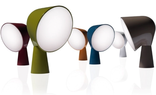
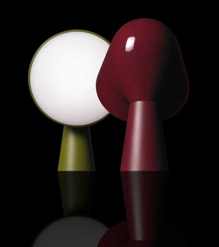
Yep, I'm a card-carrying lampaholic, so when confronted with the quirky cuteness of Foscarini's new table lamp called Binic it was lamp-love at first sight. Ionna Vautrin, the designer behind the diminutive light, was inspired by both a particular kind of small lighthouse found on the coast of Brittany and 'wind socks', those doohickeys used for ventilation on ships. Check out the pics below, and then watch the super little video to follow Ionna's design process and see how Binic went from an idea to reality. Hmmm, I think I want one in every colour...

Feeling a beat

Okay, now I know these have been out for a while, but I was struck by how simple this shot was, and yet how gorgeous that gaggle of Beat lamps look. The Beat line of fixtures is designed by Tom Dixon and inspired by trad indian cooking pots and water carriers. In fact, Dixon tapped skilled craftsmen in Mordabad, Northern India, to create the series out of hand beaten brass (hence the glow-y gold interiors) that are then finished in matte black. And if that isn't enough, the light fixtures are mirrored by an equally stunning set of ovescale vases in an unpolished satin brass. Yum. BTW, that great shot is courtesy of photographer Tom Mannion and stylist Faye Toogood - a creative power couple if ever there was one - from the latest Dixon catalogue. Oh, and if you fancy getting your sticky mitts on all the Beat bits and pieces, check in at Klaus by Nienkamper for more info.

More on that Very Important Project

I mentioned a while back about a Very Important Project that Tommy Smythe and I were working on, so here are the deets - In case you didn't happen to catch CBC's The National on Friday (have a look at a clip here), we have pulled together (with absolutely tons of incredible help) a Canadian video for the It Gets Better Project, which was all started by writer Dan Savage as a show of strength by the LGBT community over the awful series of gay teen suicides reported in the press. We got in touch with Rick Mercer, Mark Tewksbury, David Clemmer, Joeffer Caoc, George Smitherman, Anne Marie Macdonald, Peter Fallico, Diane Flacks, Rex Harrington, Deb Pearce, Enza Anderson, the cast of MTV’s 1 girl 5 gays, and many, many more and they all agreed to share their personal stories. 

It launches tomorrow night, and we couldn't be more excited to share it with as many people as possible. Watch this space, because I'll be posting the video here as soon as it's live on YouTube!

---------------------------------------------------------------------------------------------------------------------------------

On the design side of things, here's some of the latest stuff that I'm ogling at Crate & Barrel. C&B have hunted through the Dansk archives and re-issued this great capsule collection of mid-centrury Jens Quistgaard designs in eco freindly acacia wood.

A chair story, part one

I'm definitely up for a challenge, so when Virginie Martocq - Chatelaine's Decor Editor - e-mailed to ask me about re-doing a fleamarket chair for the mag I said sure! So, a day or two later when a rather grubby looking chair showed up on my doorstep I knew the game was on. Luckily I'd recently been inspired by a particular DwellStudio fabric I'd spotted at inVU Drapery called Vintage Plumes (you can see a shot of it here) and set to work figuring out the look.

Step one was to unscrew the dusty old red velvet seat and thoroughly clean the chair. Next, I lightly sanded the frame with some steel wool, and carefully painted two coats in a lovely soft beigey grey called Fashion Grey from Behr. Now, I knew that nailheads would be fun but didn't want to commit to nickel or brass. Instead, I'd seen some white painted nailheads at Home Depot and thought that they might be just the ticket. Well, the colour was waaay too bright a white, but that was quickly remedied by pushing the nails into a cardboard fruit box and spraying the whole lot cream all in one go (outside of course). I dropped the chair off at inVU this morning for the re-upholstery job and can't wait to see how it turns out!

Four times Oji

So yesterday I was out scouting kitchen gear for a feature I'm working on (tho' don't ask me the name of the mag, they're currently going through a name change) and stopped in at one of my favorite-est stores, Mjölk, where John told me all about their upcoming - and very first - exhibition, called Masanori Oji Life On The Floor. The whole shebang opens on the eve of Oct 21st, with a chance to meet the Japanese designer, whose sense of craft is, well, gorgeous (have a look here at some of his work). One of the coolest things about the exhibit, before it even starts, are the four posters John and Juli had designed by Sali Tabacchi. Take a look below, wouldn't they look fantastic all framed and grouped together on the wall? Oh and for more of John and Juli from Mjölk, take a look here for an HGTV.ca house tour of their cool space above the shop (it's well worth a look).

All about the peacock

I have a chair makeover project coming up, and I'm happy to tell you I think I found the perfect fabric at inVU Drapery. I popped in there the other day to check out the new DwellStudio collection that they're carrying which, I hafta say, is all really rather lovely with fantastic hits of yellow, teal and grey all in a smashing mix of prints and solids. But back to me, and back to that chair! The fabric that totally spoke to me at inVU is the DwellStudio Vintage Plumes in Camel. Pretty fantastic, no? The side chair is currently a hefty fleamarket find in dark stained wood, so I'm thinking about lightening it all up by either painting the frame in a soft grey (or going a tad nutty with a harvest gold???) and of course, there will have to be nailheads involved somewhere. Nickel, or maybe even white for those. Hmmm...

Checking out the details

I've already posted here about The House Hotel, a cool Autoban designed spot I'd stayed in in Istanbul a while back. Well, I thought it would be kind of nice to share some of the interesting design details of the hotel with you, snapped by me early one morning before any of the other guests were up and about (otherwise they might've thought me kind of odd, crouching down to capture a snap of the hallway floor, lol).

Here we go then - A closer look at the white and gold chandelier, there were a couple of different variations scattered around, including a lovely gold and beige one in the hotel's front hall. Next up, the enamelled steel and glass wardrobe that was in each room, inside was a small two drawer unit for all your foldable bits and pieces. Outside the rooms, each room number was cut out of brass and then spotlit. Staying in the hallway check out the stone floor (I'm loving the pattern), and then finally, topping it all off, you can see the hexagon pattern of the floor mirrored in a suspended trellis panel at the ceiling.

Hanging out with Bob

Designed by Hella Jongerius, who you might know from her work for Ikea (I still love her Ikea PS Jonsberg vases), Bob is the latest in outdoor furniture from Spanish firm Kettal. I totally dig the indoor/outdoor feel the collection has, and seriously, how handsome does it look in that architecturally stunning raw wood space - Who knew knotty pine could look so mod? I'm also loving the two-tone metal frames on all three pieces, as well as the two-tone grey upholstery and lovely crafty wound yarn detail that shows up on the armrests of the chair and on handles of the footstool and table (oh, and that cool looking lamp is an outdoor piece too). In Canada, check in with BonaVista LeisureScapes if you fancy kitting out your deck with a set.


Meeting Martha

I was lucky enough to part of a Canadian crew of design media that popped down to check out Home Depot's de-lovely new Martha Stewart Living kitchen collection in NYC, and yep, actually got to meet Martha too! I was trying not to be all goofy and star struck, but as you can see from that kooky grin on my face, that might not have happened. From left to right in the pic is Samantha Pynn, me, Martha, Suzanne Dimma, Deidre Kelly and Karl Lohnes (the delightful Margot Austin was there too, but somehow didn't make it into the photo op). On top of all this - if that wasn't jammy enough - I also got to chat with both Kevin Sharkey and Gael Towey from Martha's team (who just happened to mention that they'll be launching an iPad issue of the mag soon!), as well as Maxwell Gillingham-Ryan and Aaron Able of Apartment Therapy.
The first snap shows how stunning the Martha HQ actually is, all Deco curved windows in a two storey high space with lots of white and polished concrete. Stunning indeed. Next up is a pic of Martha addressing all the folks who attended, standing in front of the very Martha-esque putty toned Seal Harbor cabinetry, with details like the corbels inspired by her own kitchen, followed up with a close-up shot of the plate rack and cabinets. Yum. On the more modern side of things is The Weston, which takes its design cue from Martha's Chief Creative Officer Gael Towey's Manhattan kitchen. All told there are 6 cabinetry styles in a range of painted and wood finishes, 8 exclusive honed marble inspired Corian countertops and a slew of perfect hardware to finish everything off. Expect to see it all in Home Depot stores soon!

Guest blog / Jenn Hannotte: New kid 'off' the block

Jenn Hannotte: It's no secret to Torontonians that the Junction, a west-end neighborhood, has become a go-to spot for amazing decor stores over the last few years. And now open a short skip north of Dundas on Keele is Russet & Empire, a home accessories and gift store. 

Carefully curated by owner Micah Lenahan, she says that the neighborhood was lacking " a lot of options for shopping unless you wanted to buy a big piece of furniture." Now, I'm not talking traditional gifts and accessories. These are vintage toys (with the tags still on!), impossible-to-find soaps, gorgeous jewelry by local artisans and other super on-trend home accessories. Micah says she was aiming to create a gallery-like space by "adding only products that are beautiful and that i can claim that I absolutely love." Open only a month, she has events, and in-house products in the works with new products rolling in all the time. Check out some of Micah's favorite pieces below, then go say hi at 390 Keele St!

To read more of Jenn's take on style, as well as to track her reno project, click here.