Hot shot

I love a good espresso (not expresso, please, lol), and starting my day with a shot is quite the best thing since sliced bread. We have the Nespresso Le Cube espresso machine in white, which looked awfully posh in our last kitchen (take a look here) and now sits rather snugly on our teensy temporary apartment countertop. Apart from the fact that it's practically idiot-proof (the foil capsules take care of that) the design is clean, simple and modern - All you need in a countertop appliance.

Now Nespresso is jacking things up for Fall with more choice in their colour finishes. A racy and kinda Eighties hi-tech matte Black and a v. lovely Bronze Patina (which would look very swish with Jenn-Air's Oiled Bronze appliances). Plus, and this is a big plus, they're also intro-ing a larger sized milk heater / frother; the Aeroccino Plus. Which (again with the idiot-proof) does a masterful job of making the kind of cappuccino foam that a seasoned barista would be proud of. All this new gear is available in September - check out Nespresso online, or visit one of their two Canadian boutiques at The Bay in downtown Toronto and Vancouver. Take a peek at the Le Cube Bronze Patina and Aeroccino Plus below.

Hot towels

I've collected a few things over the years - clocks, Art Deco bits and pieces, scientific glassware, white pottery, souvenir silk scarves and tea-towels to name a few. They've all kind of ebbed and flowed depending on storage space and usefuleness, but the tea-towels, well, we have lots and I keep on finding more. Maybe it's a British thing, or maybe it's a pattern thing - Most are vintage and I do really hunt for good Irish linen too (just the best for glassware), but then there are often new patterns that catch my eye.

I love this article on Chow called Upgrade Your Rags that shows a smashing selection. I already have a few they show (Kaiku by Marimekko is a favourite), but it's a newer company called Simrin. with a modern sensibility that references gorgeous botanical patterns, that made me look further. Love their colourways, love the prints and I can't wait to get my hands on their gear! Take a look -

Junior envy

There's been quite the overload of kid's well-designed furniture recently, and honestly, isn't it about time? Enough of the dullsville offering that has been on the market for years, now creative parents want their kid's spaces to be just as cool as the rest of the house (after all, If it's all B&B Italia in the living room why should Junior have to suffer).

Nurseryworks (available at stores across Canada) is at the top of the kiddie food chain when it comes to cool gear. Their latest offering for Fall /08 is uber swanky and has me all envious - The Vale and Harvard headboards are quite the chicest thing but only come in twin and full. Darn.

Looking for real

Yesterday was a difficult day - Plumbing issues on a reno I'm working on (we only need 2 handles in the shower, not 3!) and then hours and hours spent walking the halls at the Toronto Gift Show, aka the CGTA. As usual I found some great, beautifully designed authentic gear, more of which you'll see later, but, also as usual, there was tons of terrible stuff. It's almost as if a great idea gets photocopied again and again until you're just seeing a sad ghostly image of the original. So, when I saw a bad rip of Eva Zeisel's fab Century Dinnerware (the real thing is available from Crate & Barrel) I knew it was time to call it a day.

I've heard the word 'authentic' alot recently and it's been really resonating with me - Whether it's things or experiences I think we're all looking for the real deal. Ilse Crawford is someone who I admire greatly, a designer and creative director who I think has that concept down in spades. She started Elle Decoration UK back in the day, and I've been avidly following her work ever since. Her company, StudioIlse, works on some amazing projects, including a recent store design for Aesop, restaurant and hotel design, and also show flats for Notting Hill London. Take a look at one of the flats below.


Brighton bizarre

As a kid I spent lots of time in Brighton, on the south coast of England. And now, whenever we travel back to the UK, we always try and head down to walk the Promenade and see the sights. One of those particular sights is The Royal Pavilion which, to this day, still takes my breath away. How crazy/amazing is it? Well, take a look below. Yup, it's in England, not India (and the interiors are just as bizarre as the exterior, with a dragon in the dining room and palm trees in the kitchen). And, while the warm beige stone exterior adds a nice air of class, I do miss the garish old pink and blue paintjob that I remember from my childhood.

For a touch of updated Regency madness I thought I'd include this charming Currey & Co table, which I think would look just smashing set next to a clean-lined modern sofa.

Image copyright The Royal Pavilion & Museums, Brighton & Hove


Chic and easy

By now everyone and their best friend has had a chance to peruse the new Ikea catalogue and dog ear pages, me included. I thought I'd post a couple of favourite roomsets that get my vote for their lashings of inspirational style (love those Kelly green closet doors) as well as being super affordable. Chic and easy on the wallet - Who can beat that?

The first shows the Grimen bed, that rocks a way Italian vibe at just a smidge of the price, the second shows just what a bit of imagination and a few Ribba frames can do.

Style blender

While you might think that I have completely my own way with the way the new place will look, think again. It's the same for us as for most couples - Compromise. Ugh, such a dirty word (lol). And David, who's quite the comedian, has given some thought on a design direction and has decreed that it should be Robot Chic. Robot Chic? Honestly, if he had his way we'd be living in a Daft Punk video wearing crash helmets with LED lights flashing across the visor. Cool, perhaps, but maybe not so livable (I think I might get a headache from all the glaring lights).

In an effort to be understanding I've found the perfect item that'll meet halfway between Robot Chic and, well, reality - The lampbase (very him) and shade (very me) are both available through the always edgy Urban Outfitters.


Get cultured

Object Factory, running at the Gardiner Museum until Sept 7th, is a must see exhibit. Featuring ceramics from a laundry list of big name artists and designers - like Cindy Sherman and Ettore Sottass  - they also have some lesser known, but no less cool, work on display too from edgy young firms like Industreal. Another one to check: The Ornamental Inheritance pieces by studio Jo Meesters, which takes vintage trad blue & white pieces and sanblasts them to create intricate urban landscapes. Take a look at the pic below, which riffs on a 17th century Dutch still life vibe.

Swedish present

After that construction nastiness let us speak of other things, of cabbages and kings. Well, more importantly, my excitement for the new Ikea catalogue!

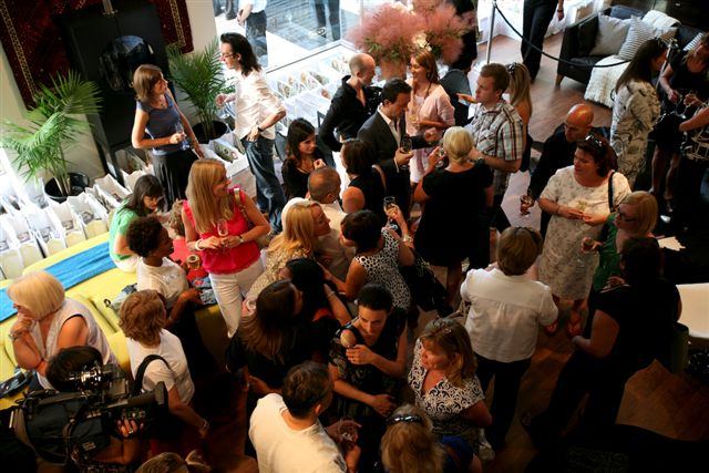
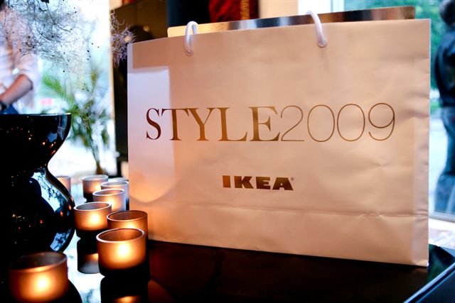
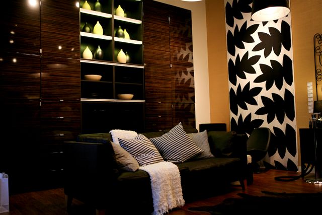
I was at the launch last night which was a huge laugh, take a look at the pics below (thanks Madeleine). The smarty-pants at Ikea have taken over a downtown Toronto storefront, on swanky King Street, to showcase all their new gear. Highlights include lots of black in both matte and gloss finishes, new kitchen cabinetry in Pop-y colours and cowhide rugs. In fact, it's open through the weekend, so if you want to take a look head to 143 King St East - I'm going to have to go back and check it out without the hordes of people. 


Pretty modern

Bev Hisey is one of the craziest (in a good way, lol) friends that I have, she's also one of the most talented. Bev and I were chatting today while I was in the midst of a haircut - which prompted the barber to ask what we did, always an interesting one to answer... Most people might not realize that Bev is a one woman operation, a tough gig for sure. She's always pushing the envelope with her work and is constantly working on something new. Below are a couple of pics that Bev and I worked on together, shot by Donna Griffith. I think she's a bit of a Canadian treasure...


It takes a sledgehammer

First thing this morning a skip showed up at the new place for the beginning of de-construction. Graham Kaye (our intrepid real estate guy) showed up to help - so much nicer than a bottle of plonk - and he and David went at the back deck with hammer and tong, well, actually sledgehammer and chainsaw. Then the gas powered weed whacker was put to work, with David at the helm, to clear cut the urban jungle of a yard. Honestly, I couldn't be there for the bulk of the work (deadlines) and showed up to lug the remains into the now full skip. I'll post pics tomorrow.

I was re-visiting a bunch of favourite online resources to come up with cool products to feature in the National Post for an upcoming Post Homes Magazine and re-discovered Christpher Jagmin. I like his gear, I've featured his dishware in Flare before, but the graphically etched glasses below are a snappy new addition to his line.

Are we sitting comfortably?

I was on set today with The Style Dept crew when talk turned to sofas. It's a dilemma for me since I'm always torn when it comes to such a pivotal choice for a room - Should you go for safe or go for style? It's a tough one since you'll be living with your choice for quite a while (a good sofa should last a decade or two). Style normally wins out, which is why at home we have a low-slung vintage teak number upholstered in chocolate brown ultrasuede, but it could be time for a change, especially for the new place...

Could this be it? The velvet is stunning, let alone the romantic lines and all that wonderful tufting. This is the Samuel Johnson from Brit firm Chesterfield 1780 (yes, they've been making sofas that long), and luckily - if you're totally smitten - they'll ship anywhere in the world.

Light reading

Another day shooting on The Style Department, a hot one for sure; with the mercury hitting 30C. The space looked lovely by the time we were all done (such a talented bunch makining it all happen), and it's always a pleasure to work with Suzanne Dimma.

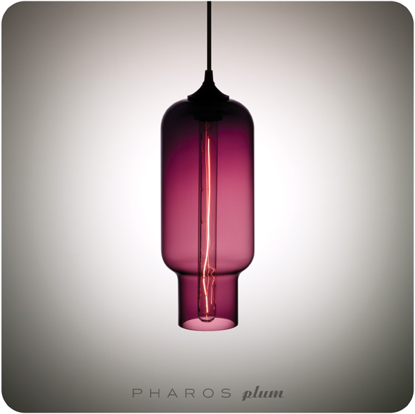
Tonight, before heading out on the town, I wanted to post a great lighting resource - Niche Modern. Their pendants are outstanding, and we'll be in the market for something stunning in the new place. Hmmm... The Plum tint of the Pharos pendant is so on trend.

NicheModern_Pharos-Plum.jpg


Trash talk

Today is a busy one - Meetings at Flare this morning about the October issue and upcoming features, a couple of last minute questions about Style Scout for the National Post this Saturday, and then shooting for the new season of The Style Dept (debuting on HGTV this Fall). Phew. In the meantime there's a couple of minutes to squeeze in lunch and a quick post...

As a kid I trained in fashion and then eventually segued into decor, so I always enjoy a hot bit of fashion-y craziness, especially when it translates into interiors. This Aubusson style flat-weave wool rug by Vivienne Westwood for The Rug Company shows, basically, Dame Westwood's trash. Now that's some design chutzpah.

Vivienne%20Westwood%20Rubbish.jpg


Style commitment

I shop all the time for work, and then I shop for fun too, yet the theme is constant - always looking for great new things. For me it's retail therapy, but on a grand scale. So last night found me in Pottery Barn (we were out buying essentials for the semi-1 bedroom) having a look at their Fall release, and I must say I was very impressed. PB seems to have really stepped up their game with lashings of high gloss finishes, intense colour, and pattern. There seemed a real commitment to decorating, and to do it well, with high contrast pairings of black and white (an enduring trend), orange and a fresh green. The patterns were Moorish and Swedish in influence, and natural elements (raw wood, lots of texture) help to keep everything grounded. Loved, loved, loved it. So of course I had to buy something - a super black glossy lampshade that had just arrived.

Below is a shot from their new catalogue, intense and very cool.

Graham%20Desk%20%20Hutch%20-%20Pottery%20Barn.jpg

Open doors

The idea of buying things that last has really been on my mind lately, at the ICFF the idea of 'anti-throwawayism' was quite the trend across the board. Fast fashion, and now fast decor, is here to stay, but hopefully people will look for better quality in everything they buy - its just more sustainable.

I came across this glam cabinet by Somerville Scott & Company this morning and just loved the attention to detail; the lacquered hits of red and green, and metallic leaf, against the ebonized walnut are wonderful. For most of us this is totally out of our snack bracket, but an investment piece like this - that mashes up art, design and craftsmanship - will stay fabulous for years to come.

Somerville%20Scott%20%20Co%201.jpg

Somerville%20Scott%20%20Co%202.jpg


Living the (fantasy) life

Palm Springs. Can we move there? I get almost compulsive about a place one we've visited, constructing a fantasy life that involves buying a place, settling in and becoming a local. Lisbon and Rome are on the list, but it's Palm Springs where I practically lost my marbles - It's cool, quirky, and about as laidback a place as you can find. Other than emptying that imaginary bank account, the closest we'll get to moving down there is scoping the interiors of the Parker Palm Springs hotel (designed by Jonathan Adler, and which has a lobby I'd happily try and cram into my carry on, take a look below).

Parker%20Palm%20Springs%201.jpg

Parker%20Palm%20Springs%202.jpg

Parker%20Palm%20Springs%203.jpg

My other house is a castle

I'm not really sure what it is about this shot that draws me in. Sure, the e15 Shiraz sofa is chic, simple and just slouchy enough to be truly lounge worthy, but it's more the vibe of the shot - kind of a 'Granny left me this castle, but I'm a modern gal' feel that's just so refreshing.

Shiraz%20e15.jpg

I heart Barbara

Barbara Hulanicki is a total style/design hero for me. It all started when my stylish Mum used to head up to the Biba store in Kensington for a fashion fix in the Seventies and bring home beautifully packaged products stamped with that curlicue Biba logo. Fast forward to this year's ICFF in NY and I got to meet Barbara, and her assistant Likorish, at the Graham & Brown wallpaper stand where I was marvelling at all the gorgeous patterns on display, including a new collection by her. Viva in Black Gloss was one of my favourite patterns.

Viva%20-%20Black%20Gloss.jpg