3 for the framers

I could totally blow the bank on artwork, and have fortunately/unfortunately found someone new on Etsy to jones over. I don't know much about Hocus, except she has a bit of a thing for vintage Danish pottery, and that she (?) is a designer/illustrator based in Toronto. Her work is sweet, but not too sugary, and I love all the textures and detail in each piece. Below you'll find all three of her limited edition, signed and numbered prints - Key Finder, Feathers and Snyder Goes For Walkies. For my money I think they'd all look brill in simple white gallery frames, hmmm, now to find a spare wall to hang them...

Yes to letters, no to pom poms

I was oohing and aahing over the graphic fairground lettering on Emily Peacock's needlepoint tapestry Hug and Kiss pillows the other day - all very cool since the do-it-youself kits are available here on Etsy - and then I realized that the finished product had pom poms. That's a slight problem. Spot, our handsome 9-month old Whippet, has a bit of a thing for pom poms. In fact the little so-and-so has already managed to gnaw off something like 7 of them from our Home Sweet Home pillow from The Rug Company. Anyways, I thought I'd share a great snap of the Hug pillow, and also the Home Sweet Home wall hanging, which we might have to consider if Spot takes any more of a liking to that Rug Co pillow, lol.

Guest blog / Julia Black: It's in the grain

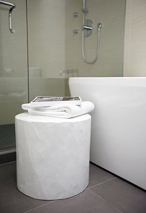
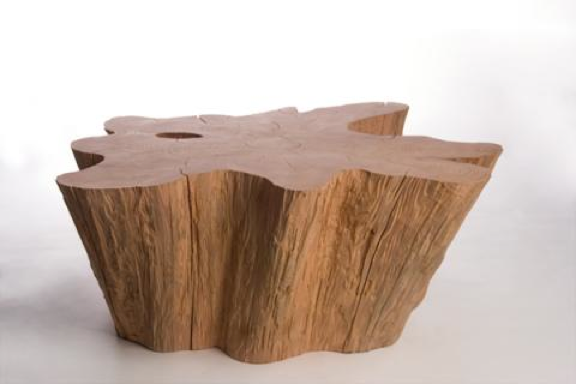
Julia Black: John Ross might as well win a gold medal at the 2010 Vancouver Olympics. Truth be told he might not exactly be an athlete, though he is a supreme representative of the Canadian way. With his overwhelming compassion for nature, his creative brilliance, and his oh-so stylish designs, what more can you ask for? As logger for nearly 15 years in British Columbia, John decided to channel his passion into high-end one-of-a kind pieces crafted from cast-off wood. You might have caught his work in Oprah Magazine and Canadian House & Home, and to actually get your hands on his furniture and lighting you can pop into one of my fave Vancouver shops, The Cross. John currently resides on Vancouver Island, so those of you lucky enough to be on the West coast right now be sure to check him out! Who knows, maybe you’ll come away with an extraordinary, and very Canadian, piece of furniture.

To read more posts from Julia click here, and to check out her cool blog click here.


What's Spanish for wallpaper?

One of the most recent wallpaper launches to make a splash is the Vital collection for Barcelona-based wallpaper firm Coordonné. Okay, what's so special about that? Well, it's the first foray into wallpaper by illustrator Jordi Labanda, and the first of Coordonné's new artist-designed series. The capsule collection shows all of Labanda's trademark fashionable wit, and includes papers wrapped around themes of make-up, 50's fashion plates, Damask silhouettes, and wild 70's inspired patterns. Yum.

A modest veil in Vancouver

Yes, the Winter Olympics in Vancouver are pretty inescapable right now, and yes, I'm not exactly a sporty type (to say the least). One thing that has caught my eye, and just about everyone else's in Vancouver, is the gorgeous facade of the Vancouver Art Gallery. The piece, titled A Modest Veil, is by artist Michael Lin and was commisioned as part of the Vancouver 2010 Cultural Olympiad. I've seen shots of it turn up on Twitter (thanks to Flare Mag's Lisa Tant), and on Facebook (courtesy of designer William MacDonald) as well as all over Flickr, so wanted to see what else I could dig up.

Lin is known for his monumantal murals which reference trad Taiwanese fabrics, with their intense colours and stylized floral patterns. In the past his work has shown up on the floor and walls of places like P.S.1 in New York and the Musee d'Art Moderne de la Ville de Paris, though by size alone A Modest Veil was a massive task; each panel was hand-painted and then mounted on a huge framework to cover the museum's Goergia Street frontage. If you fancy, you can snag a piece of Michael Lin for your own place, since he designed a carpet called Formosa for Nanimarquina (though I'd love to know what's gonna happen to the Vancouver piece once it comes down). For fun, I've also added in a Youtube interview with the man himself. [Image 1: Cara_Rouge on Flickr. Image 2: CityCaucus.com on Flickr] 


Jack is back

Just got an e-mail from designer Tom Dixon's office this morning, detailing all of the lovely stuff they'll be showing at Milan Design Week in April, and was excited to see Jack making a comeback. The Jack, described as a sitting, stacking, lighting thing, first debuted in 1997. Back then I wanted one - and considered eating cereal for a month or two to save up - and now I think I really fancy one all over again! You can now get your hands on them in either black or white (my money's on the black). Another big deal will be Dixon's collaboration with Philips on Flat Lamp, a collection of OLED lightbulbs. Exciting, since OLED is expected to be the next gen technology that will replace low energy, incandescent and conventional LED bulbs over the next few years. In Canada, check out Klaus by Nienkamper for the full Tom Dixon line.

Guest blog / Julia Black: On the runway, in the garden

Julia Black: What do you get when superstar designers from the worlds of fashion and outdoor furniture collide? The answer: You get the latest collection of outdoor furniture from Andrew Richard Designs gussied up with fabrics inspired by Bustle, the renowned Canadian sportswear label designed by Shawn Hewson and Ruth Promislow. Bustle's Muskoka-ready collection first made it’s appearance at LG Fashion Week back in October '09, but the official launch of the outdoor fabrics was celebrated at IDS10. Having caught up with Andrew Bockner of ARD, he reminded me that even though we (at that point) were only in mid-January, there’s really no reason why we can’t start gearing up and getting excited for summertime fashions and oh-so-stylish outdoor furniture a-la Andrew Richard Designs. The Cottage Style line of outdoor fabrics brings a dose of preppy fashion to the outdoors with watery blues and coral-coloured plaids, polo-esque stripes, and sailor-blue solids. Okay, now where's the sun? [Image 1: George Pimentel]

To read more posts from Julia click here, and to check out her cool blog click here.

Champagne every day

Where did Tuesday go? Oh yes, it started off with me having fun talking about Graham & Brown wallpaper on ABC 7 News in Chicago, and then slid straight downhill with an 11 hour trip back to Toronto. It was the weather. Lovely. Though highlights of the trip home included picking up a bunch of Vosges Bacon Chocolate bars at O'Hare, and downing a v. good Gordon Biersch Hefweizen beer in Cleveland (which really did have hints of clove, bubble gum and banana).

I guess I'm slightly on an alcoholic roll with today's post - The Champagne Lamps designed by Sascha Kipferling, found over on fun Brit site Supermarket Sarah. Yes, they're pricey (though as SS explains, the shades are vintage and there are lovely finishing details like the fabric-covered cord), so you might want to have a go at one yourself with this kit, and an empty bottle of Veuve Clicquot.

Blue mondays

Is Monday your most favourite day of the week? Errr, possibly not. So, to get everyone through the gloom and chill of this particular Monday I thought we could totally do with some inspiring shots by photographer Tom Mannion. I don't even remember how I stumbled across his jaw-dropping work, but as soon as I'd had the chance to have a good rummage through his stunning portfolio I knew I wanted to post this series of shots. A quick e-mail and then Tom said yes. Cool!

Anyways, I love the mix of blues (turquoise is Pantone's colour of the year, btw) and the slightly surreal feel of the shots, all beautifully styled by the v. talented Faye Toogood for Elle Decoration. Time for some dotty paper lanterns, don't you think?

Guest blog / Jenn Hannotte: 15 years in the pantry

Hi one and all, time to welcome a new contributor to the blog, Jenn Hannotte. Jenn has a great eye for style, and practically a black belt in the art of Craigslist, in fact you can see her place (and some sweet finds) in the Spring 2010 issue of Design Lines.

Julie Gibb and Christian Morrison started  Pantry Press by installing a letterpress - you guessed it -  in the pantry of their home in 1995. 

Now, 15 years on, they've retrofitted  the old stables in the backyard of their current home in Toronto's West End and are busy hand-crafting and printing custom wedding stationery, greeting cards, posters and - to use their words - 'all manner of ephemera.' To celebrate, they've opened an on-line emporium where you can buy this poster (among other things) because, hey, everyone can use a reminder. And, if you fancy reading more from the world of letterpress, be sure to check out their blog, dubbed Ink In Your Veins, here.

IDS finds

Well, it's one week later and I'm finally editing down my faves from the IDS. There was so much to see except, errr, I was kind of busy, so I literally begged off an hour on the last day of the show to run around and catch what I could. So, here's a few designs that really caught my eye, and yes, before anyone says anything, I totally realize I have a bit of a thing for lamps...

From the top: Mahabali welcome mats in natural coir by Cristina Covello. Intensely coloured turned wood lamps and mortar and pestles by Tahir Mahmood. Handmade silver on brass Egyptian pendant lights available at Snob. The Clown light, part of Jaime Hayon's hook up with Lladro (lawdy it's a stunner).

Dark and disconnected

Our hi-speed internet was down for a couple of days this week, and let me tell you dial-up just wasn't doing it for me. So yep, I was feeling a little disconnected, though no less crazy busy - Over the last couple of days I returned all the last bits of pieces from the IDS (had to drive a truck, blergh), worked on a couple of Trendwatches for House & Home, and shot a webinar for a fun upcoming project with Erica Ehm of YummyMummyClub and author Kathy Buckworth. I am so in need of a bit of rest and relaxation...

On the dark side of things, as in colour, I wanted to share a few snaps of my 700 sq ft IDS space - the Ultimate his and her's bathroom - shot by Stefano Barbera. I was asked "Why black?" a fair bit about my colour choices and well, don't you think we've seen enough white bathrooms? The first two shots show the more feminine side of things (yep, that's one of the vintage dressers I'd scored at the Sally Ann and had re-finished), then there's the black wood panelled men's side, and finally that standout polished steel chest from Kravet in the chillout space that connected the two bathrooms.

Having a flutter

Okay, I've been slightly awol due to the IDS 10 and the mega workload involved, let alone spending every day in the space too. One of the massive hits of my Ultimate space was definitely Bev Hisey's wool felt Butterfly Chairs. In fact, if I was giving out awards, her ultra-comfortable two-seaters (plus that cute wee ottoman) would definitely win 'Most Sat Upon' at the show. They were irresistible and quite a few people refused to move, lol. Check out the lovely shots below by Donna Griffith and imagine yourself sinking into them... And, because Bev is a creative genius/workaholic, she also contributed a carpet to Radiant Dark, the fab show organized by the cool folks at Made. Since I was kind of stuck at the IDS I didn't make it down, so to get more info - and to check out pics - head over and read what Kitka Design had to say about it.

IDS 10: Big trucks and letterpress

Yesterday morning I was on a truck at 5am driving down to the Interior Design Show to offload and start setup. Okay, I'm taking a moment to whinge here: There is almost nothing I hate more than driving a truck, seriously, well perhaps raw celery, but that's another story. By 7am I was in and offloaded, along with my contractors two trucks and a van, and work started. The floor was screwed together pretty sharpish, then the walls went up, and by now, 24 hours later, the floor tiles will have been completed, along with the grout. Next up is this wallpaper from Graham & Brown!

In my bleary I-haven't-had-coffee brain of yesterday morning I forgot to bring my camera to document the progress. Sheesh. So instead, since I think this is really rather cool and I love a peek behind the scenes, here's a great video by Quarter Productions that shows Repeat Press making letterpress coasters for Highsnobiety and Selectism. Oh, and the bluesy soundtrack is brilliant.

Julia Black: Manga meets chic

What do you get when you combine the brilliance of a young female cartoonist inspired by Japanese Manga comics (remember Sailor Moon?) with my fave Scandi retailer? You get Ikea's latest textile collection, Charlotta. The line of 5 patterns was designed by Asa Ekstrom, who dreampt of becoming a Mangaka (a Manga cartoonist) from the age of 13, and trained in both Sweden and Japan before releasing her first Manga comic strip. Each of the Charlotta patterns is an imaginative, magical and lively mash-up of Japanese and Swedish styles, mixing Japanese woodcuts, origami and Vikings (one even goes so far as to let Godzilla rampage through some of Scandinavia's most historical buildings). So, whether you fancy new cushions, new drapes, a tea cosy, or you just love a bit of Manga, grab a couple of yards of Charlotta and get sewing.

Sanna's birds

You probably know Sanna Annukka's work for Marimekko (her Kanteleen Kutsu pattern is a fave of mine), but did you know she designed Keane's Under The Iron Sea album art? I love her sense of style, pattern and colour, so to I was super happy discover she's launched a new online shop for her screenprints, lithographs and these v. cool wooden Soul Birds. So, be sure to check out her site, and definitely have a gander at the rest of this talented half Finnish, half British designer's projects too.


Julia Black: Staying in the closet

With New Year’s resolutions and must-do lists in mind, just the thought of tackling my closet gives me a headache. This January, not only do I need to clean mine, I also need to source an entirely new closet system that can smartly handle all my clothes and accessories, all while staying within a relatively thrifty, post-holiday budget. Thankfully, West Elm has once again managed to answer my prayers in efficiently chic home décor, this time with the Bergen Closet Collection. All the shelves, drawers and racks within the line are both stackable and portable, so I'll get that posh custom look and can always take it with me should I ever want to move! The icing on the cake: The collection (available in chocolate & white) is made with FSC-Certified wood veneers (which means it’s using material from sustainably managed forests), uses eco-friendly hardwood construction (so no MDF and therefore less glue and other icky stuff) and is finished with water-based stains and lead-free lacquer. If that isn't good news enough, most of the hardware is made from recycled materials. Love!

To read more posts from Julia click here, and to check out her cool blog click here.

Rocking out and colouring in

Funnily enough I mentioned this contemporary artist colouring book from RxART the other day and then, over the weekend, I stumbled across another reason to grab your Crayolas and get to work - The Indie Rock Coloring Book from Yellow Bird Project. YBP, if you didn't know, is a Montreal-based not-for-profit gang that hooks up with Indie rock groups to produce t-shirts (and now the colouring book) that raise money for charity. Cool no? So, yep, the book is brill and filled with 25 illustrations inspired by the likes of Broken Social Scene, Bloc Party and Devendra Banhart, all dreampt up by the v. talented illustrator Andy J. Miller. And did I mention the book was only $10? Okay, with a little mental math, that works out to, errr, less than 50 cents a masterpiece. Now that's what I call affordable artwork. Oh, and don't worry about your colouring in abilities, YBP kindly recommends that you stay outside the lines.

For more YBP click here to hook yourself up with one of their latest t's, like the one designed by Metric, oh, and I totally recommend you buying Andy J. Miller's limited edition Love Yes Wow poster too (though not before I've ordered mine).

Staying in Martin's room

Yes, I think I'm on a bit of a hotel room jag right now, since this is a suite designed by edgy Belgian fashion designer Martin Margiela for a hotel/spa set in a vineyard in France. The hotel is Les Sources de Caudalie and the room Margiela designed is the grand suite L'ile aux Oiseaux. Check the hotel's website out in French and you'll see the suite before its transformation (it's a woodsy cabin on stilts set on a secluded island and looks totally charmant). So, perhaps the new look is a little incongruous with the rest of the hotel, but it certainly does have a rather dreamy edge with all that white painted wood, faux panelling wallpaper and mirrored cubes. If you fancy checking in it is a bit of a splurge at 650 Euros a night, but those that do decide to snuggle up to the pillowed headboard will apparently receive a special gift signed by Margiela himself. Via the NY Times Style Magazine [Image: Xavier Bejot]

Is 'Hotel chic' chic?

An interior designer friend was complaining about the idea of Hotel chic the other day. He'd heard clients bandy those two words about one too many times and had quietly blown his top. Why? Well, is Hotel chic actually chic? Yes, there are tons of gorgeous hotels out there, but is there a single defining style that gums it all together? Not really. For a while it was all sleek lines and chocolate brown wood (thanks to Christian Liaigre), and we were all romanced by an imaginary jet set life of perfect room service and miniature soaps, but as soon as the bed scarf showed up it all went to pot. A bed scarf, if you've never seen one, is kind of a fakey blanket laid at the end of a hotel bed. For whatever reason a real folded blanket is a complete no-go, so we're left with this odd imaginary thing that (hopefully) only exists in the mind of hotel designers. They make me shudder...

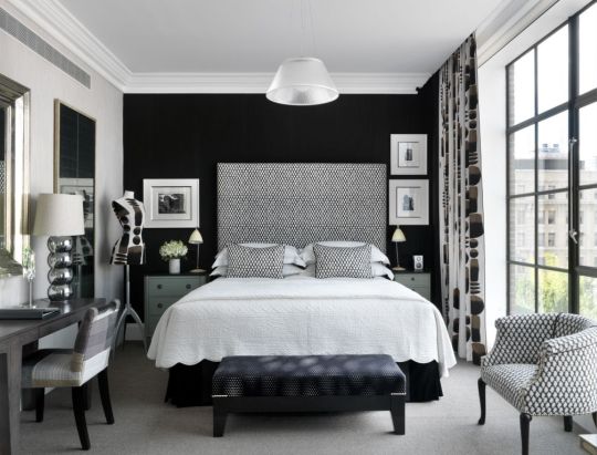
So, as you can imagine, it's been a while since I've been really inspired by a hotel bedroom. And then the Crosby Street Hotel opened up in NYC, and I saw this gorgeous monochromatic room. It's completely jam packed with personality, interesting hits of pattern and style and a brilliant mix of furnishings. Oh, and look, no chocolate brown wood, and certainly no bed scarf in sight. Love it.