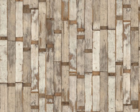
Guest blog / Jenn Hannotte: Feeling scrappy?

Jenn Hannotte: In our last house, we got a little creative and made a scrap-wood wall in our upstairs-kitchen-cum-nursery (take a look at the first snap below). We found all the wood in the rafters of our garage and cut them down into different sizes and just screwed them into the plaster. The result was a little unusual for a nursery (or a kitchen!) but it really gave the whole room a really warm, rustic vibe. We toyed with the same idea in our current house - in our actual kitchen - but fancied more of a cleaner Scandinavian cottage kinda feel (more on that soon...).Needless to say, I'm a big fan of the whole raw-wood look, so when I saw this wallpaper by Piet Hein Eek I got a little flustered. 

Scrapwood is a series of paper's that give the illusion of...well, duh...a scrap wood wall.. but without all the hassle of the cutting and screwing AND in perfectly complementary hued woods. So while I think of some where to hang my latest obsession, take a look at these images and figure out where you'll want to use it, too.'Cause you will - Obviously.

For more of Jenn's take on style click here.

Don't try this at home

Getting a custom sofa made is normally a looong process, landing somewhere between 8-12 weeks is pretty standard, and hey, good things are worth waiting for right? Well sometimes I get thrown a curve ball and have to get things done in rather more of a crunched timeline. Take the set I did for the recent revival of RapCity on MuchMusic, where we decided to go with kind of a messed up but cool 'gentleman's club' feel. I'd found the perfect chair at UpCountry - the diamond tufted Kensington armchair in Vintage Cigar leather - and they happened to have two that I could snag, but the sofa was another matter. The one I fancied was the same style, the Kensington, but wasn't ready to go in the colour I needed (a slightly aged red) so, ummm, I had to get it custom made - in 10 days - to meet the show's launch date.  

After a bit of convincing the lovely team at Silva – who make the fabric version of the Kensington for UpCountry - said it could be done, and I have to say they did a stellar job. No surprise really, since over their 30 years in business they've worked on projects for the likes of Brian Gluckstein and Sarah Richardson (as well as a gazillion other great designers). So, without further ado, here are the results. And yes - major PHEW - everything was delivered in time. Devon at Silva kindly snapped a few shots for me of the sofa in progress, just to give you a bit of an idea of what’s under all that fabric (all those strings in the shot of the back show just how tedious and time consuming it is to pull and tie each button into place), and then the final screen grab shows the sofa and chairs on set with RapCity host T-RexXx, interviewing Cory Gunz.

Big thanks again to everyone at Silva and the crew at UpCountry for making it all happen!

A little bit of B&W

This a.m. - before I headed out to give a talk to design students at Humber College (thx again Jo!) - I discovered the snap below of an Ikea dining table that had been tricked out in a black and white checkerboard. I have to say, I like the look. The hi-contrast combo of b&w seems to be one of those trends that's on the rise again (or did it really ever go away?), so it's kinda fitting that recently I got to play around with the clean and minimally styled Olympus XZ-1 that just happens to come in a lovely white-lacquered body with black detailing. Gorgeous? Yes. And for all you photography wonks out there - It comes fitted with a super-bright built-in 4x Olympus iZUIKO lens, the first ever built-in Zuiko lens on a digital camera. Oh, and just in case white isn't your thing, the XZ-1 is also available in matte black. [Image 1: Ikea/Livet Hemma]


More chair business

Sheesh, you would think that I have a one track brain and it's all about chairs. Today I was checking in on fabric options for the wonderfully kooky vintage pair below, scored by my client/friend Marija who obviously has a really great eye. Of course we had to buy them, since they were so darned cool (as well as amazingly well-priced), but it's taken us (as in me) a while to get the fabric options together. We'll be simplifying the design a fair bit - no tufting - and I would love to see if the refinisher can hack off that little glued on moulding detail before they're re-sprayed (probably in a cream or soft grey). The first fabric pic shows a few samples from the racks at DFO, the second is a slightly more luxe collection of possibilities found at Kravet in Designer's Walk. Do you have a fave? Currently the random Greek Key-ish pattern in the middle of the first snapshot is the front runner, though that herringbone from Thom Filicia could be very handsome.

Reidar on my radar

Yesterday I was doing the un-fun part of my job that always happens after a big photo-shoot - Returns. So, after getting that business out of the way at my local Ikea, my consolation prize was to walk the store and see what was new. And I'm happy to say that my chair-a-holic addiction was suitably jonesed by Reidar, one of the latest intro's in the dining department. Designed by Ola Wihlborg, the aluminum chairs come in five colours all together (the white and orange aren't shown below), are stackable, and can handle being both outdoors as well as in. Sweet!

A small look at design history

The other day I got a chance to check in on a v. cool small exhibit that's recently shown up in Toronto. Dimensions Of Design - 100 Classical Seats features perfectly scaled Vitra Design Museum miniatures that range from the 19th Century Windsor Chair at #1 all the way to the 1991 Philippe Stark designed Louis 20 at #100, and is a fascinitaing glimpse into the history of design, not to mention the vagaries of fashion and taste. The exhibition, which runs until March 9th, is housed in a pared back industrial gallery space in the Consulate General of Germany on the 25th floor of 2 Bloor St. East and has, as an added bonus, incredible views of the city that'll definitely make you want to get snap happy. Click here for deets, and check, check, check it out. Oh, and yes, if this exhibit turns you into a raging miniature chair-a-holic fear not, since you can buy them direct from Vitra here or, if you're in the city, pop in to Plan B for a quick fix.

Tables, eggs, milk, bananas

Oh I am so getting into the it's-almost-summer spirit, especially since I got to check out all the new PC Home outdoor gear yesterday. My faves were the 3 styles of occasional tables below, all available in peppy colours as well as good old white, and all affordably priced between $25 and $29. If you ask me, they're useful and cool enough to look smashing both indoors and out. Keep your eyes peeled, since the full collection - and there's loads more - will start hitting select Loblaw's and Real Canadian Superstores in the next couple of weeks (I'll definitely be tossing a couple of the tray tables into my cart the next time I go grocery shopping).


Under the covers with Tracie

Last night I was whipping through The Bay, scouting for quelque chose for a shoot, and was stopped in my tracks by a delovely set of linen. This little wonder is called Sienna and hails from an Aussie firm, Aura by Tracie Ellis. The collection, smashing in black and yellow, was inspired by Victorian wallpaper and IMHO would be quite the bedroom statement maker. Loves it. Oh, and I included a close-up of the bedside table, since it has a fab nutty vibe with its mix of a Moooi Rabbit Lamp and a Patricia Urquiola designed T Table for Kartell (not to mention the great matte black wall). Here's hoping the nice peeps at The Bay bring in more of Tracie's line.

Lilly, hot and hilarious

I spent the morning swimming in stunning fabrics down at Designer's Walk in Toronto, and I hafta say, there's a lot to be excited about (hello, I can't wait to see the Christian Lacroix collection for Designers Guild!). I was there working, scouting for Trendwatch for House & Home, and also dreaming about being somewhere hot and fabulous, since it's so stinking cold here right now. So, how about it? Florida? Palm Springs? The French Riviera?

In the meantime I'm keeping warm with the news that the Lilly Pulitzer collection of fabrics for Lee Jofa will be launching super soon (the snap below from the LP Madison Ave store shows a wall filled with the kind of fun, bright and summery styles we can expect to see). Not to mention imagining a blazingly sunny back yard with one of these hilariously over-the-top vintage Hollywood-esque style umbrellas from Santa Barbara Designs planted right in the centre (I'm currently jonesing slightly more for Flamenco over top of Lilypond). Pass the Ambre Solaire, I am so done with winter... [Image 1: Kravet's Inspired Talk]

Sitting on Tartan

Sitting on a classic Blackwatch Tartan to be exact, which is what you'll be able to do with one of the new collections from Sung Outdoor, the outdoor line designed by Alfred Sung. The other night I actually got to meet Alfred (who is an incredibly dapper chap) as well as creative director for the line, Jordin Mimran, and hear how Blackwatch Tartan is Alfred's fave fabric and how the design team worked incredibly hard to get the colour and pattern on the handwoven faux wicker just right. Oh, and get this - The peppy (and kinda preppy) Blackwatch collection is available to order exclusively at the IDS, so head down this weekend to give it a test drive.

Sign that Panton!

So tonight is the big Opening Night fun-fest for the IDS, and one of the funnest (is that a word?) parts of the evening is the unveiling of all of the customized white Panton chairs that will be auctioned off in support of Casey House. You'll see twenty of the modern classic chairs re-interpreted by everyone from Anwar Mekhayech, Matt Davis and Allen Chan of The Design Agency (get a sneak peek at their chair here) to Sarah Richardson and Tommy Smythe. Sarah, Tommy and their intrepid team have been lugging their Panton chair all over the place asking just about everyone in the design community to lend their support and sign it. Take a close look tonight and you'll see the signatures of folks like Miles Redd, Glenn and George of Yabu Pushelberg, Kirk Pickersgill and Stephen Wong of Greta Constantine, plus - as you can see from the caught-in-the-act snaps below - Tommy, Samantha Pynn and Suzanne Dimma. That is one well travelled chair! For more deets on the auction click here.

Oh, and keep your eyes peeled - I'm working on a fun Sarah Richardson giveaway for next week!

Lath and plaster and carpets

While this weekend is going to be bananas, it's also definitely gonna be fun. One thing that I'll for sure be doing on Saturday is checking out all the hot design openings for Do West Design that'll be happening along Dundas West between Bathurst and Grace. One must-see for me will be the collaboration between a couple o' friends of mine, Bev Hisey and Donna Griffith, that'll be happening at R.A.D. 899 Dundas West. Bev has been going through a major home reno and was so inspired by the lath and plaster discovererd during the demolition that not only did Donna capture it on film (take a look at some of the gorgeous pics here), Bev also created carpets with the same look and feel. Click here to get a Do West Design postcard and map.

There's tons more happening in the city for the IDS and the Toronto International Design Festival so I'd suggest a little pre-planning is in order. You can download a TIDF guide and discount passport here, and for more info on off-site design shenanigans (with parties, exhibits, lectures and maps) you can download a Toronto Design Offsite app for your iPhone here.

The gig is up

I got to meet Davide Tonizzo last year while I was hosting a Pecha Kucha Toronto design talk down at Harbourfront. Davide was super nice, especially since I totally mashed up his name while running through his bio. Now, with the Interior Design Show about to crash land in Toronto this weekend, Davide got in touch about his latest work, a multi-functional piece called Gig which'll be debuting at the show. It looks like a perfect solution for a small space, and is designed to easily flip from seating to lounging to sleeping. Oh, and his stop-go animation music video (that's DT playing) is extra fun as well.

And, in case you're planning on being at the IDS on Professional Trade Day this coming Friday, be sure to catch another Pecha Kucha Toronto talk happening at 5pm, with the likes of photographer George Whiteside, artist Bruno Billio and architect Brigitte Shim.

Spring forward with West Elm

Before the Hols I got to meet up with the always inspiring Alex Bates, West Elm's creative director, to get the lowdown on what was happening at WE for Spring, and what we can look forward to for - dare I say it - Summer!

Alex's current influences centre on both the art world and artistic expession - Art Basel in Miami and the Mori Art Museum in Tokyo - as well as architecture and the move towards greener materials, and then travel, she absolutely LOVES the Jaipur region in India. In store, terrariums and indoor gardening is big news at West Elm this coming season since they are, as Alex explains, healthy, wonderful and calming and we should all be living with plants (and the collection designed by stylist Shane Powers is gorgeous). There'll be more antique influences, like in the rather swank Modern Windsor Chaise (here) and the Scroll Headboard below, which takes a trad form and re-interprets it so it can be layered into an interior to give it what Alex would descibe as soul - it really is all about the mix this year at WE, and how you personally interpret their pieces.

One of Alex's most fave pieces from the new line is the artist designed rug collection, expecially John-Paul Phillippé Art Rug, a fantastic modern design which is woven using natural un-dyed wool (it's lovely enough to hang on the wall). Tabletop steps it up too, as does a whole new look at bath, which encompasses three different looks that you'll see hinted at throughout the store - Swedish, Globalist and Naturalist - and then for Summer keep an eye out for WE to move into the kitchen and really get into cooking and entertaining in a big way, as welll as intro-ing the first David Starck Summer collection. Phew!

From the top - Here's one of the Shane Powers layered indoor garden pieces. Next is the Scroll Headboard, as well as some lovely block printed bedding. Then there's the John-Paul Phillippé Art Rug, see what I mean about hanging it on the wall? LOVE this mixed-up tabletop shot. And finally, here's a bathroom to definitely get stylishly wet in...

Staying with the snow

We spent a fair bit of time shovelling out this morning after yet another wintery dump. Lovely. And today is a busy one, since I'm prepping for a shoot tomorrow that will not only be outdoors (in all this snow), it also involves adorably cute chocolate labrador puppies. Meanwhile I'm being tempted by an e-mail asking me to come for a cocktail to meet some fave design heroes of mine Ronan and Erwan Bouroullec, to check out their latest collaboration with Spanish carpet firm Nanimarquina. Only trouble is it's in Paris and I'm - errr - not!

The Bouroullec brother's new floorcovering design is called Losanges and is their modern take on a hand-woven kilim and well, it's pretty darned gorgeous, so here we go with a quick peek. Click here to find a listing of Nanimarquina retailers. [via Dezeen]

A chair story, part two

So you might remember a while back I was challenged to makeover a pretty ugly vintage chair by Chatelaine's decor editor Virginie Martocq, well it's time to share all the pics (thanks VM!) with you lot so you can see the results. Firstly I hafta say it wasn't just me involved, since Virginie also dragged in Tommy Smythe, Jeffrey and Deborah Fisher and Candice Olson to re-do chairs too - And looking at the bunch of them together they couldn't be more different.

That first snap shows the chair in all its - ahem - original glory. Next up there's mine, which looks fantastic thanks to inVU Drapery for the delovely DwellStudio Vintage Plumes fabric, as well as tackling the upholstery (you can see all my prep work here). Then Tommy's chair is ultra chic whith a white glossy frame and wide black and white stripe for upholstery. Jeffrey and Deborah slipcovered and skirted theirs, which did a nice job hiding the rather ugly legs. Finally Candice gave hers a preppy tween feel, dressing her chair in white, kelly green and fuchsia. Got a fave? Then you can vote here. [Images: Roberto Caruso]

Pretty tempting

This time of year is all about predictions and resolutions, especiially when it comes to decor. If you ask me I predict lovely slightly worn out ice-creamy colours will be hot, and I resolve to keep my decor as interesting and as vintage-filled as possible. Talking of predictions, Sico did a lovely job with their colour palettes for 2011, making the three looks they picked very tempting indeed. My fave is Inviting, that's the first one (LOVE the idea of a big patch of colour on the wall), followed closely by the second palette there called Dazzling, just for the sheer colourful hell of it. And finally, a look called Authentic, which - while it's perhaps the least 'me' - has a relaxed time-worn vibe and a great handsome feel to it. Which do you like, and are you feeling inspired to paint?

Happy Hols!

Okay peeps and Tweeps, this is a quickie since we've got neighbourhood Christmas cards to deliver and probably one or two more gifts to wrap before our Christmas Eve celebrations begin. This great poster is from the cool dudes at the Poster List, who have a lovely bunch of affordable art ready to doll up your walls at a moment's notice (I quite fancy grabbing their Projector on Wood for our walls). And this great shot was taken by Nora Griffin for her super-crafty blog, check it out here. See you in 2011!

Finland to Japan to Canada

On the eve of the nice folks at House & Home posting a gallery of both our houses (take a look here) I thought it would be fun to share the latest addition to the interior - snazzy new pillows. We scored the vintage Finnish Fin-Helen fabric in Tokyo - of all places - at Siige in Nakemeguro, well, truth be told, David actually grabbed it and reminded me how we needed new pillows. The pillow 'need' comes from the fact that Spot the whippet likes to chew (and chew, and chew) pillows, and all the ones we had hanging out on the sofa looked like they'd been through the wars. Thankfully Spot is pretty much past this phase, and for the most part uses any and all pillows as a snoozing aid (right this sec he's asleep with his head buried in a pillow I made out of an Orla Kiely tablecloth). Smart dog.

{giving it} Owl table lamp

{giving it} is all about my take on what makes a good gift. I spotted this little chap in West Elm the other day while I was checking in with Alex Bates, West Elm's creative director, hearing all about what'll be in store for Spring and Summer (believe me it's lovely, keep an eye out for more on that front soon). Anyway, back to the Owl table lamp - I think it's super-duper cute and would look completely charming just about anywhere. And I don't know whether I really have to say this, but almost anyone I know would love to get a table lamp for a prezzie.