Getting it going out front

The driveway is happening!!! Luckily our Plan B worked out (major thanks to my brill contractors), and on Friday a big yellow backhoe made fast work of excavating all the old concrete and aphalt. Believe me, I was happy to see it all carted away. The next day, a crew arrived and everything was levelled, then the forms were built and set in place for the concrete curbs that will run from the house to the sidewalk. Plus, for some extra greenery - and really because we don't need parking spots for 3 cars - the crew also built forms for a second raised planting bed. Then the Home Depot flatbed truck arrived with our delivery of the chic and simple charcoal grey interlocking brick I'd picked out (more on that soon). Finally, the concrete mixer showed and gingerly backed into the driveway, dumping 8 cubic yards to create a stable bed for the interlock and to fill the curb and planter forms. Oh, and did I mention this was in the midst of a busy neighbourhood yard sale that we were participating in? Thanks to a v. kind neighbour (hi Mrs Fong!), we were able to set up all our bits and bobs on a yard a couple of doors down while all the construction action was happening on ours...

Before the crew shows up to lay the interlocking brick in the next day or two the painter is here slapping up a couple of coats of Farrow & Ball's super durable and environmentally friendly Exterior Masonry paint in Railings on the facade of the house. Okay, I will admit to butterflies when it first started going up, but imho, I think it looks totally fantastic!

Getting your print on

I have a real thing for graphic interpretations of pattern as well as anything with a nice bit of lettering on it. So, with that in mind, I thought it would be fun to share a bit of that, errr, passion with you lot today. First up is artist Richard Woods, who block-prints simplistic and iconic patterns like wood grain, brickwork, Tudor architrectural detail and historical wallpaper and fabric patterns onto walls, floors and, well, just about anywhere. His work with Sebastian Wrong for Established & Sons, called WrongWoods, is a total fave of mine. The WrongWoods rug below is the latest piece in their collection, plus I wanted to add in one of their furniture pieces which - sigh - I will own one day (in TO it's available through MOTI). Plus, there's a snap of Richard's latest work, an installation called Woods' Blocks that the Perry Rubenstein Gallery will be showing at the upcoming Design Miami/Basel shinding (June 15-19). Nutty but cool, no?

Next up, continuing the graphic printy business, I thought I'd chuck a bit of fashion your way in the shape of handbag designer Anya Hindmarch's latest collaboration, a project with street artist Ben Eine (if you love the Care Bears, you'll love his site, lol). The duo worked on four bags in all, though Loot and Booty get top marks for me with the choice of lettering and the colours. Luvverly!
Guest blog / Julia Black: Under covers

Julia Black: What happens between the sheets is definitely personal. But, if I may, I’d like to recommend you get to know more about who you are in bed with, at least when it comes to your bedlinens. Shopping for linens can be a complex issue, as there’s a ton to know and a gazillion options out there, like threadccount, the brand, the content, and what part of the world does it come from? On a recent trip to Vancouver I discovered a bedding company called, simply, Bed. At Bed, they pride themselves in making their product themselves, from the sewing right through to the dying, making the most brilliant spectrum of solid, patterned and striped 100% cotton bedlinens, all locally. Luckily, you don't have to be in Vancouver to get in on the Bed action, since they ship just about anywhere, but it is great to get to support a small Canadian company who are making a positive difference in the mass manufactured market we all live in. My absolute fave at Bed was selecting from all the spectacular solid colours they carry - 48 in all - and having fun mixing and matching patterns and stripes. Better still, at the end of the day you get to hop into an overwhelmingly comfortable bed and know exactly who you're zzz-ing with!

To read more posts from Julia click here, and to check out her cool blog click here.

Big and squooshy

It's grey and rainy in my neck of the woods. Good for the garden (the heirloom tomatoes are growing gangbusters), but it really makes me want to curl up on the sofa with Spot and take a snooze. From a design perspective I'm in Cloud Cuckoo Land today, dreaming about spectacular houses that I'll never own, filled with furniture that's way beyond my snack bracket. So, Roche Bobois' inspirational interior shots are just the ticket - Up top you have the big and super squooshy new Voyage Immobile sectional designed by Cedric Ragot. Love all the kooky stripes on the sofa, let alone that art installation/giant pickup-sticks game, though the floor lamps are a wee bit alien-ish for my liking. Then there's the stripe-tastic Rythme modular sofa designed by Studio Missoni Home (the rug and tables are by the SMH too), but, what I really want to know is, where the heck did they find that insanely huge hi-gloss orange and khaki spinning top?

Fun on the Thames

Josie Curran has a lovely house, except it's on a boat, on the river Thames, moored on an island by Hampton Court (Henry VIII's palace - well worth a look-see whenever you're in the UK). I totally love her eclectic style and how open and airy the houseboat feels, with white walls and tons of pattern and colour. Look out her living room window and you might see a family of ducks swimming by. Seems like perfection to me! Oh, and apart for having the kind of house - errr, houseboat - that I'd give my right arm for, Josie is also the author of Organised Fun: A Treasure Trove of Games and Tomfoolery, a book filled with the jolly japes and games that kept everyone laughing before the advent of tv and the internet. Check out her blog here. (Via Times Online. Photography: Jake Fitzjones)


5 quick questions: Laurence Llewelyn Bowen

If you like a bit of lavish and lush, then you'll definitely enjoy a slice of designer Laurence Llewelyn Bowen, who first popped up on screen close to 15 years ago on the Brit makeover show Changing Rooms. He was, and is, unapologetically theatrical and over-the-top, though unlike Hildi Santo Tomas on TLC's Trading Spaces, I don't believe he has ever glued grass to some unsuspecting homeowner's walls... Recently LLB has been busy, designing wallpaper collections (his Helsinki pattern is one of my faves) and launching a new 32-colour paint range in the UK for Graham & Brown, as well as publishing Decorating with Laurence Llewelyn Bowen, his new book. With all that on the go, I'm super happy that he found a spare minute to answer 5 quick questions.

Arren Williams: What's inspiring you right now?

Laurence Llewelyn Bowen: Gothic.

AW: Is there anything that drives you crazy when you walk into a space?

LLB: When people have decorated a room in delusions of blandeur.

AW: What's the next thing you have your eyes on for your own house?

LLB: I am always looking for unusual and original pieces of artwork.

AW: How would you describe your look, and has it changed over the years?

LLB: I love design that fuses traditional and historical elements and up to date contemporary style.  I sometimes deviate from the balance slightly but it is a preoccupation of mine to bring historical style alive.

AW: What's next on the horizon?

LLB: My new book Decorating with Laurence..., which has just hit the book shelves and is having phenomenal feedback. The book celebrates my personal style, a lot of pattern, a lot of colour and an enormous amount of wall space.

Where we were, and where we're at

Well, while the interior of the house has been completed for a while (you'll see the results in the August issue of Canadian House & Home!), the exterior of the house has been somewhat of a head-scratching work in progress. That first shot below shows the house in all its grimy pink curtained glory when we first bought it, the second, after the fantastic energy-efficient new Jeld-Wen windows went in during the midst of the reno (check out more reno snapshots here). The thing is, the driveway still looks pretty much the same, complete with tired asphalt and broken concrete.

So now I'm on a mission to get it looking at least passably attractive, though the main issue is the mammoth size. It's 20' x 30' with parking for 3 cars. Seriously. I'd been noodling around materials and decided initially on simple and modern exposed aggregate concrete (take a look here), and got a couple of quotes. Errr, one arrived at an eye-watering $16,000. So now we're Plan B-ing it and looking at different options. Oh, and did I mention I want to get this done in the next couple of weeks? Wish me luck.

Back in the bathroom

Hey, I'm finally able to share all the shots by Angus Fergusson (including the spooky before snaps) from that bathroom project I did with Canadian Family mag. It's a pretty sweet makeover and, I hafta say, quite the dramatic change from a bathroom that looked liked something out of the Bates Motel into a bright, glossy and very practical space.

Here are the deets: We re-used the perfectly sized vintage sink (after a very good clean that involved Polident tablets), then changed out all the other fixtures and fittings to pieces from Kohler, including a v. smart WaterSense Escale toilet. We subway tiled from floor to ceiling, and then finished the sloped ceiling in tongue-and-groove, both scored at Home Depot. The floor was penny tiled in marble from Saltillo which, apart from being gorgeous, is nice and safe to walk on with wet feet (and yes, the floor was heated too, with a True Comfort kit from Home Depot). Shelving was added in above the loo, and two marble-lined nooks were added in in the bath area (the surfaces were angled slightly so they drain properly). Finally, the pretty shower curtain was custom made by Tonic Living, and the towels and bath mat were a mix-and-match between Anthropologie and HomeSense. What do you think?

A sweet bonjour from San Fran

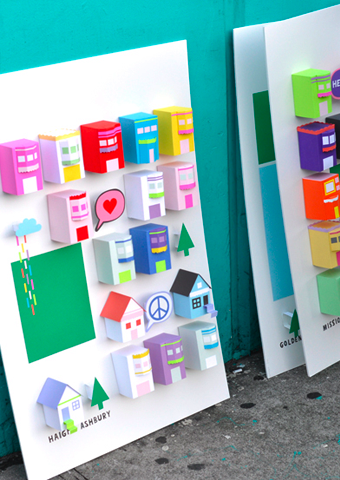
Happy Tuesday folks! Well, if you weren't feeling happy before, you certainly will have at least a twinge of the jollies after checking out the work of multi-disciplinary designer Chloe Fleury (who's work I came across on Daily Imprint). Originally from France, Chloe hopped the pond and now calls San Francisco home. Check out her series called The place i live, which was inspired by the love of her adopted city. The set of 3D posters have caused such a stir that she's been swamped with requests from people trying to buy them. Sadly, they're not up for grabs, just part of Chloe exploring her creative process, which is also inspired by cats, cupcakes and fashion. Now there's a girl after my own heart. Check out her portfolio here, and follow along on her French girl in San Fran adventures on her blog here. Oh, and yes, that's Chloe in the last shot with the pink paper ice cream!

Roughing it

Sometimes, in the midst of renovation hell, while you're ripping down walls and tearing out old plaster, something unexpectedly gorgeous can suddenly appear. Just check out these shots by Donna Griffith, over on my friend Bev Hisey's new blog, covering her full-on back to the studs reno. That got me thinking, about how imperfection and history in a space really can add gobs of charm. Have a look at the snaps below from Zanotta. Those rooms wouldn't look half as cool with plain old beige painted walls. But really, do you want to be brushing flakes of plaster off your shoulders every time you toss yourself into that sleek William sofa, or sit down for a bite at the Album table? Well maybe, especially if it would mean living with those vintage herringbone parquet floors...

Guest blog / Julia Black: Mr. Dixon's emeralds

Julia Black: One of Arren's faves, Mr. Tom Dixon, has gone and done it again. He's wowed the design industry with a new pair of sculptural light fixtures to add to his Pressed Glass Family. Bead and Top, the soon-to-hit-the-marketplace duo, have been creating quite a buzz (word is, they'll be available late July through ABC Home) and, consistent to Mr. Dixon’s industrial style, they reveal the honest imperfections of a manufacturing process originally conceived to make car headlights and glass electrical insulators. The two distinct shapes have a gorgeous heft and smashing green cast to them, and strike me as jewelry for your ceiling. I can totally see them hanging in spectacular clusters and, with that green hue, they make me feel very Dorothy in the Emerald City.

To read more posts from Julia click here, and click here to check out her cool blog.

Pass the s and p

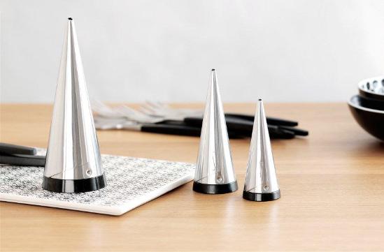
I have a great set of Dansk cutlery, Parallel Diamond to be exact, but it doesn't stop me from jonesing for other tabletop loveliness. Take the Scandi firm Gense as a case in point, who've been creating flatware and other essentials for the past 150 years. Their Focus de Luxe line of cutlery first hit the table in 1955, when it was launched at the H55 exhibition in Sweden (and where it was snapped up by the likes of Grace Kelly). Don't you think it would make slapping together a PBJ sandwich a fancy affair? The latest from Gense is the re-introduction of their Shakers, designed by Pierre Forssell and first debuted back in '55 too. Seriously. I doubt you'll find a chic-er way to chuck some s and p over french fries or tip sugar into your coffee.

Brief, colourful and pixelated

Sheesh, I'm having two short weeks in a row, what with the ICFF last week and the just-happened long weekend. At least we got the planting done on our back yard vegetable beds (I can't wait to check out the Tigerella tomatoes!), but other work beckons so I'll keep this brief - What are your thoughts on pixels? And, for that matter, fractal patterns? Have we all had enough, or, is this all still - to quote Martha - a good thing? I don't know about you, but I could totally work the brand spanking new Cristian Zuzunaga for Nanimarquina hand-knotted wool Digit rug into my place at a moment's notice...

Guest blog / Jenn Hannotte: What goes around

Jenn Hannotte: While Arren had the good fortune to physically enjoy the ICFF this year, I had to get my virtual fix and have been scouring all the blogs who have covered it. Apartment Therapy's founder, Maxwell Gillingham- Ryan, recently posted this over-view of some of the new wallpaper designs showcased. What really caught my eye were the new bold florals from London-based pattern designer, Camilla Meijer. Check out her 2010 intro, and compare to a wall in my new home with its original vintage paper. Now that's a bit of a déjà vu!! Maybe I should keep it... [Images 1,2 via Apartment Therapy]

For more of Jenn's take on style click here.

Spectacular and charming

Out of all the gazillion things that passed in front of my eyes at the ICFF, two were standouts for me for very different reasons.

First up, let's deal with the spectacular side of things with the Steel Cabinets designed by Sylvie Meuffels for JSPR. You'll know JSPR from these rubber covered baroque chairs, but Sylvie, a cum laude graduate from the Design Academy Eindhoven, is a bit newer on the scene. The handmade cabinets she's designed are wonderfully barmy, with a nod to both architectural forms and dusty old museum displays. They're brill, and I can imagine them filled with collectibles or turned into a terrarium - I just wish I had the space for one!

On the charming end of the scale is the work of Brit designer Matt Pugh. While Matt is well-known for his signature Owls (which I wouldn't mind a flock of some day), it was his playfully simple - and entirely anti-serious - Cat and Silly Duck lamps that managed to plaster a grin on my face, even after a very early Porter flight from Toronto to New York. Can't you see these looking ever-so-cute in a kid's room?

Hot for coffee [giveaway]

How zonked am I after New York? Don't ask, but if there's one thing that can give me a good kick in the pants to keep a day like today on track, it's a short sweet shot of espresso from my Nespresso machine. I wasn't always a coffee drinker though, nope, as a teenager I was possibly the world's worst barista at a coffee bar in London, see, I only drank tea then, rather than coffee (apologies to anyone and everyone I ever served an awful cappuccino to). On the design front, the latest from Nespresso are the limited edition CitiZdot Paris and New York machines, designed by Sylvia and Lo Toth of Collectif T.O.T., which, I can guarantee you, will always give you a perfect cup of coffee and zero teenage attitude.

[giveaway] Okay, now here's a bit of fun - My friends at Nespresso have offered up the chance for someone to win a CitiZ in Limousine Black (click here to take a look at one)! You're eligible if you live in North America, and all you have to do is sign up for my e-mail newsletter (see that little box under the Subscribe title on the left, that's the spot). Oh, and anyone who's already receiving for the newsletter is automatically entered. Get yourself signed up by 6pm EST on Friday, May 21st, then I'll be randomly picking 1 lucky winner!


Guest blog / Jenn Hannotte: Movin' on... up?

Jenn Hannotte: Okay, everybody relax. No need to get up in arms about my absence; let me explain. And no, I'm not going to blame it on the kids (this time), I'm going to blame it on Real Estate - capital R, capital E. I let the beast take hold of me again and I've gone and sold our house and bought another one a few blocks away, all thanks to the most amazing agent in Toronto, Nutan Brown. But I had good reason - a couple of good reasons, actually. We moved into our current house about 2 1/2 years ago and transformed it from a gold damask (in a bad way, trust me), brown carpeted, stippled mess into a pretty charming and hip abode if I do say so myself (check out my Flickr page here for the befores-and-afters of that ordeal). The main floor got a new kitchen, new floors, new laundry/mud room and upstairs got a coat of paint on every surface, including the floors. There are a lot of classic elements that remained intact from the 101 year old home that are blended with a modern and trendy reno. And that's the thing, folks - it's trendy. That, combined with a housing market that may or may not 'burst' meant that if we were going to reap the rewards from all our hard work, it was now or never. Thankfully, a young couple fell in love and in 5 short days the showings and open houses were over.

Our new house is a 'forever' kind of home. She's big and beautiful and needs a TON of work, so I'll be sharing some of that work and inspiration here as we move from project to project. Oh...did I mention we have to do it for practically free?* We're dubbing it the No-Money-Makeover and it's going to likely mean Craig's Listing, dumpster diving, recycling, street-walking....no, that's too far....and how ever else we can work towards a 'temporary' solution using cheap and clever tricks until we can get to the big stuff in a few years.

Here are a few snaps of the 'new' house below to kick-start brainstorming! Is that a fire place in the entry way? Why, yes it is! Beamed ceilings in the dining room? Check. Stippled plaster everywhere? Sure!

For more of Jenn's take on style click here.

*A disclaimer: The whole house needs the knob and tube wiring removed - a big job at an even bigger ticket price that needs to be done ASAP. so it doesn't count. Because I said so.

Patching it up in NYC

I'm in NYC right this second, check-check-checking out the world of design in and around the International Contemporary Furniture Fair. After walking the show (and interviewing folks like Amy Butler, Kelly Hoppen and Matt Carr) I ventured further afield to have a look at all the off-site exhibits. There's been some awful stuff (sorry, but I really don't want wall sconces and table lamps made of real squirrels and mice), and there's been some fantastic stuff, like the chance to see the tribute by artist Tal R for the 50th anniversary of the Arne Jacobsen Egg Chair at ABC Carpet & Home. There are masses of the quilted patchwork covered chairs on show at ABC, and each has a different feeling. I've included a couple of my faves below, one of which feels really quite nutty, while the other has almost a preppy vibe to it. Then, for the crafty types out there, there's a close-up of the fabrics from one of the other chairs. Finally, a shot of the man himself, surrounded by some of the tonal chairs he produced. Yay for patchwork!

Guest blog / Julia Black: A style called Alice

Julia Black: If you’ve ever cringed at the thought of pulling out your plunger, reaching for your broom, or digging for your mop bucket then pay attention, because Alice has a chic solution for you. Alice Supply Co. is the oh-so fab firm behind fashionably hip housewares that are far too cool to hide in the broom closet. Maria Barnes and her partner Raili Clasen are the brilliant minds and gorgeous faces behind the Alice name, and with their common pasts in the fashion industry (over 20 years at companies like Paul Smith, Roxy and Quicksilver) it's no wonder their printed, patterned and anti-beige designs boldly go where none have gone before. The inspiration came to start the business while the pair were on vacation in Mexico, where they discovered a hardware store selling some rather sensational buckets, dustpans, and other bits and pieces, spurring them to launch Alice Supply Co in '08 (and yes, the firm just might be named after Alice Nelson, the housekeeper on The Brady Bunch).  After a hugely successful intro you'll now find their designs in some of the best stores in North America - in Toronto they're in both Teatro Verde and The Drake General Store - as well as managing to pick up quite a few fans along the way. Just ask Arren, who's currently waffling between the camo and woodgrain toolboxes! Click here for where to score a bit of Alice near you.


Like candy, but for your house

Don't these pendant lights by Danish designer Rie Elise Larsen remind you of Jujubes? Love the colour (they're painted metal) and of course, the brilliantly coloured fabric-covered electrical cords (don't get me started on how hard that cord is to find in North America). Anyways, Rie Elise Larsen is a fave of mine since she's completely unafraid of saturated and sugary bright colours. Click here to see her whole line, including a brill selection of textile and paper goods, and click here to see her gorgeously styled and completely inspirational look book...